Wedding Invitation Maker App
- 0.00
- 0.0
- Installs
- 100.00K
- Price
- Free
Screenshots
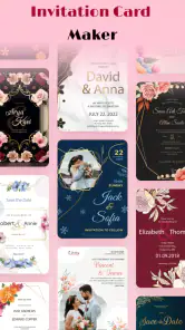
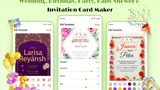
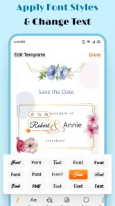
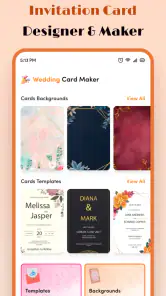
Analysis by Reviewed
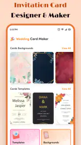
Planning a wedding often means making dozens of small decisions before the big ones are settled. The invitation is one of the first things guests see, so I wanted a tool that could help me create something personal without turning the process into a full graphic-design project. Wedding Invitation Maker, from EverestSol, is built for that specific job: creating wedding cards with text and preparing invitation designs on a phone.
After spending time with it, my impression is that it works best as a focused, practical design app rather than an all-purpose wedding planner. It is free to install, aimed at Everyone, and available for devices running Android 6.0 or later. The app has reached over one hundred thousand installs, which gives it a useful level of visibility without making it feel like an overwhelming platform packed with unrelated tools.
My main takeaway is simple: this app is most useful when you already know what you want to say and need help turning that wording into a presentable invitation. It can save time for a couple, a family member, or a friend organizing a ceremony, but it is not the right choice for someone expecting a complete event-management system or highly advanced design software.
Where the invitation-making process can get stuck
The first point of friction is usually not the design itself. It is deciding what information belongs on the card and how much text the layout can comfortably hold. A wedding invitation needs names, date, time, venue, and often a short note about the reception or dress code. If I write everything as one long paragraph, the result can quickly feel crowded, even when the wording is perfectly clear.
I found it more effective to prepare the text before working on the visual arrangement. I separated the essential details from optional information and treated the invitation as a hierarchy: the couple’s names first, the wedding date next, then the location and supporting notes. That approach matters in a text-focused app because a design can look attractive while still making guests work too hard to find the important details.
Another common sticking point is choosing a style before knowing the audience. A playful design might suit a casual outdoor ceremony but feel out of place for a formal evening event. A very decorative card may look appealing on a phone screen and become harder to read when shared in a messaging conversation. I would make the tone decision first, then adjust the wording and layout around it.
The app’s narrow focus is actually helpful here. Instead of distracting me with seating charts, guest lists, countdowns, or budget tools, it keeps attention on the invitation. That also sets a clear boundary: if I need to coordinate replies or track which guests have received the card, I would use a separate tool alongside it.
Start with the message, not the decoration
My most useful workflow was to create a plain text draft before attempting the final card. I checked names carefully, especially spelling and capitalization, then reviewed the date and venue as if I were a guest seeing the invitation for the first time. This catches mistakes that are easy to miss once the text is surrounded by colors and decorative elements.
I also kept the first version shorter than my instinct suggested. Extra wording can be sent separately in a message, while the card should remain easy to scan. This is one of the less obvious trade-offs of a wedding card maker: adding more information may seem convenient, but it can weaken the visual purpose of the invitation. The app helps with presentation; it cannot decide which details your guests genuinely need.
For a realistic example, imagine that I am helping a cousin send invitations on a busy Saturday afternoon. The ceremony details are already confirmed, but the family wants a card ready before dinner. I would draft the wording in a notes app, open Wedding Invitation Maker, build the main card, and then compare the result against the original text. That separation reduces the chance of accidentally changing a time or leaving out a location while experimenting with the design.
Setup checks that prevent avoidable frustration
Before starting, I would check that the phone meets the app’s Android requirement and that the operating system is at least version 6.0. That is a basic step, but it is worth doing before spending time on a design. Older devices can also make editing feel less comfortable simply because a small screen gives less room to inspect text and spacing.
I would then make sure the final wording is available locally and that the phone has enough working space for a design session. I am not treating this as a special requirement of the app; it is just sensible preparation for any mobile editor. If I am working with several versions of a card, I label them clearly in my own notes so I do not confuse a draft with the version intended for guests.
The current version is 1.15, so I would also check that the installed copy is up to date through the normal app store process. Updating is not a guarantee that every problem disappears, but it is a sensible first check when an editor behaves differently from expected. I prefer to update before creating the final invitation, not halfway through a rushed session.
Because the app is free to install, it is easy to try without committing money at the beginning. However, in-app purchases range from $3.59 to $35.99 per item. I would pay attention to any purchase prompt and decide in advance whether the available free workflow is enough for my needs. A free installation does not automatically mean every design option or later step is free, so I would avoid assuming that a particular element is included until I see how the app presents it.
Prepare a clean test invitation
One practical tip is to create a test card using placeholder wording before entering the final names and event details. I might use “Alex and Sam” and a simple sample date while checking how the composition feels. This lets me explore the editing process without repeatedly correcting real information.
Once the layout feels right, I would replace the placeholders carefully and read the finished card from top to bottom. I would not rely only on spellcheck. Names, venue names, and abbreviations can look correct to a keyboard but still be wrong for the people receiving the invitation. A second person’s review is especially valuable here because the creator often sees what was intended rather than what is actually written.
I would also inspect the card at the size in which guests are likely to receive it. A design that looks balanced while editing may have small text when viewed inside a chat application. This is a general mobile-design issue, but it is particularly important for an invitation because guests should understand the essential details immediately.
Recovering when a draft or workflow goes wrong
When an editing session does not go smoothly, my first response is to avoid making several changes at once. I would return to the last version that looked correct, then change one thing at a time. That makes it easier to identify whether the problem came from the wording, the arrangement, or the way I was using the editor.
If text appears crowded, I would shorten the wording before trying to force every line into the same visual space. Removing a repeated phrase is usually better than shrinking everything until it becomes difficult to read. If the invitation feels empty, I would add breathing room or improve the order of the information rather than filling every open area with more decoration.
For a draft that seems to have disappeared, I would first check whether I am looking at the same project or version I was editing. I would also avoid immediately closing the app after making a major change. In any mobile creation workflow, it is sensible to pause after a meaningful edit and confirm that the current result is still visible before moving on.
If the app stops responding, I would try the ordinary steps in order: leave the editor, reopen it, and check whether the issue affects only one draft or the whole app. I would not repeatedly reinstall while a valuable design exists unless I had already preserved the wording elsewhere. Keeping the invitation text in a separate note is one of the best recovery habits because it protects the most important part of the work.
Separate design problems from content problems
A useful diagnostic trick is to ask whether the card is failing because of the message or because of the presentation. If guests cannot find the venue, that is a content-order problem even if the design looks attractive. If the information is clear but the card feels visually unbalanced, then the layout needs attention. Treating those as separate problems prevents endless random adjustments.
I would also create a short version and a fuller version when the event needs extra instructions. The short version can serve as the main invitation, while the longer information can be delivered through a separate message. This is more practical than trying to make one card perform the job of an invitation, directions sheet, accommodation guide, and personal letter at the same time.
Another useful trade-off concerns personalization. Adding the couple’s names and a warm sentence makes the card feel more personal, but too many individual variations can create checking work. If I am preparing invitations for a large guest group, I would keep the main design consistent and change only details that genuinely need to differ. That reduces the chance of sending one guest an incorrect time or venue.
When the app is not the cause
Not every failed invitation workflow points to Wedding Invitation Maker. A design may appear wrong because the original text contains unusual spacing, inconsistent capitalization, or line breaks copied from another app. I would first simplify the wording and type a small test manually before deciding that the editor is malfunctioning.
Sharing can also introduce confusion. A card may look correct inside the editor but be viewed differently in another messaging or social application because of how that service displays images or previews. If a recipient says the invitation looks unclear, I would ask whether the issue affects the actual card or only the preview shown in the conversation. Sending the finished image directly, where appropriate, can help distinguish those situations.
Device conditions matter too. A nearly full phone, an outdated operating system, or a temporary app-store issue can interfere with installation and normal use. I would check those basics before judging the design tool itself. The app supports Android 6.0 and newer, but meeting the minimum requirement does not mean every older phone will provide the same comfortable editing experience as a recent device.
There is also a human factor. When I am working under wedding-planning pressure, I tend to revise too quickly and overlook small errors. Taking a short break before the final proofread is more useful than endlessly changing colors or wording. The best result often comes from a calmer review rather than a more complicated design.
Who will appreciate it most
I think this app suits people who want a dedicated place to make a wedding invitation without learning a broad design platform. It is a good fit for a couple preparing a simple digital card, a relative helping with the invitations, or someone who wants a quick starting point for a ceremony announcement. The Everyone age rating also makes it approachable for families working on the project together.
It is less suitable for a professional designer who needs precise control over every visual detail, or for an organizer who expects guest management and event coordination in the same app. I would also look elsewhere if my priority were a complete stationery system with matching menus, thank-you cards, and printed materials. A focused invitation maker can be easier to use, but that focus naturally limits the wider workflow.
The cost structure is another reason to decide what I need before designing. Since the app is free to install but includes item-based purchases, I would test the basic process first and only consider spending if a particular paid option genuinely improves the finished card. For a one-time invitation, a simple design may be enough; for a more polished or personalized result, the purchase terms deserve attention before I build the final version around an element I may not want to pay for.
My practical verdict after using it
Wedding Invitation Maker is a sensible choice when the task is clearly defined: create a wedding card, arrange the wording, and produce something guests can understand at a glance. I like that it concentrates on the invitation instead of pretending to replace every other wedding-planning tool. EverestSol has positioned it as an Events app, and that narrow purpose is its strongest quality for users who want a direct starting point.
My advice is to treat it as part of a small workflow rather than the entire planning process. Prepare the text separately, test the layout with placeholders, check the final details with another person, and keep a backup of the wording. Those steps address the most likely sources of trouble and make the design session much less stressful.
The app is free to begin with, supports Android devices from version 6.0 onward, and is suitable for general audiences. Its current version is 1.15, while optional purchases can cost from $3.59 to $35.99 per item, so I would review each purchase prompt carefully. I would recommend trying it when you need a straightforward digital wedding invitation and do not require advanced event management.
I would skip it only if your real need is broader than card design. For a guest list, RSVP tracking, detailed print production, or a fully coordinated stationery package, another solution will likely serve you better. But for a personal invitation made on a phone, especially when the wording is ready and the goal is to finish without unnecessary complexity, this app is a practical option that earns its place in the wedding-planning toolkit.
Pros
- Create polished wedding invitations without design experience.
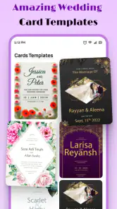
- Offers templates for different wedding styles and themes.
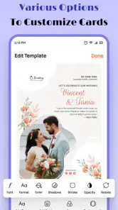
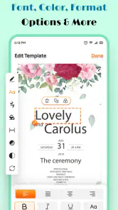
- Easy text editing for names
- dates
- venues
- and event details.
- Share invitations digitally through messaging apps and social networks.
- Useful for making matching cards
- RSVP details
- and event announcements.
Cons
- Some premium templates and design elements require a subscription.
- Free designs may include branding or export limitations.
- Advanced customization can feel limited compared with full design apps.
- Large image assets and templates may use considerable storage or data.
- Some features may require an internet connection to work properly.
- Category
- Events
- Version
- 1.15