WB Digital Base 2 Watch Face
- 22.00
- 4.2
- Installs
- 10.00K
- Price
- $2.99
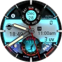
Screenshots
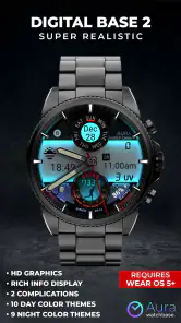
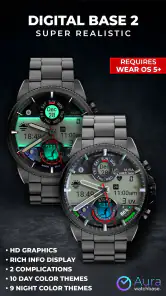
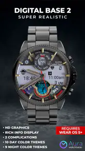
Analysis by Reviewed
My first impression of WB Digital Base 2 was that it is trying to make a smartwatch feel more like a small piece of glowing hardware than a quiet utility. This is a Wear OS watch-face app from WatchBase Aura, placed in the personalization category, and its appeal is immediate: the digital display has a deliberately realistic, illuminated look, with color themes that let the face change personality without changing the watch itself.
That first-week appeal matters because watch faces are easy to download and just as easy to abandon. I have used plenty that looked impressive in a preview but became tiring once the novelty wore off. This one has a stronger chance of staying installed because its design is recognizable at a glance and does not depend on a complicated setup ritual. Still, the same glowing style that makes it attractive can also become the reason some people switch back to a simpler face.
How the watch face feels in everyday use
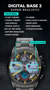
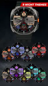
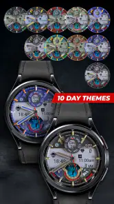
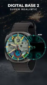
The central idea is straightforward: a digital base with a hyper-realistic LED-inspired presentation, supported by multiple color themes. I see that as a good fit for someone who wants the watch to look intentionally designed rather than merely functional. It gives a Wear OS device a more dramatic identity, especially when the screen wakes in a dim room or catches the eye while walking.
I would not choose it for a traditional, understated appearance. The visual treatment is the point, so anyone who prefers a plain monochrome face may find it too expressive. On the other hand, if your watch currently feels visually bland, changing to this face can make the device feel new without buying a different strap or hardware.
The first practical test is readability. A watch face has to work during quick glances, not only in a carefully framed screenshot. The digital approach helps here because the main information is presented in a form I can read quickly. The color choices are more than decoration: a bright theme can make the face feel energetic, while a darker or calmer choice is easier to live with during work or evening use.
My advice is to judge the face during the situations in which you actually check your watch. Try it while moving, under indoor lighting, outdoors, and during a quiet evening. A theme that looks excellent in the selection screen may feel too bright or visually busy once it becomes part of your routine. The best choice is not necessarily the most striking one; it is the one that remains clear after repeated glances.
The first week: novelty with a useful purpose
During the first few days, the strongest benefit is the feeling of personalization. Instead of treating the watch face as a fixed dashboard, I found myself matching the color mood to the watch and the occasion. A vivid theme suits casual use, while a restrained option makes more sense when I want the watch to blend into clothing or a work setting.
More From Our News Desk

Clash of Clans Is Won Between the Battles

Android Auto Makes the Case for Quieter Car Software

MobiOffice: Transforming Mobile Productivity with Seamless Integration

EA SPORTS FC™ Mobile Soccer: Redefining Mobile Sports Gaming

How Microsoft OneDrive Became a Mobile Productivity Giant

How Google Translate Breaks Language Barriers Effortlessly
That variety gives the app a better opening than a face with one visual treatment. I can change the presentation when I get bored without learning a new layout from scratch. This is a small but important distinction: the app keeps the recognizable structure while offering enough visual variation to delay the usual “I have seen this already” reaction.
A realistic everyday scenario is a busy morning when I am checking the time repeatedly while getting ready and commuting. In that situation, the face works best when I have already selected a theme with strong contrast. I do not want to stop and interpret decorative details while carrying a bag or moving between rooms. The practical advantage is not that the display contains more information; it is that the digital presentation can make the primary reading feel immediate.
There is also a useful psychological effect. A new face can make me pay more attention to the watch for a few days, which may encourage me to check the time or glance at whatever information I normally keep on my wrist. That benefit is real, but it should not be confused with lasting value. The question is whether the face remains comfortable after the excitement of installation fades.
Color themes and the trade-off between style and calm
The color themes are the feature I would spend the most time evaluating. A glowing effect can create depth and character, but it also competes for attention. If every element is visually intense, the watch may feel less like a tool and more like a miniature signboard. I prefer to choose a theme based on the background where I use the watch most, rather than selecting the brightest option simply because it looks impressive at first.
For daytime use, I would favor a theme that separates the main digits clearly from the rest of the face. For evening use, a softer appearance is likely to be easier on the eyes. This is one of the less obvious decisions with a face like this: the best theme can change with your routine, and keeping one setting forever may not be the most comfortable approach.
The downside is that theme switching can become a form of maintenance if I start adjusting the face every time I change clothes or move from work to leisure. Personalization is valuable only while it remains effortless. If the choice begins to feel like another small task, the face loses some of its advantage over a dependable default design.
What remains useful after the first month
After the initial attraction, the face has to earn its place through habit. For me, that means three things: I must be able to read it quickly, it must suit more than one part of my day, and changing its appearance should not be necessary to keep it pleasant. WB Digital Base 2 performs best when I treat the themes as optional flexibility rather than a requirement to keep redesigning the watch.
The app is priced at $2.99, which puts the decision in the “small purchase, lasting usefulness” category. I would not judge that price by the length of the installation process. A watch face can be installed in moments, but its value comes from being the face I continue using weeks later. If I enjoy the design and it becomes my regular choice, the cost is easier to justify. If I only want to experiment for an afternoon, a paid face is harder to defend.
The developer, WatchBase Aura, has focused this product on a specific visual identity instead of trying to make it appeal to every possible taste. That specialization is helpful because the face feels coherent. It is also the main reason the app will not suit everyone. Someone looking for a large collection of unrelated layouts may prefer a broader watch-face platform or a face built around customization depth rather than a single glowing style.
In month-to-month use, I would expect the strongest recurring value to come from avoiding visual fatigue. The themes give me a way to refresh the appearance without abandoning the core layout. That is more useful than it sounds: a face can remain functionally perfect and still become boring simply because I see it dozens of times a day.
However, the themes cannot solve every kind of boredom. If the underlying arrangement does not match the way you use your watch, color changes will only disguise the problem temporarily. This is why I would recommend testing the face for a few normal days before deciding that it is a permanent replacement. Pay attention to whether your hand naturally goes to the same information and whether the design helps or distracts during those quick checks.
Who will get the most from it
I think this is a strong choice for Wear OS owners who want a bold digital identity and enjoy changing the visual mood of their watch. It is especially appealing if you like LED-inspired hardware, glowing accents, and a face that looks deliberately futuristic without requiring a completely different device.
It also suits people who use their watch as an accessory as much as a timekeeper. If you coordinate the watch with clothing, prefer a modern digital aesthetic, or find standard faces too forgettable, the themes provide a simple way to make the device feel more personal.
I would be more cautious if your priority is maximum restraint, a classic analog appearance, or a face that disappears visually once you have read the time. The same character that attracts one user may irritate another. I would also look elsewhere if your main reason for changing faces is to gain a very different information layout rather than a different visual treatment.
That distinction answers an important practical question: is this a utility upgrade or a style upgrade? I see it mainly as a style upgrade with everyday readability as its supporting strength. It can improve how enjoyable the watch feels, but it should not be purchased with the expectation that it will transform the capabilities of the watch itself.
Maintenance, routine, and the small frictions
The maintenance burden is relatively low in concept because the face is not asking me to rebuild a dashboard every day. Once I find a comfortable theme, I can leave it alone and let the watch do its job. That is the best long-term workflow: choose for readability first, keep the face through a normal week, and only change the theme when the visual fatigue is genuine.
The friction comes from the nature of personalization. A glowing display can make me more aware of brightness, contrast, and context than I would be with a plain face. I may need to rethink my theme after wearing the watch in a dark bedroom, under strong daylight, or with formal clothing. None of that makes the app unusable, but it means the face rewards a little more attention during setup.
I would also avoid changing themes too frequently during the first day. Rapid switching makes every option feel exciting and makes it harder to tell which one is actually comfortable. A better method is to choose one that reads clearly, wear it through a complete routine, and then compare it with another theme later. That simple test separates lasting comfort from preview-screen appeal.
Another trade-off is visual consistency. If you use a phone wallpaper, strap, or case with a strong color scheme, a glowing watch face may either complete the look or clash with it. The app gives the watch a more noticeable presence, so it is worth considering the rest of what you wear. For me, that is part of the fun, but users who prefer accessories to stay neutral may find the effect excessive.
Where fatigue can set in
The main source of fatigue is not complexity; it is intensity. A bright digital glow can feel fresh at first and repetitive later. Because the face is visually distinctive, I notice it more than I would notice a quiet design. That makes the watch more enjoyable when I am in the mood for it, but it also makes the choice less invisible during long-term use.
A second source of fatigue is the possibility of confusing decoration with information. When I glance at a watch, I want the important reading to win immediately. If the luminous styling draws my eye around the display before I settle on the time, the face is working against its own purpose. This is why I would choose the most legible theme rather than the one with the strongest visual impact.
There is also a novelty curve. In the first week, the realistic LED look can make the watch feel upgraded. A month later, the same effect becomes part of the background. That is not necessarily a failure; it is the normal test for any personalization app. The face earns its place if it remains pleasant once I stop actively admiring it.
Compared with a usual minimal digital face, this one offers more personality but less neutrality. Compared with a traditional analog face, it feels more immediate for quick digital reading but lacks the quiet, familiar character of hands and markers. Compared with a large customization suite, it is easier to understand but narrower in purpose. Those are meaningful trade-offs, not flaws that can be ignored.
The app’s audience size also suggests a focused product rather than a mass-market default: it has over 10K installs and a 4.2 average from around 424 ratings. I read that as evidence of a reasonably positive reception, while remembering that a rating cannot tell me whether the design fits my own taste. The face is visually specific enough that personal preference matters more than popularity.
Questions I would ask before installing
If you are wondering whether it is suitable for everyday wear, my answer is yes, provided you choose a calm, readable theme and do not expect the glowing style to remain exciting forever. Its real test is whether the layout stays easy to scan after the first week, not whether the preview catches your attention.
If you are concerned about paying for something you may replace quickly, I would first ask how often you normally change watch faces. Someone who keeps one face for months can get meaningful value from a design that feels distinctive and remains comfortable. Someone who experiments constantly may prefer a free collection or a broader app with more variety.
If you want a face for formal occasions, it depends on your chosen theme and personal style. The digital format can look clean, but the luminous character may be too noticeable for someone seeking a traditional appearance. I would keep a quieter alternative available if your watch needs to move between casual and formal settings.
If you are choosing between this and a standard digital face, pick this one for personality and theme variation, not because it promises a fundamentally different watch experience. If you are choosing between this and an analog design, decide whether instant digital reading or a more classic visual rhythm matters more in your daily routine.
Finally, if you are buying it for a child or another user who needs the simplest possible display, the Everyone age rating makes it broadly suitable from a content perspective, but visual preference still matters. A glowing face may be fun for one person and distracting for another. I would let the intended wearer judge the display rather than assuming that a bright style is automatically easier to use.
My long-term verdict
WB Digital Base 2 earns consideration because it has a clear personality, useful color variation, and a design that can make an ordinary Wear OS watch feel more deliberate. I like that its value does not depend on a complicated learning curve. The face can be attractive immediately, then settle into a practical routine if I choose the theme with care.
Its lasting weakness is the same as its lasting strength: the visual style is hard to ignore. Users who enjoy a glowing, futuristic presentation may keep returning to it, while those who want their watch to fade into the background may tire of it even if the readability is good. No amount of theme switching changes that fundamental character.
My recommendation is to buy it when you want a focused personalization upgrade and expect to wear the same watch face regularly. I would skip it if you are searching for a quiet analog replacement, an all-purpose information dashboard, or a huge catalog of unrelated designs. For the right user, the $2.99 purchase can pay off through daily familiarity rather than constant novelty.
In the end, I see this as a face that can survive beyond its first-week sparkle, but only when used with restraint. Pick one theme that works in your real routine, resist the urge to keep tweaking it, and judge the app by how naturally it fits into your month. The lasting value is not the glow itself; it is whether the face remains easy to live with after the glow becomes familiar.
WB Digital Base 2 Watch Face Frequently Asked Questions
What does WB Digital Base 2 Watch Face cost, and what should I know before buying it?
WB Digital Base 2 Watch Face is a paid personalization app priced at $2.99. Before purchasing, check that your smartwatch is compatible with Wear OS and that the look suits your preferences. The design is described as a hyper-realistic digital face with glowing LED effects and multiple color themes, so it is aimed at users who want a vivid, customizable appearance rather than a plain clock display.
What is WB Digital Base 2 Watch Face?
WB Digital Base 2 Watch Face is a digital watch-face design intended for compatible Wear OS smartwatches. It focuses on a clean, information-rich layout, typically presenting the time alongside useful details such as the date, battery level, and activity or system indicators. The exact appearance and available data can vary depending on the watch model, Wear OS version, and the configuration options provided by the developer.
Which smartwatches are compatible with WB Digital Base 2 Watch Face?
Before downloading, check the compatibility information shown in Google Play for your specific device. WB Digital Base 2 Watch Face is designed for supported Wear OS watches, but not every smartwatch uses Wear OS or supports third-party watch faces. Older models, proprietary systems, and some regional device variants may be excluded. Compatibility can also change after operating-system updates, so confirming your watch is recommended.
How do I install and apply WB Digital Base 2 Watch Face?
Install the watch face through the Google Play Store while signed in with the account connected to your Wear OS watch, or install it directly from the Play Store application on the watch when available. After installation, press and hold the current watch face, select the watch-face gallery, and choose WB Digital Base 2 Watch Face. If it does not appear immediately, sync the watch, open the companion listing, or restart both devices.
Can I customize the colors, complications, and displayed information?
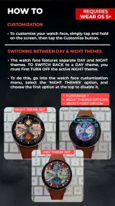
Customization depends on the version of WB Digital Base 2 Watch Face and the options supported by your smartwatch. Many Wear OS faces allow users to change color styles, select complications, and choose which information appears in designated areas. Open the watch-face customization screen from the Wear OS app or by long-pressing the face on the watch. Some features may be limited by the device or require an in-app purchase.
Pros
- Clean digital layout makes the time easy to read at a glance.
- Includes useful data such as battery level and date.
- Designed specifically for Wear OS smartwatches.
- Low visual clutter keeps the watch face looking modern.
- Simple style works well for everyday use and casual outfits.
Cons
- Compatibility may vary between Wear OS watch models.
- Some features may require configuring complications manually.
- The digital design may feel too basic for users wanting animations.
- Small text can be difficult to read on compact watch displays.
- Customization options may be limited compared with premium watch faces.
- Category
- Personalization
- Version
- Varies with device











