Verticons Icon Pack
- 307.00
- 4.8
- Installs
- 100.00K
- Price
- $0.90

Screenshots
Analysis by Reviewed
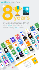
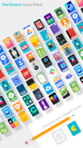
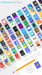
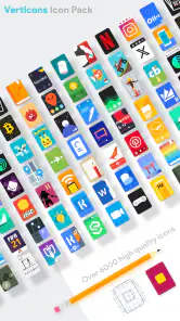
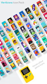
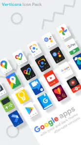
I noticed Verticons Icon Pack while looking for a way to make a familiar Android home screen feel less flat without replacing the whole launcher. Its approach is immediately distinctive: app icons are arranged as tall, rounded rectangles rather than the usual circles, squares, or loose collection of manufacturer styles. That single design decision gives the home screen a more orderly, poster-like appearance, but it also means the pack works best when you are comfortable with a fairly strong visual identity.
In my experience, this is not an app you open every day like a messaging or note-taking tool. It is a personalization app that changes how the rest of the phone looks and feels. The useful question is therefore not simply whether the icons are attractive. It is whether your launcher can apply them smoothly, whether the apps you use are covered well enough, and whether you actually want a consistent vertical shape across your shortcuts.
From a cluttered home screen to a deliberate layout
The starting condition matters more than I expected. If your phone already has a carefully matched wallpaper, widgets, and launcher grid, the pack can become the final piece that brings everything together. If your screen is crowded with mixed icon shapes, however, the change may feel more dramatic than the low price suggests. The icons do not merely add decoration; they alter the rhythm of the entire home screen.
SpaceMan has kept the concept focused. The store summary describes vertically oriented rectangular icons, and that is exactly the visual idea driving the experience. Instead of trying to imitate every platform style, the pack gives icons a shared frame and lets the artwork sit inside it. The result is especially convincing on a clean first page with a restrained wallpaper, where the repeated vertical forms create visible alignment.
I would recommend beginning with a single home-screen page rather than changing every screen at once. Put your most-used apps there, leave the second page untouched, and compare the two during normal use. This small test reveals an important trade-off: the design can make a page look calmer, but it can also make a familiar icon less instantly recognizable if you rely on color and silhouette more than text.
Installing it without losing your existing setup
The app itself is listed in the Personalization category and comes from SpaceMan. It costs $0.90, while the listing also shows in-app purchase items ranging from $0.99 to $9.99 each. That combination is worth noticing before you begin. The initial purchase is modest, but the complete cost can depend on what additional items you choose inside the app or its related workflow.
On a compatible Android phone, the practical first step is to install the pack and open it to see how it connects with your launcher. Icon packs are not universal replacements for the launcher itself, so the handoff between the pack and the home-screen software is important. A launcher with built-in icon-pack support should make the process straightforward. With a launcher that does not expose that option, the pack may be less useful even if you like the artwork.
More From Our News Desk

Clash of Clans Is Won Between the Battles

Android Auto Makes the Case for Quieter Car Software

MobiOffice: Transforming Mobile Productivity with Seamless Integration

EA SPORTS FC™ Mobile Soccer: Redefining Mobile Sports Gaming

How Microsoft OneDrive Became a Mobile Productivity Giant

How Google Translate Breaks Language Barriers Effortlessly
The minimum operating-system requirement is Android 5.0, which makes the pack accessible to many older devices as well as newer ones. That does not guarantee identical behavior across every phone, because launchers and manufacturer interfaces can handle icon packs differently. I would check the launcher’s personalization panel first, especially if the phone uses a heavily customized interface rather than a relatively open Android launcher.
A practical setup flow is to apply the pack, inspect the first page, and then check folders separately. Folders are where mismatched icons become most obvious. If a few important apps remain in their original shape, the page can look unfinished even when most icons have changed. I found it more effective to prioritize the apps that appear on the main page than to chase perfect coverage across every installed utility.
Choosing a layout that makes the vertical shape work
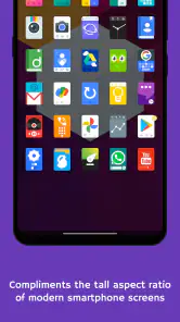
The tall rectangular format rewards spacing. If icons are packed tightly together, their frames can compete visually and make the page feel busy. A little breathing room helps each icon read as an individual tile. I would also avoid placing too many widgets beside them until the basic arrangement feels balanced; a large widget can make the vertical icons seem visually compressed.
This is one of the less obvious strengths of the pack: it encourages you to rethink placement rather than simply replacing artwork. A conventional five-column layout may not be the best match for a design built around vertical repetition. Try moving the apps you use most into a simple column pattern, then use folders for less frequent tools. The goal is not to make every screen symmetrical, but to let the icon shape support the way you actually reach for apps.
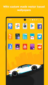
Wallpaper choice makes a surprisingly large difference. Busy photographs can fight with the strong outlines and colors, while a calmer background lets the icons act as a readable interface layer. I prefer a wallpaper with enough contrast behind the icons but not so much detail that every tile appears to sit on a different visual patch.
There is also a useful handoff between the icon pack and your own organizational habits. If you normally identify apps by their original logos, changing the shape may slow you down for the first few days. If you identify them by position, color, or folder, the transition is easier. I would not judge the pack during the first five minutes; use it through a normal morning routine and see whether the new arrangement helps or interrupts you.
What happens when an app does not match
Coverage is a real-world concern with every icon pack, and it is particularly noticeable here because the unified frame is so prominent. Popular apps are the easiest ones to place confidently, but less common tools, recently installed apps, and manufacturer utilities may not look equally integrated. When one icon remains in a circular or irregular style, the contrast can be more visible than it would be in a mixed icon theme.
My preferred solution is selective consistency. Keep the main page limited to apps that look good together, then move exceptions into a secondary folder or page. This is not as satisfying as a completely transformed phone, but it produces a better result than forcing every shortcut into the same visual area. It also gives you a useful fallback if a particular app is not represented in the way you expect.
Another handoff occurs when you switch launchers or restore your phone. The icon pack is part of the visual layer, while the launcher controls the arrangement. If you change the launcher, the grid, folders, and icon settings may need attention again. I would take a quick screenshot of the finished layout before experimenting with another launcher, not because the pack is difficult, but because the final appearance depends on several pieces working together.
A realistic everyday workflow
Imagine that I am preparing for a workday. I want the first screen to contain my calendar, email, browser, notes, camera, and music app, with a weather widget above them. I apply the pack, remove shortcuts I rarely touch, and arrange the daily tools in a simple pattern rather than filling every available space. The vertical icons give the page a more deliberate edge, and the widget becomes easier to treat as a separate information block.
Later, I install a specialist transport app. It does not fit the visual group as neatly as the existing shortcuts. Instead of allowing it to disrupt the first page, I place it in a folder with other occasional travel tools. That small decision preserves the result I wanted while keeping the app accessible. This is the kind of workflow where the pack makes sense: the theme is not doing all the work; it gives structure to a home screen that has already been edited thoughtfully.
For a family member who uses a phone mostly through a few fixed shortcuts, I would take a different approach. The tall shapes may be attractive, but recognition speed matters more than visual novelty. I would set up a small test page and ask whether the new icons are easy to identify without reading labels. If the answer is no, a simpler icon pack with more familiar silhouettes would probably be the better choice.
How it compares with ordinary icon choices
The usual alternative is to keep the manufacturer’s icons, use the launcher’s default theme, or choose a pack that imitates circles and rounded squares. Those options tend to disappear into the phone’s existing design. Verticons takes the opposite route. It asks the rest of the interface to accommodate its shape, which gives it more personality but also makes compatibility and layout decisions more important.
Compared with a minimal monochrome pack, this approach is less restrained because the individual artwork still carries visual color and detail inside the vertical frames. Compared with a pack that offers many unrelated shapes, it is more coherent. I see it as a middle ground between a subtle cleanup and a full visual redesign: the home screen remains recognizably yours, but its repeated icon geometry becomes the dominant organizing element.
The average rating is 4.8 from around 2.4 thousand ratings, and the app has passed 100 thousand installs. Those figures suggest that the focused style has found a committed audience, although they do not remove the need to test it with your own launcher and app collection. The current version is 2.5.9, and the app is marked suitable for Everyone, which fits its role as a visual customization tool rather than a content-heavy service.
Small decisions that improve the final result
First, judge the pack at the size you actually use. An icon that looks excellent in a preview can become visually dense when reduced on a compact grid. I would test the page while standing back from the phone, because that reveals whether the vertical rhythm is helping recognition or merely creating a wall of repeated shapes.
Second, keep your dock simple. The dock is visited constantly, so inconsistent or overdecorated shortcuts there are more distracting than an imperfect icon on a rarely opened page. I prefer using the most familiar and frequently used apps in that area, then allowing the themed pages to carry more of the visual experimentation.
Third, use folders as intentional handoffs rather than storage bins. A folder for finance, travel, or home controls can hide occasional mismatches while making the first page easier to scan. This works particularly well when you have a few apps that are important but not used often enough to deserve prominent placement.
Fourth, do not confuse a beautiful screenshot with a practical setup. Leave the phone in normal use for a day before deciding. If you repeatedly tap the wrong shortcut because several icons now share a similar frame, the visual consistency is costing more than it gives. If you find yourself locating apps faster because the page has clearer groups, then the pack is doing useful interface work rather than simply adding style.
Where the experience breaks down
The biggest weakness is the dependency on the launcher. The pack cannot independently redesign every part of the home screen, and a launcher with limited icon-pack support can turn an attractive idea into a frustrating setup exercise. This is the first situation in which I would skip it: if your current launcher gives you no comfortable way to apply custom icons, changing launchers just for this theme may not be worth the disruption.
The second weakness is visual rigidity. The vertical rectangle is the reason to choose the pack, but it is also the reason some people will tire of it. If you prefer mixing circular, square, and adaptive icons, this design may feel too controlled. It is not the right choice for someone who wants every app to preserve its original shape or who changes themes frequently.
There can also be friction when your most important apps do not blend into the set. A home screen with several exceptions looks less intentional, and moving those apps elsewhere may reduce convenience. Before paying, I would think about the small group of apps you open constantly, not just the total number installed. A theme that handles your daily shortcuts well can still be worthwhile even if obscure tools remain unchanged, but the reverse is rarely true.
The price is approachable, yet the additional in-app purchase range means I would pay attention during setup and decide what is genuinely necessary. I would not add extras simply to chase a perfectly uniform result. The best value comes from using the core visual idea on the pages that matter most, rather than treating every optional purchase as essential to the experience.
Who should install it
I think this pack is a strong match for Android users who enjoy arranging their phones, want something more distinctive than default rounded icons, and are willing to adjust spacing, folders, and wallpaper around a clear design. It is also a good fit for someone who wants a noticeable refresh without replacing the entire launcher experience.
I would point a less enthusiastic user toward another option if they need maximum simplicity, depend on instant logo recognition, or use a launcher with uncertain customization support. People who want a monochrome interface may also find the vertical frames too expressive, while people who want a constantly changing collection may find the consistent shape restrictive.
After living with the layout, my conclusion is that the pack succeeds because it commits to one idea instead of trying to please every taste. The result can be clean, distinctive, and surprisingly practical when the home screen is edited around it. It is less convincing when applied indiscriminately or when the launcher cannot hand control to it smoothly.
For $0.90, I see it as a low-cost visual experiment with a clear payoff for the right setup. I would install it on a compatible Android launcher, begin with one carefully chosen page, and keep the arrangement only if it improves both the look and the speed of finding everyday apps. That test tells you more than any preview: the best result comes from treating the icons as part of a workflow, not as decoration added after the layout is finished.
Verticons Icon Pack Frequently Asked Questions
Will Verticons Icon Pack work on my Android version?
Verticons Icon Pack is an Android personalization app that requires Android 5.0 or later. If your phone meets that requirement, the next thing to check is whether your launcher supports installing third-party icon packs. The pack changes the appearance of compatible app icons rather than replacing Android itself, so your device’s launcher is an important part of the setup.
Do I need a separate launcher to use Verticons Icon Pack?
In most cases, you’ll need a launcher that supports custom icon packs to apply Verticons. The pack does not replace your phone’s default launcher, and support for third-party icons varies between manufacturers and launcher apps. Check your launcher’s icon or theme settings before downloading; if it cannot apply icon packs, you may need to use a compatible alternative to get the intended home-screen look.
What is Verticons Icon Pack, and what makes its design different?
Verticons Icon Pack is an Android customization app focused on tall, rounded-rectangle icons with a clean and colorful appearance. Instead of using traditional square or circular icons, it gives compatible apps a distinctive vertical style. After installing it, you can apply the pack through a supported launcher and create a more consistent home-screen layout with matching wallpapers and icon designs.
Which Android launchers are compatible with Verticons Icon Pack?
Verticons generally works with many popular third-party Android launchers, including launchers that support standard icon-pack integration. Compatibility can vary depending on the launcher, Android version, and device manufacturer. Before downloading, check whether your preferred launcher allows external icon packs. Some launchers may require you to apply the icons manually or use an alternative launcher if automatic application is unavailable.
Does Verticons Icon Pack include icons for every application?
The pack includes a large collection of custom icons, but it may not contain a dedicated design for every app installed on your phone. Popular applications are more likely to be supported, while newer, regional, or less common apps may use a generic alternative icon. The app may also provide an icon request option, although fulfillment depends on future updates and the developer’s priorities.
Pros
- Distinctive vertical icon design gives home screens a polished
- cohesive look.
- Includes a large selection of themed icons for popular apps.
- Frequent updates can add support for newly released applications.
- Works with many third-party Android launchers and customization tools.
- Alternative icons and wallpapers provide extra personalization options.
Cons
- Requires a compatible launcher; it cannot replace the default system icons alone.
- Some less common apps may still display generic or missing icons.
- The vertical style may not appeal to users who prefer conventional square icons.
- Icon requests and updates may take time for unsupported applications.
- Certain launcher features or wallpapers may require additional setup.
- Category
- Personalization
- Version
- 2.5.9











