Themes-Wallpaper&Icons&Widgets
- 261.00
- 3.6
- Installs
- 1.00M
- Price
- Free

Screenshots
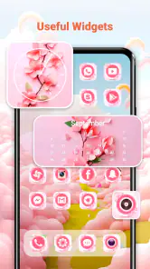
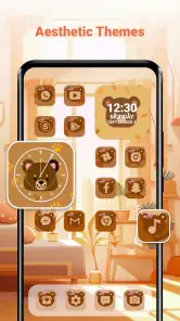
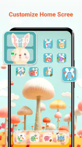
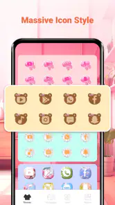
Analysis by Reviewed
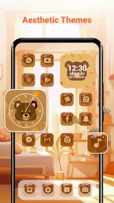
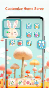
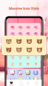
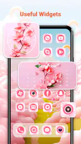
Changing the look of a phone can be surprisingly difficult when every part of the interface comes from a different place. A wallpaper may look right but clash with the icons, while a widget can add useful information and still make the home screen feel crowded. Themes-Wallpaper&Icons&Widgets, a free personalization app from Innova Tool, brings those pieces into one browsing experience. I found it most interesting as a quick way to explore complete visual combinations rather than searching separately for wallpapers, icon packs, and widgets.
The app is aimed at people who want a more personal Android home screen without spending time building every element from scratch. Its store summary focuses on themes, wallpapers, icons, and widgets, and that combination is important: the appeal is not one isolated background, but the possibility of making the whole first screen feel coordinated. It is available to everyone, works from Android 7.0 onward, and has passed the one-million-install mark. Those details make it accessible to a wide range of Android users, although the experience still depends heavily on how smoothly content loads on a particular connection.
How the personalization experience feels in everyday use
Browsing is the real starting point
When I opened the app, I approached it less like a settings utility and more like a visual catalog. That distinction matters. If you already know the exact icon pack or wallpaper you want, your phone’s built-in customization tools or a dedicated launcher may get you there faster. This app is more useful when you want inspiration and prefer to compare different looks before committing to one.
The combination of categories encourages a particular workflow. I would first look for a general mood, then consider whether the wallpaper leaves enough empty space for icons and widgets. A detailed background can be attractive in a preview but become distracting once the home screen is populated. A practical tip is to judge a theme by imagining the top and bottom areas occupied, not just by admiring the central image.
The strongest idea here is coordinated discovery rather than maximum technical control. The app can help someone who is tired of the default appearance find a direction quickly. It is less compelling for a user who enjoys manually tuning launcher grids, icon shapes, widget sizes, and individual shortcuts with precision.
Why the network affects the first impression
Because the app revolves around browsing visual material, connectivity shapes the experience from the beginning. Image-heavy catalogs are naturally more comfortable on a stable connection. On a fast home network, moving through visual choices feels more immediate, while a busy mobile connection can make the process feel stop-and-start. I would not evaluate the app only by its first few seconds, because the quality of the browsing session depends on the network available at that moment.
This also changes how I use it. I prefer exploring several styles when I have reliable Wi-Fi, then making a decision instead of repeatedly opening the app during a rushed commute. That approach avoids wasting time waiting for previews and makes it easier to compare designs with a clear eye. If you are choosing a new look while traveling, expect the experience to be more dependent on signal quality than a simple offline wallpaper picker would be.
The app’s free entry point makes casual browsing easy, but free does not mean every part of the experience is equally frictionless. In-app purchases range from $1.99 to $39.99 per item, so I would pay attention to what is included before treating a particular visual set as part of the no-cost experience. The important practical question is not only whether you can open the app for free, but whether the specific style you like requires an additional purchase.
Using it on a small screen and on the move
Personalization apps are often used in short sessions: while waiting for a bus, during a lunch break, or when a new phone feels unfinished. Themes-Wallpaper&Icons&Widgets fits that kind of browsing better than a long configuration project. You can look at a few directions, decide whether a style suits you, and return later if you want to keep exploring.
Still, a small phone display can make previews misleading. Details that seem balanced in a catalog may become difficult to read once reduced to a home-screen widget. I recommend checking the visual hierarchy rather than focusing only on color. Ask whether the clock, app labels, and important shortcuts will remain easy to recognize. A beautiful theme that slows down everyday access is not a successful customization for me.
Another useful habit is to take a mental snapshot of your current layout before making changes. Even without treating the app as a full backup tool, knowing where your important shortcuts are helps you rebuild your routine if the new arrangement feels wrong. I would test one visual change at a time when possible: start with the wallpaper, then assess the icons, and only afterward decide whether a widget improves the screen or merely fills space.
What happens when loading is interrupted
Connectivity problems are most noticeable when you are moving through the catalog or trying to view a particular design. A weak signal can turn a quick decision into repeated waiting, and that is especially frustrating when you are comparing several similar options. My advice is simple: if a preview stalls, do not keep tapping the same control. Give it a moment, move back to a broader selection, or return when the connection is more dependable.
This kind of recovery is less about a hidden setting and more about using the app sensibly. I would avoid beginning a full customization session just before leaving a reliable network. If you are changing your phone for an event or a trip, browse and choose beforehand. That gives you time to notice whether the icons remain readable and whether the widget placement works with your existing layout.
The app is also not the only layer involved in a visual change. Android launchers, icon compatibility, and widget behavior can influence the final result. If a design looks different after applying it, I would first check the launcher and home-screen arrangement rather than assuming the artwork itself is defective. This is one reason I prefer making small changes: it is easier to identify which part caused the problem.
For users who want a dependable emergency option, the phone’s own wallpaper picker remains valuable. It is usually the quickest fallback when the network is poor or when you need to restore a familiar background immediately. A dedicated launcher can also be a better alternative for someone whose priority is layout control rather than browsing themed collections.
Making the app friendlier to limited data plans
Visual catalogs can encourage endless scrolling, so data-conscious users should treat browsing as the expensive part of the experience, especially on mobile data. I would avoid opening the app simply to pass time unless I was comfortable with the connection being used for image previews. Instead, I would decide what kind of look I want first: dark and minimal, colorful, nature-inspired, or something built around a particular accent color. A narrower search saves both time and unnecessary loading.
There is also a useful trade-off between variety and efficiency. Exploring every category may reveal a better combination, but it makes the session longer and less focused. Choosing one element as the anchor works better for me. If the wallpaper is the priority, I judge icons and widgets by whether they support it. If the widget is essential, I choose a quieter background that leaves it readable. This approach reduces the temptation to keep browsing after finding a workable style.
I would also be careful with repeated previews. If you are on a limited plan, opening the same visual options several times is unlikely to improve the decision. Save your preferred direction mentally or note the name of the style if the app presents one, then return when you can browse more comfortably. The point is not to avoid personalization; it is to prevent the catalog itself from becoming a background drain on your mobile usage.
Who will appreciate it most
I think the app suits Android users who want a visible change without learning a complicated design workflow. It is especially approachable for someone setting up a phone for the first time, refreshing an old device, or trying to make a work and personal profile feel different. The broad age rating also makes it suitable for general household use, provided users understand that optional purchases may appear within the free app.
It can also help people who struggle to combine separate downloads. Instead of wondering whether a wallpaper and icon pack belong together, you can begin with a themed direction and judge the overall impression. That does not guarantee that every component will match your launcher perfectly, but it gives you a more coherent starting point than choosing random assets one after another.
On the other hand, I would skip it if you dislike browsing galleries, want a completely ad-free or purchase-free experience, or need advanced automation. It is not the right choice for someone looking for a full launcher replacement, a deep system-wide redesign, or precise control over every spacing and grid setting. A launcher built around customization would be more suitable in those cases.
How it compares with the usual alternatives
The built-in Android personalization tools are better when speed and reliability matter most. They usually involve fewer steps and are a sensible choice for applying a single wallpaper or returning to a familiar setup. Their weakness is that they may not provide the same themed discovery experience. Themes-Wallpaper&Icons&Widgets earns its place by bringing several visual ingredients together in one destination.
Dedicated wallpaper apps can be stronger for image variety and focused browsing, while icon-pack tools may offer more control over individual app symbols. Launcher applications generally win for layout rules, gestures, icon sizing, and home-screen behavior. This app sits between those options: broader than a wallpaper-only tool, but not a substitute for a full launcher when structure matters more than appearance.
That middle position is both its advantage and its limitation. I can see myself using it to find a starting point, then relying on Android or my existing launcher to fine-tune the final arrangement. Users should not expect one tap to eliminate every compatibility or layout decision. The more customized the phone already is, the more likely the app will be one part of a workflow rather than the entire solution.
What the current release and reputation suggest
The current version is 2.10.0, and the app has been available since September 27, 2023. Its average rating is 3.6 from around 2.4 thousand ratings, with 261 written reviews. I read that profile as a sign to keep expectations measured: enough people have tried it to make it a known option, but the score does not suggest that every user finds the experience seamless.
For me, that fits the app’s character. The concept is appealing, especially when I want a quick visual reset, but the result depends on several moving parts: network quality, the chosen design, the launcher, and whether optional content fits my budget. A person who understands those trade-offs is more likely to enjoy it than someone expecting a flawless one-step transformation.
My practical routine for getting better results
I would use the app in three passes. First, I would browse only long enough to identify a visual direction. Second, I would check whether the background leaves room for the icons and the widget I actually use every day. Third, I would apply the change and spend a few minutes opening common apps, checking text readability, and looking at the screen in both bright and dim conditions.
This routine avoids a common mistake: choosing a design because it looks impressive in a preview, then discovering that it makes the phone harder to use. I would also keep the first change reversible and avoid replacing every familiar element at once. If the new look feels wrong, a smaller adjustment is easier to undo than a complete redesign.
Before paying for anything, I would confirm that the item solves a real problem for me rather than simply being attractive for a few seconds. The free app is enough to explore the concept, while the listed purchase range means a premium choice should feel worth keeping. If I only want a new background for the weekend, a simpler alternative may be the better value.
My connectivity verdict
The network is not a minor detail in this app; it shapes how pleasant the discovery process feels. Reliable connectivity makes the visual catalog easier to explore, while an unstable signal turns personalization into a waiting exercise. I would use it mainly when I have a comfortable connection, especially if I plan to compare several themes or inspect detailed previews.
That does not make the app unsuitable for mobile users. It simply means I would treat it as a planned customization tool rather than something to depend on during every short break. Browse with a clear goal, keep data use in mind, and use the phone’s standard tools as a fallback when you need an immediate change.
Overall, Themes-Wallpaper&Icons&Widgets is a reasonable free starting point for Android personalization, particularly for people who want coordinated ideas instead of separate searches. Innova Tool has chosen a useful combination of visual categories, and the app’s broad device compatibility makes it easy to try. My recommendation is qualified but positive: install it if you enjoy refreshing your home screen and can accept the network and purchase trade-offs; choose a launcher or a simpler built-in option if control, speed, and predictability matter more than discovering a new look.
Pros
- Large collection of wallpapers
- icons
- widgets
- and matching theme packs.
- Customization tools make it easy to refresh your home screen quickly.
- Supports multiple visual styles
- from minimal designs to colorful themes.
- Regular content updates can provide new options for seasonal personalization.
- Preview features help you check how elements look before applying them.
Cons
- Some premium themes and customization items may require payment.
- Certain widgets may use extra battery or system resources when active.
- Compatibility can vary between Android launchers and device models.
- The app may request permissions that feel excessive for its main purpose.
- Ads or promotional content can interrupt browsing through the available designs.

- Category
- Personalization
- Version
- 2.10.0