Tenada: Graphic Design & Logo
- 355.00
- 4.6
- Installs
- 1.00M
- Price
- Free
Screenshots
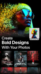
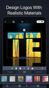
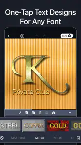
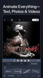
Analysis by Reviewed
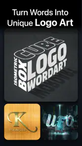
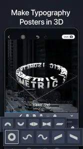
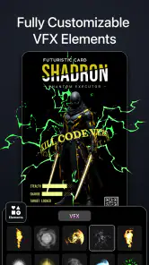
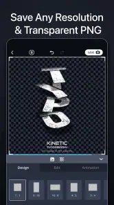
I opened Tenada: Graphic Design & Logo expecting a quick way to make decorative text, but I found a more focused tool for turning short ideas into polished visual assets. It sits in the Art & Design category and is built around 3D logos, animated lettering, posters, thumbnails, intro videos, and typography. That makes it especially useful when I need something eye-catching without starting from a blank canvas in a full desktop editor.
My first impression was that Tenada is less about drawing every element manually and more about helping me reach a convincing result quickly. I can begin with a visual direction, adjust the wording and appearance, and then refine the composition until it feels suitable for a social post, channel graphic, project title, or small promotional piece. Its strongest quality is speed with a visual payoff: even a simple phrase can become much more expressive than plain text.
How Tenada feels in everyday use
The app is developed by TENADA Corp. and is free to install, which makes it easy to try without committing to a subscription at the start. It is rated for Everyone, and the broad audience makes sense because the basic idea is approachable: choose a style, enter text, adjust the result, and create an image or motion graphic. I did not need design training to understand the main workflow.
Where it differs from a conventional drawing app is the emphasis on ready-made visual treatment. Instead of spending time building shadows, bevels, glow, depth, or animated movement from scratch, I can work from a prepared look and concentrate on whether it fits the message. That is helpful when the text itself is the main subject, such as a gaming thumbnail, event title, personal logo, or short intro screen.
A realistic everyday example is a small creator preparing a video for the evening. They may already have footage edited but still need a title card and thumbnail. Tenada can handle the visual identity for both without requiring a separate desktop graphics program. I would create a bold title treatment, keep the wording short enough to remain readable, and use a related style for the thumbnail so the two pieces feel connected.
The same approach works for a school presentation, a club announcement, a birthday montage, or a small online shop post. The app is most convincing when the design needs personality quickly. It is less suitable when I need a carefully measured layout, detailed photo retouching, complex illustration, or a complete brand system with strict rules across many assets.
Choosing the right starting point
One practical lesson is to decide the final destination before choosing a design. A logo that looks impressive in a large preview may become difficult to read when reduced to a small profile image. Likewise, an animated title can work well at the beginning of a video but feel excessive on a static poster. I get better results when I first decide whether I am making a thumbnail, a logo, a poster, or an intro, then select a style that supports that purpose.
More From Our News Desk

Clash of Clans Is Won Between the Battles

Android Auto Makes the Case for Quieter Car Software

MobiOffice: Transforming Mobile Productivity with Seamless Integration

EA SPORTS FC™ Mobile Soccer: Redefining Mobile Sports Gaming

How Microsoft OneDrive Became a Mobile Productivity Giant

How Google Translate Breaks Language Barriers Effortlessly
I also recommend testing the wording before spending time on decoration. Long phrases often weaken the impact of 3D typography because the letters have less room to breathe. Short names, initials, and compact titles usually benefit most from depth and motion. This is not a limitation unique to Tenada, but the app’s visual focus makes it particularly noticeable.
Another useful habit is to create a small family of related designs rather than one overloaded image. For example, I might use a strong logo treatment for a profile identity, a simpler version for a thumbnail, and an animated variation for an intro. Keeping the same wording or visual mood while changing the intensity prevents every asset from competing for attention.
Where the visual tools are genuinely useful
The 3D logo tools are a good match for names that need a sense of presence: a gaming handle, a music project, a hobby page, or a small creative brand. Depth can make a short word feel more substantial, especially when a flat text editor would look too ordinary. I would still inspect the result at the size where it will actually appear, because fine highlights and shadows can disappear or become visually heavy after resizing.
Animated text is more useful than it may first seem. It can provide a quick opening for a short video, a transition between sections, or a simple announcement that needs movement without a full editing timeline. The trade-off is restraint. If every word moves, flashes, or carries a strong effect, the message becomes harder to follow. I prefer using animation for one focal phrase and leaving supporting information calm.
Poster and thumbnail work benefits from the same principle. Tenada helps me establish a visual hook, but it does not remove the need for editorial judgment. A thumbnail still needs a clear subject, readable wording, and enough contrast against its background. The app can make the title attractive; I still have to decide what deserves emphasis and what should be removed.
Typography is where I see the app’s identity most clearly. It treats letters as visual objects rather than merely containers for information. That makes experimentation enjoyable, particularly when I want a dramatic title or a stylized wordmark. It also means that users looking for restrained business documents may find the available approach too expressive.
A workflow that avoids wasted effort
My preferred workflow is to begin with the shortest usable text, choose a design direction, and only then adjust color, depth, and motion. I save more elaborate changes for the end. This prevents a common mistake: polishing effects on a design whose basic wording or proportions do not work.
I also compare the design against its intended background before considering it finished. Bright effects can lose definition on light images, while dark 3D lettering may disappear in a busy scene. If the project is for a video, I would place the exported result alongside the actual footage rather than judging it only inside the editor. A title that looks balanced on a plain preview may compete with faces, scenery, or subtitles once it is used in context.
For logos, I would prepare more than one variation. A detailed version may be ideal for a cover image, while a simpler treatment is safer for a small avatar or watermark. This is one of the more important trade-offs in the app: its visual effects can create a memorable first impression, but a logo still needs to remain recognizable when the details are no longer visible.
What the current version means for users
The current version is 6.4.5, and the app was released on December 20, 2020. That history suggests a product that has had time to establish its direction rather than appearing as a one-purpose experiment. I see the present version as a mature, style-driven editor whose value comes from combining text treatment and quick content creation in one mobile workspace.
For someone already using an older release, the practical question is not simply whether the number has changed. The more useful test is whether the current workflow still matches the way they create. Existing users who regularly produce titles, logos, posters, or thumbnails should find the app’s core purpose familiar. New users can approach it without needing to understand a large professional interface first.
The minimum operating-system requirement is Android 9, so compatibility is reasonably broad for people using a relatively recent Android device. I would still keep the project workflow simple on older hardware: close other demanding apps, avoid making every element highly animated, and give the device time when working with richer visual compositions. Those are sensible precautions for any mobile graphics tool, particularly one centered on effects and motion.
The app has passed one million installs and holds a 4.6 average from around twenty-seven thousand ratings. Those figures indicate that it has attracted a substantial audience and that user satisfaction is generally strong. I would interpret that as encouragement to try it, not as proof that every design need will be covered. A popular specialized tool can still be the wrong choice for someone who needs precision layout or advanced image manipulation.
There are in-app purchases ranging from $2.99 to $59.99 per item. Since the app is free to install, I would explore the basic workflow first and decide whether the included creative range is enough before buying anything. The important point is to treat paid items as a decision about recurring creative needs, not as an automatic requirement for making a usable first project.
How existing users may need to adapt
People moving from a basic text editor will probably notice that Tenada encourages a more visual way of thinking. Instead of selecting a font and stopping there, I have to consider the relationship between lettering, depth, lighting, movement, and the surrounding canvas. That extra choice is part of the fun, but it can also slow me down when I only need a plain label.
Users coming from a full desktop suite may experience the opposite adjustment. Tenada is faster to approach, but that convenience comes from focusing the toolset. I would not choose it as my only application for a campaign containing carefully aligned text blocks, detailed illustrations, extensive photo corrections, and many separate layers. A desktop editor remains the better option when exact control matters more than rapid styling.
Compared with ordinary social-media templates, Tenada feels more specialized around typography and identity. Templates can be faster for a complete post with photos, captions, and layout blocks. Tenada becomes more attractive when the title itself should carry the visual character. Compared with a logo maker, it offers a more expressive route for animated or dimensional lettering, though a dedicated branding tool may be better when I need systematic logo variations and strict brand guidelines.
Compared with a general mobile video editor, its advantage is the speed of creating a distinctive text element. A video editor is usually better for timing several clips, balancing audio, arranging a full sequence, and placing many overlays. I would use Tenada to create the standout title or intro element, then move to a broader editor if the project grows into a complete production.
Small decisions that improve the result
One non-obvious trade-off is the difference between visual complexity and reuse. A highly decorated design may look excellent once, but it can be difficult to apply consistently across a series. If I expect to publish regularly, I choose a recognizable treatment with enough empty space to accommodate changing words. That produces a more dependable identity than selecting the most dramatic effect for every post.
Another is the relationship between animation and accessibility. Movement can draw attention, but viewers may encounter the design briefly, on a small screen, or without ideal viewing conditions. I keep animated text short, high contrast, and easy to understand from the first moment. For an intro, I would avoid hiding the key wording behind a long reveal because the audience may skip ahead before the message appears.
A third insight concerns editing order. I get cleaner results by deciding the hierarchy first: what should be read immediately, what is supporting information, and what is merely decorative. Only after that do I adjust effects. Tenada makes it tempting to start with the most attractive style, but a beautiful treatment cannot rescue unclear priorities. The app rewards users who bring a basic communication plan to the canvas.
Who should use it, and who should skip it
I would recommend Tenada to social creators, casual designers, students, hobby communities, streamers, and small project owners who need polished text graphics without learning a heavyweight design suite. It is particularly appealing if you often create short titles, logos, posters, thumbnails, or video openings and want them to feel more distinctive than standard text.
I would be more cautious about recommending it to a professional designer who needs exact typographic control, production-ready brand systems, or advanced layout management. I would also point people toward a conventional photo editor if their main task is removing objects, correcting images, or building a composition from many photographic elements. For long-form documents, presentations, and detailed illustration, another category of tool will be more efficient.
It may also be a poor fit for someone who dislikes decorative effects. The app’s personality is tied to visual impact, so users seeking quiet, minimal, or strictly functional typography may spend more time toning designs down than benefiting from them. In that situation, a simple font-and-layout editor would probably feel more natural.
What I would watch in future use
As I continue using the app, I would pay attention to how well its style-focused workflow handles consistency across multiple projects. The biggest opportunity for experienced users is not simply adding more effects; it is making repeat work easier while preserving control over readability and identity. A tool like this becomes more valuable when a creator can move from one-off experimentation to a dependable visual system.
I would also watch how the current version fits different screen sizes and project types in real use. A design that works as a large poster may need a simpler treatment for a thumbnail, avatar, or video overlay. The app is at its best when I treat each format as a communication problem rather than assuming one impressive preset will work everywhere.
After testing its role against broader design and video alternatives, my opinion is positive but specific. Tenada is not a replacement for every creative app, and it does not need to be. Its purpose is clearer: help me turn words into attention-grabbing visual pieces with less setup than a full design workstation. If your projects begin with a phrase, name, or title, this is one of the more convenient mobile tools to explore first.
The free entry point makes experimentation easy, while the paid items mean I would make purchasing decisions only after confirming that the available workflow suits my regular projects. For occasional posters or a quick channel graphic, it can save considerable time. For complex layouts, detailed photo work, or strict professional branding, I would pair it with a more comprehensive editor instead of relying on it alone.
Overall, I would recommend Tenada: Graphic Design & Logo to a friend who wants expressive typography and fast visual results on Android. It is approachable, focused, and capable of making ordinary wording feel designed rather than typed. Its best results come from short copy, clear hierarchy, thoughtful restraint, and choosing the effect for the final format. Used that way, Tenada: Graphic Design & Logo feels less like a collection of flashy presets and more like a practical shortcut for giving small creative projects a recognizable face.
Tenada: Graphic Design & Logo Frequently Asked Questions
What kinds of designs can I make with Tenada?
Tenada is a mobile graphic design app for creating logos, social media posts, posters, flyers, invitations, thumbnails, banners, and other visual materials. It combines ready-made templates with editing tools for text, images, backgrounds, colors, shapes, and decorative elements. It is aimed at beginners, small businesses, creators, and anyone who wants to produce polished designs without using complex desktop software.
Who develops Tenada, and what is its age rating?
Tenada is developed by TENADA Corp. and is rated for everyone, so it is positioned for a broad audience. It falls within the Art & Design category, with tools for creating visual content such as logos, posters, and typography. If you are choosing an app for a younger user, it is still sensible to explore the interface and any available purchase options together before they begin using it.
Can Tenada make animated text and intro videos as well as static designs?
Yes. Tenada is intended for more than still graphics: it can be used to create animated text and intro videos alongside logos, posters, thumbnails, and typography. This makes it useful when you want a consistent visual style across a profile image, promotional graphic, or short opening sequence. The editing experience and final result depend on the elements and tools you choose in the app.
Is Tenada suitable for making designs for social media or a small business?
Tenada can be useful for creators and small businesses that need visual content such as social media posts, posters, thumbnails, banners, and logo concepts. Templates and mobile editing tools offer a practical starting point when you do not want to build every design from scratch. The app is free to download, and optional in-app purchases range from $2.99 to $59.99 per item, so review purchase details before choosing paid content.
What is Tenada: Graphic Design & Logo used for?
Tenada is a mobile graphic design app for creating logos, social media posts, posters, flyers, invitations, thumbnails, banners, and other visual materials. It combines ready-made templates with editing tools for text, images, backgrounds, colors, shapes, and decorative elements. It is aimed at beginners, small businesses, creators, and anyone who wants to produce polished designs without using complex desktop software.
Pros
- Large template library for logos
- posts
- flyers
- and invitations.
- Simple drag-and-drop editor suits beginners without design experience.
- Useful branding tools help keep colors
- fonts
- and styles consistent.
- Exports are convenient for sharing designs across social platforms.
- Regular template updates provide fresh ideas for seasonal content.
Cons
- Many premium templates and assets require a paid subscription.
- Some designs can feel repetitive or overly similar to competitors.
- Advanced vector editing and precision controls are limited.
- Export options and quality may vary depending on the selected plan.
- The interface can feel crowded when browsing numerous design categories.
- Category
- Art & Design
- Version
- 6.4.5