StoryFont for Instagram Story
- 269.00
- 4.8
- Installs
- 1.00M
- Price
- Free

Screenshots



Analysis by Reviewed
I judge a story-design app not only by how quickly it makes text look different, but by how much control I retain over the finished post. A stylish graphic is useful only if I can check it, save it, and decide for myself where it goes next. That practical balance is what I look for in StoryFont for Instagram Story, an art-and-design app by Alireza Namazian that focuses on preparing visual material for Instagram Stories.
Trust starts with a clear, limited job
My first impression is that this is a focused creative tool rather than a replacement for Instagram or a full graphic-design suite. That narrow purpose can be reassuring: I can work on the look of a story and then choose what to do with the result. Still, I treat any app that handles images or text I create as a place to make deliberate choices. I avoid putting private details into a design unless I have a reason to share them, and I check the app’s current permission prompts and privacy information on my own device before deciding how to use it.
Visible choices matter more than assumptions
When I make a story, I want to inspect the finished image before it reaches my camera roll or social account. The preview and save workflow described here gives me a useful point to pause: I can look at the composition, decide whether it says what I intend, and then choose whether to keep it. I would not treat a smooth design process as proof of anything about data handling; instead, I look at the choices the app actually presents and keep sharing decisions in my hands.
This matters most when a story includes a face, a location, a work detail, or text that was meant for a small audience. I can use a decorative font without adding sensitive information, and I can review the final image before uploading it. That small pause is more useful to me than rushing directly from editing to posting.
First Impressions
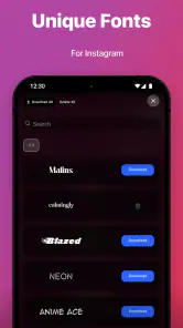
Upon downloading StoryFont for Instagram Story, I was greeted with a clean and intuitive interface. It’s straightforward, which I really appreciate because, let’s be honest, nobody wants to spend hours trying to figure out how an app works. The app offers a variety of fonts right off the bat, and let me tell you, there’s something for everyone. Whether you’re into bold, striking fonts or more subtle, elegant ones, this app has got you covered.
That quick start is especially handy if I only have a few minutes between taking a photo and sharing it. I can focus on whether the type suits the picture instead of learning a complicated editing system. It is a free app, though in-app purchases range from $4.99 to $29.99 per item, so I would explore what is available before paying and decide whether a particular extra is worth my use. The app is rated for teens, has a 4.8 average from around 20,000 ratings, and has passed one million installs. Those figures suggest it has found an audience, but I still judge the experience by whether the available choices fit my own workflow.
Features That Stand Out
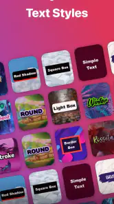
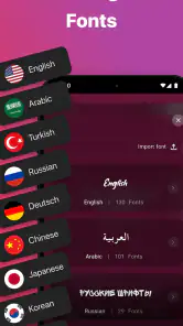
One of the first things I noticed was the sheer range of fonts available. Not only do you get the standard options, but the app also throws in some unique choices that I haven’t seen elsewhere. The customization doesn’t stop at fonts, though. You can also tweak the size, color, and even add cool effects like shadows and outlines. I found this particularly useful for making certain words or phrases stand out, especially when I’m trying to emphasize a point or add a bit of drama to my stories.
More From Our News Desk

Clash of Clans Is Won Between the Battles

Android Auto Makes the Case for Quieter Car Software

MobiOffice: Transforming Mobile Productivity with Seamless Integration

EA SPORTS FC™ Mobile Soccer: Redefining Mobile Sports Gaming

How Microsoft OneDrive Became a Mobile Productivity Giant

How Google Translate Breaks Language Barriers Effortlessly
Another neat feature is the ability to preview your changes in real-time. This means no more guessing games about how your story will look once it’s live. You can play around with different combinations until you find the perfect look, all without leaving the app.
One practical trick is to keep the most important words short and test the design against the actual background image. A font that looks elegant on a plain screen can become hard to read over a busy photograph; a restrained outline or shadow may help, but adding effects to every line can make the whole story feel crowded. I also find it useful to settle on one main type style and use a second only for emphasis. That creates a clearer hierarchy than changing the font for every phrase.
StoryFont makes the most sense when typography is the part of the story I want to improve. Compared with building every slide in a general design editor, a dedicated font tool can be quicker for a short caption or announcement. A broader editor is still the better choice when I need several carefully aligned elements, a consistent multi-slide layout, or more control over the full composition. I would not choose this app as my only creative tool if those are my regular needs.
Using the App
Getting started with the app is as easy as pie. After selecting your desired font and customization options, you can save your creation directly to your phone’s gallery. From there, uploading it to Instagram is a breeze. The process is smooth and seamless, and I didn’t encounter any hiccups along the way.
I also appreciated the app’s speed. There’s nothing worse than an app that lags or crashes just as you’re about to hit the save button. Thankfully, StoryFont for Instagram Story runs like a charm, making the whole experience enjoyable and stress-free.
A realistic use for me is preparing a quick event reminder: I can make the key time or place visually prominent, preview it over the chosen image, save it, and then decide whether to post it publicly or send it elsewhere. Saving first is a helpful extra step because it lets me check the result outside the editor and avoid sharing a draft by mistake. If I make several related slides, I would also compare them together before posting; matching colors and type choices can make a sequence feel intentional without requiring elaborate design work.
People who regularly add expressive text to casual stories are likely to get the most from this workflow. It is also approachable for someone who finds a full design app too involved for a simple caption card. On the other hand, if I only post plain photos, already like Instagram’s built-in text tools, or need precise control over a complete campaign layout, I may be better off staying with those familiar options or using a broader editor. A separate save-and-upload step is convenient for review, but it is still another step compared with editing directly in Instagram.
Making a short story feel considered
I find the app most useful when I know what one slide needs to communicate before I start styling it. For a small-business update, for example, I might put the essential announcement in the largest type, keep the supporting detail quieter, and use the photo as context rather than decoration. This avoids the common trap of making every word compete for attention. It also makes the design easier to check at a glance on a phone, where a viewer may only pause briefly.
For a personal story, the same approach helps with a different problem: deciding how much text belongs on the image at all. A short caption can add tone to a photo, while a long explanation may be easier to read as a separate slide or in the post itself. I would draft the wording first, then choose a font and effect, rather than letting a striking typeface tempt me to add more text than the image can comfortably hold.
There is also a useful distinction between making a single graphic and building a repeatable visual identity. StoryFont can help me give an individual announcement a distinct typographic feel. If I were preparing a regular series, I would keep a note of the style choices I used so the next slide does not drift into a completely different look. That little bit of planning matters because a focused font tool can make experimentation easy, but it does not replace the editorial decision to keep related posts coherent.
Practical control before sharing
For everyday use, I would keep the editing task separate from the decision to publish. I can create a design, inspect legibility and spelling, and then choose the audience and destination in Instagram. This gives me a chance to catch an accidental name, number, or background detail before it becomes part of a post. I also prefer to keep a clean original photo when I might want to reuse it, rather than treating the finished story image as my only copy.
StoryFont is free to start with, but I would not assume every font or design option is included without cost. The sensible approach is to try the choices that are available, then consider an in-app purchase only if it solves a recurring need. It runs on Android 7.0 or later, and version 3.1.7 is the current version. Because app interfaces and permission prompts can change, I would read what appears on my device when installing or updating and make only the choices I am comfortable with.
Before sharing, I would also check that the saved image has the framing I intended and that small text remains readable outside the editing view. A design can look balanced while I am zoomed in, then feel cramped when viewed as a complete story. If a graphic is time-sensitive, such as a change to an event plan, I would verify every detail after saving rather than relying on memory of what I typed. These checks take little effort and matter more than adding one extra decorative effect.
Final Thoughts
To wrap things up, I’d say StoryFont for Instagram Story is a fantastic tool for anyone looking to elevate their Instagram game. It’s user-friendly, packed with features, and most importantly, it delivers on its promise to make your stories stand out. Whether you’re a social media newbie or a seasoned pro, this app is definitely worth checking out. So go ahead, give your stories the makeover they deserve and watch your engagement soar!
My recommendation is a little more specific: I’d try it if the look of story text is something I adjust often and I want a focused place to experiment before posting. I would skip it if I need an all-in-one layout studio or prefer to keep every edit inside Instagram. Used thoughtfully, its strongest benefit is the chance to give a short message more personality while still reviewing the final image before sharing. That makes it a useful creative option, as long as I keep the design simple, check the choices on my screen, and let my own privacy boundaries guide what I publish.
My cautious verdict is that this is a sensible add-on, not a must-have layer in every posting routine. I would use it when typography is central to the message, especially for a quote, a brief notice, or a photo that needs a little more character. For a quick snapshot with no text, the extra editing and saving step may not earn its place. The best reason to keep it is not simply that it offers more decoration, but that it gives me a dedicated moment to shape and review wording before deciding where the finished image belongs.
StoryFont for Instagram Story Frequently Asked Questions
Does StoryFont work as a standalone design app, or do I need Instagram installed?
StoryFont’s main purpose is creating designs for Instagram Stories, so Instagram is useful if you plan to share your finished work there. You can still consider it for preparing visual designs, but its tools and focus are built around Instagram-oriented content. The app is an Art & Design app by Alireza Namazian, with stylish fonts, stickers, and backgrounds for story-making.
What does StoryFont include for making a Story look more personal?
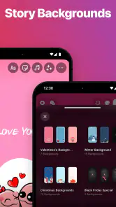
StoryFont’s central creative options include stylish fonts, stickers, and backgrounds for Instagram Stories. These elements give you ways to add a more individual look to a design rather than relying only on Instagram’s standard text choices. The app is presented as an Instagram Story maker, making it most relevant to people who enjoy customizing the appearance of their Stories before sharing them.
Can I use StoryFont to create designs for posts or only for Instagram Stories?
StoryFont is centered on Instagram Story creation, with its stylish fonts, stickers, and backgrounds intended to help personalize story designs. Its tools may also be useful when preparing visual content for other purposes, but the app is presented as an Instagram Story maker. If your main goal is to create polished, individualized Stories, its focus should be a good fit.
What is StoryFont and how does it enhance Instagram Stories?
StoryFont is an innovative app designed to enhance your Instagram Stories by offering a wide array of unique and stylish fonts. This tool allows users to customize their stories with fonts that go beyond the standard options available on Instagram, helping to create more eye-catching and personalized content. It's ideal for users who want to make their stories stand out and engage more effectively with their audience.
Is StoryFont compatible with all devices and Instagram versions?
StoryFont is compatible with most modern Android and iOS devices. However, to ensure the best experience, it is recommended to use it with the latest versions of Instagram and your device's operating system. Compatibility may vary with certain older devices, so users should check the app requirements before downloading to avoid any inconveniences. The Android version requires Android 7.0 or later.
Pros
- User-friendly interface for all ages.
- Wide variety of fonts to choose from.
- Seamless integration with Instagram.
- Quickly customizable text styles.
- Regular updates with new features.
Cons
- Limited free font options.
- Occasional app crashes reported.
- Some features require in-app purchases.
- Compatibility issues on older devices.
- No offline mode available.

- Category
- Art & Design
- Version
- 3.1.7