Repaint House Paint Visualizer
- 38.00
- 4.4
- Installs
- 10.00K
- Price
- Free

Screenshots
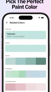
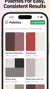
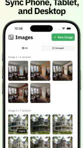
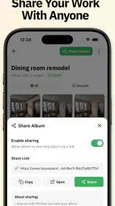
Analysis by Reviewed
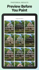
I tried Repaint House Paint Visualizer as the kind of tool I would open before buying sample pots or asking a painter for a quote. Its purpose is simple: help me preview different paint colors on a house, both outside and inside, before I commit to a real-world change. In practice, that makes it most useful as a decision aid rather than a replacement for physical samples, lighting tests, or professional color advice.
The app sits in the House & Home category and comes from HPAI Labs, LLC. It is free to install, with optional in-app purchases ranging from $9.99 to $39.99 per item. It is rated for Everyone, so the presentation is approachable and suitable for general household planning. I also like that the basic idea is immediately understandable: take a visual look at a repainting possibility before spending money and time on the actual work.
My main takeaway is that this is best treated as a fast visual comparison tool. It can help narrow a broad choice into a few realistic candidates, especially when I am stuck between several exterior neutrals or want to see whether a room feels better with a warmer or cooler direction. The important distinction is that the preview shows an interpretation of a photograph, not a guarantee of how the finished paint will look on a wall.
How the current version fits into a real decorating decision
The current release is version 1.0.13, and the app has already attracted more than ten thousand installs. Its average score is 4.4 from around 267 ratings, with 38 written reviews. Those figures suggest that people are finding the concept useful, but I would still judge it by the workflow rather than by the score alone. A visualizer succeeds when it makes comparison easier, not merely when it produces an attractive image.
When I use a tool like this, I do not begin by hunting for the perfect shade. I begin with a photo that shows the surfaces clearly. For an exterior, that means capturing the front elevation without too much shadow, glare, parked vehicles, or foliage hiding the walls. For an interior, I prefer a straight-on view with the floor, trim, doors, and windows visible. The quality of that starting image affects how convincing the result feels.
The app’s strongest role is early planning. I can look at several directions in one sitting: a pale body color with darker trim, a restrained monochrome scheme, or a stronger accent around a door or feature wall. This is much quicker than mentally imagining the same changes from a written color name. It also gives household members something concrete to discuss, which is often more productive than saying that a shade feels “too cold” or “not warm enough.”
There is a practical advantage for renters, new homeowners, and people preparing a renovation budget. Even if the final decision happens elsewhere, a visual preview can reveal that a dramatic idea may be better limited to one wall, one entrance, or a smaller architectural detail. That kind of narrowing is valuable because paint projects become expensive when every surface is treated as an experiment.
Getting a useful image before choosing colors
The most important preparation step is taking a representative photograph. I would avoid using a heavily filtered image or one captured at sunset, because the original color balance can push the preview in the wrong direction. A bright but overcast moment is often more informative than harsh midday sun. For rooms, turning on the usual lights can be useful if that is how the space is normally experienced, but I would also remember that artificial lighting can make warm colors appear even warmer.
It helps to photograph one area at a time rather than trying to show an entire property from an awkward angle. A front door, living-room wall, or kitchen cabinet section can produce a clearer comparison than a distant image containing many competing surfaces. I also recommend keeping a clean original copy of every photo. That makes it easier to compare the visualizer’s result with the untouched room or house and prevents a preview from becoming the only reference.
Another useful habit is to create a small shortlist instead of scrolling endlessly. I would first decide whether I want a light, medium, or deep overall effect, then compare nearby options within that range. This makes the app more helpful as a selection tool and less like a color roulette wheel. The visual differences between close shades are easier to judge when the surrounding choices are controlled.
Exterior planning is where the app feels most practical
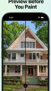
Exterior repainting is a particularly good use case because the scale and cost of the decision make mistakes frustrating. A color that looks appealing on a tiny sample can feel overwhelming across siding, stucco, brick, or a large garage door. Seeing a broader preview helps me ask better questions: Does the body color compete with the roof? Does the trim disappear? Does the front door need contrast, or would that make the entrance look disconnected?
I would use the app to compare complete combinations rather than isolated wall colors. For example, a neutral exterior should be considered alongside its trim and door treatment. A dark accent may look elegant on a small section but become visually heavy when repeated around every window. The visualizer is useful here because it lets me inspect relationships between surfaces, not just individual swatches.
Still, exterior previews need careful interpretation. A photograph may contain reflections, plants, glass, brick texture, or deep shadows that affect how the recoloring appears. If a wall is partly hidden, the result may look cleaner than the real job will be. I would therefore use the image to decide which combinations deserve physical testing, not to skip testing altogether.
Interior previews help with mood, but lighting remains the judge
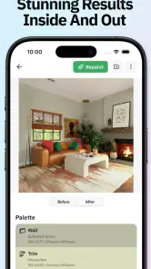
For interiors, I found the visual comparison most useful when thinking about atmosphere. A room can feel calmer with a muted direction, more energetic with a brighter accent, or more enclosed with a deep tone. The app makes those broad mood changes easier to imagine than a paint card held beside a single wall.
However, interiors are full of variables that a picture cannot completely settle. Flooring, upholstery, artwork, curtains, wood tones, and metal finishes all influence the result. A color may look balanced in an empty room but clash once furniture is returned. My preferred workflow is to preview the room with its everyday contents visible, then make a second judgment using a real sample placed near the trim and the largest pieces of furniture.
One non-obvious benefit is that the app can expose proportion problems before painting begins. If an accent wall looks too dominant in the preview, I can reconsider whether the accent should move to a smaller surface. Conversely, if an entire room looks flat, a stronger treatment on one architectural feature may be enough. That is a more useful conclusion than simply labeling a color attractive or unattractive.
Major-brand color ideas without treating the screen as a swatch
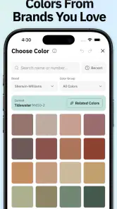
The app is designed to preview colors from major brands, which makes it more relevant to someone who already has a shortlist from a paint retailer. I would use that connection to organize options by practical intent: exterior body, trim, ceiling, door, cabinet, or feature wall. Keeping the role of each color clear prevents a shade chosen for a small accent from accidentally becoming the main wall color.
Even when a color is associated with a familiar brand, I would not assume the phone display is an exact color reference. Screen brightness, display settings, camera processing, and the surrounding colors in the photograph all affect perception. The app can help me compare directions and combinations, but a physical card or sample remains the safer step before ordering enough paint for a whole property.
This is also where I would be cautious about using a preview for a formal client decision. If I were helping someone else choose, I would present the images as visual concepts and label the selected colors separately for later confirmation. That keeps the conversation honest and avoids turning an attractive mock-up into an accidental promise about the final finish.
What has changed, what still needs care, and who should use it
The release information places the app at version 1.0.13, following its release on December 23, 2025. I see that as an early product stage rather than a sign that the workflow is already complete. The current version is worth assessing on what it does today: it offers a focused way to imagine repainting an exterior or interior, while the surrounding process still depends on good photos, sensible comparisons, and real samples.
For existing users, a version number matters less than whether the app remains comfortable for repeated planning. Someone repainting a whole house may return to the same project several times, compare options with another person, and revisit a decision after seeing the image in daylight. A useful visualizer should therefore be judged by how clearly it supports those repeated comparisons, not only by the first preview it produces.
I would save screenshots of promising results with descriptive names such as “warm body with dark trim” or “living room lighter option.” That simple habit turns a casual experiment into a usable decision record. It also helps when discussing the project with a partner, decorator, contractor, or paint-store employee. The app becomes more valuable when its output feeds into the next step instead of being forgotten after a quick test.
There are also clear situations where I would choose a different option or add another tool. If I need exact paint specification, a retailer’s official color reference is more appropriate. If the surface has unusual texture, severe damage, or complex architectural details, an experienced painter can judge preparation and coverage issues that a visual preview cannot. If I am matching an existing wall, fabric, tile, or historic finish, a physical sample and careful comparison are more dependable than a phone image.
I would also skip relying on this app alone when the photograph is poor. A dark, angled, cluttered, or strongly filtered image can make the result look more certain than it really is. In that situation, retaking the photo is likely to improve the decision more than trying additional colors. This is one of the practical trade-offs of an AI-assisted visualizer: it saves time during exploration, but it does not remove the need for judgment at the input stage.
The optional purchase model deserves attention before a serious project begins. The app is free to install, but some items cost between $9.99 and $39.99 each. I would first test the free experience and decide whether its preview quality and workflow fit my needs before paying for anything. For a small repaint, that may be enough to settle on a direction. For a large renovation, the cost should be weighed against the value of avoiding a poor color choice, while remembering that paid access still does not replace physical validation.
A realistic weekend workflow
Imagine I am planning to repaint a tired front entry and a living room. On Saturday morning, I would take clean photos of both areas in ordinary lighting, making sure the surfaces and surrounding trim are visible. I would then use the exterior image to compare a few body-and-trim combinations, paying special attention to whether the door remains a clear focal point.
For the living room, I would keep the furniture in place and test a lighter overall direction against a more expressive feature-wall idea. Rather than selecting the most dramatic image, I would remove any option that makes the existing flooring or curtains look wrong. The remaining choices would become a short list for physical samples.
On Sunday, I would view those samples beside the actual trim and furnishings at different times of day. The app would have done its job if it helped me reduce uncertainty and avoid testing unsuitable combinations. It would not need to predict the final wall perfectly to be useful; it would need to make the next decision clearer.
Who will enjoy it, and who should be cautious?
I recommend Repaint House Paint Visualizer to homeowners who are still exploring, people preparing a renovation conversation, and anyone who struggles to imagine color changes from small printed cards. It is especially handy when several people need to react to the same proposed look. The ability to see an exterior or room in context can turn an abstract discussion into a specific one.
I am less enthusiastic about using it as the only authority for exact matching, professional specification, or difficult surfaces. People who already know their color and only need a purchase quantity may get more value from a paint retailer’s tools. Likewise, anyone expecting a perfect simulation under every lighting condition should lower those expectations before starting.
What I would watch in future development is not simply a larger color selection. More valuable progress would be anything that makes comparisons easier to organize, improves difficult edges and partially hidden surfaces, and helps users distinguish a visual concept from a dependable real-world color reference. Clearer project handling would also matter for people working through several rooms or exterior sections.
For now, the app earns a place in my early-stage decorating toolkit because it addresses a genuine problem: paint decisions are difficult to imagine before the first coat. Its free entry point makes experimentation accessible, while the optional purchases mean I would check the value of any paid item against the size of my project. I would use it to explore, compare, and communicate—not to skip samples, lighting checks, or professional advice when those are needed.
Overall, Repaint House Paint Visualizer is a focused House & Home app with a sensible everyday purpose. I would recommend it to a friend who has a repainting idea but cannot yet picture the result. The strongest approach is to combine its previews with careful photography, a short list of candidates, and real paint samples. Used that way, it can save mental effort and prevent impulsive choices without pretending that a screen can reproduce every detail of a finished surface.
Because it is rated for Everyone and supports devices running Android 7.0 or newer, it is accessible to a broad range of users. I would still keep the final decision grounded in the actual property: its natural light, materials, neighboring colors, and daily use. That balance—fast digital exploration followed by real-world checking—is where this app makes the most sense today.
Pros
- Quickly previews wall colors before committing to paint.
- Useful for comparing several shades in the same room.
- Helps coordinate walls with existing furniture and décor.
- Simple interface makes basic color testing easy.
- Can inspire ideas for refreshing outdated rooms.
Cons
- Results depend heavily on the quality of the uploaded photo.
- Lighting and shadows may make colors look inaccurate.
- Some advanced colors or tools may require in-app purchases.
- Precise edges can be difficult around windows and furniture.
- The visualizer cannot fully reproduce real paint texture or finish.

- Category
- House & Home
- Version
- 1.0.13