Pika! One - Themes & Wallpaper
- 40.00
- 4.7
- Installs
- 100.00K
- Price
- Free

Screenshots
Analysis by Reviewed
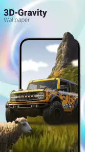
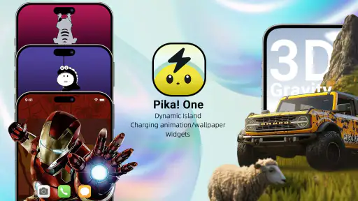
I usually notice a personalization app only when it changes how I use my phone, not when it simply adds another collection of static pictures. Pika! One - Themes & Wallpaper caught my attention because it brings several visual tools into one place: animated wallpaper effects, charging animations, and Dynamic Island-style elements. After spending time with it, I see it as a playful customization app for people who want their phone to feel more expressive without rebuilding the entire interface.
The app is developed by Pika! Studio and sits in the personalization category. It is free to install, with optional purchases ranging from $1.99 to $89.99 per item. That price range matters because the basic download is easy to try, but anyone who wants to explore every premium-looking option should check the purchase screen carefully before committing. My overall impression is positive, reflected in its 4.7 average from around three thousand ratings, but the experience is more about visual fun than deep system-level customization.
From a Plain Screen to a More Personal Phone
My starting point was a phone that worked perfectly well but looked ordinary. The wallpaper was functional, the charging screen gave me no visual feedback beyond the usual system indicator, and I was not interested in installing a full launcher or replacing familiar navigation habits. That is where this app makes sense: it offers noticeable changes while leaving the rest of the phone alone.
The first useful decision is to choose what kind of change I actually want. A moving wallpaper creates an effect that is visible during everyday phone use. A charging animation is more occasional, appearing when the device is connected. Dynamic Island-style elements are aimed at users who enjoy a more animated status area. These are related ideas, but they do not solve the same problem, so treating them as separate layers helps avoid making the phone feel visually overloaded.
I would begin with one visual element rather than activating everything at once. That makes it easier to judge whether the chosen style fits the phone, the home-screen icons, and the way I normally use the device. A dramatic animated background can look excellent in a preview yet become distracting behind widgets and app shortcuts. A quieter design may be less impressive in a screenshot but more comfortable every day.
Choosing a Wallpaper Without Losing Usability
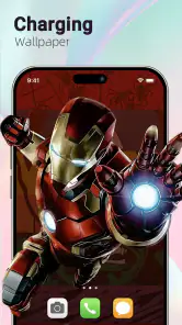
The wallpaper workflow is most useful when I think about the phone’s practical layout first. I look at where the clock, icons, and widgets sit, then choose a design with enough calm space around those areas. Busy motion in the center can compete with text, while strong contrast near the top can make the status information harder to read. This is a small point, but it is the difference between decoration and a screen I can comfortably use.
I also recommend testing a wallpaper during both quick checks and longer sessions. A design that feels exciting when I unlock the phone once may become tiring after repeated use. The best outcome for me is not the most energetic animation; it is the one that adds character without making every glance feel like a visual interruption.
More From Our News Desk

Clash of Clans Is Won Between the Battles

Android Auto Makes the Case for Quieter Car Software

MobiOffice: Transforming Mobile Productivity with Seamless Integration

EA SPORTS FC™ Mobile Soccer: Redefining Mobile Sports Gaming

How Microsoft OneDrive Became a Mobile Productivity Giant

How Google Translate Breaks Language Barriers Effortlessly
There is another trade-off here. Animated content is more expressive than a still image, but it can also make the phone feel less calm and may be less suitable for someone who keeps the home screen deliberately minimal. If your priority is maximum battery discipline, a conventional static wallpaper remains the simpler alternative. Pika! One is better suited to someone who accepts a little visual activity in exchange for personality.
Adding Charging and Dynamic Island-Style Effects
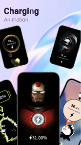
After settling on a background, I would move to the charging and Dynamic Island-style choices separately. Charging animations are a good fit for people who treat plugging in as a small routine and want a more visible transition. I can imagine using one at a desk or beside the bed, where the phone is stationary and the animation becomes part of the charging moment rather than an interruption during active use.
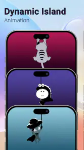
The Dynamic Island-style option needs a little more thought because it imitates an interaction pattern associated with a different phone design. It can make a compatible-looking visual area feel more lively, but it should be viewed as an aesthetic layer rather than a replacement for native system behavior. That distinction answers an important question: this app is primarily changing presentation, not turning an Android phone into an iPhone or replacing the operating system’s built-in controls.
For that reason, I would avoid judging the app only by screenshots. The real test is whether the effect appears naturally during the moments when I expect it, whether it remains readable over the chosen background, and whether it feels consistent with the rest of the phone. The handoff from selecting an effect to living with it is where many personalization apps disappoint, because a polished preview does not always translate into a comfortable daily setup.
A Practical Evening Setup
A realistic example would be my evening charging routine. I connect the phone after work, select a charging animation that is easy to notice without being excessively bright, and leave the home-screen wallpaper relatively restrained. The result is a phone that feels customized when I pick it up, but it does not turn the entire interface into a constant display.
In that scenario, the app’s three visual areas work best as a coordinated handoff. The wallpaper provides the background identity, the charging animation marks a specific event, and the Dynamic Island-style effect adds a separate accent. If all three use intense colors and fast movement, they compete. If one is allowed to lead while the others stay quieter, the phone feels more deliberately designed.
This is one of the more useful insights I took from using the app: personalization is not just a matter of finding attractive assets. It is also about assigning each effect a job. The background should support readability, the charging screen can be more decorative because it is temporary, and the status-area treatment should remain visually clear. That simple hierarchy produces a better result than choosing the most eye-catching option in every section.
What Happens When the App Hands Off to the Phone
The important handoff is between Pika! One and the phone’s own display behavior. The app helps me select the look, but the final experience still depends on how the device presents wallpapers, charging states, and system overlays. This is why I would check the result in normal conditions rather than assuming that an in-app preview tells the whole story.
Another handoff happens between the app and my existing personalization setup. If I already use widgets, icon packs, or a launcher, the new visual layer has to coexist with them. I would take a screenshot of the current home screen before changing anything, not because the app is complicated, but because it gives me a quick reference for reversing a choice if the new style makes the layout harder to use.
The app is compatible with devices running Android 7.0 or later, which gives it a broad starting point across older and newer phones. Still, broad operating-system support should not be confused with identical results on every model. Screen shape, manufacturer software, and the way each phone handles visual overlays can affect how convincing or convenient a particular style feels. I would treat compatibility as an invitation to try it, not a promise that every effect will look identical everywhere.
For someone asking whether this is suitable for an older Android phone, my answer is cautiously positive: the minimum operating-system requirement is not especially demanding, but the best choice is to start with one feature and observe the phone in ordinary use. If the interface feels busy or the animation does not fit the display, a static wallpaper from the app may be a better compromise than abandoning the whole idea.
The Result: A More Expressive but Still Familiar Device
When the setup works, the result is pleasantly immediate. I do not need to learn a new launcher, reorganize my apps, or change the way I navigate. The phone remains familiar, but the moments of unlocking, charging, and checking the top area feel more distinctive. That balance is the app’s strongest quality.
I especially like the separation between everyday decoration and occasional display moments. A wallpaper can remain part of the phone’s identity, while a charging animation can be treated as a small visual reward rather than something I have to watch constantly. This makes the app more flexible than a single-purpose wallpaper collection.
It also gives the app a clear audience. It is a good match for someone who enjoys animated phone themes, wants a more playful charging experience, or likes the look of Dynamic Island-style presentation but does not want to replace the entire Android interface. It is less suitable for someone who wants advanced launcher controls, highly precise icon-grid editing, or a completely distraction-free home screen.
The app’s age rating is Everyone 10+, so it is positioned as accessible personalization rather than an adult-focused product. I would still make the choice based on the user’s taste: younger users may enjoy the animated presentation, while adults who prefer understated tools may find the visual approach too playful. The rating tells me who can use it, but not who will enjoy living with it every day.
Where the Flow Breaks
The main friction is the gap between novelty and long-term comfort. Animated effects are easy to appreciate at first, but not every design is equally practical behind icons and widgets. Some users will also prefer the cleaner consistency of the phone’s native wallpaper and charging presentation. In those cases, the app may feel like an extra layer rather than a useful improvement.
There is also a financial decision to make. The app is free, but optional in-app purchases can cost from $1.99 to $89.99 for an individual item. That is a very wide range, so I would not assume that every attractive preview is included at no cost. My advice is to explore the free experience first, identify the specific style you would actually keep, and only then consider a purchase. Paying for a single favorite can make sense; buying broadly before knowing your long-term preference is harder to justify.
Someone who asks whether the app is completely free should understand the distinction: installation is free, while optional purchases are available. Someone who wants a one-time static image may also find a simpler wallpaper app more efficient. Pika! One earns its place when the charging and animated elements matter, not merely because it contains backgrounds.
Another possible break occurs when the visual layers do not agree. A bright wallpaper, a colorful charging animation, and a prominent Dynamic Island-style effect can make the phone look less polished than any of them would alone. My practical fix is to choose a main color family and let only one element use strong motion. This is not a hidden setting; it is a workflow choice, but it has a larger effect on the final result than endlessly browsing for another theme.
I would also avoid installing it solely because a friend has a particular setup. Personalization depends heavily on screen size, icons, widgets, and tolerance for motion. The same design can feel lively on one phone and cluttered on another. The most reliable approach is to test the least intrusive feature first, then add another only if the first one improves the experience.
How It Compares with More Conventional Options
Compared with a standard wallpaper app, Pika! One has a broader purpose. A conventional wallpaper tool is usually the better choice when I want a quick still image, minimal setup, and no extra visual behavior. Pika! One is more interesting when I want the phone to respond differently during charging or to adopt a more animated presentation around the status area.
Compared with a full launcher, it is also less disruptive. A launcher can offer deeper control over icons, gestures, grids, and app organization, but it may require a larger adjustment to the way the phone behaves. Pika! One sits between a wallpaper picker and a full interface replacement: it changes the mood and selected moments without asking me to relearn the whole home screen.
That middle position is both its strength and its limitation. Users seeking granular control should look toward launcher-based customization. Users who only want a clean background should choose the simpler route. The app is at its best for the person in between: someone who wants more than a picture but less than a complete Android makeover.
My Recommendation After Using the Complete Workflow
Pika! One - Themes & Wallpaper is a focused personalization app with a clear visual personality. Pika! Studio has combined wallpaper customization, charging presentation, and Dynamic Island-style effects into a package that can make an ordinary phone feel more individual. Its current version is 1.9.2, and the app has passed one hundred thousand installs, suggesting that the concept has found an audience without needing to replace the phone’s familiar interface.
I would recommend it to anyone who wants to experiment with animated phone styling and is willing to spend a few minutes balancing appearance with readability. Start with one wallpaper, use a calmer choice for the home screen, reserve stronger animation for charging, and treat the status-area effect as an accent rather than the centerpiece. That workflow gives the app the best chance of feeling intentional.
I would skip it if my priority were a completely static, distraction-free screen, advanced launcher controls, or a predictable one-price experience with no optional purchases. For everyone else, the free installation makes it easy to explore. My final view is that Pika! One - Themes & Wallpaper is most successful when used selectively: it adds personality through small, visible moments, and it works better as a thoughtful layer over Android than as an attempt to replace it.
In short, this is a visual customization tool, not a full phone transformation. That honest expectation is the key to enjoying it. Choose the effect that solves a real preference, check how it behaves in your daily routine, and keep the rest of the interface calm. Done that way, the app delivers a more distinctive phone without turning personalization into a project.
Pika! One - Themes & Wallpaper Frequently Asked Questions
What does Pika! One include besides wallpapers?
Pika! One is a personalization app that brings together 3D gravity wallpapers, charging animations, and Dynamic Island animations. That all-in-one approach may appeal if you want to explore several visual effects in one place rather than use separate apps. The exact options you see can depend on your device and operating system, so check that the features you want are available for your phone.
What is Pika! One - Themes & Wallpaper?
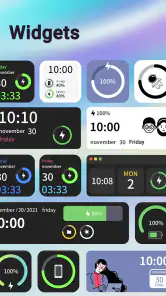
Pika! One - Themes & Wallpaper is a customization app designed to give your phone a coordinated visual style. It typically combines wallpapers, icons, widgets, and other themed elements so users can change the appearance of their home and lock screens. The app is aimed at people who want a more personalized setup without manually searching for every matching image or icon.
Is Pika! One - Themes & Wallpaper free to use?
Pika! One is free to download, with in-app purchases ranging from $1.99 to $89.99 per item. Some themes, wallpaper collections, or customization tools may require payment. Before making a purchase, review the price shown for the specific item and any payment terms in your app store. That helps you decide whether the free options meet your needs before spending money.
How do I apply wallpapers, themes, or icons with Pika! One?
After opening the app, users can browse the available categories, preview a design, and select the option to apply or download it. Wallpapers are usually straightforward to set on the home screen, lock screen, or both. Icon packs and widgets may require additional steps, such as using a compatible launcher or adding widgets manually, depending on the device and operating system.
Is Pika! One - Themes & Wallpaper compatible with every Android or iPhone?
Compatibility can vary considerably between devices. Wallpapers normally work on most supported phones, but complete themes, custom icons, and interactive widgets may depend on the operating system version, screen size, launcher, or manufacturer interface. iOS users may have more restrictions than Android users because of Apple’s customization limits. Check your device’s operating system requirement and recent user reviews before installing.
Pros
- Large collection of wallpapers and themes for different tastes.
- Simple browsing makes it easy to discover new visual styles.
- Frequent content updates help keep the library feeling fresh.
- Many designs are optimized for modern smartphone screens.
- Previewing backgrounds before applying them is quick and convenient.
Cons
- Some premium designs may require payment or a subscription.
- The app may show advertisements during browsing or downloading.
- Wallpaper quality and resolution can vary between individual designs.
- Heavy animated content may consume more battery and storage.
- Some themes may not fully support every Android or iOS device.
- Category
- Personalization
- Version
- 1.9.2











