Paper of Time - Watch Face
- 36.00
- 4.1
- Installs
- 10.00K
- Price
- $1.99
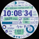
Screenshots
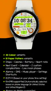
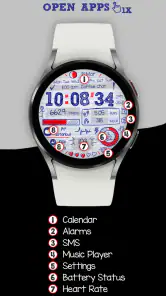
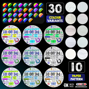
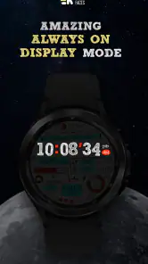
Analysis by Reviewed
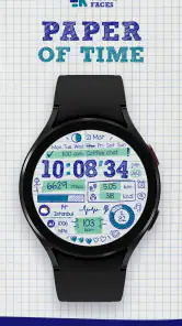
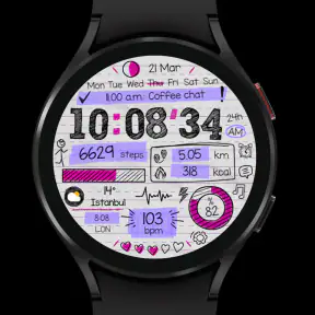
I spent time with Paper of Time as a personalization app for a smartwatch, and its appeal became clear very quickly: it tries to make checking the time feel like looking at a small piece of paper rather than opening another busy digital interface. The idea is simple, but the mood is distinctive. Instead of treating the watch face as a dashboard packed with information, it gives the passage of time a quieter, more visual character.
That makes it a particularly interesting choice for someone who wants a watch face with personality but does not want a wall of widgets. The developer, EK Watch Faces™, has positioned it around a paper-inspired concept, and the result feels more like a design statement than a utility panel. I would not choose it for maximum data density, but I can easily see why someone would install it for everyday wear, especially if the standard faces on their watch feel too sterile or repetitive.
How the paper-inspired design feels in daily use
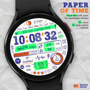
The first thing I noticed is that the concept affects the whole experience, not just the appearance of the numbers. A paper theme suggests something tactile, calm, and slightly imperfect, while a conventional digital face usually emphasizes precision and instant information. That contrast gives this app a clear identity. It is not trying to imitate a technical instrument; it is trying to make the watch feel more expressive.
In practice, that changes how I use the watch. I am less tempted to stare at it looking for every possible detail, and more likely to glance at it for the time and move on. That sounds minor, but it is a real advantage for people who want their wearable to stay in the background. The face works best when the watch is part of an outfit or personal style rather than the center of a productivity routine.
The store summary describes the experience as shaping time with paper and treating minutes as meaningful. I think that captures the intended mood better than a technical description would. The face is aimed at the emotional side of personalization: choosing something that makes a familiar object feel more like yours.
There is also a useful distinction between installing a face because it is attractive and installing one because it solves a practical problem. This belongs firmly in the first group. It can make the watch more enjoyable to wear, but it should not be mistaken for a replacement for a data-heavy face designed around exercise, appointments, weather, or rapid access to several complications.
What I noticed about speed and responsiveness
For a watch face, perceived speed is mostly about the moment-to-moment glance. I expect the display to feel immediate when I raise my wrist, and I do not want the design to make reading the time harder than it needs to be. Paper of Time benefits from keeping its central purpose focused: it is built around showing time in a visually recognizable way rather than presenting a crowded collection of information.
More From Our News Desk

Clash of Clans Is Won Between the Battles

Android Auto Makes the Case for Quieter Car Software

MobiOffice: Transforming Mobile Productivity with Seamless Integration

EA SPORTS FC™ Mobile Soccer: Redefining Mobile Sports Gaming

How Microsoft OneDrive Became a Mobile Productivity Giant

How Google Translate Breaks Language Barriers Effortlessly
I would describe the experience as visually light rather than technically demanding. That is an important distinction. A clean design can feel fast because the eye knows where to look, even when the underlying device has ordinary smartwatch limitations. I did not approach it as a benchmark test, and I would not claim a measured improvement over other faces. My judgement is based on the practical experience of opening the face, glancing at it, and understanding what it is communicating.
The paper treatment can also influence readability depending on lighting and the watch itself. A face that looks elegant indoors may need a slightly longer glance outdoors, especially if the display is small or the surrounding light is harsh. That is not a flaw unique to this design; it is the trade-off that comes with choosing atmosphere over maximum visual bluntness.
My advice is to judge it at the distance where you normally read your watch. Do not evaluate it only from a large phone preview. A design can look beautiful in a store image and still feel less convenient on a wrist. With this face, the balance between charm and instant legibility is central to the decision.
When the watch is under heavier everyday use
The most demanding moments are not likely to be ordinary time checks. They are the situations where I want the watch to do several things at once: show time, expose health information, let me check an appointment, and provide quick access to another function. That is where a minimalist face naturally gives up ground to a more configurable alternative.
Imagine a weekday morning when I am leaving home, checking the time, watching for a message, and trying to keep track of a meeting. A face designed around a paper-like presentation may look calmer, but it will not necessarily be the most efficient command center. I would switch to a more information-rich option for that kind of day, then return to this one when I want the watch to feel less like a second phone.
A similar trade-off appears during exercise. If I need live workout information at a glance, a sports-focused face is likely to be the better choice because its layout is built around quick access to metrics. Paper of Time makes more sense before or after the activity, when I care about the look of the watch rather than monitoring several changing values.
That does not make the app weak. It simply gives it a narrower but clearer role. The strongest personalization products are often the ones that know what they are trying to be. Here, the attraction is the visual experience, not an attempt to win a feature-count contest.
One practical workflow is to treat it as a mood-based face. I would use it for weekends, evenings, social occasions, or quieter workdays, while keeping a more functional face available for travel and exercise. That approach avoids forcing one design to handle every context and lets the paper concept do what it does best.
Reliability, recovery, and the small details that matter
Reliability on a wearable is more than whether an app installs successfully. I also care about whether the face remains understandable after the watch wakes, whether the time is easy to read after a quick movement, and whether returning to it feels natural after using another face. A design that looks good but creates hesitation during every glance would become frustrating quickly.
Paper of Time is best suited to users who value consistency of presentation. Its appeal comes from the face looking like a deliberate visual object, so I would not expect it to satisfy someone who wants constant customization and frequent layout changes. The more often I alter a watch face, the less important its identity becomes; this one rewards leaving it in place and letting its character settle into the routine.
Recovery is another reason to keep expectations realistic. If a watch restarts, changes faces, or temporarily behaves differently after an update, the important question is whether the face can be selected and understood again without a complicated process. I would keep a familiar backup face available while testing any new personalization app. That is sensible with a paid watch face, particularly when the watch is needed for an early appointment or a workout.
I also prefer to install a new face when I have a few quiet minutes rather than immediately before leaving home. That gives me time to check readability, confirm that the style suits the display, and decide whether it belongs in my regular rotation. This is not a criticism of the developer; it is a good habit for any watch customization purchase.
The app has an average rating of 4.1 from around 248 ratings, with 36 written reviews. I read that as a generally positive but not universal response. That feels believable for a design-led face: visual taste is personal, and a paper-inspired style will appeal strongly to some people while leaving others wanting more information or a different look.
Device limits and choosing it intelligently
The most important device constraint is the watch display itself. Screen size, shape, brightness, and the way the watch presents a face can all change the result. A paper-like design depends on visual balance, so a small screen may make subtle details less noticeable, while a sharper or larger display may give the concept more room to breathe.
I would also consider how often I need information beyond the time. If my day revolves around calendar reminders, weather, step counts, battery status, or workout data, I would compare this face carefully with the built-in options before paying for it. The default faces usually win on integration and practical density. They are often the safer choice for someone who wants a single screen to answer several questions instantly.
On the other hand, a built-in face can make a watch feel generic. That is where this app earns its place. It offers a more intentional visual identity for people who see the watch as an accessory rather than only a miniature control panel. The decision is less about which face is objectively better and more about whether I want information first or atmosphere first.
The age rating is Everyone, which fits the straightforward personalization purpose. The app costs $1.99, so the purchase is small enough to be approachable, but it is still worth thinking about what I expect from it. If I only want to experiment for a few minutes and then return to a standard face, the price may feel less justified. If I plan to wear the design regularly, the cost is easier to defend because the value comes from repeated daily enjoyment rather than from a long feature list.
It is also worth remembering that paid personalization is not the same as a subscription service or a general watch-management tool. I would expect the purchase decision to be about this particular design. Someone looking for a broad library, extensive automation, or a single app that manages every aspect of a wearable should look at a different kind of product.
Who will enjoy it, and who should choose another face
I would recommend Paper of Time to someone who finds most smartwatch faces too busy, too glossy, or too interchangeable. It is a good match for a person who notices typography, visual mood, and the feeling an object creates during ordinary use. It also suits anyone who wants a watch face that can complement casual clothing or a more understated personal style.
It is especially appealing if I already have a functional face for workouts and travel. In that setup, this app becomes the expressive option in the rotation. I can use the practical face when I need information and the paper-inspired one when I want the watch to feel calmer and more personal.
I would skip it if I need the watch face to act as a compact dashboard. People who depend on constant health data, multiple shortcuts, or highly visible notifications may become impatient with a design whose main strength is restraint. I would also skip it if I prefer bright, technical, or aggressively modern visuals; the paper direction is specific enough that it will not suit every taste.
Compared with the usual alternatives in the personalization category, its advantage is character rather than breadth. Standard faces are generally better for predictable readability and system-level convenience. Highly configurable third-party faces are better for tailoring many data points. Paper of Time occupies the middle ground as a focused design purchase: more distinctive than a default face, but less utilitarian than a dashboard.
That positioning is useful because it prevents a common disappointment. I would not install it expecting a dramatic productivity upgrade. I would install it because I want the simple act of checking the time to feel a little more considered.
My performance verdict after living with the concept
Paper of Time is a focused personalization app with a clear visual idea and a sensible audience. Its performance appeal comes from the feeling of simplicity: there is less visual competition during a glance, and the face does not ask the watch to become a miniature phone. I cannot turn that impression into a technical speed claim, but as an everyday experience, the design feels best when I want calm, quick recognition rather than a flood of data.
The limitations are equally clear. The paper-inspired presentation may not be the fastest choice for every lighting condition or every kind of task, and it cannot replace a sports or productivity-oriented face for users who need several live details. Its value depends heavily on whether the style remains enjoyable after the novelty fades.
Still, I think the app succeeds because it does not hide behind a vague promise of personalization. The developer has chosen a recognizable direction, and that gives the watch a different emotional tone. With over 10 thousand installs, it has found an audience interested in that approach, while the rating suggests that the design has broad appeal without being universally perfect.
Released on March 6, 2024, it remains a relatively focused choice for people who want to shape the look of their wearable rather than overload it with functions. At $1.99, I see it as a modest style purchase: worthwhile for regular wearers who connect with the paper theme, less convincing for anyone searching for maximum information or deep utility.
My final recommendation is simple: choose it when you want your watch to feel like a personal design object, keep a data-rich alternative for demanding days, and test the face in your normal lighting before making it your everyday default. For the right wearer, that quieter approach is exactly what makes it stand out.
Paper of Time - Watch Face Frequently Asked Questions
What does Paper of Time - Watch Face look like in everyday use?
Paper of Time - Watch Face is a personalization app by EK Watch Faces™ built around a paper-inspired way of displaying time. Its clean typography and restrained layout are intended to make the watch screen feel distinctive without looking crowded. The overall appeal is visual simplicity, so it may suit people who prefer a calm, minimal watch face over a screen packed with information.
Is Paper of Time - Watch Face suitable for all ages?
The app has an Everyone content rating, so it is presented as suitable for a general audience. Its purpose is to personalize a smartwatch’s appearance rather than provide age-specific entertainment or content. If you are choosing it for someone else, the practical consideration is whether their wearable supports the watch face and whether they like its paper-inspired, minimalist look.
What is Paper of Time - Watch Face?
Paper of Time - Watch Face is a minimalist watch-face application designed to give compatible smartwatches a distinctive paper-inspired appearance. Its visual style focuses on clean typography, simple layouts, and an uncluttered presentation of the time. Depending on your watch and operating system, available customization options and supported features may vary, so checking compatibility before downloading is recommended.
Which smartwatches and devices are compatible with Paper of Time - Watch Face?
Compatibility depends on the platform and the specific smartwatch model you use. Paper of Time - Watch Face is intended for supported wearable devices rather than functioning as a regular phone wallpaper. Before installing, review the app-store listing and your watch’s requirements, including operating-system version, companion-app support, and available storage. Some features may not appear on every compatible device.
Can I customize the appearance of Paper of Time - Watch Face?
The watch face is built around a deliberately simple paper-like design, but the available customization controls depend on the version installed and the smartwatch platform. Users may be able to adjust elements such as color, layout, complications, or information displayed on the screen. If extensive personalization is important to you, confirm the listed options before downloading because the design may prioritize minimalism over unlimited customization.
Pros
- Clean
- elegant design that suits both casual and formal outfits.
- Time remains easy to read at a quick glance.
- Includes useful customization options for personal styling.
- Designed to complement round Android smartwatch displays.
- Lightweight watch face with minimal visual clutter.
Cons
- Some features may require a premium purchase.
- Compatibility can vary between Wear OS devices.
- Customization choices may feel limited for advanced users.
- Small details may be difficult to see on compact screens.
- Battery impact may depend on the selected display settings.
- Category
- Personalization
- Version
- Varies with device











