Octopi Launcher • Home Screens
- 344.00
- 4.7
- Installs
- 100.00K
- Price
- Free

Screenshots
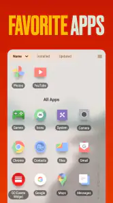
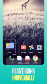
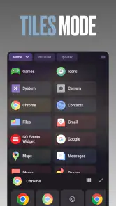

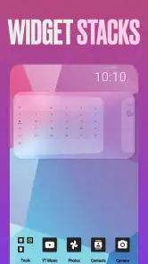
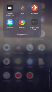
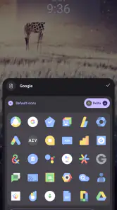
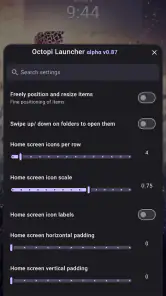
Analysis by Reviewed
I have a soft spot for Android launchers that question the usual grid of icons, and Octopi Launcher is clearly built for people who feel the same. Developed by OctopiAppFactory, this free personalization app takes a deliberately unusual approach to the home screen instead of simply adding another icon pack, wallpaper collection, or widget shelf. My overall impression is that it is most interesting when I stop treating the home screen like a miniature app drawer and start treating it like a personal workspace.
That change in thinking is the key to understanding it. If you want a familiar layout with predictable folders, a conventional dock, and almost no adjustment period, this may feel unnecessarily different. If you want your phone to feel less cluttered and more deliberately arranged, the unusual design is its main attraction. I would recommend trying it to anyone who enjoys customizing Android and is willing to spend some time learning a new rhythm.
How the unusual home screen feels in daily use
The first thing I noticed is that Octopi Launcher is not trying to win by copying the standard Android launcher. Most default launchers organize everything around a fixed grid: place icons in rows, add a few widgets, and swipe to reach the rest. That system is efficient, but it can also turn into visual noise. Octopi’s appeal comes from making the home screen feel more intentional, with the layout itself becoming part of the experience rather than a blank surface filled with shortcuts.
That difference sounds small until it changes how I reach common apps. Instead of automatically searching through several pages, I became more aware of which apps deserved immediate access and which ones were better left out of sight. For me, this created a useful distinction between tools I use repeatedly and apps I only open occasionally. It is a better fit for a curated phone than for someone who wants every installed app visible at once.
The strongest evidence in its favor is the sense of ownership it creates. A conventional launcher usually asks me to arrange objects inside a system that already exists. This one encourages me to decide how I want the screen to behave and what deserves attention. That makes it especially appealing after a phone setup has become crowded with work apps, shopping apps, social networks, media services, and utilities that all compete for the same visual space.
I also appreciate that the app is free to start using. That matters with a launcher because replacing the home screen is a personal commitment: I need enough time to see whether a new layout suits my habits before paying for it. Optional in-app purchases range from $0.99 to $2.99 per item, so the initial experiment does not require a purchase. I would still approach those extras as optional rather than assuming they are necessary for the basic idea to make sense.
A practical workflow for a less distracting phone
My most useful way to test Octopi was to begin with a deliberately small set of apps. I kept communication, navigation, notes, camera, music, and one browser close at hand, then left everything else available only when needed. This is more effective than trying to recreate the entire old home screen immediately, because it reveals whether the launcher’s structure actually helps or merely looks different.
More From Our News Desk

Clash of Clans Is Won Between the Battles

Android Auto Makes the Case for Quieter Car Software

MobiOffice: Transforming Mobile Productivity with Seamless Integration

EA SPORTS FC™ Mobile Soccer: Redefining Mobile Sports Gaming

How Microsoft OneDrive Became a Mobile Productivity Giant

How Google Translate Breaks Language Barriers Effortlessly
A realistic example would be a weekday morning. I might need a calendar, messages, maps, transit information, and a task list, but I do not necessarily need social media, a marketplace, or a video service staring back at me before breakfast. A carefully arranged Octopi screen can support the first group without inviting me into the second. That is not a replacement for personal discipline, but reducing visual prompts can make disciplined use easier.
There is a less obvious trade-off here: a minimalist setup can improve focus while making spontaneous discovery slower. On a standard launcher, I can often spot an app because I remember its color or approximate position. With a more distinctive arrangement, I need to remember the logic behind my organization. I found that naming my own groups mentally was more helpful than trying to make the layout look decorative. The best arrangement is the one that reflects how I think, not the one that looks most impressive in a screenshot.
Another useful workflow is to separate apps by time and purpose rather than by company. For example, I found it more practical to think in terms of “quick actions,” “deep work,” and “occasionally useful” than to place every app from the same service together. That approach makes the home screen answer a real question—what am I trying to do now?—instead of merely showing where an app came from.
Where it stands against familiar launcher choices
Compared with the launcher that comes with a phone, Octopi is less about immediate familiarity and more about deliberate organization. The default option usually wins when I want everything to work exactly as expected, especially after a system update or when another person needs to use the device. Octopi wins when I want the home screen to reflect my own habits rather than the manufacturer’s assumptions.
It also differs from launchers that focus mainly on visual polish. A launcher built around icon packs, animations, and elaborate themes can be rewarding for someone who enjoys changing the appearance of every detail. Octopi’s more interesting contribution is structural: it asks me to reconsider how I access apps. That means it may feel less satisfying to a customization fan whose priority is decorative control, but more useful to someone who wants fewer distractions and a clearer starting point.
Against highly utilitarian minimalist launchers, the trade-off goes the other way. A strictly minimal interface can be faster to understand because it removes almost everything. Octopi’s distinctiveness leaves more room for personal arrangement, which also means more decisions. I would choose the simpler alternative for a family member who dislikes setup work, while I would choose Octopi for myself when I want the phone to feel personal rather than merely stripped down.
The app’s store summary describes a launcher that tries to be different, and that is a fair description without being the whole story. Its difference is not valuable just because it is unusual. It becomes valuable when the unusual layout helps me reach important tools with less clutter. If the design makes me pause too often to remember where something is, the novelty stops helping.
The friction I would not ignore
The biggest weakness is the learning curve. Any replacement home screen changes a behavior I perform dozens of times a day, so even a thoughtful design can feel slower at first. I had to resist the temptation to judge it during the first few minutes. At the same time, I would not dismiss that initial friction entirely: if a launcher requires too much explanation, it may not be suitable for someone who values instant familiarity above experimentation.
There is also a maintenance cost. A carefully designed home screen can become less useful when my priorities change. A new job, a move, a different messaging service, or a temporary project can make yesterday’s arrangement feel awkward. With a conventional grid, moving a few icons is straightforward and the overall mental model remains stable. With Octopi, reorganizing may feel more like redesigning a workspace, which is rewarding when I want that control but inconvenient when I just need a quick change.
Another limitation is that a distinctive launcher is not automatically the best solution for every Android user. People who depend heavily on manufacturer-specific home-screen behavior may prefer to stay with the original launcher. The same is true for users who regularly hand their phone to children, relatives, or colleagues. Familiar controls reduce confusion, while Octopi’s strength depends on the owner understanding the arrangement.
I would also be careful about over-customizing at the start. One of my practical lessons was to avoid building a complicated system of categories, exceptions, and rarely used shortcuts. The more elaborate the arrangement becomes, the more likely it is to recreate the clutter the launcher was meant to reduce. Start with a few important actions, live with them, and add only what repeatedly proves useful. That approach keeps the distinctive design from turning into another organizational project.
Compatibility, cost, and the setup decision
Octopi Launcher is available for Android devices running Android 8.0 or later, which covers a broad range of phones. That makes it approachable for people who are not using the newest hardware, although the experience will still depend on how comfortable the individual phone is with replacing its normal home screen. I would check the device’s current launcher settings before switching, particularly if I expected to return to the original arrangement frequently.
The app is rated for Everyone, so its intended audience is broad rather than limited to a particular age group. In practical terms, that does not mean every person will enjoy the interface. Age suitability and ease of use are different questions here. A curious teenager, a customization enthusiast, or an adult trying to reduce home-screen clutter may all find value in it, while someone who wants the phone to behave exactly like every other Android device may find the same design frustrating.
Its release date was May 27, 2025, and the current version is 1.865. I would treat those details as useful context when deciding whether to install it, especially if I am comparing it with a launcher that has been familiar for years. The developer is OctopiAppFactory, and the app has already attracted over 100,000 installs, with a 4.7 average from around 1,700 ratings. Those figures suggest that the concept has found an audience, but they do not remove the need to test the interaction style personally.
The number of written reviews is around 344, which gives prospective users additional feedback to browse before making the switch. Still, launcher preferences are unusually personal. A rating can tell me that many people enjoy the idea, but it cannot tell me whether I will prefer a radial arrangement, a reduced app list, or a more structured browsing flow. The most sensible approach is to install it when I have time to adjust, rather than during a busy day when every extra tap feels inconvenient.
Who should give it a serious try
I think Octopi is a strong candidate for people who feel their phone has become visually noisy. It suits users who want a home screen that reflects routines instead of simply displaying every possible shortcut. It is also a good match for anyone who enjoys testing alternative interfaces and does not mind spending an evening refining the arrangement.
It may be particularly useful for someone who wants separate mental spaces for work and personal life without maintaining multiple devices. A work-focused layout can put communication, documents, meetings, and navigation within easy reach, while less urgent entertainment apps stay out of the immediate visual field. The value is not that the launcher magically enforces boundaries; the value is that the home screen can make those boundaries easier to maintain.
I would skip it if my priority is zero setup, maximum familiarity, or perfect continuity with a manufacturer’s existing tools. I would also hesitate if I frequently switch between phones and rely on the standard Android layout to orient myself quickly. In those cases, the default launcher or a more conventional replacement is likely the better choice, even if it offers less personality.
For a friend asking me whether to install it, my advice would be simple: try it with a restrained first layout, not a full recreation of the old phone. Keep the apps used every day, leave the rest alone for a while, and pay attention to whether reaching common tasks feels calmer or slower. If the new arrangement makes me think more clearly about what belongs on the home screen, it is doing something worthwhile. If I keep searching for the familiar grid, the experiment has already answered the question.
My verdict after living with the idea
Octopi Launcher is worth trying when you want to rethink access, not merely repaint your icons. Its best quality is the way it turns the home screen into a personal system. I found that refreshing because it challenged the assumption that every app should be equally visible and equally easy to reach. That can support a calmer daily workflow, especially when the phone has accumulated more distractions than genuinely useful shortcuts.
The cost of that freedom is adjustment. The design can slow me down while I learn it, and it asks me to maintain the arrangement as my routines change. Those are meaningful limitations, not minor complaints. A launcher should serve the user, and there will be days when a conventional grid is simply more practical.
Still, the free entry point makes the decision easy. I would recommend Octopi Launcher to curious Android users, people seeking a more focused home screen, and anyone who enjoys organizing technology around real habits. I would not recommend it blindly to users who want a familiar interface with no learning curve. For the right person, though, OctopiAppFactory’s experiment is more than a visual novelty: it is a thoughtful invitation to decide what the first screen of a phone should actually do.
Octopi Launcher • Home Screens Frequently Asked Questions
Will Octopi Launcher work on my Android phone?
Octopi Launcher • Home Screens is an Android app, and it requires Android 8.0 or later. If your phone meets that requirement, you can try it as a replacement for the standard home screen. The experience may still vary with your device manufacturer’s software, screen size, and Android interface, so it is worth considering how your particular phone handles third-party launchers.
Is Octopi Launcher free, and are there any optional purchases?
Octopi Launcher • Home Screens is free to download, with in-app purchases available from $0.99 to $2.99 per item. You can consider the free experience first and decide whether any optional purchase is useful to you. As with other launchers, check the purchase details shown in the app before confirming a transaction, especially if someone else may use the device.
What is Octopi Launcher • Home Screens, and what does it do?
Octopi Launcher • Home Screens is an Android customization app designed to replace or enhance the standard home screen experience. It lets you organize applications, access shortcuts, and personalize the way your icons and home pages are arranged. Before downloading, remember that the available features and appearance may depend on your Android version and the device manufacturer’s software.
Is Octopi Launcher • Home Screens easy to set up and use?
The launcher is generally intended to be straightforward for users who want a different home screen without making complicated system changes. After installation, you may need to select it as your default launcher and grant certain permissions for shortcuts or personalization features. The settings can take a little time to explore, especially if you are unfamiliar with replacing your phone’s original home screen.
Can I customize the appearance and layout of my home screen?
Octopi Launcher • Home Screens focuses on giving users more control over their home screen arrangement than the default launcher may provide. Depending on the version, you can typically manage app placement, pages, shortcuts, and visual organization. However, some customization options may be limited by your phone’s Android interface, screen size, accessibility settings, or compatibility with third-party icon and widget systems.
Pros
- Clean
- minimalist interface keeps the home screen easy to navigate.
- Flexible icon placement helps create a layout that fits your habits.
- Useful customization options without requiring a powerful phone.
- Can make older devices feel more organized and responsive.
- A focused design reduces distractions from unnecessary home-screen clutter.
Cons
- Some advanced customization features may take time to discover.
- Users wanting extensive widget controls may find it somewhat limited.
- The unusual layout may require adjustment after switching from another launcher.
- Compatibility can vary across Android versions and device manufacturers.
- Battery impact may differ depending on animations and live home-screen options.
- Category
- Personalization
- Version
- 1.865











