Nothing Icon Pack : Line
- 21.00
- 4.6
- Installs
- 10.00K
- Price
- $0.99

Screenshots
Analysis by Reviewed
I installed Nothing Icon Pack : Line to see whether its monochrome Nothing-inspired look works as an everyday replacement rather than just a quick visual experiment. My first impression was clear: this is a focused personalization app for people who want their home screen to feel calmer, more consistent, and closer to the Nothing design language. It is not trying to replace a launcher, reorganize your phone, or add widgets. Its job is narrower, and that focus is both its appeal and its main limitation.
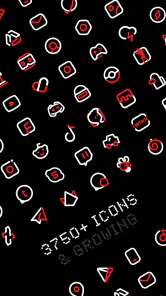
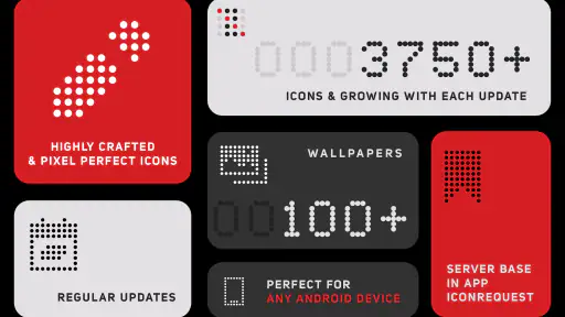
Created by AlphaOne, the app offers more than 3,750 carefully drawn icons and currently sits at version 3.9. It is a paid app at $0.99, aimed at Everyone, and works on devices running Android 6.0 or later. That combination makes it easy to consider for an older spare phone as well as a modern Android handset. In my experience, the low one-time cost feels reasonable if you already enjoy minimalist themes, but the value depends heavily on whether your launcher can apply icon packs smoothly.
How the current icon experience feels
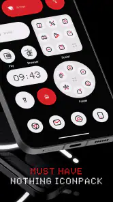
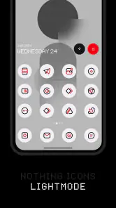
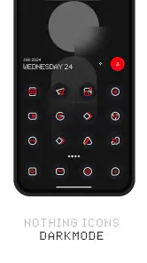
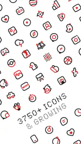
The strongest part of the pack is its visual discipline. Instead of mixing colorful logos across the home screen, it pushes the interface toward a restrained line-based appearance. The result is especially effective when the wallpaper is simple and the launcher leaves enough empty space around icons. On a crowded screen, the design still looks distinctive, but it loses some of the quiet balance that makes this style attractive in the first place.
I found the pack most convincing when used across a complete home-screen layout rather than on just a few shortcuts. Applying it to the main page, app drawer, and dock creates a more deliberate rhythm. If only the most visible apps change while the rest keep their original colors, the contrast can make the unsupported icons stand out. That is not a flaw unique to this app, but it is an important practical trade-off before you pay for a themed appearance.
The large icon collection is useful because it reduces that problem. A broad catalog means common social, communication, media, productivity, and system apps have a better chance of receiving a matching design. Still, an icon count alone does not guarantee perfect coverage for every phone. Smaller developers, newly installed apps, regional services, and manufacturer-specific tools may require a workaround, such as selecting a similar icon manually or leaving the original icon visible.
That is where your launcher matters more than many first-time users expect. An icon pack is not a complete interface by itself. You need a compatible launcher or a launcher feature that can read and apply third-party packs. If your current home app does not recognize it, the pack may appear installed but remain difficult to use. I would check launcher compatibility before buying, especially if your phone uses a heavily customized manufacturer interface.
What changed in the recent version
Version 3.9 is the current release, and the app has been available since January 27, 2024. Those details place it in a relatively recent stage of its development rather than making it an established system component. The practical takeaway is that I would judge it as a maintained visual product with a defined identity, while still expecting the experience to depend on how actively new app icons are added over time.
More From Our News Desk

Clash of Clans Is Won Between the Battles

Android Auto Makes the Case for Quieter Car Software

MobiOffice: Transforming Mobile Productivity with Seamless Integration

EA SPORTS FC™ Mobile Soccer: Redefining Mobile Sports Gaming

How Microsoft OneDrive Became a Mobile Productivity Giant

How Google Translate Breaks Language Barriers Effortlessly
The most meaningful sign of evolution is not a dramatic change to the concept. The concept remains simple: a Nothing-style line icon pack with a large collection. What matters for existing users is whether the collection keeps pace with the apps they install. A pack can look excellent on launch day and gradually feel incomplete as new apps appear. For that reason, the current version is encouraging, but I would still treat future coverage updates as important to its long-term usefulness.
I would not install it expecting a new launcher, animated transitions, a complete lock-screen makeover, or a set of matching widgets. Its development is centered on icons. That narrow scope is helpful because the app does not distract from its main purpose, but it also means the rest of your phone’s visual identity is left to your launcher, wallpaper, notification style, and widgets.
For someone already using a Nothing phone or a launcher arranged around a monochrome layout, that limitation may barely matter. The icon pack can complete an existing style without forcing a broader redesign. For someone hoping to turn a conventional Android phone into a full Nothing interface with one tap, expectations should be lower. The icons contribute a recognizable layer, not the entire operating-system experience.
What existing users should know before changing their layout
If you already use another icon pack, switching is usually less disruptive than replacing the launcher, but I would still take a few minutes to record your current layout. Icon packs can alter the appearance of shortcuts without changing the apps themselves, yet launcher behavior varies. A careful switch makes it easier to return to your previous setup if the line style feels too stark after a day or two.
My preferred workflow is to apply the pack only after simplifying the home screen. I remove duplicate shortcuts, keep the most-used apps on the first page, and use a plain wallpaper with enough contrast for thin lines to remain readable. This is a non-obvious but important point: the pack’s success depends on spacing and background more than on the icons alone. A busy wallpaper can make the clean artwork look faint and less legible.
I also recommend checking the dock separately. The dock is visible constantly, so inconsistent icons there are more noticeable than an unmatched app several pages away. If one essential app does not have a convincing themed icon, I would rather keep a simple original shortcut on a secondary page than weaken the appearance of the main screen. That small layout decision made the overall result feel more intentional.
Another useful approach is to use the pack for a work profile or secondary phone instead of changing everything at once. A minimalist screen can help separate a focused device from a personal one, particularly when you want fewer visual distractions. The pack does not block notifications or limit applications, so the benefit comes from reducing visual noise, not from adding digital-wellbeing controls.
The app’s Everyone content rating also makes it straightforward to consider for a shared family device from a content perspective. However, the real question is usability: children or less technical users may prefer familiar colorful logos, while someone who relies on quick visual recognition could find a monochrome set slower at first. I would introduce it gradually for users who identify apps by color rather than shape.
Where the design works and where it becomes inconvenient
The line treatment looks best on a clean grid with consistent icon sizing. It gives a phone a more coherent surface and can make unrelated applications feel as though they belong together. I particularly like the effect on a compact first page: a few essential shortcuts, a restrained wallpaper, and enough breathing room for the outlines to remain distinct.
The same restraint can become a weakness in bright outdoor conditions or on a low-contrast wallpaper. Colorful stock icons often communicate instantly because their branding is familiar. A monochrome line icon may require a second glance, especially when several symbols have similar silhouettes. I would not choose this pack for someone who values the fastest possible visual recognition over appearance.
There is also a difference between theming an app icon and theming a shortcut created by another application. Some launchers handle both cleanly, while others may leave certain shortcuts untouched or require manual editing. This is one reason I would test the pack on the apps you use most before redesigning every page. The experience can be excellent on one launcher and merely acceptable on another, even with the same phone.
The $0.99 price lowers the risk of experimenting, but it does not remove the need to match the style to your habits. A low-cost purchase is worthwhile when you expect to keep the look for months. It is less compelling if you frequently change themes, prefer colorful adaptive icons, or want a single app to control wallpapers, widgets, lock screens, and system accents together.
How it compares with ordinary icon-pack alternatives
Compared with broad icon packs that preserve original brand colors, this one makes a stronger aesthetic decision. Traditional packs often aim to make icons look polished while keeping them immediately recognizable. Nothing Icon Pack : Line instead asks you to accept a more uniform visual language. I prefer it when the goal is a deliberate minimalist layout, but I would choose a conventional pack for a family member who needs instant recognition.
Compared with complete theme engines, it is simpler and less invasive. You are not committing to a new launcher experience or an elaborate collection of matching interface elements. That makes the pack easier to remove and easier to combine with your existing setup. The trade-off is that the final result may feel unfinished unless you also adjust the wallpaper, grid, widget placement, and icon spacing yourself.
Compared with using the original Nothing interface, this pack is an approximation rather than a full replacement. It can bring the visual character of line icons to compatible Android setups, but it cannot reproduce every detail of a device-specific design system. If you already own a Nothing phone and want its native presentation, the built-in experience is naturally more integrated. If you simply like the look and use another Android phone, this is a practical way to borrow part of that visual direction without changing hardware.
The app also differs from manually replacing icons one by one. Manual customization gives you precise control, but it takes time and tends to produce inconsistent results. A dedicated pack gives you a starting point across a large library, which is much more sensible for a complete home-screen refresh. I would reserve manual editing for the few apps that are missing or do not look right in the automatic selection.
Who should install it, and who should skip it
I would recommend it to Android users who enjoy monochrome design, already use a compatible launcher, and want a large icon collection without paying for a broad customization suite. It is also a good fit for people who have grown tired of a wall of unrelated colors and want their home screen to feel calmer without changing how their apps work.
It makes particular sense for a minimalist setup with a small number of primary shortcuts. The pack’s visual identity becomes clearer when the screen is not overloaded. It can also suit a secondary device used for reading, work, or travel, where a quiet interface helps the phone feel more purposeful.
I would skip it if you want widgets, wallpapers, lock-screen tools, notification controls, or launcher customization in the same package. I would also hesitate if your launcher does not support third-party icon packs, if you depend on color coding to find apps quickly, or if you expect every newly installed application to match immediately.
Before purchasing, I would answer three practical questions. Can your launcher apply external icon packs? Are you comfortable with a mostly monochrome screen? And will you spend a few minutes adjusting the wallpaper and layout? If the answer to all three is yes, the small price is easy to justify. If any answer is no, the pack may create more fiddling than enjoyment.
What to watch as the pack continues to develop
The main thing I would watch is coverage for newer and less common applications. A large existing library is valuable, but long-term satisfaction comes from keeping the collection relevant as people’s app drawers change. I would also pay attention to how consistently new icons follow the established line style, because a pack feels strongest when its symbols share the same visual weight and level of detail.
Another point is launcher compatibility over time. Android launchers and manufacturer interfaces evolve independently, so a smooth experience today is not a guarantee that every device will behave identically after a system or launcher change. Users who customize heavily should keep their previous layout in mind and avoid treating the pack as an irreplaceable part of the phone.
The current reception is positive, with a 4.6 average from around 250 ratings and more than 10,000 installs. Those figures suggest that the concept has found an audience, although I would still interpret them alongside your own launcher and design preferences rather than as a promise of universal compatibility. The app is popular enough to feel established, but personal fit matters more for an icon pack than it does for many utility apps.
After using it, my view is favorable but specific. Its real strength is consistency, not quantity alone: the extensive collection gives the Nothing-inspired line style a chance to cover most of a normal home screen, while the focused design keeps the app uncomplicated. Its weaknesses are equally clear: it depends on launcher support, may leave gaps for unusual apps, and can reduce quick recognition for people who rely on color.
Nothing Icon Pack : Line is worth the $0.99 if you want a restrained Android home screen and are willing to shape the rest of the layout around it. I would install it for a clean, intentional setup, especially on a compatible launcher with a simple wallpaper. I would not choose it as a universal customization solution. Think of it as a strong visual foundation: effective when matched with the right habits, but not a substitute for a full theme system or a native Nothing device experience.
Nothing Icon Pack : Line Frequently Asked Questions
Does Nothing Icon Pack : Line work on iOS?
Nothing Icon Pack : Line is an Android personalization app, so it is designed for use with Android launchers that support custom icon themes. It is not a system-wide iOS icon pack. If you use an iPhone, check the options available through iOS Shortcuts and custom home-screen setup before buying; those methods are separate from the launcher-based features this pack is made for.
How much does Nothing Icon Pack : Line cost, and what should I check before buying?
Nothing Icon Pack : Line costs $0.99. Before purchasing, check that your Android launcher supports third-party icon packs, since compatibility depends on the launcher rather than the phone alone. Its content rating is Everyone, and the app is intended for personalizing a home screen with Nothing-inspired line icons. A compatible launcher is the key requirement for getting the expected result.
What is Nothing Icon Pack : Line?
Nothing Icon Pack : Line is a minimalist icon pack inspired by Nothing’s distinctive visual style. It replaces supported app icons with clean, line-based designs, usually featuring a monochrome appearance and simple geometric details. It is intended for users who want a more consistent, modern home screen rather than the colorful default icons found on most Android devices. The pack’s collection includes more than 3,750 crafted icons.
Is Nothing Icon Pack : Line compatible with every Android phone?
Compatibility depends mainly on the launcher installed on your Android phone. Icon packs generally work best with launchers that support custom icon themes, such as Nova Launcher, Lawnchair, Smart Launcher, Action Launcher, and similar alternatives. Some manufacturer launchers may not support third-party icon packs, so you should check your launcher settings before downloading or purchasing the app. The app requires Android 6.0 or later.
Does the icon pack change all application icons automatically?
The pack can automatically apply icons for many popular applications when used with a compatible launcher, but it may not include every app installed on your device. Less common, regional, or newly released applications might retain their original icons. In those cases, you may be able to select an alternative icon manually, depending on the launcher and the options provided by Nothing Icon Pack : Line.
Pros
- Clean line-art style gives home screens a distinctive
- modern appearance.
- Works well with many popular Android launchers and icon replacement tools.
- Large icon collection covers numerous common apps and games.
- Included wallpapers help create a more consistent overall theme.
- Lightweight design has minimal impact on device storage and performance.
Cons
- Some less common apps may remain with mismatched default icons.
- The monochrome style can make certain icons harder to recognize quickly.
- Launcher compatibility and setup steps may vary between Android devices.
- Icon requests or updates may not arrive immediately for newer apps.
- Customization options are limited if you prefer colorful or highly detailed icons.
- Category
- Personalization
- Version
- 3.9











