Nixie Digital - Wear OS Face
- 26.00
- 4.2
- Installs
- 10.00K
- Price
- $1.00
Screenshots
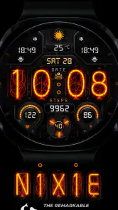
Analysis by Reviewed
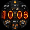
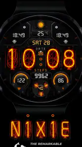
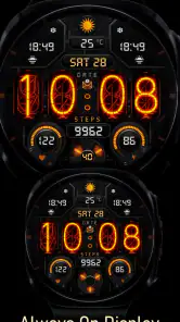
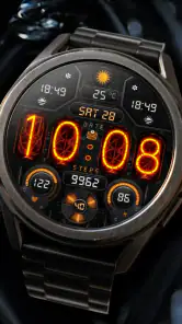
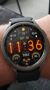
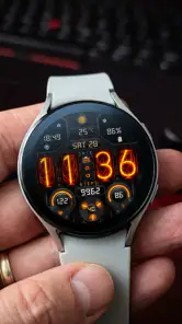
I spent time with Nixie Digital - Wear OS Face as a personalization app for a compatible smartwatch, and its appeal became clear quickly: it gives the watch a deliberately digital, retro-inspired identity instead of trying to imitate a traditional dial. The experience is centered on a Nixie-style digital presentation, with health and weather information intended to sit alongside the time. That makes it more than a decorative change, although its usefulness depends heavily on how comfortably you can read and interact with a small watch screen.
The face is made for Galaxy Watch, Pixel Watch, and other devices running Wear OS 5 or later. That compatibility point matters more than it may seem. A watch-face purchase is only worthwhile when the underlying software and hardware are supported, so I would check the Wear OS version before spending anything. The app costs $1, which is a modest price for someone who wants one carefully designed look rather than a large collection of interchangeable faces.
How the design affects readability and navigation
The strongest part of the design is its visual character. A Nixie-inspired display gives the time a warmer, more distinctive appearance than the plain digital faces that usually come preinstalled. I found it better suited to people who want their watch to feel like a personal object, not just a tiny dashboard. The style is recognizable at a glance, but it is also more visually expressive than a basic block of numerals.
That character creates an important trade-off. A highly stylized display can be pleasant to look at while still requiring more attention than a simple, high-contrast clock. If you often check the time while walking, carrying bags, or moving between rooms, a straightforward digital face may be easier to interpret immediately. With this design, I would spend a little time checking how the digits look at the brightness level I normally use, especially if I rely on quick glances rather than deliberate reading.
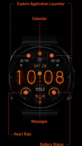
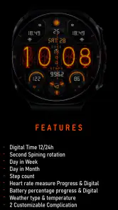
The health and weather elements give the face a practical role. Instead of opening separate apps for every small check, I can treat the watch face as a starting point for everyday information. That is useful when I want to know the time and quickly orient myself to the day without navigating through a menu. It also keeps the watch feeling focused: the information is presented in the context of the clock rather than turning the display into a crowded app launcher.
For navigation, the main advantage is reducing the number of steps needed for routine checks. A glance can be enough for time, while the additional information can support decisions such as whether I need a jacket or whether I should pause to review my activity. The limitation is that a watch face is not a full health or weather application. When I need detail, history, forecasts, or deeper explanations, I still need to open the relevant function on the watch or phone.
I would also approach the face as something to configure patiently rather than install and forget. Small displays magnify minor layout decisions. If the secondary information is positioned too close to the main time, or if the visual styling competes with the data, the face can become less efficient for someone with reduced visual attention or limited time to focus. The best setup is the one that makes the time unmistakable first and treats everything else as supporting information.
More From Our News Desk

Clash of Clans Is Won Between the Battles

Android Auto Makes the Case for Quieter Car Software

MobiOffice: Transforming Mobile Productivity with Seamless Integration

EA SPORTS FC™ Mobile Soccer: Redefining Mobile Sports Gaming

How Microsoft OneDrive Became a Mobile Productivity Giant

How Google Translate Breaks Language Barriers Effortlessly
Why the digital format can help some users
Digital time has a practical advantage for anyone who finds analog hands difficult to interpret. There is no need to estimate angles or distinguish between overlapping hands. For users who prefer direct numerical information, that can make the basic function of the watch more predictable. I also think it suits people who regularly use a watch in short bursts, because the reading task is conceptually simple: identify the displayed digits and move on.
At the same time, the Nixie-inspired treatment is not automatically ideal for every reader. Decorative styling can affect recognition differently from person to person. Someone who needs very plain lettering, strong separation, or minimal visual ornament may prefer a simpler Wear OS face. This is not a flaw in the concept; it is a reminder that personalization should include readability preferences, not only color or appearance.
Motor, sensory, and cognitive considerations
A watch face has a relatively small interaction surface, so accessibility is shaped by the entire watch experience rather than the face alone. I found the design most comfortable for people who primarily glance at the display and use the watch’s existing touch gestures or buttons for deeper actions. That workflow avoids unnecessary tapping and makes the face function well as a passive information surface.
For users with limited fine-motor control, the practical question is how often the face requires precise interaction. A time display itself does not demand much movement, but accessing additional health or weather details may involve taps, swipes, or opening another screen. If reaching a small target is difficult, the face is most useful when it provides enough information without requiring frequent adjustments. I would set it up once, test it during a normal day, and avoid relying on repeated small-screen configuration.
People with tremors or reduced touch accuracy may also benefit from using the watch’s physical controls where available, rather than depending entirely on gestures. The face does not remove the general interaction limits of a smartwatch, but it can reduce the need to open apps for basic awareness. That distinction is important: it can streamline a routine without solving every motor-access challenge created by a compact wearable.
For sensory needs, the display’s visual style deserves a personal test. Some users will appreciate having the time presented as digits, while others may find the decorative treatment less comfortable than a plain, high-contrast layout. I would compare it under indoor lighting, outdoors, and in dim conditions before deciding whether it works as an all-day face. A design that looks excellent in a product preview can behave differently when the screen is viewed at an angle or during movement.
The health and weather information can also support users who prefer contextual prompts rather than opening several separate screens. Seeing those categories near the time can reduce mental switching during a busy routine. For example, before leaving home, I can glance at the watch and decide whether I need to check the weather more closely. However, those indicators should be treated as quick orientation aids, not as a replacement for detailed information or personal judgment.
Cognitive simplicity is another area where the face can be useful. A consistent home screen gives me one familiar place to begin. Rather than remembering which app contains the time, weather, or health information, I start from the same visual arrangement. This can help users who prefer predictable routines. The possible downside is visual competition: if too much information is presented at once, the face may require more filtering than a minimal clock.
A realistic daily routine
Imagine putting on a compatible watch before commuting. At the door, I check the time and weather information without taking out my phone. During the journey, the digital presentation makes a quick time check feel more direct than reading hands. Later, I glance at the health information during a break, then return to the main display without opening a separate watch-face app. This is where the product makes sense to me: it turns repeated micro-checks into one familiar habit.
That same routine reveals who may want something else. If the watch is used mainly for notifications, detailed exercise tracking, navigation, or large text, a face built around a distinctive clock design may not provide enough room or clarity. In that situation, a highly minimal face or a system option designed around larger complications could be a better everyday choice.
Access in different places and situations
The face is most convincing in ordinary, glance-based situations: checking the time at a desk, looking down while preparing to leave, or viewing a small amount of context during a short pause. Its digital identity also works well for users who want a watch that feels less formal than an analog design. I can imagine it fitting a casual outfit, a creative workspace, or a night-time routine where a familiar digital display is easier to recognize than a traditional dial.
Outdoor use is more dependent on the individual watch and the surrounding conditions. Bright sunlight, reflections, motion, and viewing angle all affect a small screen. I would not judge the face only from a stationary indoor glance. Try it while walking outside and while holding the wrist at a natural angle. If the digits require squinting or repeated wrist movement, the visual personality is not compensating for the access problem.
Low-light use has a similar trade-off. A digital face can be convenient when I want a quick, unambiguous time check, but brightness that feels comfortable in a dark room may not be enough in daylight. I would use the watch’s normal brightness controls and consider whether automatic behavior makes the display consistently readable. The important test is not whether the face looks attractive in one setting, but whether the main time remains easy to identify across the places where I actually wear the watch.
For users who need information without sound, the visual display can be a useful part of a broader watch routine. It keeps time, health, and weather awareness visible rather than depending on an audible cue. Conversely, users who cannot comfortably read a small display may need to rely more on the watch’s other interaction and notification options. The face should therefore be seen as one accessibility layer, not a complete solution for every sensory situation.
Shared and professional environments also influence the choice. A watch face is personal and unobtrusive, so it can be checked during a meeting or while waiting without pulling out a phone. The Nixie-inspired appearance may attract attention, which could be a positive if you enjoy distinctive design, but less appealing if you want an invisible, purely functional interface. In a workplace where immediate legibility matters more than style, a plain system face may be the safer choice.
Compatibility and setup decisions
Before buying, I would confirm that the watch is a Galaxy Watch, Pixel Watch, or another Wear OS device running version 5 or later. This is the first practical filter, and it prevents the common disappointment of choosing a face that does not fit the watch software. I would also make sure I am comfortable with the way my watch handles face installation and switching, since the best-looking design is not useful if changing or configuring it becomes frustrating.
The app comes from Inspire Watch and is rated for Everyone. Its current audience is still relatively small, with over ten thousand installs, but it has an average rating of 4.2 from over one hundred ratings and more than twenty reviews. I treat those figures as a helpful signal rather than a guarantee, especially because personal comfort with a watch face is subjective. The strongest evidence will be whether the style and information arrangement suit your own eyes and routine.
Remaining barriers and honest trade-offs
The clearest limitation is that a distinctive visual design cannot satisfy every readability preference. Users who need extremely large numerals, unusually strong contrast, or a very sparse screen may find a dedicated accessibility-oriented face more suitable. I would also skip this purchase if the main goal is extensive customization, because the attraction here is the specific Nixie-style identity rather than an open-ended design system.
There is also a difference between seeing information and understanding it. A weather indication can help me decide whether to investigate conditions, but it is not the same as a full forecast. Health information can encourage awareness, but it should not be mistaken for a clinical measurement or interpretation. Anyone choosing the face for health-related reasons should keep using the watch’s appropriate health tools and personal judgment instead of treating the face as a medical interface.
Another barrier is the small-screen context itself. Users with low vision may be able to read the main time but struggle with secondary information, depending on the watch size and their preferred display settings. Users with motor limitations may find basic glances easy but deeper interaction less comfortable. These are not problems unique to this design, yet they matter when deciding whether a decorative face is worth replacing a more utilitarian alternative.
I would also avoid choosing it for a child or another user who needs a very plain, instantly understood display, even though the app carries an Everyone age rating. The age rating describes suitability in general terms; it does not mean the visual arrangement is the best match for every ability or age group. For a user who needs maximum simplicity, the default face may communicate more efficiently.
Compared with the usual Wear OS alternatives, this app sits between a basic digital face and a more information-heavy dashboard. It offers more personality than a plain system clock and more practical context than a purely decorative face. A system face is likely better when broad compatibility, familiar controls, or maximum simplicity are the priorities. A feature-packed third-party face is better when you want many complications and extensive layout changes. This one is the better choice when the visual concept itself is the reason you are changing faces.
Who I would recommend it to
I would recommend it to someone who owns a supported Wear OS watch, prefers digital time, and wants a retro-styled display that still keeps health and weather close at hand. It is especially appealing if you value quick visual orientation and do not want the watch to look like another generic technology product. The one-dollar price makes experimenting relatively easy, provided compatibility is already established.
I would be more cautious for users with specific visual, motor, or cognitive requirements. The face may support a simpler glance-based routine, but it does not replace larger text, specialized contrast controls, voice features, or other accessibility tools that may be important to you. Test the main time and secondary information in your real environments, not just in a bright room with the wrist held still.
My inclusive verdict is positive but selective. The digital format, familiar home-screen role, and compact health and weather context can make daily checks easier for many people, while the Nixie-inspired styling gives the watch genuine personality. Its best accessibility quality is the reduction of routine navigation, not a promise of universal readability. If your priority is a distinctive digital face for a supported Wear OS watch, Nixie Digital - Wear OS Face is a thoughtful one-dollar option. If your priority is maximum contrast, very large information, or deep customization, I would choose a more utilitarian alternative instead.
Nixie Digital - Wear OS Face Frequently Asked Questions
Does Nixie Digital - Wear OS Face show health and weather information?
Nixie Digital is described as a digital watch face with health and weather information for compatible Wear OS devices. What appears on your screen can depend on the watch, the face’s available settings, and any permissions or connected services involved. After applying it, check the watch-face configuration and the displayed information to see which health and weather details are available on your device.
Does the watch need to be running Wear OS 5 or later?
Nixie Digital is intended for Galaxy Watch, Pixel Watch, and other compatible devices running Wear OS 5 or later. Confirm that your watch meets this requirement before downloading, since a phone running Android does not by itself make a non-Wear OS watch compatible. Availability through Google Play can also depend on the device you use to browse and install the app.
How much does Nixie Digital - Wear OS Face cost, and is it suitable for everyone?
Nixie Digital - Wear OS Face costs $1.00 and has an Everyone content rating. It is a personalization app from Inspire Watch, intended for people who want to change the appearance and glanceable information on a compatible smartwatch. Consider the price and the Wear OS compatibility requirement before purchasing, and make sure the watch face suits the style and information you want on your wrist.
What is Nixie Digital - Wear OS Face?
Nixie Digital - Wear OS Face is a digital watch face designed for compatible Wear OS smartwatches. It focuses on presenting the time in a clear, modern style while adding useful at-a-glance information such as the date, battery status, or other supported complications. Its appearance may vary depending on the watch model and the customization options available through Wear OS.
Which smartwatches are compatible with Nixie Digital - Wear OS Face?
The watch face is intended for devices running Google’s Wear OS platform, including Galaxy Watch and Pixel Watch models that meet the Wear OS 5+ requirement. Compatibility can also depend on the watch model and the way the app is distributed through Google Play. Before downloading, check the store listing from the smartwatch or connected Android phone. Traditional Bluetooth watches and most non-Wear OS devices are not expected to support it.
Pros
- Clean
- retro-inspired design that stays readable at a quick glance.
- Offers useful customization for colors
- layouts
- and displayed information.
- Designed specifically for Wear OS smartwatches.
- Lightweight face with minimal impact on everyday watch performance.
- Works well for users who prefer a distinctive digital style over stock faces.
Cons
- Some customization options may require an in-app purchase.
- Compatibility can vary between Wear OS watch models and screen sizes.
- The design may feel too niche for users wanting a modern or minimalist face.
- Advanced health data may depend on permissions or supported watch sensors.
- Battery usage can differ depending on animations
- complications
- and brightness settings.
- Category
- Personalization
- Version
- Varies with device











