Niagara Launcher ‧ Home Screen
- 4.30K
- 4.7
- Installs
- 10.00M
- Price
- Free

Screenshots
Analysis by Reviewed
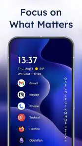
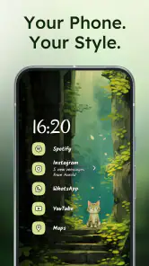
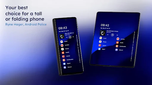
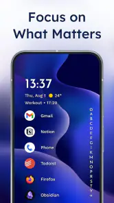
I like a launcher best when it gets out of the way without making everyday tasks harder. That is the appeal of Niagara Launcher: it replaces the familiar grid of icons with a quieter home screen built around a list of apps. The change is more than cosmetic. It asks you to find things by name and reach for a small set of favorites, rather than scanning rows of shortcuts. If your phone currently feels busy, that can make opening it feel calmer; if you enjoy arranging every inch of a home screen, the same restraint may feel limiting.
Who benefits from the list-first approach
I can see this fitting someone who mostly opens the same handful of apps, but occasionally needs to find something else quickly. Pinning frequent choices gives those apps a prominent place, while the alphabetical list provides a predictable route to the rest. One useful habit is to keep only genuinely daily apps at the top: pin too many and the short list starts to feel like the crowded grid you were trying to leave behind.
It also suits one-handed use. When I am carrying groceries or standing on a crowded train, a layout that does not make me hunt across several pages is more practical than a carefully decorated screen. For a realistic example, I might pin messaging, maps and music, then use the app list when I need a less frequent tool. That workflow favors quick access over visual browsing, so it is not ideal if you remember apps by their icons or prefer to group them into custom pages.
How it compares with familiar launchers
Most conventional Android launchers make the grid the center of the experience: users arrange icons, add widgets and move between pages. Niagara takes the opposite route, making the app list the main navigation surface and keeping the home screen visually spare. I find that distinction more important than any theme choice. It is a good alternative when a grid has become clutter, but a traditional launcher is likely better if your routine depends on multiple widgets, folders or a highly arranged layout.
The trade-off is that minimalism changes how you discover and revisit apps. A list can be quick once its logic becomes familiar, but it offers less visual context than a page where related icons sit together. Before switching, I would think about whether I navigate by app names or by where I placed an icon. That small preference can determine whether this feels refreshingly simple or like an extra adjustment every time you unlock your phone.
Useful boundaries to know before switching
The calmer screen may reduce visual clutter, but it cannot by itself stop every distraction: notifications still matter, and a simpler layout does not replace choices about which alerts deserve attention. I would treat the launcher as a way to make the first screen less demanding, not as a complete focus system. Likewise, notification dots help surface updates, but anyone who wants a screen full of glanceable information may prefer a widget-heavy setup.
If you are unsure, try using the list-first arrangement for ordinary tasks before spending time tuning its appearance. Notice whether you can reach your frequent apps comfortably and whether searching the list feels natural. If you keep wishing for several pages of icons, that is useful evidence that another launcher is a better match—not a sign that you have set this one up incorrectly.
A practical first-week test
I would make the first few days a small experiment rather than a full redesign project. Keep the apps you use on the move near the top, then pay attention to the moments when you instinctively expect a folder, widget or familiar icon position. Those moments show whether the new layout is reducing steps or merely asking you to learn a different route. A launcher should fit your routine, not turn every unlock into a test of patience.
One useful check is to notice what happens when you are in a hurry. If you can reach a frequent app without stopping to think, the list is doing its job. If you repeatedly search for the same app or miss a glanceable widget, that is a meaningful drawback, even if the screen looks tidier. I would not judge the setup by its first impression alone; the better measure is whether it stays convenient during an ordinary, busy day.
Hey there! Have you ever felt that your smartphone's home screen is just too cluttered and overwhelming? Well, I've got the perfect solution for you: the Niagara Launcher. This nifty app is designed to simplify your home screen experience, and honestly, it's quite a game-changer. Let me take you through what makes this app stand out.
Embrace Minimalism with Style
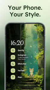
The first thing you'll notice about the Niagara Launcher is its minimalist design. Instead of overwhelming you with icons and widgets, it presents your apps in a neat and tidy list on the home screen. This approach not only makes it easier to find what you need but also gives your phone a sleek and modern look. I mean, who wouldn't want their phone to look like it belongs in the future, right?
Intuitive App Access
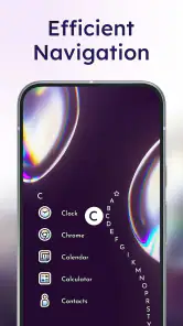
One of the coolest features of Niagara Launcher is its intuitive app access. Instead of scrolling endlessly through multiple pages, you can access your favorite apps with just a swipe. The app list is arranged alphabetically, and you can customize it by pinning your most-used apps at the top. It's like having a personal assistant who knows exactly what you need, when you need it.
Stay Focused with Less Distraction
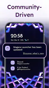
Another thing I absolutely love about Niagara Launcher is how it helps you stay focused. With fewer distractions on your screen, you're less likely to get sidetracked by notifications or flashy widgets. Plus, the launcher integrates seamlessly with notification dots, so you won't miss out on any important updates. It's like having a clean desk that helps you focus better on your tasks.
I would use those notification dots as a quick cue, not a reason to open every app that shows one. For example, on a workday I might check a message notification when I already have a reason to open messaging, but leave less urgent alerts for later. This makes the uncluttered layout more useful without pretending it controls notifications for me. If alerts are the main source of interruption, adjusting notification habits still matters more than changing launchers.
Customization at Its Best
Even though Niagara Launcher is all about simplicity, it doesn't skimp on customization options. You can tweak the app's appearance to suit your personal style, from changing the font size to selecting a theme color that matches your mood. This level of personalization ensures that your phone feels truly yours, and that's something I really appreciate.
Who it suits, and what to expect
For me, the strongest case for this design is a phone used in short bursts: check a message, open navigation, start music, then put it away. It is less compelling for someone who treats the home screen as a dashboard for calendars, weather and several live widgets. Niagara is a personalization app by Peter Huber, but its idea of personalization is deliberately narrower than a launcher built around endless placement options. I would choose it for a simpler routine, not because I expect it to reproduce every grid-based setup.
The practical question is whether the list remains comfortable as your app collection grows. Alphabetical order gives you a stable way to browse, while pinning helps with repeat tasks; keeping the pinned area selective is the key. If you rely on visual grouping—for example, a page of work tools beside a page of entertainment—this system asks you to change that habit. I would give the new navigation a fair trial, but switch back if locating apps by name becomes friction rather than a shortcut.
What the current release tells me
The app was released on January 30, 2021, and the current version is 1.15.2. Those facts show that Niagara has continued through multiple versions, but they do not establish a particular feature history, so I would not assume a specific recent redesign or change. Existing users can judge an update by checking whether their pinned choices, appearance settings and everyday navigation still suit them after installing it, rather than expecting every version to transform the experience.
It is free to install, with in-app purchases ranging from $0.99 to $42.99 per item. I would start with the free experience and only consider a purchase if a specific option matters to me; the price range alone does not tell you which extras you will personally value. The app is rated for Everyone and requires Android 5.0 or later, so it can suit a broad range of Android users whose devices meet that requirement. Its 4.7 average from around 160,000 ratings and more than 10 million installs suggest wide adoption, though popularity cannot tell you whether the list-based approach fits your habits.
Reading the trade-offs honestly
A minimalist launcher can make the first glance feel calmer, but it does not remove distractions from the phone itself. Notification dots can still draw your attention, and fewer icons do not automatically change how often you open social or entertainment apps. I see the design as a helpful nudge: it makes the home screen less visually busy, while the choices about alerts and app use remain yours.
Customization also has a boundary here. Font size and theme color let you shape the look, but the central experience remains a list rather than a canvas for arranging many widgets and pages. That consistency is a strength if you want fewer decisions; it is a limitation if personalizing means building a detailed dashboard. I would skip it if that dashboard is the part of your current launcher you enjoy most.
Keeping the setup useful over time
After switching, I would spend a few days noticing which apps I actually reach for, then pin only those. That is more useful than trying to make the home screen look perfect on the first evening. If the list feels unfamiliar, give yourself time to learn its rhythm; if you still miss visual folders and page-by-page browsing, return to a conventional launcher without treating the experiment as a failure.
It can also help to separate “often opened” from “important.” A tool you need once in a while may be important without earning a permanent place among your daily shortcuts. Keeping the pinned choices focused preserves the list’s quick-glance quality, while the alphabetical route remains available for everything else. I find that distinction especially useful for people whose work and personal apps compete for limited attention on the same phone.
Niagara has earned a 4.7 average across around 160,000 ratings and has been installed more than 10 million times, but I would treat those figures as context rather than a promise. The app is free to start, rated for Everyone, and developed by Peter Huber. For me, its best quality is the clear choice it makes: put frequent apps within easy reach and let the rest stay orderly. If that matches how you use your phone, it is worth trying; if you need a widget-rich, heavily arranged home screen, a more traditional launcher will probably serve you better.
Niagara Launcher ‧ Home Screen Frequently Asked Questions
Will Niagara Launcher work on an iPhone or iPad?
Niagara Launcher is an Android home screen app, so it is intended for Android phones rather than iPhones or iPads. If you are choosing a launcher for an Android device, its minimalist layout and one-hand-friendly approach may suit you. iOS users will need to use the home screen options available on their Apple device instead.
Who develops Niagara Launcher, and what kind of app is it?
Niagara Launcher is a personalization app developed by Peter Huber. It replaces the standard Android home screen with a minimalist layout designed to make everyday access to apps feel more focused and convenient. Its emphasis is on a clean, one-hand-friendly experience, so it is worth considering if you want a different way to reach your apps rather than a more traditional home screen.
Is Niagara Launcher compatible with my Android device?
Niagara Launcher is an Android home screen app and supports devices running Android 5.0 or later. If your phone meets that requirement, you can try replacing its usual home screen with Niagara’s minimalist layout. It is intended for everyday phone use, with a one-hand-friendly design that makes browsing your apps convenient on a smaller screen or while you are on the move.
Does Niagara Launcher include ads, and is it suitable for all ages?
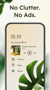
Niagara Launcher is described as having zero ads, so you can use its home screen without advertising interrupting the experience. It is rated for Everyone, making it suitable for a general audience. The app focuses on organizing access to your phone’s apps and notifications rather than providing entertainment content, which is useful to keep in mind when deciding whether its approach fits your needs.
What is Niagara Launcher and how does it differ from other launchers?
Niagara Launcher is a minimalist Android home screen app that offers a fresh take on the traditional launcher design. Unlike other launchers, it emphasizes simplicity and accessibility, providing a clean and uncluttered interface. Its unique vertical app list and ergonomic design make it easy to navigate using one hand. Additionally, it offers smooth animations and smart widget integration, setting it apart from more conventional launchers.
Pros
- Sleek and minimalistic design.
- Highly customizable interface.
- Efficient one-handed use.
- Smooth and fast performance.
- No ads in the free version.
Cons
- Limited widget support.
- No built-in app drawer.
- Paid features can be pricey.
- Limited gesture controls.
- Occasional minor bugs.

- Category
- Personalization
- Version
- 1.15.2