My Rush
- 111.00
- 4.2
- Installs
- 10.00K
- Price
- Free

Screenshots
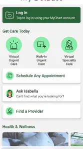
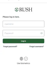
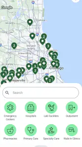
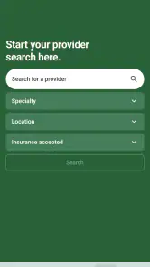
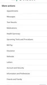
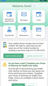
Analysis by Reviewed
I approached My Rush as a practical healthcare companion rather than an app I would open for entertainment. Developed by Rush University System for Health, it is designed around the everyday task of managing care, and that focus makes a big difference. The experience feels most useful when I already know what I need to do—check a healthcare detail, prepare for an appointment, or keep important tasks together—rather than when I am simply browsing for medical information.
That distinction is worth making at the start. A healthcare app is judged less by flashy presentation than by whether it reduces small points of friction at the right moment. My Rush has a clear reason to exist: it brings Rush-related healthcare management into a mobile setting. It is free, carries a Teen content rating, and is available for devices running iOS 11 or later. Its current version is 1.6.2, so users with older phones should check compatibility before planning around it.
How My Rush feels during everyday healthcare tasks
My first impression was that the app’s value depends heavily on context. If I were already receiving care through Rush, I would see a much stronger reason to keep it installed than someone who only wants general health advice. The app is not something I would treat as a replacement for a clinician, an urgent care service, or a broad medical reference. Its appeal is more focused: it helps put personal healthcare management closer at hand.
That focused approach also affects perceived speed. Screens that deal with personal healthcare information naturally need to do more than display a static article. Depending on the task, the app may need to load account-related information or connect with a healthcare service. I would therefore judge it by whether the transition is understandable and whether the app makes it obvious what is happening, not merely by how quickly the first screen appears.
In my experience with apps in this category, the best performance is not always the one with the shortest loading moment. It is the one that avoids making me repeat a task, search through unrelated menus, or wonder whether an action succeeded. My Rush is most convincing when it keeps the path from opening the app to handling a healthcare need direct and calm.
A realistic example would be preparing for a clinic visit while away from a computer. I might open the app to review the information connected with my care, confirm what I need before the appointment, and close it once the immediate task is finished. That is a more believable use than leaving the app open all day. The benefit comes from having a healthcare tool ready when needed, not from constant background activity.
What makes the app useful before an appointment
Before using a healthcare app, I like to decide what I am trying to accomplish. With My Rush, that could mean checking a detail related to an upcoming visit, organizing the questions I want to ask, or making sure I have the right information available before contacting a care team. Preparing first is a small habit, but it prevents the app from becoming another place where I wander without a clear goal.
One practical tip is to open it a little before the moment when the information becomes urgent. If I wait until I am standing outside a clinic, dealing with a weak connection or a nearly empty battery, even a stable app can feel inconvenient. A quick check earlier gives me time to notice whether I need to sign in again, update the application, or find an alternative way to access something important.
This is also where My Rush differs from a general search engine. A web search can quickly explain a symptom or point me toward broad medical information, but it does not organize my personal relationship with a healthcare provider in the same way. Conversely, a general medical reference may be better for learning about conditions, while My Rush is better suited to handling personal healthcare tasks connected with Rush.
Heavy-use moments and the limits of mobile convenience
The app’s heavier moments are likely to occur when I ask it to handle several healthcare tasks in one session rather than when I simply launch it. For example, I might move between appointment-related information, personal details, and communication-oriented tasks. That kind of session puts more pressure on navigation and network responsiveness than a quick glance at one screen.
I would not describe a healthcare app as resource-friendly merely because it opens quickly. A more useful test is whether it remains comfortable during a longer session. Does the interface stay responsive when I move between sections? Does it recover gracefully after a connection interruption? Does returning to the app preserve enough context that I do not have to start again? These are the details that shape trust more than a polished opening screen.
My Rush makes the most sense for short, purposeful sessions. I would use it to complete a specific healthcare task, then close it, rather than expecting it to function as a complete health diary or an always-on monitoring tool. That is not necessarily a weakness; it is an important boundary. Users who want extensive wellness tracking, exercise analysis, nutrition logging, or broad symptom research should look toward specialized apps instead.
There is another trade-off during busy periods. A single healthcare app can be convenient because it keeps related tasks in one place, but that also means the app becomes more important when I need several things at once. If one part of the experience is slow or temporarily unavailable, I may feel the inconvenience more strongly than I would with a simple information app. My advice is to keep essential appointment details accessible through the usual channels as well, especially when timing matters.
A useful workflow is to use the app for preparation and organization, while keeping direct clinical questions for a qualified professional. I can write down what I want to discuss, review the information available to me, and arrive better prepared. I should not use a delay in loading or a missing piece of information as a reason to postpone urgent care. That distinction is particularly important because a healthcare-management app is not the same thing as emergency support.
Stability, recovery, and confidence during use
Reliability matters more here than visual novelty. When I open My Rush, I want to feel that it is a dependable route to my healthcare information, not an experiment that may or may not remember where I was. The app has a modest but meaningful public response, with an average rating of 4.2 from around 234 ratings and over 111 written reviews. I read that as a generally positive signal, while still remembering that personal healthcare needs vary widely.
Stability is not limited to avoiding crashes. It includes predictable sign-in behavior, clear feedback after an action, and sensible recovery when the network changes. A user may move from home Wi-Fi to mobile data, lock the phone, receive a call, or leave the app idle before returning. In those situations, I value a clear message and a safe restart more than an interface that tries to hide every interruption.
My preferred recovery pattern is simple: if a session expires or a connection fails, the app should tell me what happened and guide me back without making me guess. I also avoid tapping repeatedly when a healthcare action appears delayed. Repeated taps can create uncertainty about whether I submitted something once or several times. Waiting for visible feedback is a small but sensible habit when handling personal care tasks.
For anyone concerned about dependability, I would recommend testing the app during a low-pressure moment. Open it at home, explore the areas relevant to your care, and learn how it behaves when you briefly switch away and return. This does not guarantee that every future session will be identical, but it gives me a better understanding of the workflow before I need it on a busy day.
Recovery is also about the device itself. If the phone is low on storage, running many demanding apps, or using an older operating system, the overall experience may feel less consistent even when the app is functioning normally. Keeping the operating system supported and leaving enough free space for routine updates is basic maintenance, but it can prevent avoidable frustration.
Device constraints and who should install it
My Rush supports iOS 11 and newer, which gives it a broad compatibility range for Apple users. Still, compatibility alone does not tell me how comfortable it will feel on every device. A newer phone may handle transitions more smoothly, while an older supported model can make any account-based app feel slower when several processes are active.
I would also consider screen size and accessibility needs. Healthcare information is easier to manage when text is comfortable to read and controls are easy to reach. If I rely on enlarged system text or other accessibility settings, I would test the app’s most important screens rather than assuming every layout will feel equally convenient. A healthcare tool should fit the way I use my phone, not force me to adjust my habits unnecessarily.
Storage and connectivity are practical concerns too. The app is free, so there is no purchase decision to make before trying it, but free does not mean frictionless. I still need a compatible device, a usable connection for account-related activity, and enough battery for the task. I would avoid uninstalling other essential healthcare tools until I had confirmed that My Rush covers the specific parts of my routine that matter to me.
The Teen rating is another reminder that this is a healthcare application intended for a wide audience, but parents and caregivers should still think about how personal medical information is handled on a shared device. I would use a device lock and avoid leaving sensitive screens visible in public. Those are sensible precautions for any personal healthcare app, regardless of how polished the interface may be.
The current version, 1.6.2, is important when troubleshooting. If the app behaves unexpectedly, I would first check whether the installed version matches the current release and whether the phone meets the minimum operating-system requirement. Then I would restart the app, verify the connection, and try again before assuming the problem is permanent. If the issue affects something time-sensitive, I would use the normal Rush contact route rather than relying on the app alone.
Where it beats ordinary alternatives—and where it does not
The strongest comparison is with the usual alternatives: a browser, phone calls, paper notes, and separate health apps. A browser is flexible and often faster for general research, but it can leave me sorting through unrelated results. Paper notes are reliable when a phone is unavailable, yet they do not provide the same connected access to healthcare management. Calling a clinic can be the right choice for a nuanced question, although it may take more time than handling a straightforward task digitally.
My Rush is a better fit when I want a Rush-centered mobile option and already have a reason to manage care through that system. It is less compelling for someone outside that care environment or for a person looking for a universal medical assistant. I would not install it simply because I want medication reminders, fitness goals, or symptom explanations; those needs belong to different categories of tools.
One non-obvious advantage of a focused healthcare app is reduced decision fatigue. Instead of deciding which general service to trust each time, I can return to the same Rush-oriented place for relevant tasks. The trade-off is that the app’s usefulness is tied to that healthcare relationship. A specialized tool can be more relevant than a general one, but it is not automatically more useful for every person.
Another useful distinction is between preparation and diagnosis. I can use My Rush to make a visit more organized, but I should not interpret a convenient digital workflow as medical judgment. If a symptom is severe or urgent, the better option is immediate professional help. If I need general education, a reputable medical reference may explain the topic more fully. If I need personal care management connected with Rush, this app is the more natural starting point.
My performance verdict after weighing the trade-offs
My Rush earns its place as a focused medical app because it addresses a concrete problem: keeping healthcare management closer to the phone I already carry. I like it most for planned, purposeful use, especially before appointments or when I need to organize a care-related task without reaching for a desktop browser. Its free availability makes trying it straightforward, provided I use a supported Apple device and have a connection when needed.
My overall performance verdict is measured rather than enthusiastic. I would expect the app to feel responsive enough for ordinary healthcare sessions, but I would not judge it like a game or a social feed where instant transitions are the entire experience. The meaningful questions are whether it remains understandable under pressure, whether it recovers cleanly from interruptions, and whether it saves me time compared with calling or searching manually.
I would recommend it to Rush patients who want a dedicated mobile route to healthcare management and are willing to spend a few minutes learning the workflow before an important appointment. I would skip it if I need a general medical encyclopedia, a detailed fitness platform, or a substitute for urgent clinical advice. In those cases, another specialized option—or direct contact with a healthcare professional—would be more appropriate.
After using it, my practical advice is to install it before you need it, confirm that your device meets the requirement, explore the sections relevant to your care, and keep a backup plan for urgent information. That preparation turns the app from a last-minute gamble into a useful part of a healthcare routine. The best reason to choose My Rush is not that it tries to do everything, but that it can make Rush-related care easier to reach when a focused mobile tool is exactly what you need.
Pros
- Fast
- simple controls make it easy to start playing immediately.
- Short races fit well into quick gaming sessions.
- Bright visuals make the tracks easy to follow on small screens.
- Unlockable content gives regular players a reason to keep racing.
- Offline play is useful when you have no internet connection.
Cons
- Gameplay can feel repetitive after extended play sessions.
- Progress may become slower without optional in-app purchases.
- Limited customization reduces the sense of vehicle ownership.
- Some tracks offer little challenge for experienced players.
- Ads may interrupt the experience between races.

- Category
- Medical
- Version
- 1.6.2