My HomeScreen
- 15.00
- 3.8
- Installs
- 10.00K
- Price
- Free

Screenshots




Analysis by Reviewed
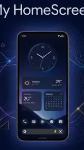
My HomeScreen is a personalization app from Tiki Media LTD that takes a different approach to the Android home screen. Instead of treating the first screen as a simple grid of icons, it brings together a launcher, built-in tools, and a live news feed. I found that this central idea matters more than any individual visual change: the app tries to make the home screen a place where I can begin several small tasks without opening a collection of separate apps.
That sounds convenient, but it also changes the rhythm of using a phone. A conventional launcher is quiet and predictable. My HomeScreen is more active because information is placed beside the apps and tools I use. For someone who wants a more useful starting point, that can feel refreshing. For someone who prefers a completely empty, distraction-free screen, the same design may feel busy.
The app is free and aimed at Everyone, which makes it easy to try without turning the decision into a purchase. It runs on Android versions starting with 8.0, so it is not limited to only recent phones. Its current version is 2.0.4, and its store presence shows over ten thousand installs, with a 3.8 average from 44 ratings and 15 written reviews. Those figures suggest a small but established audience rather than a mainstream replacement used by almost every Android owner.
A home screen built around one useful starting point
The live feed is the feature that changes the experience
The most important capability here is the combination of the launcher and live news feed. A normal launcher helps me reach apps; this one also puts current information in the same starting area. That means the first screen is no longer only a doorway to another app. It becomes a quick check-in point for what I want to do and what I want to read.
In practical terms, the benefit is about reducing small interruptions. If I pick up my phone to see what is happening, I can look at the feed without first opening a news application. If I want to continue to another task, the launcher remains available as the same base. That makes the app most interesting for people who regularly alternate between checking information and launching everyday tools.
I would not describe this as a complete replacement for a dedicated news reader. A focused news app is usually better when I want deep reading, saved stories, detailed topic controls, or a long session with one publication. My HomeScreen is more suitable for brief awareness: seeing what is current, deciding whether something deserves attention, and then moving on.
That distinction is important because the live feed can either save time or invite more screen time. The feature is useful when I use it as a short glance. It becomes less helpful if every unlock turns into an unplanned scroll. My advice is to treat the feed as a starting signal rather than the main reason to stay on the phone.
Built-in tools make the first screen more functional
The other part of the concept is the collection of built-in tools. Their value is not simply that they exist; it is that they are placed alongside the launcher and feed instead of being hidden behind several app openings. This creates a more compact workflow for quick actions, especially when I am already on the home screen and do not want to search through folders.
I found this approach more useful for short, repeated actions than for complex work. A home screen should help me begin something quickly, not replace every specialist app on the device. My HomeScreen works best when the built-in tools handle the little moments between larger tasks. I can start with the launcher, check the feed, use a tool, and then return to the rest of the phone without changing the overall context.
There is also a trade-off in putting more functions on one screen. Every additional element competes for attention with the apps I deliberately placed there. If I already have a carefully arranged Android home screen, moving to this style requires accepting that the screen is now designed around the app’s broader workflow rather than only my existing icon layout.
What changes compared with an ordinary launcher
Traditional launchers generally focus on appearance, speed, folders, widgets, and access to installed applications. My HomeScreen has a more editorial and utility-driven personality because the live feed is part of the starting experience. That makes it feel less like a blank canvas and more like a dashboard.
Compared with a dedicated news app, it is quicker for casual checking but less focused for research. Compared with a standard launcher, it offers more information immediately but potentially less visual calm. Compared with a widget-heavy setup, it can reduce the need to assemble several separate pieces, although I give up some control over choosing every individual component.
That comparison helped me understand where the app fits. It is not mainly for people who enjoy spending an hour perfecting icon packs and spacing. It is for people who want the first screen to do more without manually building a dashboard from multiple widgets and applications.
How I used it during an ordinary day
The morning glance
A realistic use case is the first phone check of the morning. I may want to see what is happening, open a familiar app, and handle one quick task before getting on with the day. With a conventional setup, that usually means unlocking, opening a news app, returning home, and then finding another app. The combined design of My HomeScreen shortens that sequence because the information layer and the launcher live in the same starting environment.
The advantage is not dramatic in a single interaction. It appears through repetition. When the same small transition happens several times each day, having one consistent starting point feels less tiring. I especially appreciated this when I wanted awareness rather than a full reading session. I could make a quick decision about whether the feed contained anything worth opening, instead of automatically committing to a separate app.
My practical tip is to decide in advance what a “quick check” means. I would look at the feed, choose one item only if it genuinely matters, and then return to the launcher. Without that boundary, the feature can turn a short home-screen visit into a longer browsing habit. The app makes information easy to reach; it cannot decide whether I should consume it at that moment.
Moving from information to action
The strongest workflow is the transition from reading to doing. I might notice a topic, use one of the built-in tools for a small follow-up, and then open another application from the launcher. This is where the app feels more coherent than a collection of unrelated widgets. The pieces are presented as parts of one starting point rather than as separate objects that I have to arrange and remember.
That workflow is particularly suitable for a phone used as a practical daily device rather than as a heavily customized visual project. I do not need to make the home screen beautiful before it becomes useful. The app’s identity comes from the way it combines information and access, not from asking me to create a complicated layout.
A second useful tip is to keep the first screen focused on the actions I perform most often. The temptation with a feature-rich launcher is to expose everything immediately. I think the experience is cleaner when the home screen remains a launch point, while less frequent apps stay in the usual places. The live feed already adds visual activity, so adding unnecessary shortcuts can make the screen harder to scan.
Returning to ordinary app use
My HomeScreen does not need to control every part of the phone to be useful. Its role ends when I open the application I actually need. That makes it a layer over everyday Android use rather than a replacement for the entire operating system.
This is a strength for people who want a different entry point without abandoning familiar apps. It is also a limitation for anyone expecting a complete productivity environment. The app helps organize the beginning of a task; it does not turn a phone into a full desktop-style workspace. I would judge it by how much friction it removes before an action, not by whether it can replace specialist software.
Where the app earns its place and where it creates friction
The best scenario: a phone used for quick awareness
The clearest match is someone who unlocks a phone frequently for short checks. If I want a current snapshot, access to common tools, and a familiar launch point in one place, the design makes sense. It is also a reasonable fit for a person who has never enjoyed building a home screen from separate widgets and wants something more purposeful than a plain icon grid.
Another good scenario is a secondary or shared-purpose phone where convenience matters more than elaborate customization. The free price removes an obvious barrier to trying it, and the Everyone age classification keeps the app approachable for a broad audience. I would still take a few minutes to see whether the feed and layout fit my habits before making it the permanent home screen.
The app may also suit people who often ask themselves, “What do I need to know before I open anything else?” That is the question its design answers. It is less compelling for someone whose first action is always opening one specific application and who wants the fastest possible route there with no additional content around it.
The main trade-off is control versus convenience
The central trade-off is straightforward: the more the app assembles for me, the less the home screen feels like a completely personal blank canvas. A conventional launcher lets me decide exactly what appears and often encourages detailed visual customization. My HomeScreen prioritizes an integrated experience, so its appeal depends on whether I value immediate usefulness more than total control.
This matters for users who are sensitive to distraction. A live feed is not neutral decoration; it gives the screen something new to inspect. Even when the content is relevant, it can pull attention away from the task that caused me to unlock the phone. If I am trying to keep my phone quiet and intentional, a simpler launcher may be the better choice.
There is a similar issue for people who depend on a particular launcher setup. Anyone with carefully arranged folders, widgets, gestures, or a visual theme should expect some adjustment when moving to a different home-screen system. The app’s value is not that it perfectly preserves every existing habit. Its value is that it offers a different starting structure.
Questions I would ask before installing
One obvious question is whether it costs anything to try. My HomeScreen is free, so the initial experiment is low risk. I would install it when I have enough time to use the home screen naturally for a day rather than judging it after one glance. The important test is whether the combined feed and tools save steps or simply add another layer to ignore.
Another question is device compatibility. The app supports Android 8.0 and newer, which covers a wide range of phones, including devices that are not running the latest Android release. That does not guarantee that every phone will feel identical, but it does make the app relevant to people who have kept an older device and still want to try a modernized starting screen.
Some readers will wonder whether it is suitable for children or a family device. Its Everyone content rating makes it broadly accessible, but I would still make the decision based on the intended use. A live information feed may be convenient for an adult’s quick checks, while a simpler, more controlled home screen could be preferable for a child’s device.
People may also ask whether it replaces a news app. In my view, it replaces the need for a separate first glance, not the need for deeper reading. If I want a focused news workflow, I would keep a dedicated reader available. If I only want current information to be visible while I decide what to do next, the integrated feed is the more convenient arrangement.
Who gets the most from My HomeScreen
A strong fit for practical, glance-based users
I would recommend My HomeScreen to someone who wants the phone’s first screen to answer two needs at once: “What is happening?” and “Where do I go next?” The combination of a live feed, built-in tools, and launcher access is specific enough to make the app feel purposeful. It is not merely a cosmetic replacement for the default screen.
It is also a good option for users who do not want to spend time comparing widgets or configuring a complex launcher. The app gives the home screen a clear role from the beginning. My advice is to keep the setup restrained, use the built-in tools for genuinely repeated actions, and avoid treating every available element as something that must remain visible.
Who should choose a different option
I would skip it if my priority were absolute minimalism, deep visual customization, or a home screen that never changes. A lightweight conventional launcher is likely better for that kind of user. I would also choose a dedicated news application when reading, organizing, or following information in depth is the main goal.
Likewise, users who already have a carefully tuned launcher workflow should compare the benefit of an integrated feed with the disruption of changing their habits. The app is most valuable when the existing setup feels fragmented or too passive. If the current launcher already gives me a fast, calm, and satisfying starting point, My HomeScreen may offer novelty without enough practical improvement.
My final take
My HomeScreen is an interesting personalization app because it focuses on what happens immediately after unlocking rather than only on how the phone looks. The live news feed is the defining capability, and the built-in tools make that feed part of a broader starting workflow instead of an isolated information panel.
In my experience, the app makes the most sense as a quick-awareness dashboard. It can reduce the number of small jumps between checking information and opening an app, especially during repeated everyday moments. Its weakness is the same feature viewed from another angle: a more active home screen can compete with concentration and offers less appeal to people who want a completely controlled, quiet layout.
With a free price, support beginning at Android 8.0, and a current version of 2.0.4, it is easy to test on a compatible device. I would recommend trying it for practical reasons rather than expecting a dramatic visual makeover. If you want your home screen to help you decide what to do next, rather than merely display your icons, My HomeScreen is worth a careful trial.
Pros
- Simple layout makes essential apps easy to find quickly.
- Supports personal customization for a more individual home screen.
- Can help reduce clutter compared with many standard launchers.
- Lightweight design may work well on older Android devices.
- Useful for users who prefer a focused
- straightforward interface.
Cons
- Customization options may feel limited for advanced launcher users.
- Some features could require permissions that raise privacy concerns.
- May not offer as many widgets as full-featured Android launchers.
- Compatibility and performance can vary across different devices.
- Users may need time to adjust to its alternative navigation style.

- Category
- Personalization
- Version
- 2.0.4