Live Wallpapers - VibeWalls
- 384.00
- 4.8
- Installs
- 100.00K
- Price
- Free

Screenshots
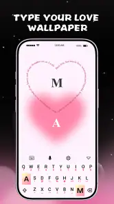
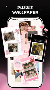
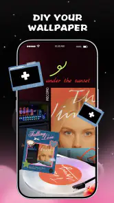
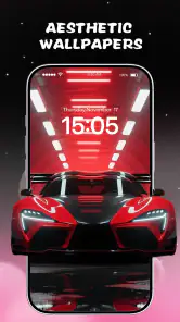
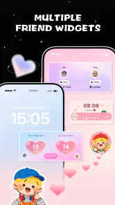
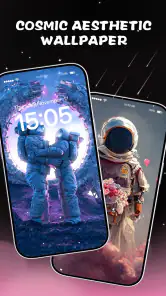
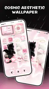
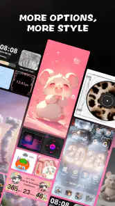
Analysis by Reviewed
I spent time with Live Wallpapers - VibeWalls as a personalization app, focusing not only on how attractive the screen can look, but also on how comfortably different people can browse, choose, and live with animated backgrounds. Its appeal is easy to understand: instead of treating a phone wallpaper as a fixed picture, it turns the background into a moving part of the device’s personality. The app brings together live wallpapers, 4D-style effects, animated themes, and widgets in one place, so the experience feels broader than simply picking an image from the gallery.
My overall impression is positive, especially for someone who enjoys changing the visual mood of a phone without spending time building a theme manually. At the same time, motion is not automatically helpful for everyone. A moving background can add energy for one person and become distracting, uncomfortable, or visually tiring for another. That makes the real question less about whether the effects look impressive and more about whether the app lets you make choices that fit your eyes, attention, habits, and phone use.
How the app feels to browse and understand
The first thing I noticed is that VibeWalls is designed around visual discovery. That is a sensible approach for a wallpaper app because the preview matters more than a long written explanation. I could judge the atmosphere of a background quickly, which is useful when I want something calm, futuristic, colorful, or more dramatic. The combination of wallpapers, themes, and widgets also makes the catalog feel like a place to shape a whole screen rather than select one isolated image.
For readability, the important test is whether the moving preview competes with the labels and controls around it. A busy animation can make text harder to follow, particularly when several bright colors, particles, or depth effects are visible at once. I found it more comfortable to slow down and inspect one option at a time instead of rapidly scrolling through previews. That is a practical habit for anyone who experiences visual overload or simply wants to make a careful choice.
The app is free to download, which lowers the barrier to trying it. Some items are supported by in-app purchases ranging from forty-nine cents to thirty-nine dollars and ninety-nine cents per item, so I would not assume that every attractive preview is included without charge. I recommend exploring the free choices first and deciding whether the visual style is genuinely useful before considering optional purchases. This is particularly important for users who depend on clear spending boundaries or who find busy catalogs difficult to navigate.
The developer is Hong Kong Mishi Technology Co., Limited, and the app is listed in the personalization category. It has an average rating of 4.8 from around 2.3 thousand ratings, with more than 100 thousand installs. Those figures suggest that the concept has found an audience, but they do not tell me whether the visual experience will suit a particular person. A high rating cannot replace checking how motion, contrast, and screen density feel on your own phone.
I also appreciate that the app’s purpose is immediately understandable. The short store label, “VibeWalls,” communicates the mood-focused idea without requiring technical knowledge. That simplicity helps users who do not want to learn a complicated design tool. On the other hand, a simple concept can still become visually crowded once live backgrounds, 4D effects, themes, and animated widgets are all presented together. I would treat the catalog as something to explore slowly, not as a screen to rush through.
More From Our News Desk

Clash of Clans Is Won Between the Battles

Android Auto Makes the Case for Quieter Car Software

MobiOffice: Transforming Mobile Productivity with Seamless Integration

EA SPORTS FC™ Mobile Soccer: Redefining Mobile Sports Gaming

How Microsoft OneDrive Became a Mobile Productivity Giant

How Google Translate Breaks Language Barriers Effortlessly
Readability depends on the wallpaper, not only the interface
A wallpaper can look excellent in a preview and still reduce the clarity of icons on the home screen. This is one of the most important trade-offs I found. A dark, relatively quiet background can help app labels stand out, while a bright animation behind the same icons may make them harder to distinguish. The effect is especially noticeable when the wallpaper contains movement near the top or center of the screen, where notification icons and frequently used shortcuts often appear.
My practical advice is to judge a wallpaper with your real home-screen layout, not only with the app’s sample preview. After applying an option, look at the icons you use most often, read a few labels, and open a normal app. If the background makes you pause to identify an icon, the design is too demanding for everyday use, even if it looks beautiful in isolation. This is a useful workflow for people with reduced contrast sensitivity, reading difficulties, or attention-related challenges.
Animated widgets create another layer of visual information. They can make a home screen feel more expressive, but they may also compete with static widgets, notification badges, and text. I would keep the most active element away from the area where I need to read regularly. For example, if a person relies on a calendar or medication reminder widget, a calmer wallpaper is likely a better companion than a highly animated theme directly behind it.
There is also a difference between a wallpaper that is easy to understand and one that is easy to live with. A short preview may feel exciting, but repeated motion across many hours can become tiring. I found it helpful to ask whether I still liked the effect after using the phone for ordinary tasks rather than admiring it for a few seconds. That change in perspective is especially valuable for users who are sensitive to flicker, constant movement, or visual clutter.
Motor comfort and the effort of making a choice
Choosing a wallpaper is usually a low-effort task, but the browsing process can still matter for people with limited dexterity, tremors, joint pain, or fatigue. A catalog encourages repeated scrolling, tapping, previewing, and returning to earlier choices. That may be perfectly comfortable for a quick session and less comfortable when someone wants to compare many options. I would avoid treating the app as a task that needs to be completed in one sitting.
A better approach is to decide on a visual direction first. I might choose a quiet color family, a nature-inspired mood, or a simple depth effect, then stop once I find an option that works with my icons. This reduces unnecessary swiping and makes the experience more manageable. It also helps users who find open-ended visual catalogs tiring because there are too many similar choices.
For people who use a phone one-handed, the placement of controls and the size of touch targets can make a difference, but the experience will depend on the device and system layout. I would test the app while holding the phone in the way I normally do rather than assuming that a comfortable preview session will translate to daily use. If applying a theme requires repeated reaching, rotating the phone, or precise taps, taking breaks is sensible.
The app’s greatest motor advantage is that it focuses on a simple end result: a more personal screen. It does not require me to create artwork from scratch or coordinate separate editing tools. That can be a real benefit for someone who wants customization without a long sequence of design decisions. The trade-off is that a ready-made catalog gives me less control over every detail than a dedicated wallpaper editor would.
I would choose a conventional still-image gallery instead if my priority were complete control over cropping, placement, and exact visual simplicity. VibeWalls is stronger when I want an effect with minimal effort. A static image is also easier to reuse across different devices and tends to involve less browsing once I have selected it. The animated approach is more expressive, but it asks me to think about motion and screen comfort in a way a normal photo does not.
Different sensory needs call for different visual choices
Motion is the defining feature here, and it should be treated as an option rather than an automatic improvement. Some users will enjoy the sense of depth and activity created by live or 4D-style backgrounds. Others may find movement distracting while reading, navigating, or trying to concentrate. If I were setting up the app for someone who is sensitive to animation, I would start with the least visually intense choices and avoid placing several animated elements together.
Color is just as important as motion. A vivid background may be attractive but can make small labels less comfortable to read. A design with clear separation between the background and icons is usually more practical than one filled with similar tones. I would also avoid judging a wallpaper only in a dark room or only at maximum brightness. A screen that looks balanced in one lighting condition may feel harsh outdoors or too low-contrast at night.
People with hearing differences are not excluded from the main wallpaper experience because the value is primarily visual. Still, visual movement should not be treated as a substitute for every kind of feedback a person may need from a phone. The app changes the appearance of the screen; it does not replace the device’s own notification, text, or communication settings. That distinction matters for anyone hoping a decorative theme will also solve a broader access need.
For users with cognitive or attention-related needs, consistency can be more helpful than novelty. Changing the wallpaper constantly may make the phone feel fresh, but it can also make the home screen less predictable. I would select one calm theme and keep it for a while if the phone is used for work, study, navigation, or reminders. The ability to personalize is useful, but personalization works best when it supports the way I already use the device instead of competing with it.
One non-obvious advantage is that a wallpaper can act as a visual context cue. I could use a calmer appearance during a period when I need concentration and a more energetic one when I want entertainment or social use. This is not a formal focus system, and I would not depend on it for critical reminders, but it can provide a small environmental signal. The key is to choose backgrounds that are distinct without making the screen harder to read.
Using VibeWalls in real situations
Consider an ordinary commute. I might check the phone in bright daylight, glance at a message while walking, and later use the same screen indoors. A highly detailed animated wallpaper that looked impressive at home could become difficult to read outdoors because reflections and changing light already reduce clarity. In that situation, I would favor a darker or simpler design and keep the most animated options for a device used mainly indoors.
At work or school, the best choice may be the least noticeable one. A moving background can draw the eye every time I unlock the phone, which is not ideal during reading or meetings. A subtle theme may preserve the personalization benefit without turning the screen into a repeated distraction. If I use animated widgets, I would place only the information I genuinely check often and avoid filling the screen with decorative motion.
For a child or another user who enjoys colorful screens, the Everyone age rating makes the app broadly approachable. I would still help them choose backgrounds that keep icons visible and set clear expectations around optional purchases. The free entry point is useful for trying the experience together, while the range of possible in-app purchase prices means a quick conversation about spending is worthwhile.
For an older adult who wants a more personal phone, I would not begin with the most complex 4D effect. I would first set up a quiet background, check label visibility, and make sure the screen remains easy to recognize. The app can add personality without requiring a complicated design process, but the visual result should be judged by everyday legibility rather than by novelty.
Another useful workflow is to separate experimentation from permanent setup. I can browse and preview when I have time, then apply one option and use the phone normally for a day. During that period, I would notice whether icons remain easy to locate, whether the movement becomes tiring, and whether the phone feels slower to use simply because the screen is visually busier. This trial-based approach is more reliable than deciding immediately after a short preview.
Where the experience still has limits
The biggest limitation is that visual personalization can introduce the very problems it is meant to avoid. A crowded animation may reduce readability, create distraction, or make the home screen feel less stable. The app is therefore not the right choice for someone who wants a completely still, low-stimulation interface. In that case, the phone’s standard wallpaper picker or a carefully selected static image would be a better fit.
I also would not choose it as my main tool if I needed precise accessibility customization. A dedicated launcher, system-level display settings, or a simple high-contrast wallpaper may offer more direct control over text visibility and layout. VibeWalls can change the visual atmosphere, but it should complement those tools rather than replace them.
Cost is another point to consider. Free access makes experimentation easy, yet optional purchases can become significant at the upper end of the listed range. I would avoid buying several similar themes simply because the catalog makes each one look appealing. Decide what problem the purchase solves: better icon contrast, a preferred mood, a particular widget style, or simply a short-term novelty. If the answer is only “it is different,” keeping the free option may be wiser.
There is also a practical trade-off between visual richness and battery-conscious habits. I cannot treat every animated background as equally demanding, and the effect will vary by device and settings. Anyone who is careful about battery life should observe the phone after applying a live wallpaper instead of assuming that a preview tells the whole story. If the device already struggles during a normal day, a static alternative is the safer recommendation.
The current version is 1.0.75 and the app supports Android 7.0 or later. That gives it a broad Android reach, but the experience can still differ between older and newer hardware. On an older phone, I would be especially cautious with layered animation and animated widgets. On a newer device, the same design may feel smoother, but smoothness does not automatically solve the issues of distraction or reduced text clarity.
Because the app is specifically about visual effects, users who need strong predictability should approach it selectively. I would skip it if motion causes discomfort, if I need the home screen to remain visually quiet, or if I am looking for a tool centered on accessibility settings rather than decoration. Those are not failures of the app; they are situations where its main strength is simply not the right priority.
My inclusive verdict after living with the moving backgrounds
I see VibeWalls as a friendly way to make an Android phone feel less ordinary, especially for people who want live backgrounds, depth effects, themes, and widgets without designing everything themselves. Its free starting point makes it easy to test, and the broad Everyone rating means it can suit a wide range of users. The strong average rating and growing install base also indicate that many people enjoy the basic idea.
What I value most is the freedom to treat personalization as a matter of comfort, not just appearance. The best result is not necessarily the most colorful or active wallpaper. For me, it is the option that keeps icons recognizable, does not interfere with reading, and still adds a little character. That may mean choosing a restrained theme, limiting animated elements, or returning to a static background after experimenting.
If you are sensitive to motion, easily distracted, or dependent on very clear text and icons, begin cautiously. Test one background in your normal lighting, use the phone for ordinary tasks, and check whether the effect remains comfortable after the initial excitement fades. If it does not, a standard wallpaper or a more accessibility-focused setup will serve you better.
If you enjoy visual change and want your home screen to feel more expressive, I think this app is worth trying. I would recommend it as a flexible personalization layer rather than as a complete solution for every kind of screen access. The most inclusive choice is the one that makes the phone feel personal without making it harder to see, understand, or control. With that mindset, VibeWalls can be enjoyable and practical, provided I choose motion deliberately instead of assuming that more animation always means a better experience.
Live Wallpapers - VibeWalls Frequently Asked Questions
What does Live Wallpapers - VibeWalls offer besides animated wallpapers?
VibeWalls is a personalization app whose store summary describes live wallpapers, 4D wallpapers, live themes, and animated widgets. That range gives you several ways to change your phone’s look, rather than focusing only on a still background. Before downloading, consider whether you want to customize one part of your screen or try a more coordinated visual style across wallpapers, themes, and widgets.
Who develops Live Wallpapers - VibeWalls, and what should I check before installing it?
Live Wallpapers - VibeWalls is developed by Hong Kong Mishi Technology Co., Limited. Its content rating is Everyone, and the app is free to download, with optional in-app purchases. Checking the developer name, content rating, and purchase details in the relevant app store is a sensible way to make sure you have the intended app and understand its basic terms before installing.
What is Live Wallpapers - VibeWalls?
Live Wallpapers - VibeWalls is a personalization app designed to replace a standard static background with animated, dynamic wallpaper content. It offers a selection of moving visuals intended to make your home screen or lock screen feel more distinctive. Depending on the device and available options, users may be able to browse categories, preview wallpapers, and apply their preferred design directly from the app.
Does Live Wallpapers - VibeWalls work on both Android and iPhone?
Compatibility depends on the version of the app and the operating system installed on your device. Android generally provides broader support for animated home-screen wallpapers, while iOS may limit how live wallpapers behave because of Apple’s system restrictions. Before downloading, check the app-store listing, supported iOS or Android versions, and whether your specific phone model supports the intended live-wallpaper features.
Will VibeWalls drain my battery or use a lot of storage?
Animated wallpapers can consume more battery than ordinary still images, especially when they use continuous motion, bright colors, high resolution, or interactive effects. The impact varies according to your phone, screen refresh rate, and how often the wallpaper is displayed. Downloaded videos or high-quality backgrounds may also require extra storage, so users with limited battery life or space should monitor both after installation.
Pros
- Large collection of animated wallpapers with multiple visual styles.
- Smooth motion effects add personality to your home and lock screens.
- Preview wallpapers before applying them to avoid unwanted downloads.
- Simple browsing makes it easy to discover new backgrounds quickly.
- Supports customization options for creating a more personal screen look.
Cons
- Animated wallpapers may consume more battery than static backgrounds.
- Some devices may show reduced performance with complex live effects.
- The best wallpaper selection may require in-app purchases or subscriptions.
- High-resolution wallpapers can use considerable mobile data when downloaded.
- Compatibility and available features may vary between Android and iOS devices.
- Category
- Personalization
- Version
- 1.0.75











