iControl: Easy Widgets Themes
- 959.00
- 4.7
- Installs
- 10.00M
- Price
- Free
Screenshots
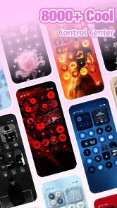
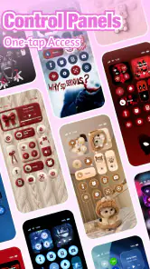
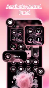
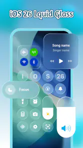
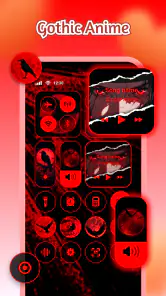

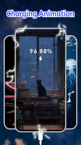
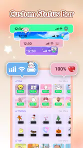
Analysis by Reviewed
I judge a personalization app by what it changes day to day, not just by how attractive its previews look. iControl: Easy Widgets Themes brings together control-panel styling, widgets, and fonts, so its appeal is the chance to give several visible parts of a phone a more coordinated look. That can make a familiar screen feel more personal, but it also raises a practical question: does the customization remain easy to read and use? My view is that this app is best approached as a visual-tuning tool, with a little care about clarity and the way a chosen style works in real situations.
Readability and navigation: style should serve the screen
The app sits in the personalization category, but its mix of control-panel themes, widgets, and fonts makes it more focused than a simple wallpaper picker. Those elements affect places people glance at repeatedly: the panel used for quick controls, the home screen, and the text that gives a phone its visual character. A consistent theme can make a device feel considered rather than assembled from unrelated pieces.
That same combination makes restraint useful. A decorative font can look appealing in a preview and still be tiring when used for everyday reading. Likewise, a widget that looks polished may be less helpful if its lettering blends into its background. I would choose a theme by checking whether labels and key information remain easy to distinguish, not just by asking whether the colors match.
One practical way to make that choice is to start with the part of the phone you use most. If you check a widget repeatedly, make its clarity the deciding factor; if you mainly want a visual refresh, start with the control-panel appearance or a font and leave the rest familiar. Changing one element at a time also makes it easier to notice what actually improves the experience instead of losing track of which change made the screen harder to scan.
This matters particularly for people who already find small text or busy layouts demanding. A style app can offer visual variety, but variety is not the same as improved readability. I would treat a theme as a personal preference, then judge it at the size and viewing conditions in which I actually use the phone. If a font makes messages or settings harder to read, it is not a worthwhile trade, however cohesive the overall look may be.
Motor comfort and sensory preferences
Customization can support comfort in indirect ways. Some people prefer a calmer visual arrangement, while others enjoy stronger contrast or a more distinctive type style. With a tool that touches widgets, fonts, and a control panel, there is room to consider more than one part of the interface. But I would not assume that a particular theme is designed for a specific visual, motor, or sensory need. The useful test is personal: does the result make your own routine feel easier, or does it add visual noise?
For motor comfort, fewer unnecessary decisions can make a setup less demanding. I would browse with a goal—such as refreshing the home-screen widgets—rather than trying to redesign the entire phone in one sitting. Once a combination feels comfortable, keeping it stable can be more useful than repeatedly switching styles. That is a practical workflow, not a feature claim: it helps avoid turning personalization into a constant task.
For sensory preferences, the main trade-off is between expression and stimulation. A striking font or coordinated set of visual changes may be enjoyable, but several bold elements together can compete for attention. I would try a restrained combination first, then add another change only if it still feels comfortable. Anyone who relies on a familiar, low-distraction screen may prefer to leave the typography alone and make a smaller visual adjustment instead.
I also would not use a themed appearance as a substitute for phone-level settings that someone depends on for accessibility. A personalization layer is there to change presentation; it should not be presumed to provide the same support as operating-system options chosen for vision, touch, or reading needs. If a device already has settings that make it easier to use, I would check that a new look remains compatible with the person’s established routine before committing to it.
Situational access: where a theme meets real life
A realistic use case is checking a widget while walking between appointments or glancing at a phone in a bright room. In those moments, a pretty layout is secondary to information that can be found quickly. I would test a chosen widget in the places I actually use the phone, rather than judging it only in a comfortable browsing session. If its text is difficult to pick out at a glance, a simpler design—or the usual default—may be the better choice.
Another situation is sharing a device or helping a family member personalize theirs. A style that makes sense to the person who selected it may not be as clear to someone else who occasionally uses the phone. In that case, I would prioritize familiar visual cues and legible text over a highly individual redesign. The person who uses the device most should have the final say, especially if a theme changes what they depend on seeing quickly.
For work or study, it can help to separate experimentation from the layout used for important tasks. I would try new styles when there is time to assess them, then keep a dependable arrangement for periods when I need to find controls or read information without thinking about the design. This is a small but useful distinction: a personalization app can be fun to explore without every experiment needing to become the permanent setup.
Compared with the usual alternatives, such as changing a wallpaper or adjusting a single widget, this app’s defining appeal is its broader combination of visual elements. That makes it more convenient for someone seeking a coordinated change, but also means there are more opportunities for a style choice to affect everyday legibility. If you only want a new background, a simpler option may be enough. If you want to bring widgets, fonts, and the control-panel look into the same visual direction, iControl is the more relevant kind of tool.
What to expect before making it part of your setup
The app is free to install, with in-app purchases listed from $0.99 to $20.99 per item. I would explore the available experience with a clear idea of what I want to change before deciding whether any paid item is worth considering. The existence of purchases does not tell me that a particular style is essential, so I would not treat spending as a prerequisite for a better-looking or more usable phone.
It has a 4.7 average from around 111,000 ratings and more than 10 million installs, which suggests that a large audience has found the concept appealing. Those figures are useful context, but they do not tell you whether a particular font or theme will suit your eyesight, taste, or phone habits. I would still make the decision based on the actual result on your own screen.
The app is made by Fancy keyboard for theme apps, is rated Teen, and its current version is 1.7.9.0915. It was released on May 23, 2025, and is listed for devices running Android 8.0 or later. Those details help establish whether it fits your device and household expectations; they do not replace checking how the chosen presentation feels in daily use.
One small but valuable habit is to take note of what you changed before trying a new combination. If a widget becomes harder to read or the overall screen feels too busy, knowing which adjustment came last makes it easier to return to a comfortable setup. I also recommend changing styles in a moment when you can pause and assess the result rather than doing it in a hurry before leaving home.
Remaining barriers and who may prefer another option
The central limitation is that visual customization can create work as easily as it creates delight. Browsing possibilities, comparing combinations, and deciding what looks right takes attention. Someone who wants a phone that simply stays familiar may find a collection of styling choices unnecessary. In that case, the built-in appearance options or a single small change may suit them better than reworking multiple areas.
There is also a natural tension between visual coordination and quick recognition. If a familiar screen helps you find controls without looking closely, a substantial redesign could make routine actions less automatic. I would avoid changing several visual cues at once when predictability matters, and I would be ready to revert to a simpler look if the new one causes hesitation.
People with specific accessibility needs should be especially cautious about assuming that a theme will solve them. A font can be attractive without being comfortable for extended reading, and a widget’s visual treatment may not suit every user or environment. If you need dependable support for a particular condition, prioritize settings and tools that you know meet that need; use personalization only when it preserves the comfort and clarity those options provide.
The same caution applies to anyone who uses a phone under changing conditions, such as outdoors or while moving. A design that looks clear indoors may not be the easiest one to scan everywhere. Testing it in ordinary situations is more informative than judging it from a still preview, and returning to a simpler appearance is a sensible choice rather than a failed experiment.
Inclusive verdict: useful when personal choice stays practical
I recommend iControl: Easy Widgets Themes to people who enjoy shaping their phone’s appearance and want to consider widgets, fonts, and control-panel styling together. Its strongest idea is that personalization can reach beyond the background and create a more consistent visual identity. For someone who likes experimenting and is willing to judge each change by how it works on their own screen, that breadth is a real reason to try it.
I would be more reserved for anyone who depends on a highly familiar layout, dislikes spending time on appearance settings, or needs guaranteed support for a particular accessibility requirement. The app should not be mistaken for an accessibility solution simply because it offers visual changes. Its value is personal choice, and that choice works best when it preserves comfortable reading and quick recognition.
My practical recommendation is to start small, assess the result in the places you use your phone, and keep only the changes that make the screen feel better without making it harder to use. If that balance sounds appealing, this is a worthwhile personalization app to explore. If clarity and consistency matter more to you than a coordinated new look, staying with familiar settings—or making just one modest change—is likely the better fit.
iControl: Easy Widgets Themes Frequently Asked Questions
What is iControl: Easy Widgets Themes?
iControl: Easy Widgets Themes is an iOS customization app focused on widgets and themed home-screen designs. Depending on the features available in its current version, it may offer ready-made styles or tools for arranging widgets to suit your preferences. Before downloading, check the App Store description and screenshots to confirm which widget types, themes, and iOS versions are supported.
How do I set up widgets and themes with the app?
Typically, you choose a widget or theme in the app, customize its appearance if those options are provided, and then add the widget through iOS’s Home Screen editing controls. The exact steps can vary by app version and iOS release. Review the app’s instructions before starting, and remember that some designs may require additional setup or manual adjustments.
Is iControl: Easy Widgets Themes free to use?
The app may be free to download while offering paid features, subscriptions, or in-app purchases for additional themes and customization options. Pricing and included content can change, so check the App Store listing before installing and review any purchase screen carefully. If a subscription is offered, confirm its price, billing period, and cancellation terms before agreeing.
Does the app require special permissions or collect personal data?
Widget customization apps may request access to information or device features needed for particular functions, but requirements vary by feature and version. Check the App Store privacy information and the permissions shown by iOS before granting access. Avoid providing sensitive information unless it is clearly necessary, and review the developer’s privacy policy if you want details about data collection or sharing.
Which devices and iOS versions are compatible with the app?
Compatibility depends on the app’s current requirements and the widget features available in your version of iOS. Before downloading, check the App Store listing for supported iPhone or iPad models, minimum operating-system version, and any device limitations. Also note that widgets can behave differently across iOS releases, so a theme shown in promotional images may not look identical on every device.
Pros
- Quickly personalize the home screen with widget and theme options.
- Useful for adding visual variety without redesigning every screen.
- Widget choices can make selected information easier to access.
- A straightforward way to give an iPhone a more coordinated look.
- Good for users who enjoy frequently refreshing their home-screen style.
Cons
- Some designs or features may require an in-app purchase.
- Widgets may need manual setup and placement on the home screen.
- Customization options may feel limited compared with dedicated design tools.
- Widgets can take up space that could otherwise hold app icons.
- The app’s usefulness depends on the styles and features available in its catalog.
- Category
- Personalization
- Version
- 1.7.9.0915