GUERILLA - Analog watch face
- 41.00
- 4.5
- Installs
- 10.00K
- Price
- $1.49
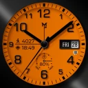
Screenshots
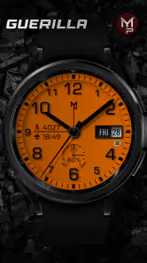
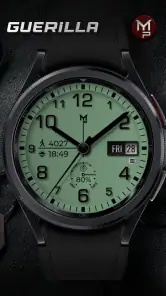
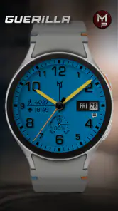
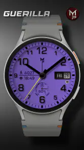
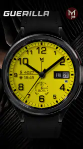
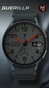
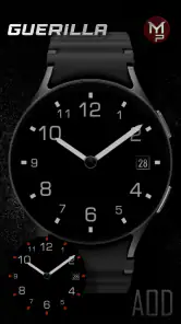
Analysis by Reviewed
I came to GUERILLA - Analog watch face with a simple starting condition: my Wear OS watch worked well, but its default face felt too ordinary. I wanted something with a stronger visual identity without turning the watch into a cluttered dashboard. This app takes the personalization route rather than trying to become a full productivity tool, and that focus is its biggest strength.
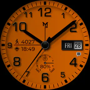
Created by p10trm, GUERILLA is a paid watch-face app in the personalization category. It costs $1.49, carries an Everyone age rating, and was released on April 1, 2025. The store presents it as a customizable digital watch face for Wear OS watches, while the name and visual direction point toward an analog-style look. In everyday use, I found the appeal less about adding more information and more about changing the character of the watch on my wrist.
That distinction matters. If you are looking for a face that replaces every phone notification, calendar detail, weather panel, and fitness metric, this is probably not the first option I would suggest. If you want the watch to look deliberately designed and you are comfortable spending a small amount for that change, it makes much more sense. The current audience is still relatively compact, with over ten thousand installs, but the response is encouraging: it holds a 4.5 average from around two hundred ratings and has dozens of written reviews.
From an ordinary watch screen to a more personal daily setup
My first useful test was not simply opening the app and admiring the preview. I treated it like a real change to a device I use throughout the day. The starting point was a Wear OS watch already paired and functioning normally. The desired outcome was straightforward: choose a face that felt less generic, make the available customization worthwhile, and then check whether it remained readable during quick glances rather than only looking good in a static preview.
That last part is easy to overlook with watch faces. A design can appear impressive when you study it on a bright phone screen but become less practical when you check the time while walking, carrying a bag, or standing outdoors. GUERILLA works best when approached as a visual choice first. I would not install it expecting the same information density as a highly technical fitness face. I would install it when the watch’s appearance is part of the reason I wear it.
The paid model also changes the decision slightly. At $1.49, this is an inexpensive purchase rather than a long-term subscription commitment, but it is still worth deciding what you want before installing. The right question is not “does this offer every possible watch feature?” It is “will this particular style make me happier to use my Wear OS watch every day?” For me, that is the more honest way to judge it.
The setup flow is about choosing a look, not rebuilding the watch
I would begin by installing the face on the compatible Wear OS watch and then moving through its customization controls at a calm moment, rather than trying to configure it while rushing out of the house. The practical workflow is simple: select the face, inspect the available appearance choices, apply the version that fits the watch, and then live with it for several hours before making a final judgment.
More From Our News Desk

Clash of Clans Is Won Between the Battles

Android Auto Makes the Case for Quieter Car Software

MobiOffice: Transforming Mobile Productivity with Seamless Integration

EA SPORTS FC™ Mobile Soccer: Redefining Mobile Sports Gaming

How Microsoft OneDrive Became a Mobile Productivity Giant

How Google Translate Breaks Language Barriers Effortlessly
That pause is useful because customization can create a false sense of progress. Changing colors or visual details repeatedly may feel productive, but the important test is whether the final arrangement remains comfortable at a glance. I recommend setting up one restrained version first. Start with the most readable combination, wear it through a normal morning, and only then experiment with a bolder appearance. This prevents the common mistake of choosing a striking design that becomes tiring after repeated checks.
The app’s main handoff is between the phone-side setup experience and the watch itself. The phone is where making a selection feels easier; the watch is where the decision has to prove itself. That separation is normal for Wear OS customization, but it means the preview should not be treated as the finished result. The watch’s physical size, display behavior, and surrounding case all influence how the face feels once installed.
I also found it helpful to judge the face in three different situations: a deliberate look at the screen, a very quick time check, and a glance when the wrist is not perfectly positioned. Those situations reveal different weaknesses. A face that succeeds only when I stop and focus on it is less useful than one that communicates the time immediately. GUERILLA’s strongest role is as a visual refresh, so the setup should protect that usefulness rather than sacrificing it for decoration.
How I would use it during an ordinary day
Imagine a weekday morning. I put on the watch, check the time while making coffee, and later glance at it while moving between appointments. During that kind of routine, the face is not competing with a phone app or asking me to manage a complicated system. It is simply the surface I see most often. A distinctive analog presentation can make the watch feel more like an accessory and less like a tiny phone strapped to the wrist.
At work, the same quality can be useful in a quieter way. I may only need the time, and a visually focused face keeps the watch from looking like a miniature control panel during a meeting. In that situation, the app’s restraint is an advantage. Someone who wants every piece of information visible at once may disagree, but I prefer not to confuse “more data” with “more useful.”
On a weekend, the design can also serve a different purpose. The watch may be part of an outfit, and changing the face can help it feel less repetitive without buying another device. This is one of the more practical reasons to pay for a specialized face: the change is small, but it affects something I look at many times a day.
A less obvious use case is creating a deliberate separation between information modes. I would use GUERILLA when I want the watch to function mainly as a timepiece, then switch to a more data-heavy alternative before a workout or a day when health information matters. That workflow is better than demanding that one face be perfect for every situation. The trade-off is that switching faces adds a small amount of friction, but it also lets each design do what it is best at.
What happens when the phone hands the choice to the watch
The handoff from configuration to daily use is where I pay attention to details that a store summary cannot show. A watch face is not finished when it appears in a selector. It is finished when I stop thinking about the installation and begin using the watch naturally. If I keep reopening the settings because the result feels unfinished, the customization has not really succeeded.
My advice is to avoid changing several visual elements at once. Pick one overall direction, apply it, and observe the result on the wrist. If the face feels too busy, simplify the appearance rather than adding another adjustment to compensate. If it feels too plain, make one stronger change and then stop. This one-change workflow makes it easier to understand which choice actually improved the result.
There is also a social handoff: the watch moves from being something I configure privately to something other people may notice. GUERILLA’s identity makes sense for someone who enjoys a watch face with attitude rather than a completely neutral design. That will not suit every outfit or workplace, and that is part of the point. A highly expressive face is more personal, but it is also less universally appropriate than a plain default face.
For a new Wear OS owner, I would explain the purchase this way: you are buying a visual layer, not a replacement for the watch’s operating system. Your watch remains the source of notifications, apps, and other functions. GUERILLA changes the first thing you see when you raise your wrist. That makes the app easy to understand, but it also sets a clear limit on what it can improve.
Where it beats the usual alternatives
The usual alternative is to keep the manufacturer’s default face. That costs nothing and is often perfectly readable, but it can make an otherwise capable watch feel generic. GUERILLA has a clearer point of view, which is valuable if the default options all seem too safe or interchangeable.
Another alternative is a dense information face built around weather, fitness, appointments, battery status, and shortcuts. Those faces are better when the watch is part of a daily information workflow. I would choose one of them before a long run, a travel day, or a schedule-heavy workday. GUERILLA is the better choice when I want the screen to feel intentional and visually coherent instead of maximally packed.
There is also a difference between a free face and a low-cost paid face. Free options reduce risk, especially if I change styles often. Paying for GUERILLA makes more sense when I value its particular design direction and expect to keep it installed. The small price is easier to justify as a long-term personalization choice than as something I will test for a few minutes and abandon.
The app is also more focused than a broad customization suite. A suite may offer many faces, complications, themes, and tools in one place, while this app is easier to approach as a single design decision. That focus can feel refreshing, but it means I would not choose it for variety alone. Its value depends on liking this face, not on receiving a huge catalog.
Three practical lessons I took from using it
First, customization should begin with the viewing distance, not the preview. I would hold the watch at the distance used for a normal glance and check whether the main time remains immediate. This is especially important for an analog presentation, where decorative elements can compete with the hands if the design is viewed too closely during setup.
Second, I would match the face to the watch’s role for that day. For a simple timekeeping day, the visual character is the feature. For exercise or information-heavy routines, another face may provide a better handoff from the watch to the activity. Treating GUERILLA as part of a rotation makes its limits less frustrating and gives the design a clearer purpose.
Third, I would judge the face after the novelty fades. The first impression is important, but repeated glances are more revealing. If I still understand the time quickly after a full day, the design has earned its place. If I find myself wishing for more context every few minutes, the issue is not necessarily poor quality; it may simply mean I need a different kind of watch face.
A fourth lesson is to keep one dependable alternative available. That gives me a quick fallback when I need more information, without forcing GUERILLA to become something it was not designed to be. It also makes experimentation safer: I can try a stronger visual setup knowing that returning to a practical face is easy.
Where the workflow breaks down
The biggest friction is the narrowness of the concept. A watch face cannot solve every Wear OS need, and this one should not be judged as though it were a full companion app. If your first question is whether you can see a broad set of live details without opening anything else, a data-oriented face is likely a better fit.
Another possible problem is visual preference. The name GUERILLA suggests a distinctive style, not a completely invisible interface. People who prefer understated, traditional, or highly conservative watch designs may find the personality unnecessary. That is not a defect I would try to hide; it is a genuine reason to skip the purchase.
The setup can also feel less satisfying if you expect customization to transform the entire watch experience. It changes the face, but the rest of the device remains the same. Notifications, apps, and the broader Wear OS workflow still determine how the watch behaves. The result is meaningful when the face itself matters to you, but modest when you are looking for a wider functional upgrade.
I would also be cautious about installing it immediately before an important day. Give yourself time to check readability, settle on the appearance, and confirm that the finished face suits your routine. A short trial in real conditions is more useful than deciding from a preview alone. If the look is attractive but the information hierarchy does not match your habits, discovering that after a few hours is better than discovering it during a busy appointment or workout.
Who should choose it, and who should pass
I would recommend GUERILLA to a Wear OS owner who sees the watch as both a device and an accessory. It is especially appealing if the default face feels bland, if a stronger analog-inspired identity sounds attractive, and if you prefer paying once for a focused design rather than sorting through a large collection.
I would be more cautious if you change watch faces constantly. A broad face library may offer more value in that case. I would also point fitness-focused users toward a face built around the information they check during training. The same applies to anyone who wants a miniature dashboard on the wrist; the visual-first approach here may feel too limited.
The Everyone rating makes the app broadly approachable from an age perspective, and the low one-time price keeps the experiment relatively easy to justify. Still, affordability does not remove the need for a good match. The deciding factor is not the number of options but whether this particular design earns repeated use on your watch.
My final result after living with the change
After following the whole workflow—from an ordinary default screen, through setup and customization, to real wrist checks—the result is a more individual-looking Wear OS watch. I like that the app has a clear purpose instead of pretending to solve every problem. The best outcome is not a dramatic new feature; it is the feeling that the watch looks chosen rather than assigned.
p10trm has made a focused personalization app for people who care about the face they see all day. The 4.5 average from around two hundred ratings supports the idea that the design connects with its audience, while the still-growing install base suggests it remains a more specialized choice than a universal default. I would not buy it for a dense dashboard or for fitness-first information. I would buy it for character.
My recommendation is simple: choose it when appearance, quick time checks, and a distinctive analog mood matter more than maximum data density. At $1.49, it is a reasonable upgrade for the right Wear OS user, provided you treat it as a carefully chosen watch face rather than a complete change to the watch itself. That honest expectation is what turns the app from a brief visual experiment into a useful part of a daily rotation.
GUERILLA - Analog watch face Frequently Asked Questions
Who is GUERILLA - Analog watch face best suited for?
GUERILLA is a personalization app for people who want to give a compatible Wear OS watch a rugged, military-inspired look. Its analog-style presentation suits users who prefer an industrial or adventure-oriented design over a plain, minimalist face. If you like having practical information alongside the time, its configurable indicators may also make the style more appealing.
What is GUERILLA - Analog watch face?
GUERILLA - Analog watch face is a military-inspired watch face designed for compatible Wear OS smartwatches. It focuses on a rugged, tactical appearance, combining an analog-style dial with practical information such as the time, date, and other configurable indicators. Its visual style is aimed at users who prefer an industrial or adventure-oriented look instead of a traditional, minimalist watch face.
Which smartwatches are compatible with GUERILLA - Analog watch face?
Compatibility depends on the version of Wear OS supported by your smartwatch and the way the developer distributes the watch face. It is generally intended for Wear OS devices, but not every older Android smartwatch may be supported. Before downloading, check the Google Play listing for the current compatibility information and confirm that your watch appears as an available installation target.
Can I customize the GUERILLA - Analog watch face?
The available customization options may vary according to the watch model and the specific release of the app. Users should typically expect control over elements such as color styling, complications, date information, or display settings, although the exact choices are determined by the developer. Review the in-app settings after installation to see which parts of the design can be adjusted.
Does GUERILLA - Analog watch face affect battery life?
As with any active smartwatch watch face, GUERILLA - Analog watch face can have some effect on battery consumption, especially when it uses complications, animated elements, frequent updates, or an always-on display mode. The impact will differ between devices and settings. If battery life becomes a concern, reducing complications and disabling unnecessary always-on features may help.
Pros
- Elegant military-inspired design suits casual and outdoor styles.
- Clear analog layout makes the time easy to read at a glance.
- Offers useful complications for quick access to device information.
- Runs smoothly with minimal interaction once installed.
- Distinctive appearance helps the watch stand out from standard faces.
Cons
- Some customization options may require a compatible Wear OS version.
- Dark styling can reduce visibility in very bright sunlight.
- Detailed elements may look small on watches with compact displays.
- Battery impact may vary depending on complications and ambient mode.
- Not ideal for users who prefer colorful or highly modern watch faces.
- Category
- Personalization
- Version
- Varies with device











