Fonts & Stylish Text Bio
- 1.00
- 4.6
- Installs
- 10.00K
- Price
- Free

Screenshots
Analysis by Reviewed
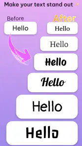
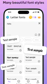
Fonts & Stylish Text Bio is the kind of personalization app that catches my attention quickly because it changes something I use every day: ordinary text. Developed by Stay Strong, it is designed for creating decorative writing, profile bios, and nicknames that look different from the standard keyboard output. I found the appeal immediate, especially when preparing a social profile or sending a playful message where plain text feels a little dull.
My first impression was positive, but this is also an app that needs to prove its value after the novelty wears off. A collection of stylish characters is fun to explore once; the more important question is whether it becomes part of a repeatable writing routine. In my experience, its lasting usefulness depends less on how many visual styles are available and more on whether you have regular places to use them.
What the first week feels like
The app belongs to the personalization side of Android apps rather than productivity or communication. Its main purpose is visual expression: take a name, short phrase, bio line, or nickname and give it a more distinctive appearance. That makes it especially suitable for people who spend time adjusting social profiles, game identities, messaging status lines, or other small pieces of public text.
I would not approach it expecting a complete graphic-design workspace. Its strength is speed. Instead of opening a design editor, choosing a typeface, adjusting spacing, and exporting an image, I can work with text directly and use the result where text is accepted. That difference matters when I want a quick profile change rather than a polished visual project.
The free price makes experimenting easy. The app is also marked for Everyone, so its basic audience is broad. On compatible devices, the minimum operating-system requirement is Android seven or newer, which keeps it accessible to many existing phones without making it a tool reserved for recent hardware.
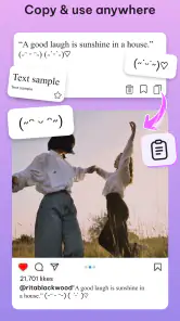
During an initial session, I would recommend testing the same short phrase in several settings instead of judging every style inside the app. A font can look attractive in a preview but become awkward in a social bio, a nickname field, or a messaging app. Some decorative characters take more visual space than normal letters, and certain services may display unusual symbols differently. The real test is how the copied text survives outside the app.
That copy-and-use workflow is the first practical insight. Stylish text is not automatically better text. A heavily decorated nickname may be memorable, but it can also be harder to search, read aloud, or recognize quickly. I prefer keeping one expressive version for a profile and a simpler version for places where friends need to find me without guessing the spelling.
More From Our News Desk

Clash of Clans Is Won Between the Battles

Android Auto Makes the Case for Quieter Car Software

MobiOffice: Transforming Mobile Productivity with Seamless Integration

EA SPORTS FC™ Mobile Soccer: Redefining Mobile Sports Gaming

How Microsoft OneDrive Became a Mobile Productivity Giant

How Google Translate Breaks Language Barriers Effortlessly
Useful jobs beyond making a profile look different
A realistic everyday scenario is preparing a new social profile during a lunch break. I can draft a short bio in a normal notes app, open Fonts & Stylish Text Bio to try a few treatments, and then paste the most readable version into the profile field. If I am helping a friend choose a nickname for a game or group chat, the same process works without requiring image editing or a separate font installation.
It can also help with small moments of presentation. A short heading in a personal message, a decorative name for a private group, or a special line for a celebration can feel more intentional when the letters have a different shape. I see the app as a finishing tool for brief text, not something I would use to transform every sentence I write.
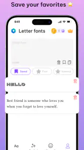
One useful habit is to create two versions of anything important: a decorated version for visual impact and a plain-text backup. This matters because unusual Unicode-style characters are still text, but they are not always handled consistently by every service. If a platform rejects a character or makes it difficult to edit later, the plain version saves time. That is a small workflow improvement, but it makes the app more practical.
Where it compares well with usual alternatives
The usual alternatives are a phone’s built-in keyboard, a website that generates special characters, or a design app that turns words into images. The keyboard is faster for normal typing, but it rarely offers this kind of concentrated decorative-text experimentation. A website may do a similar conversion, yet switching between browser tabs and the destination app can feel less convenient on a phone. A design app offers much more control, but it usually produces an image rather than text that can be pasted into a profile field.
Fonts & Stylish Text Bio sits between those options. It is more focused than a design editor and more expressive than a standard keyboard. The trade-off is that it does not replace a proper design tool when I need control over color, layout, illustrations, or exact brand typography. Its value comes from handling short text quickly, not from trying to become a full creative suite.
The app has an average rating of 4.6 from around 616 ratings, and it has passed 10 thousand installs. Those figures suggest that the concept is landing well with its audience, although they do not change my main advice: choose styles for readability first, then add decoration. A high rating can confirm that the basic idea is appealing, but the usefulness of a personalization app remains very dependent on each person’s habits.
Does it keep earning space after the novelty?
Month-to-month value depends on recurring occasions
After the first week, the excitement naturally becomes quieter. I am unlikely to open a stylish-text tool every day unless I regularly manage several profiles, change usernames, participate in communities, or enjoy customizing messages. For someone who updates a bio once and forgets about it, the app may deliver its main benefit in one afternoon.
For me, the strongest long-term use is occasional refresh work. I might revisit a profile when my interests change, prepare a new nickname for a community, or create a themed line for an event. That recurring but irregular pattern is enough to justify keeping the app if I enjoy personal presentation. It is not a daily utility in the same way as a calendar or keyboard.
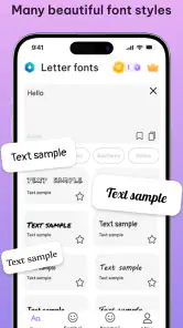
There is also value in having a familiar place for experimentation. Rather than searching the web each time I want a different text treatment, I can return to the same app and compare options. This saves a little effort and keeps my preferred styles in one workflow. The benefit is modest, but repeated small conveniences are often what determine whether a personalization app survives on my phone.
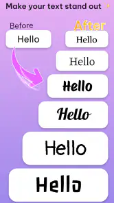
A second non-obvious insight is to treat decorative text as a hierarchy tool. If every line uses an elaborate style, nothing stands out. I get better results by reserving the most unusual treatment for one short element, such as a nickname, while keeping the rest simple. This makes the result easier to scan and reduces the chance that a profile looks cluttered after several edits.
People who manage multiple identities may find more repeated value than casual users. A streamer, community moderator, role-playing participant, or person who maintains several social profiles can use the app as a small naming workshop. Someone who rarely changes public text may prefer a browser generator or simply keep the app only for occasional events.
The maintenance burden is small, but not zero
The app itself is easy to understand as long as I keep my expectations focused. The maintenance burden comes mainly from the text I create. Once I paste a decorative nickname into a profile, I need to remember that editing it later may be less comfortable than editing normal letters. Searching for the exact name can also become harder if the characters are visually unusual.
That is why I would keep a plain-text record of any important username or bio before decorating it. This is especially useful when a profile needs to be recovered, copied to another service, or shared with someone who cannot easily reproduce the same characters. The app makes creation convenient, but it does not remove the need for sensible text management.
In-app purchases range from ten cents to ten dollars per item. Since the app is free to start, I would use it for a while before paying for anything. The right question is not whether an extra style looks attractive in isolation, but whether it will be used repeatedly. If I only need one profile refresh, spending money can be difficult to justify; if I return often and find a paid option genuinely useful, the decision becomes more reasonable.
Version 1.0.2 suggests a relatively early stage of the product’s life. I would therefore judge it by how smoothly it fits my current routine rather than assuming it will become a permanent part of my keyboard. Early-stage personalization apps can be enjoyable, but their long-term place depends on continued convenience and on whether the available styles remain useful rather than merely surprising.
What creates fatigue over time
The first source of fatigue is visual excess. When every message contains ornate letters, the effect stops feeling special and can make ordinary conversation harder to read. I find the app more satisfying when I use it selectively, almost like adding emphasis rather than replacing my normal writing style.
The second is compatibility. Decorative text may paste successfully but still look different across phones, apps, or operating systems. A friend may see a symbol with a different shape, or a service may limit what can be entered in a username field. This is not a reason to avoid the app, but it is a reason to test important text in its final destination before publishing it.
The third is repetition. Once I have found a favorite look, browsing through more options can become less rewarding. The discovery phase is enjoyable, but the practical task is usually short. I would avoid spending too much time comparing tiny differences between styles when a clear, readable choice is already available.
There is also a social trade-off. A distinctive nickname can help friends recognize me, but excessive decoration can make the name seem less approachable or even look like an imitation of someone else’s style. For professional profiles, support accounts, or any place where clarity matters, I would choose a restrained treatment or stay with ordinary text.
Who should use it, and who should skip it?
I think the app is a good fit for people who enjoy customizing their online identity and want a direct way to experiment with bios and nicknames. It is particularly useful if you often move short text between profiles, chats, and communities and do not want to create an image every time you want a visual change.
It is less suitable for anyone looking for a full font-management system, a design editor, or a tool for long-form writing. I would also skip it if I needed guaranteed uniform display across every platform or if I rarely personalize text. In those cases, the built-in keyboard is simpler, while a design application is the better choice for visual work that needs precise control.
Privacy-conscious users should also keep the workflow minimal: use short text, avoid entering sensitive information, and paste only what is needed into the destination service. Creating a nickname or bio does not require turning the app into a place for storing personal details. That simple boundary makes the tool easier to keep in a regular rotation.
My long-term verdict
Fonts & Stylish Text Bio earns a place on my phone only when I treat it as an occasional creative utility rather than a permanent replacement for normal typing. Its free entry point, focused purpose, and quick text-based workflow make it easy to recommend to someone who enjoys profile customization. The developer, Stay Strong, has positioned it in a useful middle ground between plain keyboard text and image-based design.
Its lasting value is real but specialized. I would keep it for recurring profile updates, nickname experiments, and small personal touches, especially if I participate in several online communities. I would not keep opening it just to browse styles without a specific use in mind. That is where the novelty fades and the app can start to feel less like a tool and more like a collection of decorations.
My practical recommendation is to begin with a short phrase, test it in the exact app where it will appear, save a plain backup, and use decoration sparingly. If that workflow solves a recurring problem for you, the app can remain useful from month to month. If you only want a single unusual bio and never expect to edit it again, a one-time web alternative may be enough.
Overall, I see it as a pleasant, focused personalization app with a clear audience rather than an essential everyday companion. The Everyone age rating and broad Android compatibility make trying it straightforward, while the optional purchases mean I would stay selective about spending. For readers who want their text to feel more personal without opening a full design program, it is worth trying; for readers who prioritize maximum clarity, consistency, and low-maintenance communication, ordinary text remains the better long-term choice.
Fonts & Stylish Text Bio Frequently Asked Questions
Can I use Fonts & Stylish Text Bio without design experience?
Yes. The app is intended to make decorative text easy to create: enter the words you want to use, browse the available styles, and copy a design that suits your profile or message. You do not need to build lettering by hand or understand typography. It is a personalization app for anyone who wants a quick way to give ordinary text a more distinctive look.
What is Fonts & Stylish Text Bio used for?
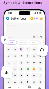
Fonts & Stylish Text Bio is designed to help you create decorative text for social media profiles, captions, comments, messages, and usernames. After entering your text, the app generates different font styles, symbols, and layouts that you can copy and paste into compatible apps. It is especially useful for users who want to personalize an Instagram bio, WhatsApp status, TikTok profile, or other online content without manually creating special characters.
Does Fonts & Stylish Text Bio work with Instagram, WhatsApp, and other social media apps?
In most cases, the text created with Fonts & Stylish Text Bio can be copied and pasted into popular platforms such as Instagram, WhatsApp, Facebook, TikTok, Telegram, and messaging applications. However, the final appearance depends on the platform and the device receiving the text. Some unusual Unicode characters may display differently, appear as empty boxes, or be unsupported, so it is recommended to test your chosen style before publishing it.
Is Fonts & Stylish Text Bio free to download and use?
Fonts & Stylish Text Bio is free to download, and its in-app purchases range from ten cents to ten dollars per item. This means you can try the app without an upfront payment, while some optional features or content may cost extra. Check the purchase prompt before confirming anything so you know what you are buying and whether it is a one-time item or another kind of charge.
Does the app require an internet connection or special permissions?
Basic font generation and text copying may work without a continuous internet connection, depending on the app version and the specific feature being used. Internet access can still be required for advertisements, downloading additional style packs, syncing content, or accessing premium tools. Users should also check the permission requests during installation and avoid granting access that is unrelated to the app’s main purpose, such as unnecessary contacts or location permissions.
Pros
- Offers many stylish fonts for bios
- captions
- and messages.
- Quickly copies formatted text for use in other apps.
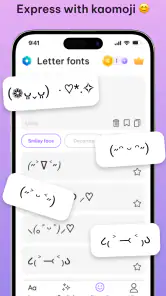
- Includes decorative symbols and emojis for extra customization.
- Simple interface makes font browsing easy for beginners.
- Works well for creating eye-catching social media profiles.
Cons
- Some fonts may not display correctly on every device.
- Many designs are locked behind ads or premium features.
- Copied text can look different across social media platforms.
- Frequent ads may interrupt browsing and text customization.
- Certain fonts reduce readability
- especially in longer messages.
- Category
- Personalization
- Version
- 1.0.2











