Fonto - story font for IG
- 397.00
- 4.7
- Installs
- 1.00M
- Price
- Free

Screenshots


Analysis by Reviewed
When I want a story to feel more personal than a quick caption, I look for a simple way to make the words fit the picture. Fonto - story font for IG is aimed at that small but useful job: adding styled text to social posts without turning the process into a full design project. I see it as an approachable creative app for people who care about how their stories look but do not want to learn a complicated editor.
A focused tool for story text
Before choosing a separate app, I ask myself what I actually need to make. If the answer is a photo, a short message, and a typeface with a little more character than the social app’s built-in options, Fonto has a clear purpose. It concentrates on styling words for Instagram or WhatsApp stories rather than trying to be an all-purpose image editor.
That focus is useful when I want to finish a post quickly, but it also sets expectations. I would not open it expecting a complete campaign workspace or advanced photo editing. Its value is in giving a short line of text more visual choice, while leaving the photograph and message at the center.
Why Fonto Stands Out
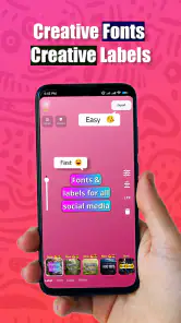
First off, Fonto isn’t just your run-of-the-mill font app. It’s like having a designer in your pocket! The app offers an impressive array of fonts, ranging from ultra-modern to whimsically vintage, ensuring your Instagram stories always look on point. I was particularly impressed with the variety and how each font adds its own flair to the visuals. You know that moment when you find the perfect font that just clicks with your photo? Yeah, Fonto gives you plenty of those moments.
Easy to Use
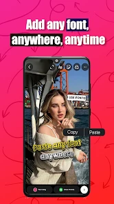
One of the things I love about Fonto is its user-friendly interface. As soon as you open the app, you’re greeted with a clean and intuitive layout. Even if you’re not tech-savvy, you’ll find it easy to navigate. Just select a photo from your gallery, choose a font, and voila! You’re ready to post a killer story. It’s like they’ve taken the complexity out of design and left you with pure creativity.
That straightforward flow is most helpful when I already have a photo in mind and only need to add a short line: a location, a punchy observation, or a few words that give the image context. For a daily creator, keeping a handful of preferred styles for recurring posts can also help a feed feel consistent without making every story look identical. I’d still preview the text against the image before sharing; a decorative typeface can look lively on a plain background but become hard to read over a busy photo.
Customization at Your Fingertips
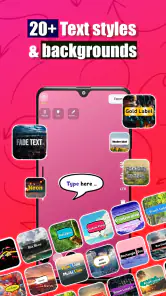
Beyond just fonts, Fonto offers a slew of customization options. You can adjust the size, color, and alignment to make sure everything fits just right. Plus, there are some cool effects to play with, giving your stories that extra pop. It’s these little touches that make your content not only stand out but also reflect your personal style.
More From Our News Desk

Clash of Clans Is Won Between the Battles

Android Auto Makes the Case for Quieter Car Software

MobiOffice: Transforming Mobile Productivity with Seamless Integration

EA SPORTS FC™ Mobile Soccer: Redefining Mobile Sports Gaming

How Microsoft OneDrive Became a Mobile Productivity Giant

How Google Translate Breaks Language Barriers Effortlessly
My practical tip is to start with legibility, then add personality. A contrasting color and a restrained size often do more for a story than piling on effects. If a caption has several lines, I’d check how it sits near the edges and over the subject before exporting or sharing; small placement adjustments can keep a face, product, or important detail from being covered. This makes Fonto especially handy for quick announcements, event snapshots, and small-business posts where the image still needs to do most of the talking.
A realistic day-to-day workflow
Imagine I take a photo of a handwritten specials board at a café, then want to share it with a brief note about a new drink. I can select the photo, try a few type treatments, and adjust the size and alignment until the note feels connected to the picture without competing with the board. Before posting, I’d check the words at phone-screen size and make sure they do not cover the drink or the details a visitor needs to see. That final check matters more than adding another effect.
For recurring posts, I’d treat a few reliable combinations as a simple visual system: one restrained style for practical information and another with more personality for casual moments. The point is not to make every story look like a template, but to avoid starting from zero each time. If the image is already visually busy, I’d choose a simpler treatment or skip extra text altogether. A dedicated font tool cannot create breathing room that the photo does not have.
Who Will Get the Most from It
Fonto fits casual creators, friends sharing everyday moments, and anyone who wants more typographic choice than a basic social-app text tool provides. It can also suit a small shop or community page that needs occasional, polished story graphics but does not need a full branding suite. For example, if I were posting a café visit, I could add a brief note to the photo, choose a style that matches the mood, and share it without building a multi-layer design from scratch.
There is a trade-off: this is a focused text-and-story tool, not a replacement for a full graphics editor. If I needed precise brand templates, detailed image retouching, or a coordinated campaign with many assets, I would reach for a broader design app instead. And if I only wanted plain text over a picture, the built-in Instagram or WhatsApp tools may already be enough. Fonto makes more sense when its extra type choices and adjustments are worth the additional step of working outside the social app.
I would also think about how often I make this kind of post. Someone who shares a designed story every day may appreciate having a separate place to shape text, while a person who posts only occasionally may find the built-in tools faster. For a small business, it is best suited to one-off updates and simple announcements rather than strict brand production, where repeatable layouts and precise controls matter more.
Current State and Everyday Fit
Fonto is an Art & Design app from ZEEBAVERSE LLC (Apps), and its current version is 4.1.5. It is free to download, with optional in-app purchases ranging from $0.99 to $14.99 per item. The app is rated for Everyone, and the minimum operating system is 7.0. Its average rating is 4.7 from around 20,000 ratings, with more than 1 million installs, which suggests that this focused approach has found an audience.
The app was released on March 27, 2022, so it has had time to establish itself, while version 4.1.5 is the clearest snapshot of its present form. I would not assume a particular feature has changed just because the version number has moved; what matters for an existing user is whether the current editing flow still suits their routine. If you already have a set look, try a new font or color on one low-stakes story first, then decide whether it improves your usual workflow before changing your whole style.
For someone already using it, the sensible way to judge the current version is by how it handles the work they actually do: selecting a photo, trying a style, adjusting the words, and getting a story ready to share. I would not overhaul a familiar routine just to explore every option. Instead, test one new treatment on a post where experimentation will not undermine readability or the purpose of the image.
Where it differs from the usual alternatives
The simplest alternative is to add text directly inside Instagram or WhatsApp. That route keeps everything in one place and is hard to beat when speed matters more than fine-tuning. Fonto is more appealing when the built-in selection feels limiting and I want to compare type styles or make a small adjustment before the image goes into a story.
A general-purpose design app is the other common alternative. It is usually the better choice for layered layouts, reusable campaign assets, or a carefully controlled brand look, but it can bring more steps than a quick story needs. Fonto sits between those options: more focused on text styling than a basic social editor, but not a substitute for a full design workspace. The trade-off is convenience versus control, so I would choose according to the post rather than use one tool for everything.
Limits Worth Keeping in Mind
Font choice is useful, but it cannot rescue a crowded composition or a message that is too long for a story. The strongest results will usually come from a short caption, readable contrast, and a photo with enough uncluttered space. I would also avoid choosing a novelty style just because it catches the eye: if a friend has to pause to decipher the words, the design is working against the message.
Another practical consideration is whether you want to make the image inside a separate app at all. Each extra step can interrupt a quick posting habit, especially when the built-in editor already covers what you need. The free starting point makes it easy to see whether the workflow suits you, but I’d explore the app before paying for any optional item and judge purchases by whether they solve a specific need rather than by the promise of more choices.
There is also a difference between having many ways to style a line and having a layout that works in every situation. A font that suits a playful holiday snapshot may feel wrong on a serious announcement, and a color that pops on one photo may disappear against another. I would make choices in context instead of settling on one decorative style for every post. If consistency matters, a small set of adaptable choices is more useful than changing the look each time.
What I’d Watch For
For someone deciding whether to keep using Fonto, I’d pay attention to three things: whether the font selection gives your stories a genuinely different feel, whether text remains readable after you place it over real photos, and whether the separate editing step saves time rather than adding friction. Those are better tests than simply counting available styles. The app’s focus is its strength, but it also means users who want elaborate layouts may quickly outgrow it.
If your main question is whether it works for both Instagram and WhatsApp stories, its purpose is to create story visuals for those social settings. If you are wondering whether you need design experience, the basic photo-and-text workflow is approachable, though good contrast and restraint still take a little judgment. And if you want to know whether it is worth trying before spending money, the free download gives you a chance to see whether its style options fit your habits; optional purchases are there if you later decide you need them.
I would also judge any optional purchase by a concrete task: perhaps you repeatedly need a particular kind of text treatment, or you have reached a point where the free experience no longer meets your needs. If you cannot name what the purchase would improve, there is little reason to pay simply because more choices are available. For an occasional user, starting with the free version and making a few real posts is a practical way to decide whether this separate workflow earns a place in their routine.
My Take
Overall, Fonto - story font for IG is more than just a font app; it’s a storytelling tool. By combining ease of use with a plethora of customization options, it empowers users to create stunning Instagram stories that capture attention. So, if you’re ready to take your IG stories to the next level, give Fonto a try. It might just be the creative boost you’ve been looking for!
I’d recommend it most to someone who regularly shares photos with short, considered text and wants more typographic personality without committing to a full design editor. If you mainly need a fast caption, stay with the social app’s own tools; if you need precise layouts and broader campaign work, choose a more capable design workspace. For everyone in between, the best test is simple: make a real story, check that it reads clearly on the photo, and see whether the extra choice feels worth the extra step.
Fonto - story font for IG Frequently Asked Questions
What can I create with Fonto besides a standard text overlay?
Fonto is aimed at making story-style posts look more personal through its font-focused creative tools. It is presented for creating stories for Instagram or WhatsApp, so it may suit short messages, announcements, or other designs where the text is a central part of the image. Its main appeal is giving story text a distinctive visual style.
Who develops Fonto, and how can I identify the right app?
Fonto is developed by ZEEBAVERSE LLC (Apps), and its short store description is simply “Fonto.” When looking for the app, check that the developer name matches so you can distinguish it from similarly named apps. It appears in the Art & Design category, which also helps identify its purpose as a creative tool for making visually styled stories.
Does Fonto have a large user community?
Fonto has reached over one million installs and has a 4.7 average rating, suggesting that it has attracted a substantial audience of people interested in story design. Those figures can help provide context when deciding whether to try it, but they do not guarantee that every font or workflow will match your preferences. Consider what you want to create and explore the app yourself.
Is Fonto free to download, and are there optional purchases?
Fonto is free to download, so you can try its story-font features without paying upfront. The app also offers in-app purchases, with items ranging from $0.99 to $14.99. Before choosing a paid option, check its details in the app so you know what it includes and whether it suits the way you want to create stories.
What is Fonto and how does it enhance my Instagram stories?
Fonto is a specialized app designed to enhance your Instagram stories by providing a diverse range of unique and stylish fonts. With Fonto, users can easily personalize their stories, making them more engaging and visually appealing. The app offers various font styles that can be applied directly to text within your stories, adding a creative flair that stands out.
Pros
- Offers a wide variety of fonts.
- Easy integration with Instagram.
- User-friendly interface.
- Regular updates with new fonts.
- No watermarks on saved images.
Cons
- Limited free font options.
- In-app purchases required for premium fonts.
- Occasional app crashes.
- Ads can be intrusive.
- Requires internet to access fonts.

- Category
- Art & Design
- Version
- 4.1.5