FlightHotelFares
- 0.00
- 3.8
- Installs
- 1.00M
- Price
- Free

Screenshots
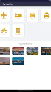

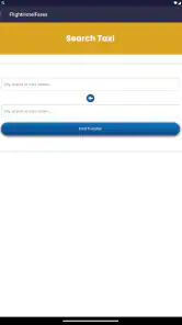

Analysis by Reviewed
When I look for a travel app, I want to understand the result quickly, compare realistic options, and avoid being pushed through a confusing booking process. FlightHotelFares takes a straightforward comparison approach: it brings flight and hotel offers from major travel sites into one place, so I can begin with a broad view instead of opening several travel apps one after another. That makes it most interesting for people who are still deciding where to book rather than travelers who already know the exact airline, hotel, or booking service they want.
This is a free travel and local app from Sunstone-Dev, with an Everyone content rating. It runs on Android devices using at least Android 5.1, and its current version is 1.0. The app reached release on January 8, 2025, and has built an average rating of 3.8 from around 1.7 thousand ratings, alongside more than a million installs. Those figures suggest that plenty of people are willing to try its comparison model, while the rating also tells me to approach it as a useful starting point rather than an automatic replacement for every established travel service.
How the comparison experience feels in everyday use
Readable navigation matters more than a crowded travel dashboard
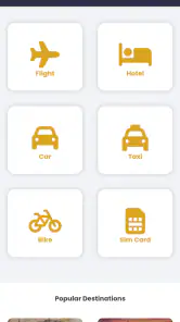
The main value here is not a long list of travel tools. It is the chance to reduce the first stage of planning to a comparison task. Instead of deciding which airline or hotel platform deserves attention before I have seen the market, I can use the app to explore flight and hotel fares together. That is particularly handy when the destination is fixed but the dates, accommodation, or booking provider are still flexible.
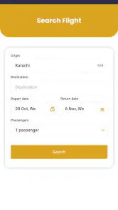
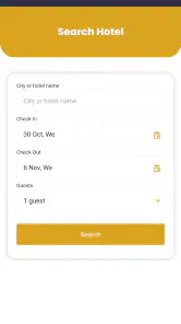
I find this kind of workflow easier when I separate research from commitment. I would first enter the trip details, scan the available flight choices, and then compare hotel possibilities without immediately treating the first attractive price as the final answer. A low fare may involve an inconvenient schedule, while a cheap room may be far from the area I actually need. The app can shorten the search, but it cannot replace the judgment needed after the results appear.
For readability, comparison apps have a difficult job: they need to show enough information to make options meaningful without turning every result into a wall of labels. With FlightHotelFares, I would use the first pass to identify a small group of plausible choices, then inspect those choices carefully. This is more manageable than trying to memorize every fare shown at once. A useful personal habit is to note the total travel dates, preferred arrival window, and acceptable hotel area before searching. That keeps the screen from becoming the thing making the decision for me.
The short store description, “FlightHotelFares,” is not especially informative by itself, but the app’s broader purpose is clear once I use it as a combined flight-and-hotel search tool. I would not expect a full trip-management system from that description. Its strongest role is earlier in the process, when I need a practical overview of possible bookings.
Why the app can help people who compare visually
Some travelers make decisions by scanning patterns rather than reading every detail in sequence. A comparison app can support that style because similar travel choices are presented in a common search context. I can look for the balance between timing, fare, and accommodation instead of switching constantly between unrelated services. That reduction in app-hopping is a real convenience for anyone who becomes tired or loses track when several browser tabs and booking screens are open.
There is also a useful distinction between finding and verifying. FlightHotelFares is well suited to finding possibilities. Before paying, I would still read the final conditions presented by the booking provider, check the passenger names, confirm the dates, and make sure the hotel location is correct. This two-stage habit is especially important for users who need accessible rooms, flexible travel arrangements, or specific airport transfers, because a broad comparison result may not communicate every practical detail equally clearly.
My best tip is to treat the first search as a shortlist builder, not as the booking decision. I would save or note two or three options, compare their schedules and locations, and only then move toward the external booking step. That approach reduces the risk of choosing a result simply because it appeared first or looked cheapest at a glance.
Motor comfort and the cost of repeated searching
Travel planning can involve repeated tapping, scrolling, typing, and backtracking. That matters for people with limited dexterity, hand fatigue, tremors, or pain. Even when an app is visually simple, a long search session can become physically demanding if every change of date or destination requires several precise actions. I therefore see the app as most comfortable for short, prepared searches rather than constant experimentation.
Before opening it, I would decide the basic trip parameters in a note: departure and arrival locations, approximate dates, number of travelers, and whether the hotel needs to be near a particular landmark. Entering those details once with care is easier than repeatedly correcting a rushed form. If typing on a phone is difficult, using the device’s built-in voice input may reduce the amount of manual entry, although that depends on the phone and operating system rather than on a special feature I can promise inside the app.
Another practical technique is to search in stages. I would first establish the flight range, then examine hotels, instead of changing every filter at the same time. This makes errors easier to spot and reduces the need for repeated gestures. It also gives me a clearer record of what caused a price or availability change. For a traveler assisting another person, this staged process makes it easier to explain what is being compared without rushing through a dense screen.
The trade-off is that a comparison tool can encourage more browsing than a direct airline or hotel app. That is useful when I am flexible, but tiring when I already know what I want. A person who has a preferred carrier, a loyalty account, or a familiar hotel chain may find a direct service less demanding because it removes irrelevant choices. FlightHotelFares earns its place when comparison is the goal, not when the decision has already been made.
Sensory considerations during travel research
People use travel apps in imperfect environments: on a bright platform, in a noisy terminal, in a dark room, or while sharing a phone with someone else. I would judge FlightHotelFares less by whether it looks impressive and more by whether I can return to the important details without losing my place. For users sensitive to visual clutter, the most sensible workflow is to narrow the search early and avoid keeping too many possibilities open.
Users with hearing-related needs are unlikely to benefit from relying on spoken explanations during a booking search. I would keep important information in written form, verify every date and location visually, and avoid making a decision based only on an alert or brief message. For users with low vision, enlarging the device’s text or display settings may help where the operating system and app layout cooperate, but enlarged text can also cause labels or results to wrap differently. That is a reason to check the complete fare and hotel details before continuing.
For people who experience cognitive overload, the app’s comparison purpose can be both helpful and difficult. Seeing alternatives in one place removes some of the burden of switching services, but it can also produce too many plausible choices. I recommend setting a firm rule before searching, such as choosing only options within an acceptable arrival period and a realistic hotel area. This turns an open-ended search into a smaller decision and makes the app more approachable.
A less obvious benefit of this method is that it can support shared planning. One person can conduct the initial search while another checks the practical details, such as location or timing. That is useful for families, carers, and travelers who prefer a second pair of eyes. The app becomes a common reference point rather than a solitary decision tool.
Situational access for ordinary trips
Imagine I am arranging a short visit and know the destination but not the best combination of transport and accommodation. I can use FlightHotelFares to establish whether an earlier flight is worth the extra hotel night, or whether a later arrival makes a different hotel location more practical. This is where combining travel categories becomes more useful than searching for a flight in isolation. The real question is often not “Which flight is cheapest?” but “Which complete plan is easiest to live with?”
It can also help when plans are being made on a phone rather than a computer. A mobile comparison tool is convenient when I am away from my desk, discussing a trip with someone, or checking possibilities during a break. However, I would avoid making a rushed purchase in a noisy public place. Travel details are too easy to mistype when attention is divided, and accessibility needs often make careful review more important than speed.
For a group trip, I would use the app to create a shared shortlist before asking everyone to agree. This prevents the conversation from becoming a stream of disconnected screenshots from different services. The limitation is that a shared shortlist still needs human coordination: different travelers may have different tolerance for early departures, long connections, or distant hotels. The app can organize the options, but it cannot resolve those priorities automatically.
For a traveler with mobility requirements, I would use the comparison stage to identify promising routes and hotels, then verify accessibility details directly before booking. A broad fare comparison is not the same as a guarantee that an aircraft connection, station transfer, entrance, room, or bathroom will suit a particular person. That extra verification is not a flaw unique to this app; it is a necessary safeguard whenever search results compress complicated travel arrangements into brief cards.
Where the experience still creates barriers
The first barrier is information density. Flights and hotels have many details that affect the true value of a result, including schedule, location, conditions, and the final booking path. A comparison screen can make alternatives look equivalent when they are not. I would never judge an offer by its headline fare alone, and I would be cautious if an important condition is difficult to find or requires several steps to inspect.
The second barrier is the handoff between comparison and booking. Because the app brings together offers from travel sites, the final transaction may involve another service or another style of interface. That can be inconvenient for users who rely on a familiar text size, a consistent navigation pattern, or saved accessibility settings. My advice is to pause at that transition, confirm the provider name, and repeat the essential details rather than assuming the last screen in the comparison app is the complete booking record.
A third barrier affects people who need highly specialized travel filters. If I require a particular room configuration, assistance arrangement, or very specific connection condition, a general comparison search may not be enough. In that situation, a direct conversation with the airline, hotel, or a specialist travel adviser can be better. FlightHotelFares remains useful for orientation, but I would not make it the only source for a trip where a small mismatch could create serious difficulty.
The app’s current version is 1.0, which makes me more cautious about depending on it for a complicated itinerary without checking everything twice. A first release can be perfectly usable, but I prefer a backup plan when travel is time-sensitive. I would keep the final confirmation from the actual booking provider and avoid assuming that a search result alone proves a reservation exists.
Who should use it, and who should choose another route
I think FlightHotelFares is a good fit for flexible travelers, occasional planners, families comparing several combinations, and anyone who dislikes opening multiple travel sites just to understand the market. It is also useful for people who begin with a destination and a rough date range rather than a fixed booking preference. The free price makes trying that comparison workflow easy, especially when I want to see whether the convenience is worth adding another travel app to my phone.
I would be more hesitant to recommend it as the main tool for frequent business travelers who already have established booking routines. If your trips depend on a company travel policy, loyalty benefits, negotiated rates, or a specific support channel, a direct corporate or airline platform may be more appropriate. Likewise, travelers who only need hotel reservations or only need flights may prefer a specialist service with fewer unrelated choices.
People who need extensive assistance information should also use it carefully. I would start with the app to discover possible routes and properties, but I would confirm the details with the provider before payment. That is the safer workflow for wheelchair users, travelers with service animals, people who need quiet rooms, and anyone whose trip depends on a precise accommodation requirement.
My inclusive verdict after using the comparison approach
FlightHotelFares succeeds when I use it for what it does best: creating an initial view of flight and hotel possibilities without forcing me to begin with a single travel brand. Its free access, broad Android compatibility, and Everyone rating make it approachable for a wide audience. The more than a million installs show that this simple idea has attracted substantial interest, while the 3.8 average tells me that expectations should remain practical rather than idealized.
From an inclusion standpoint, its greatest strength is reducing the number of separate places I need to visit during early planning. That can help people who find constant app switching tiring, confusing, or physically uncomfortable. Its main weakness is that comparison itself can create overload, and the move from search results to an outside booking service may introduce a different experience. Users with sensory, motor, or cognitive needs should narrow searches deliberately, inspect details slowly, and retain the final confirmation from the actual provider.
My recommendation is therefore conditional but positive. I would install it for destination research, flexible trip planning, and shared comparisons, especially when I am trying to balance a flight with a hotel rather than hunt for one isolated fare. I would not rely on it alone for specialized accessibility arrangements, strict corporate travel requirements, or a booking where missing one condition could cause major problems. Used as a careful shortlist tool instead of a blind shortcut, FlightHotelFares is a practical first step for making travel choices more manageable.
Pros
- Compares flight and hotel options in one convenient search
- Useful filters help narrow results by price
- dates
- and preferences
- Can reveal flexible travel combinations and potential savings
- Booking details are presented clearly for quick comparison
- Helpful for planning trips without switching between multiple apps
Cons
- Prices and availability may change before completing a booking
- Some offers may redirect you to external booking providers
- Extra fees or taxes may not appear in the initial search price
- Search results can vary depending on location and travel dates
- Customer support may depend on the selected airline or hotel partner

- Category
- Travel & Local
- Version
- 1.0