Flight Pro - White Icon Pack
- 208.00
- 4.6
- Installs
- 50.00K
- Price
- $2.49
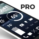
Screenshots
Analysis by Reviewed
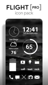
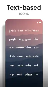
I spent time using Flight Pro - White Icon Pack as a personalization app, and my first impression was clear: this is made for people who want their Android home screen to look calm, bright, and deliberately coordinated. It is not trying to replace a launcher or transform every part of a phone interface. Instead, it concentrates on icons, wallpapers, and matching clock and weather widgets, giving a minimalist setup a consistent visual language.
The pack comes from Nate Wren Design and has built a strong enough user base to reach over 50 thousand installs, with an average rating of 4.6 from around 1.7 thousand ratings. Those figures do not make it automatically right for everyone, but they do suggest that the central idea works for many users: a large collection of flat white icons combined with a sky-themed backdrop can make a busy home screen feel much more controlled.
What the app feels like in everyday use
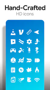
The main appeal is visual consistency. Many phones look untidy because every app brings its own color, shape, and branding to the home screen. A white icon pack reduces that noise. On a darker or blue-toned wallpaper, the icons become easy to scan without competing with one another. I found that especially useful when I wanted the wallpaper to be visible but still needed familiar app positions.
The design is intentionally restrained. If you enjoy glossy icons, strong gradients, cartoon artwork, or highly detailed illustrations, this will probably feel too plain. The white treatment is the point, not a limitation the app is trying to hide. It works best when the rest of the home screen follows the same idea: a simple wallpaper, a small number of visible apps, and widgets that do not introduce a completely different style.
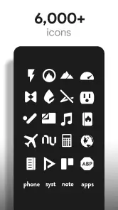
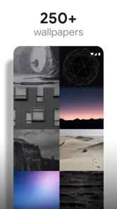
The store summary describes more than six thousand icons, along with sky wallpapers and clock and weather widgets. That scale matters because an icon pack becomes frustrating when only the most obvious apps are covered. A broad library gives me more freedom to organize a phone without leaving a few brightly colored icons breaking the layout.
Cost and what the purchase means
This is a paid app listed at $2.49, so the decision is straightforward for someone who already knows they want this particular look: you pay once for the main product rather than treating it as a free download that happens to contain a theme. The app also lists in-app purchases ranging from $1.00 to $50.00 per item. I would therefore check the purchase screen carefully before confirming anything, especially if I were expecting the initial price to cover every optional item or future addition.
For me, the price is easier to justify when I think of the pack as a complete visual setup rather than a folder of replacement images. The value comes from combining the icon collection with the matching wallpaper and widget style. If I only wanted a handful of white icons, paying for a full pack would be less compelling. If I planned to keep a consistent home screen for a long time, the one-time entry price would feel more reasonable.
More From Our News Desk

Clash of Clans Is Won Between the Battles

Android Auto Makes the Case for Quieter Car Software

MobiOffice: Transforming Mobile Productivity with Seamless Integration

EA SPORTS FC™ Mobile Soccer: Redefining Mobile Sports Gaming

How Microsoft OneDrive Became a Mobile Productivity Giant

How Google Translate Breaks Language Barriers Effortlessly
The app is marked for Everyone and supports devices running Android 6.0 or later. That makes it accessible to a wide range of Android phones, including older devices that may not support newer personalization tools. Compatibility with the phone itself is only part of the question, though. The launcher is important too, because icon packs depend on launcher support for applying replacements smoothly.
Before buying, I would confirm that the launcher I use can load third-party icon packs. This is one of the most practical checks a buyer can make. A beautiful pack is not useful if the preferred launcher cannot apply it, or if the process requires manually changing icons one by one. That is not a flaw unique to this app, but it is a real part of the ownership experience.
Where the value is stronger than the store summary suggests
The most useful benefit is not simply having many icons. It is being able to reduce visual decision-making every time I unlock the phone. When the icons share one treatment, I can arrange apps by function or frequency without also worrying about whether a red, green, or multicolored logo dominates a row.
I also like the way a white pack can make a wallpaper more useful. With ordinary icons, I often choose a background based on whether it clashes with app logos. Here, I can choose a sky image for its mood and let the icons sit above it with less visual conflict. That makes the home screen feel closer to a personal dashboard than a collection of unrelated shortcuts.
A practical workflow is to begin with only the first home-screen page. I would apply the pack, remove rarely used shortcuts, and keep the wallpaper visible around the remaining icons. Then I would decide whether the widgets improve the layout or make it too crowded. This approach prevents the common mistake of installing a theme and immediately filling every available space, which defeats the minimalist effect.
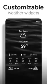
The clock and weather widgets are valuable because they can tie the top of the screen to the icon style. A separate widget from another design family may be functional but visually distracting. Matching elements are particularly helpful on a phone where the wallpaper has a strong horizon or open sky, since the widget can become part of the composition rather than a block placed over it.
Another less obvious advantage is that the white icons can serve as a visual filter for home-screen organization. Apps that I rarely use become easier to move away from the first page because the design no longer encourages me to keep every colorful logo visible. In that sense, the pack can support a simpler phone routine, although that depends on how much effort I put into arranging the launcher.
Limits, launcher dependence, and visual compromises
The biggest trade-off is that a uniform icon style can reduce immediate brand recognition. I normally identify some apps by their colors before reading the label. After applying white icons, I rely more on position and text. That is not a serious problem once the layout becomes familiar, but it can slow me down during the first few days or after I rearrange the home screen.
Coverage is another point to consider. A collection of more than six thousand icons sounds extensive, but no icon pack can guarantee a custom design for every app installed on every phone. When an app is not represented, the launcher may use an alternative icon, and that can stand out sharply against the white set. The more unusual or newly installed my apps are, the more likely I am to encounter a mismatch.
That mismatch is especially noticeable on a minimalist setup. In a colorful theme, one unthemed icon may disappear into the general variety. In an almost entirely white arrangement, a single bright original icon becomes a focal point. My advice is to keep the first page limited to well-supported, frequently used apps and move less common apps into folders or a secondary page.
The white design also depends heavily on contrast. On a pale wallpaper, the icons can lose definition and become harder to see. A dark sky, deep blue gradient, or image with enough empty contrast will usually suit the pack better than a bright cloud scene. The included sky wallpapers are therefore not just decorative extras; they are important to getting the intended readability.
I would not choose this pack if I wanted extensive control over individual icon colors, a playful theme, or a highly animated home screen. Its strength is the fixed visual direction. People who enjoy changing themes every few days may find the purchase less satisfying than users who want one dependable appearance.
How it compares with ordinary alternatives
The usual alternative is to keep the default icons and change only the wallpaper. That costs less effort and preserves instant app recognition, but it rarely produces the same sense of order. Default icons are designed independently, so even a carefully chosen wallpaper cannot make them feel like one collection.
Another option is a free icon pack. Free packs can be excellent for experimentation, and they make sense if I am unsure whether I will keep a monochrome layout. The advantage here is the more focused identity: Flight Pro is built around flat white icons, sky imagery, and coordinated clock and weather elements rather than asking me to assemble those pieces from unrelated sources.
There are also highly customizable icon systems that let users change colors, shapes, and individual app artwork. Those are better for someone who wants to fine-tune every detail. I see this pack as the better choice for a quicker, more coherent result. The trade-off is that I accept the designer’s visual decisions instead of building a theme from scratch.
Compared with a full launcher replacement, this is a narrower tool. A launcher can change gestures, grids, folders, animations, and navigation behavior. This pack focuses on appearance. That narrower scope is actually an advantage if I like my current launcher and only want to improve the home screen’s visual balance.
Who is most likely to get their money’s worth
I think the strongest audience is someone who already prefers dark, clean, or monochrome phone layouts and wants a large icon library without spending hours drawing replacements. It also suits users who use a supported launcher, keep a stable home-screen arrangement, and appreciate a matching widget instead of mixing several unrelated styles.
It can be a good fit for a work phone too. A quieter screen may feel less distracting than a wall of bright logos, and the simple treatment looks professional without becoming sterile. I would still keep communication and navigation apps easy to reach, because the reduced color cues mean that a carefully arranged grid matters more than usual.
Someone who changes phones often should think about the setup effort. The purchase may remain useful if the new device and launcher support the pack, but the home-screen arrangement may need to be rebuilt. Likewise, people who depend on visual color recognition for accessibility or speed should test the monochrome approach before committing to it as their main layout.
I would skip it if my phone is already full of custom shortcuts, unusual apps, or widgets that use strong colors. I would also skip it if I want a free trial-style experience before deciding. The listed price is modest, but the value depends on liking this exact white-and-sky aesthetic, not merely wanting any icon pack.
Version, longevity, and the buying decision
The current version is 3.9.5, and the app was released on July 29, 2014. That long presence is reassuring in one sense: this is an established personalization concept rather than a brand-new experiment. At the same time, older apps deserve a practical compatibility check on a modern phone, particularly when the launcher is responsible for applying the icons.
My recommendation is to decide based on workflow rather than the icon count alone. First, check launcher support. Second, consider whether your wallpaper will provide enough contrast. Third, imagine your most-used apps arranged on one page and ask whether you are comfortable identifying them by shape, label, and position instead of their original colors.
If the answer is yes, I think the $2.49 asking price can be fair for a polished, focused home-screen refresh, while remembering that optional in-app purchases are listed separately. The included visual direction is more valuable than the raw number of icons because it saves me from combining a wallpaper, icon set, and widgets from different designers.
My final view is positive but specific: Flight Pro - White Icon Pack is worth considering when the goal is a calm Android home screen with strong visual consistency. It is not the most flexible route, and it will not suit people who need colorful recognition or unlimited customization. For me, its best use is a restrained first page, a contrasting sky wallpaper, and a matching widget that keeps the whole layout intentional rather than merely decorated.
Flight Pro - White Icon Pack Frequently Asked Questions
What does Flight Pro - White Icon Pack include besides icons?
Flight Pro - White Icon Pack is described as a personalization app with more than 6,000 flat white minimalist icons, along with sky wallpapers and clock and weather widgets. These extras can help create a coordinated home screen rather than changing app symbols alone. The overall look is bright and pared back, so it is most appealing if you prefer a consistent, uncluttered style.
What is Flight Pro - White Icon Pack?
Flight Pro - White Icon Pack is a customization app designed to give your Android device a clean, minimalist appearance through white-themed icons. It replaces supported app icons with a consistent visual style and is intended for users who enjoy simple, bright home screens. The pack normally works alongside compatible third-party launchers rather than changing the entire Android interface by itself.
Which launchers are compatible with Flight Pro - White Icon Pack?
Compatibility depends on the launcher installed on your device. Icon packs such as Flight Pro - White Icon Pack generally work with popular customizable launchers, including those that support manual icon-pack selection. After installation, you may need to open your launcher settings, choose the icon or theme section, and select Flight Pro. Stock launchers from some phone manufacturers may offer limited or no support.
Does Flight Pro - White Icon Pack include icons for every application?
No icon pack can guarantee coverage for every application, especially newly released, region-specific, or less popular apps. Flight Pro - White Icon Pack focuses on providing a unified white design for a broad selection of commonly used apps, but unsupported icons may remain unchanged. Many compatible launchers allow you to apply an alternative icon manually or request additional icons from the developer.
How do I apply Flight Pro - White Icon Pack after downloading it?
First, install the icon pack and make sure you have a launcher that supports third-party icons. Open the launcher’s settings, find the appearance, theme, or icon-pack menu, and select Flight Pro - White Icon Pack. Some launchers also let you apply it directly from the pack’s own dashboard. If the icons do not change, restart the launcher or check whether your current launcher supports custom icon packs.
Pros
- Clean white icons give home screens a refined
- minimalist appearance.
- Works with many popular Android launchers and is easy to apply.
- Large icon library covers many common apps and games.
- Frequent updates can add support for newly released applications.
- Includes matching wallpapers for a more coordinated setup.
Cons
- White icons may have poor visibility on very light wallpapers.
- Some less popular apps may remain unthemed or use generic icons.
- Requires a compatible launcher; it does not replace system icons everywhere.
- The minimalist style may feel too plain for colorful or detailed setups.
- Icon availability and update frequency can vary between devices.
- Category
- Personalization
- Version
- 3.9.5











