Emoji Battery: Status Bar Icon
- 40.00
- 4.5
- Installs
- 500.00K
- Price
- Free

Screenshots
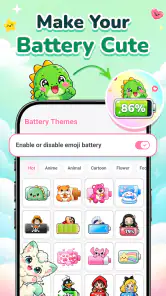

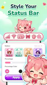
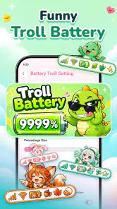

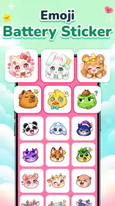

Analysis by Reviewed
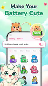
I like small personalization tools best when they make a phone feel more like its owner without getting in the way of ordinary tasks. Emoji Battery: Status Bar Icon focuses on that narrow idea: instead of leaving the battery indicator looking purely functional, it offers a more playful visual treatment using emoji, stickers, and pet-themed icons. That can make a familiar part of the screen feel friendlier, though the value depends on whether you enjoy decorative cues and can still read the status bar comfortably.
This is a free personalization app from TRUNGHIEUCOM, and its modest scope is both its appeal and its main limitation. It is not a general home-screen makeover or a battery-management tool; the point is to change the look of the battery indicator. I would consider it if you want a small daily customization rather than a full redesign. If accurate, understated status information matters more to you than cute styling, the standard battery display may remain the better choice.
Making the battery indicator easier to live with
A small visual change, not a new battery tool
The idea is straightforward: personalize the status bar with expressive battery imagery. That distinction matters. An emoji or pet icon is decoration, not evidence of longer battery life, faster charging, or more precise power information. I would treat the app as a visual accessory and keep relying on the phone’s usual battery indicator and system settings for practical power decisions.
That focused purpose makes the app easier to understand than broad customization suites, which can ask you to choose among wallpapers, icon packs, themes, widgets, and fonts before you reach the detail you wanted to change. Here, the decision is much narrower: do you want a more playful battery symbol in your everyday status bar? For someone who does, the limited scope can be refreshing.
There is a trade-off, though. A conventional battery symbol is familiar and restrained; a themed icon has to compete with the other small indicators at the top of the screen. If your status bar is already crowded, extra personality may come at the cost of quick recognition. I would choose a design that remains easy to distinguish at a glance, not simply the one that looks most charming in isolation.
Readability and navigation in everyday use
The most useful test is not whether an icon looks cute in a preview, but whether it makes sense in the context where you normally check your phone. I would look at the chosen style against the status bar’s background, alongside notification symbols, and at the screen brightness I actually use. A design that seems clear while browsing settings might be harder to pick out when I glance at the phone outdoors or while moving between apps.
There is also an important difference between visual personality and visual information. A themed battery icon can make the interface feel more welcoming, but a decorative image may not communicate charge level as immediately as the standard shape people already know. If you often check remaining charge quickly, especially before leaving home, prioritize instant recognition. The best-looking option is not automatically the most useful one.
I would approach setup as a brief comparison rather than a hunt for a perfect theme. Try a style, return to normal phone use, and notice whether your eyes find the battery indicator naturally. If you keep having to interpret the icon, switch to something simpler or return to the default. That small real-world check is more informative than choosing solely from a list of attractive designs.
Motor and sensory considerations
Because the app’s appeal is centered on a small visual element, it may suit someone who enjoys a gentle, personal touch without adding another prominent item to the home screen. For people who find cute symbols more inviting than technical-looking indicators, a pet or emoji motif can make the interface feel less sterile. That is a matter of preference, not a guaranteed accessibility benefit.
At the same time, the status bar is a compact place to communicate important information. Anyone who has difficulty distinguishing small shapes, relies on strong contrast, or prefers minimal visual clutter should be cautious about replacing a familiar battery symbol with a decorative one. A themed icon is not a substitute for the phone’s accessibility controls, and the app should not be assumed to provide particular contrast, text-size, screen-reader, or motion options.
Motor comfort matters in a different way: this is best suited to someone willing to make a small number of deliberate choices and then leave the appearance alone. If you dislike fiddling with customization, the payoff may feel too minor to justify the setup. Conversely, if you enjoy tuning details but do not want to rearrange your whole home screen, changing one persistent visual cue is a low-commitment way to personalize the device.
Situational access: when the change helps and when it does not
A realistic use case is checking your phone while getting ready to leave. You might glance at the top edge of the screen while packing a bag and enjoy seeing a friendly icon instead of a plain indicator. But if you are making a quick decision about whether to charge before heading out, clarity should win over novelty. I would choose the most immediately recognizable design for that routine, rather than a highly decorative one that takes an extra moment to interpret.
In a quiet setting, a playful battery marker can simply add a bit of character. In bright daylight, in a hurry, or when your attention is split, the same detail can become harder to read because the status bar is small and surrounded by other symbols. People who depend on visual information at a glance should test it in those different conditions before settling on a style. If it is not clear in the situations that matter most, the customization is not serving its purpose.
The app may also be a better fit for personal devices than for phones used in a strictly uniform work setting. A cute icon can feel warm and expressive on a private phone; someone who prefers a clean, conventional interface for work may find the decoration distracting. This is not a deep system overhaul, so the decision is less about changing how the whole phone works and more about whether this one persistent detail fits the contexts in which you use it.
How it compares with familiar alternatives
The usual alternative is to keep the default battery display, which tends to be the simplest option for quick recognition and consistency. Another route is a broader theme or icon-customization app, which can change more of the interface but may be unnecessary if the battery indicator is the only detail you want to personalize. This app occupies the middle ground: more expressive than the standard display, yet more narrowly focused than a full visual makeover.
That focus is its clearest advantage for a specific kind of user. If you want a small daily reminder of a favorite style or enjoy pet-themed details, you do not need to redesign every screen to get a visible personal touch. If you want detailed battery statistics, power-saving advice, or a redesigned notification area, this is the wrong category of tool. I would keep those needs separate rather than expecting an icon app to solve them.
It is also worth remembering that status bars differ between phones and software versions. A customization that looks balanced on one device may feel crowded or less legible on another. Before committing to a favorite, check the result on your own phone in more than one app and against both light and dark screen content. That is a practical safeguard, not a guarantee that every interface will display every style identically.
Who should try it, and who may prefer the default
I can see the appeal for people who like cute interface details, want a modest change rather than a full theme, or enjoy making a personal phone feel less generic. Its 4.5 average from around 1.5 thousand ratings and more than 500 thousand installs suggest that the idea has found an audience, though popularity does not tell you whether a particular icon will be readable or appealing on your device.
The app is free, is rated for Everyone, and runs on Android starting with version 7.0. It is currently at version 1.3.2. Those basics make it approachable for a broad range of Android users, but they do not mean it will suit every visual preference or device setup. The release date is August 14, 2026, so I would still judge it by how the current version behaves on the phone you plan to use rather than assuming a certain level of refinement from its age.
I would skip it if you need a highly legible, conventional status bar, dislike decorative symbols, or expect a battery utility with practical monitoring features. I would also avoid choosing a busy-looking style simply because it is amusing; the battery marker is something you may see repeatedly throughout the day, and a design that feels delightful at first can become visual noise. A simple option, or no customization at all, may be more comfortable over time.
Remaining barriers and a practical way to decide
The biggest barrier is that personalization and clarity can pull in opposite directions. The app’s central idea asks you to trade a familiar indicator for a more expressive one, and that trade will not work equally well for everyone. Small status-bar graphics can be difficult for some people to parse, while other users may find extra visual detail tiring. Since those needs vary, I would not describe a cute icon as inherently easier to use.
There is also a context barrier: a battery symbol is most valuable when it is understood quickly. If a design blends into its surroundings or competes with nearby notifications, the visual makeover could slow down a glance rather than improve it. The sensible workflow is to make one change at a time, use the phone normally, and judge the icon during a quick battery check—not just while you are actively customizing the interface.
For a more inclusive setup, I would keep the phone’s other readability adjustments in mind and avoid stacking several decorative changes at once. That makes it easier to tell whether this particular icon is comfortable. If it causes uncertainty, revert to the familiar system display; there is no reason to keep a customization that makes an everyday task harder. The app’s best role is optional expression, not a replacement for system-level accessibility choices.
My inclusive verdict
Emoji Battery: Status Bar Icon makes sense when you want a cheerful, narrowly targeted bit of Android personalization and are happy to trade some conventional simplicity for character. I like that the concept stays focused: it gives people who enjoy emoji and pet motifs a way to make a frequently seen detail feel more personal, without requiring them to change the entire interface.
My recommendation comes with a clear condition: test for legibility before settling on a design. If the icon remains easy to recognize in your normal routine, the small touch can be enjoyable. If you rely on an instantly familiar battery shape, have difficulty distinguishing tiny graphics, or prefer a quiet interface, the default display is likely the more comfortable option. This is a charming extra for the right person, not an essential tool, and its success depends on whether the decoration stays readable in the moments you need it.
Emoji Battery: Status Bar Icon Frequently Asked Questions
What does Emoji Battery: Status Bar Icon do?
Emoji Battery: Status Bar Icon is a customization app designed to make your device’s battery level easier to notice by representing it with an emoji-style icon in the status bar. The exact appearance and available choices may depend on the app version and your device. Before installing, check the screenshots and description to confirm that its supported styles match what you want.
How do I get the emoji battery icon to appear?
After installing the app, open it and follow its setup instructions. Android may require you to grant permissions or enable an accessibility service, notification access, or another system setting for the icon to work; the requirements vary by version and device. If the icon is missing, revisit the app’s instructions and check whether your phone’s battery-saving settings are restricting it.
Is Emoji Battery: Status Bar Icon compatible with every Android phone?
Compatibility can vary because Android manufacturers customize the status bar, and newer Android versions may limit how apps can display or modify icons. Some phones may show the emoji as a notification rather than replacing the built-in battery symbol, while others may not support the feature as expected. Check the app’s store listing, Android requirements, and recent user feedback for your particular device.
Does the app drain the battery or affect phone performance?
An app that keeps a status-bar indicator updated may run in the background, but its actual battery and performance impact depends on how it is implemented and how your phone manages background activity. The impact may be small, but it cannot be guaranteed to be zero. After installation, review your device’s battery-usage settings and disable background permissions if you notice unusual power use.
Is Emoji Battery: Status Bar Icon free, and is it safe to install?
Check the current Google Play listing for the price, in-app purchases, advertisements, and privacy details, since these can change over time. For safer installation, download the app from an official store, review the developer and requested permissions, and read the privacy policy. Grant only permissions that make sense for the stated battery-indicator features, and avoid unofficial download files.
Pros
- Adds a playful emoji to the status bar to show battery level at a glance.
- Makes battery status easier to spot without opening the notification shade.
- Offers a simple
- lightweight alternative to more feature-heavy battery apps.
- Can add a personal touch to an otherwise standard status bar.
- Useful for quickly noticing when your battery is running low.
Cons
- The emoji indicator may be too small to read clearly on some screens.
- Status bar appearance can vary by device and Android version.
- May require notification or status bar permissions to work as intended.
- Emoji styles and visibility may differ between Android manufacturers.
- Provides less detailed battery information than dedicated monitoring apps.

- Category
- Personalization
- Version
- 1.3.2