Design Studio & Craft Space
- 30.00
- 3.1
- Installs
- 10.00K
- Price
- Free
Screenshots
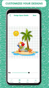
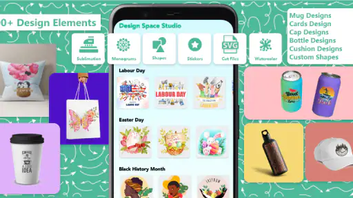
Analysis by Reviewed
I approached Design Studio & Craft Space as a practical starting point for small DIY design jobs rather than as a full professional graphics suite. It is a free Art & Design app from couldcoding, built around a collection of fonts, monograms, and SVG cut files. That focus matters: the useful question is not whether it can replace every design tool, but whether it helps you move from a vague project idea to a usable decorative asset without spending a long time drawing from scratch.
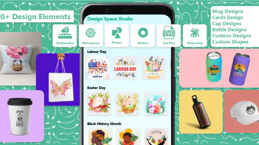
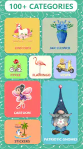
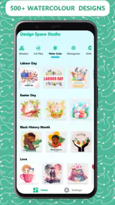
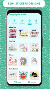
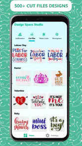
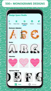
My first impression is that the app makes the most sense for people who work with personalized crafts, labels, signs, cards, decals, and similar projects. The store summary points to more than a thousand SVG design resources, so the appeal is variety and speed. I would not install it expecting a complete illustration workstation with the same depth as a desktop vector editor. I would install it when I want a ready-made starting point, a different lettering style, or a monogram that can become part of a larger handmade project.
What to expect before making your first design
The app’s short store description is simply “Design Studio,” but the more useful way to understand it is as a resource-focused design companion. Its central value comes from combining decorative typography with cut-file material. That combination is especially relevant if your finished work will be transferred to paper, vinyl, fabric, or another craft surface through a cutting workflow.
Because the app is free to download, it is easy to test without committing money at the beginning. There are in-app purchases ranging from $3.99 to $54.99 per item, however, so I would treat the free installation as an opportunity to inspect the collection and workflow before deciding whether any paid content is worthwhile. The pricing range is broad enough that casual users should avoid tapping through purchase screens too quickly.
The audience rating is Everyone, which fits the general subject matter. I see this as a family-friendly creative utility, although the usefulness will depend much more on your project than on your age or design experience. Someone preparing a birthday name decal may get immediate value, while an experienced illustrator looking for detailed path editing may find the experience limited compared with a dedicated vector application.
The app has reached over ten thousand installs and carries an average rating of 3.1 from roughly ninety ratings, with around thirty written reviews. I read that combination as a reason to keep expectations measured. It suggests that the concept is attracting real interest, but it is not a signal that every user will find the workflow equally smooth. I would judge it by a small test project before building an important order around it.
On the technical side, the listed current version is 26.0, and it supports Android devices running version 5.0 or later. That makes the compatibility barrier fairly low for Android users with older phones, although an older operating system does not automatically guarantee that every screen will feel equally comfortable. A larger display can make browsing lettering and artwork much less tiring than working on a compact phone.
More From Our News Desk

Clash of Clans Is Won Between the Battles

Android Auto Makes the Case for Quieter Car Software

MobiOffice: Transforming Mobile Productivity with Seamless Integration

EA SPORTS FC™ Mobile Soccer: Redefining Mobile Sports Gaming

How Microsoft OneDrive Became a Mobile Productivity Giant

How Google Translate Breaks Language Barriers Effortlessly
Who will get the most from it
I think the strongest audience is a beginner who already knows the type of object they want to make but does not yet have a personal library of SVG artwork. The app can shorten the most frustrating early stage: searching for a suitable visual direction. Instead of opening a blank canvas and wondering how to create an attractive monogram, you can begin with a prepared design and think about adaptation.
It can also suit a hobbyist who repeatedly makes personalized items. If you create labels for storage boxes, initials for gifts, decorative names for children’s rooms, or seasonal craft pieces, a collection of reusable visual starting points can save time. The benefit is not only the individual file; it is the ability to compare styles quickly and choose something that fits the mood of the project.
I would be more cautious about recommending it to a professional designer who needs precise control over nodes, layers, typography metrics, color management, or production-ready export settings. A traditional vector editor is usually the better choice when the design must be engineered exactly, revised many times, or delivered in a strict format. This app is more approachable when inspiration and convenience matter more than exhaustive control.
Setting up a sensible first project
For a first session, I would not begin by browsing aimlessly. Decide on one small outcome, such as a single initial for a gift tag or a short name for a decorative label. Keeping the target narrow makes it easier to tell whether the app is helping. It also prevents the large selection of fonts and cut files from turning the first visit into an endless scrolling exercise.
After installing, I would spend a few minutes identifying how the app separates its design material. Look for the difference between font choices, monogram elements, and SVG cut files, then open a few examples from each group. The important early task is learning what is immediately usable and what is better treated as a visual reference for another program.
When browsing lettering, compare the shape of the letters at the size you actually expect to use. A script style may look attractive in a preview but become difficult to weed or cut when reduced to a small label. Conversely, a simple monogram can appear plain on screen and become much more effective once placed on a larger sign. The best first choice is the design that survives its final physical size, not merely the one that looks most dramatic in the gallery.
I also recommend keeping the first project monochrome in your planning. Even if you eventually add several materials or colors, a one-color test makes it easier to evaluate the silhouette, spacing, and readability. With cut-oriented artwork, those qualities often matter more than decorative detail. If the design is unclear as a simple shape, extra color will not necessarily fix it.
Getting to the first meaningful success
My preferred beginner workflow is straightforward: choose a short word or one initial, select a legible font or monogram, and treat the result as a test piece rather than a finished masterpiece. The goal is to create something that could realistically be used on a card, label, notebook, or small gift. That first success teaches you more than browsing a hundred attractive previews.
Start with a name or phrase that contains different letter shapes. A mix of narrow and wide characters reveals spacing problems more clearly than a single repeated letter. If you choose a monogram, check how the initials overlap and whether the central shape remains recognizable. I would avoid an elaborate phrase during the first attempt because decorative lettering can become visually crowded before you understand how the app handles it.
Once you have a candidate, pause and inspect it as a finished object. Ask whether the letters can be read from a short distance, whether the outer edges look clean enough for the intended material, and whether any thin interior areas might be fragile. This is a useful habit because a design that looks fine on a bright phone screen may be awkward when cut, peeled, glued, or printed.
A realistic everyday example would be preparing a personalized storage label after reorganizing a child’s room. I would choose a clear font, create the child’s name, and make a small test version before committing to the final label material. If the letters are too ornate, I would return to the collection and compare a simpler style. That small loop—choose, inspect, test, adjust—is more reliable than assuming the first attractive option is the right one.
For a gift, I would use the same approach with a monogram. A single initial can work on a card, favor box, notebook cover, or fabric decoration, but the surrounding shape needs to match the object. A dense emblem may suit a large sign and overwhelm a small tag. The app’s collection is most useful when you treat each resource as a component to evaluate, not as a guaranteed finished answer for every surface.
Where beginners can become confused
The phrase “SVG cut files” may lead some new users to expect that every part of the crafting process happens inside this app. I would not make that assumption. The app’s role is to provide design material and a studio-like place to work with it; the physical cutting or final production stage may involve another tool or device. Before choosing a design, think about what you will do with the result afterward.
That distinction is particularly important for someone buying supplies for a large project. I would first confirm that the selected artwork fits the workflow you already use, including the way you normally handle files and prepare them for production. A visually appealing resource is not automatically convenient if it requires extra cleanup or does not behave as expected in your usual craft setup.
Another common source of confusion is the difference between a font and a finished graphic. A font gives you a way to form words, while a monogram or cut file may already have a more specific visual arrangement. If you need a custom name, begin with a font. If you need an emblem-like initial, begin with a monogram. Choosing the wrong category can make the app feel less capable than it really is.
Browsing volume can create its own problem. A large collection sounds helpful, but too many similar choices can slow down decision-making. I use a simple filter in my head: readability, cutting practicality, and fit for the object. If a design fails one of those checks, I move on quickly instead of trying to justify it because the preview looks impressive.
I would also keep an eye on the commercial side of the experience. Since optional purchases are available, the free portion is best explored deliberately. Do not assume that every attractive item follows the same access rules. If you are creating something for a small personal project, decide your budget beforehand and only consider paying after you have found a resource that solves a specific problem.
Three practical techniques that improve the results
First, compare designs by silhouette before comparing decoration. Place two or three possible choices mentally against the same project and imagine them as a single-color shape. This exposes overly thin strokes, cramped counters, and awkward overlaps. It is a more useful comparison than judging each design in isolation against a bright interface.
Second, use the app as a planning library even when the final arrangement will be completed elsewhere. You might find a lettering style you like, then build the complete composition in a tool that gives you more control over alignment and spacing. This is a sensible trade-off: the app can provide inspiration and starting material, while a dedicated editor handles precision.
Third, separate the design decision from the material decision. A bold monogram that works beautifully on a large sign may not be the right choice for delicate paper. Likewise, a thin script can be attractive on screen but troublesome when cut from a material that does not tolerate fine details. Choosing the artwork first and the physical method second often leads to avoidable rework.
A fourth useful habit is to keep a small shortlist rather than repeatedly reopening every category. Save or note the styles that meet your needs, then compare them against the actual project dimensions and purpose. This turns the collection into a personal reference shelf over time. The more often you craft, the more valuable that shortlist becomes because it reduces future browsing.
How it compares with familiar alternatives
Compared with starting from a blank canvas in a full vector editor, this app is less intimidating. You do not need to invent every decorative shape yourself, and the presence of fonts, monograms, and cut-oriented artwork gives a beginner a clearer direction. The trade-off is that you may have less freedom to construct highly specific geometry or make detailed technical adjustments.
Compared with searching the web for individual craft files, the app offers a more contained browsing experience. That can be convenient when you want to stay focused on a project rather than opening many pages and comparing unrelated sources. On the other hand, a web search may offer a wider range of styles, clearer licensing explanations, or files tailored to a very unusual request. I would choose the app for quick exploration and a specialist source when the project has strict requirements.
Compared with a general drawing app, its collection-oriented approach is more immediately relevant to personalized craft work. A drawing app may be better for sketching, painting, or freehand experimentation, while this one is better suited to choosing prepared lettering and decorative assets. Neither approach is universally superior; they support different stages of the creative process.
If your main goal is professional typography, detailed illustration, or exact production preparation, I would lean toward a dedicated design suite. If your goal is to make a personal item without designing every element from zero, this app is easier to justify. Its strongest position is between a blank creative tool and a massive, unfocused asset search.
Who should skip it, and who should continue
I would skip it if you need advanced layout controls, a carefully managed professional file pipeline, or guaranteed compatibility with a particular production process. It is also not the best first choice for someone who mainly wants a freehand sketchbook. The app’s identity is tied to prepared design resources, so users seeking painting brushes or open-ended illustration may feel that it points them in the wrong direction.
I would continue using it if you regularly personalize objects and enjoy choosing from many visual directions before settling on one. It is especially suitable when the blank page is the biggest obstacle. The app can give you a concrete shape to react to, which is often enough to turn “I want to make something” into a project with a recognizable next step.
For a first-time user, I would judge the app after one complete mini-project rather than after the installation screen. Choose a modest design, inspect it at its intended size, and see whether it fits the rest of your craft workflow. That test will answer the practical questions that a rating or store summary cannot: whether browsing feels manageable, whether the available styles suit your taste, and whether the result saves you time.
My recommendation after using it
Design Studio & Craft Space is worth trying when you want a convenient source of fonts, monograms, and SVG-oriented artwork for personal DIY projects. I like its clear usefulness for beginners: it gives you material to start from, and it encourages a more concrete design process than staring at an empty canvas. The free entry point also makes a cautious trial reasonable.
My reservation is that the collection alone does not guarantee a smooth finished project. You still need to think about readability, physical size, material, and what happens after the design stage. Optional purchases also mean that I would explore carefully and avoid treating the whole library as automatically included.
Overall, I recommend it to hobby crafters, gift makers, and anyone who needs a quick personalized design idea. I would pair it with a more precise editor when the project demands technical control, and I would test a small piece before using an elaborate design for an important item. Used that way, Design Studio & Craft Space is a practical source of creative starting points rather than an all-purpose replacement for professional design software.
Design Studio & Craft Space Frequently Asked Questions
What devices and operating systems can run Design Studio & Craft Space?
Design Studio & Craft Space is an app for Android devices, and it requires Android 5.0 or later. Before downloading, check your device’s operating system version and available storage so the installation can complete smoothly. The app is listed in the Art & Design category and is intended for a broad audience, including people exploring creative projects for the first time.
What kinds of designs and resources does Design Studio & Craft Space offer?
The app brings together more than 1,000 SVG design resources, including fonts, monograms, and cut files for DIY projects. These can provide a starting point for personalizing craft work or developing a design idea. Consider whether SVG resources fit your preferred creative workflow and any tools you use for making projects, since the usefulness of the files depends on how you plan to work with them.
What is Design Studio & Craft Space, and what can I do with it?
Design Studio & Craft Space is a creative app for planning, designing, and organizing craft projects in one place. Depending on the tools available in your version, you can create visual concepts, experiment with colors and layouts, save project ideas, and use them as references while working on handmade decorations, gifts, artwork, or other DIY creations. It is aimed at both beginners and experienced crafters.
Is Design Studio & Craft Space suitable for beginners?
Yes, the app is designed to be approachable for users who are new to digital design and crafting. Its workspace generally encourages experimentation, so you can start with simple ideas before moving on to more detailed projects. Beginners should still allow time to learn the available menus, templates, editing controls, and export options, especially if they want to create precise designs for cutting, printing, or presentation.
Does Design Studio & Craft Space work offline?
Offline functionality may depend on the specific tool, device, and app version. Basic editing or previously saved projects may remain available without an internet connection, while cloud synchronization, online assets, account features, advertisements, and some downloads may require connectivity. Before starting an important project away from Wi-Fi, open the app, save your work locally, and confirm that the features you need are accessible offline.
Pros
- Intuitive tools make it easy to start designing without prior experience.
- Supports creative projects for different skill levels and interests.
- Clean interface keeps the main workspace easy to navigate.
- Useful for experimenting with layouts
- colors
- and visual ideas.
- Projects can provide inspiration for future crafts and designs.
Cons
- Some advanced options may feel limited for experienced designers.
- Large or detailed projects can require considerable device storage.
- The learning curve increases when using more specialized tools.
- Performance may vary on older Android and iOS devices.
- Creative results depend heavily on the quality of available resources.
- Category
- Art & Design
- Version
- 26.0