Cool Launcher Pro
- 78.00
- 4.2
- Installs
- 100.00K
- Price
- Free

Screenshots

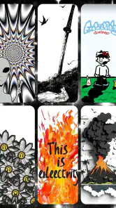

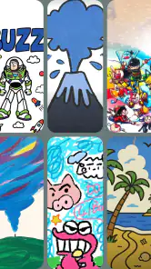
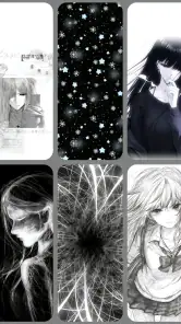
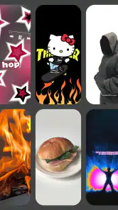

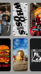
Analysis by Reviewed
I noticed Cool Launcher Pro because it takes a familiar Android task—changing the look of the home screen—and pushes it toward moving backgrounds rather than static images alone. After spending time with it, I see the appeal: it can make a phone feel more personal without asking the user to rebuild every part of the device. At the same time, its value depends heavily on how much visual motion you actually enjoy and how many people use the same device.
This is a free personalization app from Game Studio1314, intended for Android phones running Android 9 or newer. It currently sits at version 2.0.1, carries a Teen content rating, and has reached over one hundred thousand installs. Its average score is 4.2 from around six hundred ratings, which suggests a generally positive reception while still leaving room for individual experiences to differ.
I would describe it as a launcher-focused customization tool with an emphasis on video wallpapers. That distinction matters. Someone looking for a complete replacement for every Android behavior may find the experience narrower than expected, while someone who mainly wants a more lively home screen may appreciate the direct approach. In my experience, the best way to judge it is not by asking whether it replaces every launcher, but whether its visual style suits the way you use your phone every day.
How it feels on a shared household phone
The most interesting test is a phone used by more than one person. Imagine a device kept in a kitchen, living room, or family car: one person checks the calendar, another searches for a recipe, and a teenager picks it up to play music or send a message. A moving wallpaper can give that shared device a recognizable identity. It becomes easier to spot among several phones and feels less like a blank utility screen.
That benefit comes with a practical compromise. Personalization is usually strongest when one person chooses the visual style, but shared devices rarely have one single taste. A dramatic animated background that looks exciting to one household member may feel distracting to another. I would involve the regular users before settling on a style, especially if the phone stays visible in a common room or is passed between adults and younger users.
For a household, I would keep the home screen visually clear even if the background is energetic. Put the most-used apps where everyone expects them, avoid relying on tiny icons over a busy scene, and check the result in both bright and dim surroundings. The wallpaper should decorate the phone, not make basic actions harder for the next person.
There is also a social detail that is easy to overlook: a shared phone is not the same as a shared account. A launcher can change the appearance and starting point of the device, but it should not be treated as a way to separate personal information. Messages, photos, browsing history, saved accounts, and notifications still belong to the phone’s wider Android setup. If several people use one handset, I would keep account boundaries in mind before making the device more inviting to pass around.
More From Our News Desk

Clash of Clans Is Won Between the Battles

Android Auto Makes the Case for Quieter Car Software

MobiOffice: Transforming Mobile Productivity with Seamless Integration

EA SPORTS FC™ Mobile Soccer: Redefining Mobile Sports Gaming

How Microsoft OneDrive Became a Mobile Productivity Giant

How Google Translate Breaks Language Barriers Effortlessly
That makes this app more suitable for a household “utility phone” than for a device containing one person’s private work and personal life. On a family tablet or spare Android phone, the visual change may be welcome. On a personal phone that is occasionally borrowed, I would be more cautious about presenting a customized surface as if it created separate user spaces.
What the first setup should accomplish
My advice is to approach the first setup as a design decision, not a permanent commitment. Start with a background that is easy to read behind icons. Give yourself time to open the apps you use most, move between screens, and check whether the animation competes with text or notification badges. A wallpaper can look impressive while previewing and become tiring once it sits behind every task.
On a shared device, agree on a simple rule: the person choosing the appearance should not also rearrange everything without asking. The app’s main attraction is visual, so it is tempting to keep experimenting, but constant changes can frustrate anyone who depends on familiar icon positions. I would take a quick screenshot of the layout before trying a new look, making it easier to restore the arrangement if the household dislikes the change.
Another useful boundary is to separate experimentation from everyday use. Try a new video wallpaper when the phone is not needed for navigation, a call, or an urgent message. If the result feels too busy, return to a calmer option rather than forcing everyone to adapt. This is a small workflow, but it prevents personalization from becoming a source of household friction.
The Teen content rating is worth considering when younger family members regularly handle the device. It does not automatically tell me how a particular visual will fit every age group or household preference, so I would still preview the appearance myself. A parent or guardian may want a neutral background on a shared phone, while an older teenager may prefer something more expressive on a personal handset. The right choice is about context, not just the label.
Because the app is free, it is easy to try without turning the decision into a purchase. That lowers the risk for someone who simply wants to test a different look. Still, “free” does not mean every user will find the experience effortless. The real cost can be attention: choosing a suitable background, checking readability, and deciding whether motion remains pleasant after repeated daily use.
Keeping the home screen usable for everyone
My strongest practical recommendation is to judge the app while doing ordinary tasks rather than during a quick visual inspection. Open the dialer, read a notification, search for an app, and look at the screen from an angle. If the moving image pulls your eyes away from the icons, the novelty is working against the launcher’s basic job.
This matters even more for people with different visual preferences. A child may enjoy motion, an older relative may prefer stillness and strong contrast, and a busy adult may want the least distracting screen possible. A household can coordinate around one calm background, or reserve the more animated style for a personal device. Cool Launcher Pro is flexible as a visual choice, but it cannot resolve a disagreement between users by itself.
I also recommend checking how the phone feels when it is nearly out of attention or when the device is being used for a long stretch. I would not make a firm claim about battery behavior without testing the exact phone, display settings, and selected wallpaper together. The sensible approach is to watch your own device after a normal day. If the phone feels less comfortable or needs charging sooner, a static alternative may be the better household choice.
The same caution applies to older or less powerful phones. Android 9 is the minimum operating system, but that does not make every Android 9 device equally capable. Hardware, screen resolution, memory, and the complexity of the chosen video all influence how smooth a moving background feels. If a shared phone is older, I would test it with the least demanding-looking option first and pay attention to whether opening the home screen still feels immediate.
These are not reasons to reject the app. They are reasons to treat animated personalization as a trade-off. The visual effect is the point, so users who dislike motion, value maximum simplicity, or want the lightest possible home screen may be happier with a conventional static wallpaper and a standard launcher.
Coordinating preferences without creating confusion
In a household, coordination works best when the appearance has a purpose. A shared phone used for shopping might benefit from a quiet, readable look. A family media device could use something more playful. A teenager’s personal phone can reflect individual taste, provided the owner understands that a launcher does not create a private account boundary.
I would also keep the app’s role clear when explaining it to another user. It changes the phone’s presentation; it is not a replacement for Android’s user management, messaging privacy, or parental conversations. That distinction is especially important when a younger person asks to make a family device “theirs.” A customized screen can feel personal, but access to accounts and information should be handled separately.
One useful routine is to agree on a review point after a few days. Ask whether everyone can still find the important apps, whether the motion is distracting, and whether anyone avoids using the phone because the new appearance feels uncomfortable. This is more reliable than deciding based on a first impression. A background that seems fun for ten minutes may be less welcome during repeated practical use.
For people who coordinate devices across a household, consistency can matter more than originality. If several phones are used by the same family, giving each one a clearly different visual identity may help users recognize them. On the other hand, keeping the layout familiar across devices can reduce confusion for someone who regularly switches between them. I would choose one approach deliberately rather than changing every phone simply because the app makes experimentation easy.
The developer, Game Studio1314, presents this product as a personalization experience rather than a productivity system. That matches my impression. I would not install it expecting advanced organization, deep work tools, or a complete answer to shared-device management. I would install it when the main goal is to make the starting screen feel more distinctive through video-based visual customization.
Age, trust, and the limits of a customized surface
The Teen rating makes the app a better fit for users who can make their own judgment about visual content and device settings, but households should still decide what is appropriate for their circumstances. A rating is not a substitute for supervision or a conversation about what a shared phone is used for. If a younger child only needs access to a small set of apps, the important work is still organizing access and accounts through the phone’s broader settings, not relying on the launcher’s appearance.
I would be particularly careful when lending a personal phone to children or visitors. A more attractive home screen can encourage people to explore, but it does not change who is signed in. Before handing over the device, I would use the phone’s own privacy and account tools, remove sensitive notifications from view where appropriate, and explain which parts of the device are private. That workflow protects trust more effectively than any decorative change.
There is a similar issue with older relatives. An animated screen may be enjoyable, but a busy background can make icons harder to identify. If I were setting up a device for someone who values predictability, I would prioritize legibility and familiarity. The app can still be considered, but only if the chosen visual leaves the important controls easy to see and the person genuinely likes the motion.
For a personal phone, the decision is simpler. If you enjoy changing the mood of your device and want something more alive than a still image, the concept is easy to understand. If you use your phone mainly for reading, navigation, work messages, or quick one-handed actions, a quieter launcher may serve you better. The app’s strength is expression, not reducing visual stimulation.
How it compares with ordinary launcher choices
The usual alternative is the launcher already included with the phone, paired with a static wallpaper. That route is normally better for predictability: the interface is familiar, the visual layer is simpler, and there is less to evaluate after setup. It is the sensible choice for a shared phone where every user needs the same straightforward starting point.
A third-party launcher with extensive layout controls may be better for someone who wants carefully arranged grids, gestures, folders, icon packs, and a highly customized workflow. Cool Launcher Pro makes more sense when the moving visual is the priority and you do not want to spend your time rebuilding every interaction. I see it as a focused personalization option rather than a universal replacement for feature-heavy launchers.
Static wallpaper apps are also stronger for users who want a particular photograph, illustration, or minimal pattern to remain unchanged. They offer visual personality without making the screen feel active all the time. The choice comes down to whether motion adds character or becomes background noise. In my own assessment, the app is most convincing for users who notice and enjoy that difference every time they unlock the phone.
It is also worth comparing the app with doing nothing. A default home screen has a major advantage: nobody in the household needs to learn what changed. If your phone already feels comfortable, installing a personalization tool may not improve your daily routine. I would only keep Cool Launcher Pro if the new appearance continues to make the device more pleasant after the initial novelty fades.
My household verdict after weighing the trade-offs
I think Cool Launcher Pro is a reasonable free experiment for Android users who specifically want video wallpapers and a more individual-looking home screen. Its strongest use case is a personal device or a shared household phone where everyone agrees on a readable, non-distracting style. The app is easy to understand as a concept, and its current version, 2.0.1, gives interested users a clear starting point on supported Android devices.
I would skip it for a phone that must remain visually neutral, for a user who dislikes motion, or for anyone expecting a full account-separation system. It is also not my first recommendation for a performance-sensitive older device until the owner has tested the chosen background in normal use. The minimum Android 9 requirement tells you whether the operating system is supported, but the everyday result still depends on the individual hardware and setup.
My practical approach would be to install it on a spare or personal phone first, choose a calm video wallpaper, verify that icons and notifications remain readable, and use it through several normal routines. If the screen still feels comfortable after repeated unlocking, then it may be worth introducing on a shared device. If the effect becomes distracting, returning to the phone’s standard launcher and a static background is not a failure; it simply means clarity matters more than animation in that situation.
The best reason to choose this app is not that it changes everything, but that it can give one Android home screen a distinct visual identity. For a household, that identity should support easy recognition and comfortable use rather than compete with them. With sensible boundaries around accounts, age, and shared preferences, Cool Launcher Pro can be a pleasant personalization layer. Without those boundaries, its attractive surface may create more confusion than value.
Cool Launcher Pro Frequently Asked Questions
Is Cool Launcher Pro free to download, and what should I expect before installing it?
Cool Launcher Pro is a free personalization app for Android, aimed at people who want to give their phone a different look and feel. Its store description highlights video wallpapers and a personal touch. It has a Teen content rating, so check that rating and the app’s current store page before downloading, especially if a younger person will use the device.
What is Cool Launcher Pro, and what does it do?
Cool Launcher Pro is an Android customization app designed to change the appearance and behavior of your phone’s home screen. It typically provides alternative themes, icon styles, wallpapers, widgets, transition effects, folders, and app-drawer layouts. After installation, users can select it as their default launcher and personalize the interface without replacing the phone’s operating system or deleting installed applications.
Is Cool Launcher Pro compatible with every Android device?
Compatibility can vary depending on your Android version, device manufacturer, screen resolution, and available system permissions. Cool Launcher Pro requires Android 9 or later, but certain features—such as gesture navigation, notification badges, lock-screen effects, or advanced animations—might be limited on some models. Before downloading, check the Google Play listing for supported Android versions and review recent user comments for device-specific issues.
Does Cool Launcher Pro affect phone performance or battery life?
A third-party launcher generally uses some memory and processing power because it manages the home screen, animations, widgets, and background updates. On newer devices, the impact may be barely noticeable, while older or entry-level phones could experience slower transitions or slightly higher battery consumption. Disabling unnecessary animations, live wallpapers, and continuously updating widgets can help maintain smoother performance.
What permissions does Cool Launcher Pro require, and are they safe?
The permissions requested by Cool Launcher Pro depend on the features included in the version you install. A launcher may request access to notifications, storage, wallpaper settings, or accessibility features for gestures and shortcuts. You should read each permission explanation carefully and deny anything unrelated to the launcher’s purpose. Downloading only from the official store also reduces the risk of modified or unsafe versions.
Pros
- Clean interface with smooth transitions and responsive app launching.
- Offers useful customization for icons
- layouts
- widgets
- and home-screen appearance.
- Includes gesture shortcuts that make common actions faster to access.
- Lightweight design generally uses fewer resources than feature-heavy launchers.
- Provides an alternative home-screen experience for users bored with stock launchers.
Cons
- Some advanced customization options may require a paid upgrade.
- Compatibility can vary across Android brands and customized system versions.
- Extra launcher features may increase battery use on older or less powerful phones.
- Certain system settings and widgets may not integrate perfectly with every device.
- Users may need time to learn the launcher’s gestures and navigation controls.
- Category
- Personalization
- Version
- 2.0.1











