Compose Material Catalog
- 24.00
- 3.9
- Installs
- 100.00K
- Price
- Free

Screenshots

Analysis by Reviewed
If you're a fan of sleek, modern design and robust functionality, then buckle up because the Compose Material Catalog is about to become your new best friend. Having spent some quality time exploring this bad boy, I can honestly say it's a game-changer for developers and design enthusiasts alike.
Where connectivity enters the picture
The catalog is a reference app, so the most useful question for me is not whether it can replace a full development setup, but how easily I can consult it when I need to make a design decision. It gives me a place to inspect Compose Material examples on a phone rather than jumping straight into a project or searching through a broad collection of general design advice. That focus is valuable, but it also means the app is best treated as a companion to coding and documentation, not as a complete workflow by itself.
Network conditions matter most when I move between this quick visual reference and the rest of my work. If I am checking how a component is presented, the app can help me reason about the example in front of me; if I need to verify implementation details in a project, I still need my development environment and reliable access to the references I normally use. I would avoid assuming that every resource or action is available without a connection. My practical approach is to open the material I need while I have a dependable connection and keep the actual project tools close at hand.
That distinction is useful for deciding whether to install it. A developer who often wants a visual reminder while away from a desk may appreciate having a focused catalog on a phone. Someone expecting a mobile app to replace a code editor, a complete API reference, or a team’s design system will probably find the scope too narrow. The value is in making examples easier to browse, not in removing the need for the rest of the development process.
Getting Started with the Catalog
Jumping into the Compose Material Catalog is like opening a designer’s toolbox that’s packed with all the essentials. It’s an app that showcases components, colors, typography, and other elements that follow the Material Design principles. Think of it as your personal cheat sheet for building beautiful, intuitive apps.
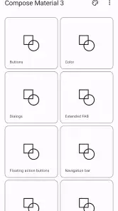
Right off the bat, the app offers a clean, easy-to-navigate interface. The main menu is straightforward, with sections dedicated to different UI components. Whether you’re looking for buttons, cards, or navigation drawers, it's all neatly organized. And let’s not forget about the dark mode – because who doesn’t love a good dark mode?
Using it in everyday mobile work
The phone format makes the catalog most useful in short, specific sessions. I can imagine opening it during a design review when someone asks whether a button or card feels consistent with a Material approach, then returning to the conversation with a clearer visual reference. It is also handy when sketching a screen away from my workstation: I can compare the kinds of elements I might use before committing to a layout in the actual project.
More From Our News Desk

Clash of Clans Is Won Between the Battles

Android Auto Makes the Case for Quieter Car Software

MobiOffice: Transforming Mobile Productivity with Seamless Integration

EA SPORTS FC™ Mobile Soccer: Redefining Mobile Sports Gaming

How Microsoft OneDrive Became a Mobile Productivity Giant

How Google Translate Breaks Language Barriers Effortlessly
One practical habit is to look at related examples in sequence rather than treating each component as an isolated answer. A button may look right on its own but feel out of place beside a different card treatment or navigation pattern. Browsing a few relevant sections together can help me think about the screen as a system. That is a more useful way to consult a catalog than copying a single attractive element without considering how it fits the rest of the interface.
There is a trade-off, though. A phone is good for quick inspection, not for judging every detail of a finished interface. Small differences in spacing, text hierarchy, or how a component behaves in a larger layout are easier to assess on a fuller screen and within the app being built. I would use this as a prompt for decisions, then check the result in the real project and on the devices that matter to its users.
Why It’s a Must-Have for Developers
For developers, the Catalog is pure gold. It doesn’t just show you what’s possible; it lets you play around with the components right there in the app. Want to see how a floating action button looks against a particular background? Go ahead, give it a whirl. It’s all about hands-on learning and experimentation.
Moreover, the app provides code snippets for each component, making it super easy to integrate these elements into your projects. No more endless Googling or digging through documentation – it’s all right there at your fingertips. This makes the app not just a tool, but a real time-saver, streamlining your workflow and letting you focus on what truly matters: creating awesome apps.
Making examples useful without mistaking them for a finished design
The strongest workflow here is to treat each example as a starting point. When I find a component that seems close to what a screen needs, I would note the relevant pattern, then compare it with the surrounding interface and the project’s own requirements. A catalog can show a component clearly, but a production screen also has to account for the content, accessibility needs, and visual choices of the product it belongs to. The example is a reference, not a reason to make every app look identical.
Code snippets can shorten the trip from seeing a pattern to trying it, but I would still review them in context before using them. A snippet is useful for understanding the shape of an implementation; it does not automatically settle questions about the app’s existing dependencies, conventions, or design decisions. For someone learning Compose, that makes the catalog a helpful bridge between a visual idea and code. For an experienced developer, it is more of a quick reminder than a substitute for checking how the project is structured.
A small but useful discipline is to compare the snippet with the version of the design and code already in the project before adopting it. That helps avoid copying an example simply because it is convenient, especially when the surrounding screen has established patterns. I would also use a catalog visit to answer one narrow question at a time—such as how a particular component is presented—rather than expecting a single browse session to resolve an entire design problem.
How it compares with other references
Compared with a general web search, a focused catalog can make it quicker to find a relevant visual example without sorting through unrelated tutorials, discussions, or screenshots. Compared with formal documentation, its appeal is the immediate, visual way of exploring components. Those alternatives still have clear advantages: documentation is the better place to check exact implementation guidance, while a team’s own design system is the authority for a product’s approved patterns. I would use the catalog to orient myself, then consult the project’s own standards whenever consistency or implementation detail matters.
It is also different from a design tool where I can build and review a complete screen. A component catalog helps me examine building blocks; it does not replace arranging those pieces into a working product flow. That boundary is important for beginners in particular. It can help answer “what does this kind of element look like?” more readily than “is this the right interaction for my users?” The second question needs the context of the app and the people using it.
Connectivity, interruptions, and sensible recovery
In everyday use, I would expect the experience to be most predictable when I have a stable connection, particularly if I am moving between the catalog and external project references. A dropped connection can interrupt a broader research workflow even if the immediate visual browsing feels straightforward. I would not plan an important implementation task around the assumption that every part of the experience will remain available during a network interruption.
If something fails to load or a lookup is interrupted, the sensible response is to retry when the connection is steady and keep the question small. I would first return to the relevant component rather than restarting a whole research session, then verify any code or implementation decision in the development environment. That approach limits wasted time and helps separate a temporary connectivity problem from a mismatch between an example and the project.
For a commute or a meeting in a building with unreliable reception, I would prepare by opening the sections I expect to discuss before leaving dependable coverage, while keeping critical notes in the project or another tool I already rely on. This is not a claim that the app works offline; it is simply a practical way to avoid depending on a last-minute lookup when the network is uncertain.
Data-conscious use and audience
Because this is a visual reference rather than a service I need to consult continuously, I would use it deliberately instead of leaving it open as a background companion. That keeps my workflow focused and makes it easier to notice when I actually need an external reference or project resource. If I am mindful about mobile data, I can reserve catalog browsing for moments when a particular design question arises and use a trusted connection for broader research.
Google LLC developed this free app, which sits in the libraries and demo area rather than serving as a general-purpose design editor. It is rated for Everyone, so it is suitable for a broad audience, though its practical audience is mainly people interested in Compose Material examples. The current version is 2.5.0, and it requires Android 6.0 or later. It has a 3.9 average from around 825 ratings, with over 100K installs; those figures suggest an established audience, but they do not tell me whether it fits any one person’s workflow.
I think it is a good fit for Android developers learning Compose, designers who want to discuss Material-style components with developers, and students who benefit from seeing examples alongside code. It is less suitable for someone who wants a complete design system for a specific company, a full-screen prototyping environment, or a replacement for technical documentation. In those cases, the project’s own component library, a dedicated design tool, or the official implementation reference is the better place to spend time.
The Aesthetic Appeal
Okay, let’s talk aesthetics because, trust me, it’s important. The Catalog doesn’t just serve functionality on a platter; it does so with style. The app is visually pleasing, showcasing a perfect blend of minimalistic design and vibrant colors. It’s a reminder that good design isn’t just about usability, but also about creating an experience that’s enjoyable and inspiring for the user.
With a range of color palettes and typography options, you can really see how different elements come together to create a cohesive look. It’s like having an entire design seminar condensed into an app – you get to see theory in action, and that’s pretty darn cool.
When the catalog is—and is not—the right choice
A realistic use for me would be preparing a screen for a quick team discussion. Before the meeting, I could browse the relevant component examples, identify a couple of patterns worth considering, and use those as concrete visual starting points. During the conversation, I would still compare them with the product’s existing interface and user needs. That turns the app into a useful shared reference instead of a source of ready-made answers.
It is less helpful when the core problem is not about choosing a component but about designing a complicated interaction, testing a full user journey, or resolving a technical issue in an existing codebase. In those situations, the catalog may help with one small piece, but I would move quickly to a prototype, the project’s design system, or the relevant documentation. Knowing when to stop browsing is part of getting value from a reference app.
If you are deciding whether it belongs on your phone, ask what you usually need at the moment you reach for a design reference. If you want quick visual examples and a way to connect them with Compose code, it has a clear purpose. If you need a complete workspace, collaboration system, or authoritative guide to every implementation decision, this should be one resource among several rather than your only one.
Final Thoughts
Wrapping it all up, the Compose Material Catalog is more than just an app; it’s a comprehensive toolkit that empowers you to design with confidence and creativity. Whether you’re a seasoned developer or just starting out, it offers invaluable insights into the world of Material Design.
So, if you haven't already, I'd highly recommend giving this app a spin. It's not just about building apps; it's about building better, more beautiful ones. And honestly, who wouldn’t want that?
For me, the connectivity verdict is straightforward: this is most valuable as a focused companion when I can consult examples and then return to my project with a specific question in mind. I would not make it the only source for implementation guidance or rely on an uncertain connection for a time-critical task. Used within those limits, it can make a quick design check more concrete; used as a replacement for a full development or design setup, it will feel incomplete.
Compose Material Catalog Frequently Asked Questions
Is Compose Material Catalog free to download?
Yes. Compose Material Catalog is free, so you can install it without paying for the app. It is a practical option for developers who want to explore Jetpack Compose Material components and examples without making a purchase. The app is rated for Everyone, though its developer-focused content may be most useful to people learning or building Android interfaces.
What is Compose Material Catalog and what can I do with it?
Compose Material Catalog is an essential tool for developers working with Jetpack Compose, a modern toolkit for building native UI in Android. The app provides a comprehensive collection of Material Design components and showcases their usage through interactive examples. Users can explore different UI elements, understand their properties, and see how they behave in real-time, making it easier to design beautiful and functional applications.
Is Compose Material Catalog suitable for beginners in Android development?
Yes, Compose Material Catalog is suitable for both beginners and experienced developers. It offers an intuitive interface that allows beginners to explore and understand Material Design principles and Jetpack Compose components without requiring extensive coding knowledge. The interactive examples and detailed documentation make it a valuable learning resource for anyone starting with Android development.
How frequently is Compose Material Catalog updated with new features?
The Compose Material Catalog is regularly updated to align with the latest releases and features of Jetpack Compose and Material Design. Updates typically include new components, enhancements, and bug fixes. Users can expect timely updates that ensure they have access to the latest tools and components for building modern Android applications efficiently.
Can I use Compose Material Catalog offline, or does it require an internet connection?
Compose Material Catalog is designed to be used offline. Once the app is downloaded, users can explore all the features, components, and examples without needing an internet connection. This offline capability makes it convenient for developers to work on their projects anytime and anywhere, without being dependent on internet availability.
Pros
- Intuitive UI design.
- Extensive component library.
- Regular updates and support.
- Cross-platform compatibility.
- High customization options.
Cons
- Steep learning curve.
- Limited offline features.
- Requires recent Android version.
- Occasional performance lags.
- Complex for beginners.
- Category
- Libraries & Demo
- Version
- 2.5.0