Always On Edge Lighting & AOD
- 3.31K
- 3.5
- Installs
- 10.00M
- Price
- Free

Screenshots
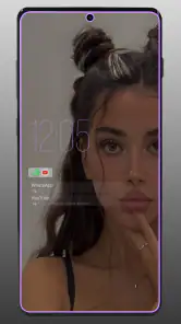
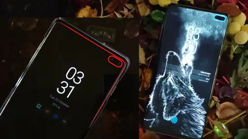
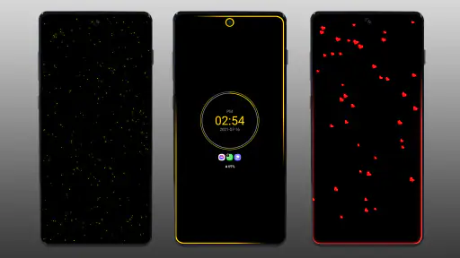
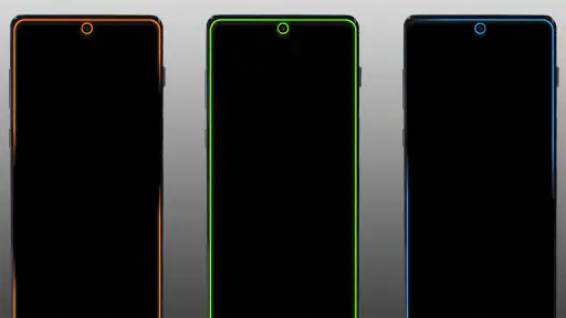
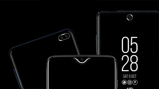
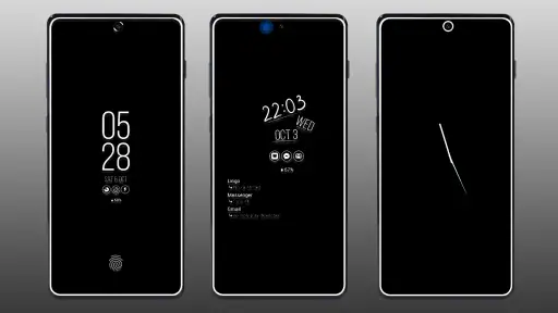
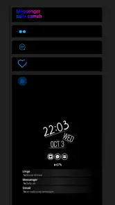
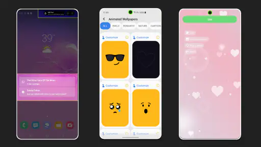
Analysis by Reviewed
I started using Always On Edge Lighting & AOD because I wanted my phone to communicate more clearly when it was resting on a desk. A normal notification sound is easy to miss, while a bright edge effect or a small always-on display can give me a quick visual clue without unlocking the screen. That sounds simple, but this app is more than a decorative wallpaper: it combines an always-on display with animated border lighting and notification-focused personalization.
My experience is that it works best for people who want their phone to feel more visible and expressive, especially when it is placed face up in a shared room, on a bedside table, or beside a keyboard. It is a free personalization app from Dubiaz, available for everyone and supporting devices running Android 8.1 or newer. The app has passed the ten-million-install mark and holds a 3.5 average from roughly 196 thousand ratings, so it is clearly used widely, although the middling score also suggests that the experience depends heavily on the phone model, display behavior, and how much setup a person is willing to do.
How it fits into a shared household
The most convincing everyday use I found was not showing off a colorful animation. It was using the phone as a quiet visual signal while I was doing something else. Imagine preparing dinner while the phone sits across the room: a glance at the edge of the screen can tell you that something happened without forcing you to pick it up with wet or messy hands. In a home where several people are moving between rooms, that small visual cue can be more useful than a notification sound that everyone hears but nobody identifies.
There is also a practical shared-device angle. A phone left on a kitchen counter or living-room table may be seen by more than one person, so the display style should be informative without becoming distracting. I would choose a restrained border effect in that situation rather than a fast, bright animation. The app gives the phone a more noticeable presence, but that is both its strength and its main risk: a setting that feels helpful to one person can feel like visual noise to everyone else.
For a personal desk, I found the always-on display more useful than the decorative lighting alone. It can make the phone easier to read at a glance, while the border effect adds a quick indication that an alert has arrived. This is particularly handy when the phone is on silent or when I am listening to something and do not want a sound interrupting the room.
That does not mean it replaces checking the phone. An illuminated edge is a prompt, not a complete message preview. I still need to look at the lock screen or open the relevant application to understand what happened. I would treat it as a visual nudge rather than a privacy-safe summary of every notification.
Starting with a controlled visual style
The first setup decision should be whether the phone needs information or atmosphere. If the goal is practical awareness, I would begin with a simple always-on layout and a modest border animation. If the goal is personalization, I would experiment with more expressive effects only after confirming that they are comfortable in the room where the phone is normally kept.
This order matters because bright lighting can make a feature appear impressive during setup but become tiring after several hours. A shared household also magnifies that problem. A bedroom, study, and living room have different lighting conditions, and an effect that looks subtle during the day may feel intrusive at night. I recommend testing the phone in its real resting places instead of judging everything while holding it in front of you.
The app is best approached as a collection of visual choices rather than a one-tap replacement for the phone’s built-in display behavior. Android manufacturers handle always-on displays differently, and some devices already include a polished system option. On those phones, Always On Edge Lighting & AOD makes more sense as an extra layer for people who specifically want animated borders or a different visual identity.
There is a trade-off here. A manufacturer’s own always-on display is usually better integrated with the device’s power management and lock-screen rules. A separate personalization app can offer a more distinctive look, but it may require more attention during setup and may not behave identically on every model. I would not install it expecting every effect to look exactly the same across different Android phones.
Keeping boundaries clear on a phone used by more than one person
Shared use makes notification design more important. If a phone belongs to one person but sits in a common area, the lighting should communicate presence without encouraging everyone nearby to inspect the screen. I would avoid highly descriptive or overly prominent arrangements when other people are around. The edge effect can announce that something needs attention, but the owner should still decide whether the content itself is appropriate to reveal.
This is also where account boundaries matter. The app personalizes the device’s appearance; it does not turn a shared phone into separate private spaces. If different people use the same handset, the visual settings apply to the device rather than magically understanding who is looking at it. I would keep one agreed style and avoid treating the lighting as a substitute for separate user profiles, app locks, or private notification settings.
For a family phone, that distinction is easy to overlook. A child may see a glowing border and assume that the alert is meant for them, while an adult may simply want a reminder to check the phone later. The display effect is a signal, not a household coordination system. It can support a routine, but the routine still needs to be agreed on by the people using the device.
A useful arrangement is to make the phone’s resting location part of the system. For example, placing it in one visible spot during homework or meal preparation makes the lighting predictable rather than something that follows people around the house. I found that this simple habit reduced the temptation to keep checking the screen, because the visual effect told me that an alert existed without demanding an immediate response.
Using the lighting to coordinate without creating pressure
In a household, notifications can easily become interruptions. A colorful edge animation may attract attention from someone who is not the intended recipient, especially if the phone is left on a table. I would use a calmer effect during family conversations, meals, or shared viewing, then reserve more noticeable styles for situations where missing an alert would genuinely be inconvenient.
This is one of the app’s less obvious strengths: it can help separate the idea of “something happened” from “I must respond now.” The phone becomes visually legible from a distance, but I remain in control of when to pick it up. That is a healthier arrangement than repeatedly unlocking the device just to check whether a new notification arrived.
It can also work for household coordination in a limited way. If one person is waiting for an important message, the edge lighting can make the phone easier to notice while it is charging or sitting on a counter. However, I would not rely on the effect for emergencies, time-sensitive care, or anything that cannot safely wait. A visual personalization layer is not a guaranteed alert channel, and a phone’s normal notification behavior remains the more dependable foundation.
Another practical tip is to place the phone where the edge is actually visible. If it lies under a notebook, inside a bag, or face down, the main visual benefit disappears. The feature rewards deliberate placement. That sounds obvious, but it is the difference between a useful glanceable display and an effect that exists only in the settings screen.
Age, trust, and the meaning of “Everyone”
The app carries an Everyone content rating, which fits its role as a visual personalization tool rather than an entertainment app built around mature themes. That makes it easy to consider for a household device, but an age rating should not be confused with a complete privacy or supervision feature. The app changes how the phone presents information; it does not define who may read that information.
For younger users, I would focus on whether the visual effects encourage constant checking. Some children enjoy customizing every part of a device, and this app can make the phone feel more personal. At the same time, an always-visible display may make the handset more tempting to watch during study, meals, or bedtime. The right choice depends less on the rating and more on the family’s expectations about screen use.
Trust also matters for adults sharing a device. A glowing border can be visible to anyone nearby, but it does not explain what the alert contains. That ambiguity can be useful for privacy, because the notification text need not be exposed from across the room. Still, the phone owner should review the underlying lock-screen settings and choose a layout that matches the household’s comfort level.
I would skip this app for someone who wants strict separation between work and personal notifications on one shared handset. The visual layer cannot create independent boundaries by itself. A person who needs multiple private profiles, detailed notification filtering, or tightly managed access should look first at the phone’s built-in tools or a dedicated privacy solution. This app is about presentation and awareness, not account administration.
What feels different from ordinary alternatives
The usual alternatives are the manufacturer’s built-in always-on display, a simple notification LED where the hardware supports one, or no visual alert at all. The built-in option generally wins for seamless operation and low effort. It is already connected to the phone’s display and lock-screen behavior, so it is the sensible choice for someone who wants basic time and notification information with minimal customization.
A physical notification light, when available, is more discreet and often easier to understand at a glance. It lacks the visual flexibility of animated borders, though, and many modern phones do not offer that hardware. Turning the screen off entirely saves the user from another visual distraction, but it also makes missed notifications more likely when the phone is across the room.
Always On Edge Lighting & AOD sits between those choices. It is more expressive than a standard system display and more noticeable than a tiny indicator, while remaining less intrusive than unlocking the phone for every alert. The cost of that flexibility is extra adjustment. I would choose it for a person who enjoys tuning the appearance and wants the phone to be visible in a particular way, not for someone who considers customization a chore.
The app’s store summary emphasizes a professional always-on display with LED and border-light effects. In practice, I interpret “professional” as a visual style goal rather than a guarantee that every phone will look identical. The result depends on the device’s screen, its edge shape, brightness behavior, and the surrounding light. A curved-edge phone may make the border effect feel more natural, while a flat display can present it as a frame around the screen.
Small workflow decisions that improve the experience
My first concrete recommendation is to create a low-distraction baseline before exploring the more dramatic options. Keep the always-on information easy to read, use a slower or less intense border treatment, and leave the phone in its normal location for a full day. This reveals whether the feature is genuinely useful or merely attention-grabbing.
Second, compare the app with the phone’s own always-on display before committing to the custom look. If the system option already provides everything needed, the extra layer may not justify the additional setup. If the built-in display feels too plain or the notification cue is too easy to miss, the app has a clearer purpose.
Third, think about charging habits. A phone that remains on a stand or near a wall outlet is a natural candidate for an always-on display. A phone carried in a pocket for most of the day gains less from a visible edge effect, because the screen is frequently covered. This is a simple but important trade-off: the feature’s value rises with the amount of time the device rests in view.
Fourth, use the effect as a reminder to batch checks rather than as an invitation to react instantly. When I see a visual alert while working, I can finish the current task and check the phone at a sensible pause. That turns the app into a small attention-management aid instead of another source of interruptions.
There is also a financial detail worth considering. The app is free to install, while optional in-app purchases range from ninety-nine cents to four dollars and forty-nine cents per item. I would try the free experience first and decide whether the available customization is enough before paying. For this type of app, the value depends on whether the visual style becomes part of a daily routine, not on how many effects can be collected.
Performance expectations and everyday friction
The current version is 9.6.8, and the project has been available since June 20, 2018. That long presence and large install base make it feel like an established personalization option rather than a brand-new experiment. Even so, an established app does not remove the compatibility question. Android phones vary widely in display controls, battery behavior, lock-screen handling, and manufacturer-specific restrictions.
I would pay attention to how the app behaves after the phone is restarted, after a system update, and when battery-saving settings are active. These are the moments when a visual overlay or notification-related feature may behave differently from the initial setup. If the effect is important for a shared household routine, test it during ordinary use rather than assuming that the preview screen represents every situation.
The 3.5 average rating is a useful warning against treating the app as universally seamless. I read that score as a reason to keep expectations realistic: the concept is appealing, but the experience may be uneven from one device to another. Someone with a phone that already has excellent built-in always-on controls may notice little improvement, while someone with a basic lock-screen experience may appreciate the added visibility much more.
Battery awareness is another sensible part of the decision. An always-on display and repeated lighting effects are designed to keep the screen visually active, so I would avoid the brightest or most animated configuration if battery endurance is a priority. I would also be cautious about using a highly visible style overnight. A feature that helps in a bright kitchen may be distracting in a dark bedroom.
These are not reasons to dismiss the app. They simply define the right expectations. Personalization has a cost in attention, setup time, and potentially power use. The best configuration is not the most elaborate one; it is the one that makes the phone easier to read without making the room revolve around it.
Who should install it, and who should pass
I would recommend it to someone who keeps a phone face up on a desk, wants a clearer visual sign for incoming notifications, and enjoys adjusting the look of the device. It is also a reasonable fit for a shared household where the phone owner wants a quiet, visible cue while cooking, working, or moving between rooms. The free entry point makes experimentation straightforward, and the Everyone rating makes the app broadly approachable from a content perspective.
I would be more cautious for a person who already likes the manufacturer’s always-on display and wants the fewest possible background services or settings to manage. The built-in option is likely the cleaner choice in that case. I would also skip this app for anyone who is easily distracted by glowing screens, needs guaranteed emergency alerting, or expects separate family accounts and supervision controls.
For privacy-sensitive users, the app can be used thoughtfully, but it should not be mistaken for a privacy product. Keep the visible design general, review what the phone itself shows on the lock screen, and avoid leaving the handset in a place where every passerby can inspect it. The border can tell you that attention is needed without revealing the reason, which is a useful compromise when configured carefully.
My final view is positive but selective. The real value is not the animation itself; it is the ability to notice the phone without constantly unlocking it. Always On Edge Lighting & AOD gives that idea a more customizable and noticeable form than a plain system display, but it asks the user to manage brightness, placement, household expectations, and device compatibility.
For my own use, I would keep the design calm in shared spaces, use a more expressive style only when the phone is personal and nearby, and treat the always-on display as a glanceable reminder rather than a replacement for normal notifications. Dubiaz has made a useful tool for people who want their Android phone to communicate visually, but it is best when used with clear boundaries. If that balance sounds right to you, the free version is worth trying; if you want invisible operation and zero setup, the phone’s standard display controls are probably the better answer.
Pros
- Highly customizable edge-lighting colors
- patterns
- and animation speeds.
- Works with many notification types
- including calls and messaging apps.
- AOD options help check essential information without unlocking the phone.
- Can use different lighting effects for individual contacts or applications.
- Offers flexible scheduling to reduce interruptions during selected hours.
Cons
- Some advanced features may require in-app purchases or premium access.
- Continuous lighting and AOD use can increase battery consumption noticeably.
- Setup may require several permissions and accessibility-related settings.
- Compatibility can vary between devices
- Android versions
- and screen types.
- Frequent notifications may trigger repeated animations and become distracting.

- Category
- Personalization
- Version
- 9.6.8