US Debt Clock .org
- 311.00
- 4.7
- Installs
- 10.00K
- Price
- $4.99

Screenshots




Analysis by Reviewed
I tend to reach for US Debt Clock .org when a headline leaves me curious about the scale of public finances, but I’m not ready to read a full report. It gathers a wide range of US economic figures in one place, making it easy to browse and follow questions as they occur to me. I find it most useful as a visual starting point, not as a tool for making personal money decisions or settling a policy debate.
Reading a busy financial display
The app’s appeal is also its main challenge: many figures compete for attention. If you like scanning data and following connections between indicators, that density can be absorbing. If small or tightly packed information is uncomfortable to read, the experience may feel tiring, especially during a long session. I’d approach it in short visits, choosing one topic to follow instead of trying to take in every number at once.
That distinction matters because a live-looking counter can feel more precise than its context warrants. I use the display to notice broad relationships and then seek an explanation before drawing conclusions. A moving total alone does not tell me what caused a change, how a figure is calculated, or what policy response might follow. Treating it as a prompt for further reading keeps the app informative without asking it to do the work of a full analysis.
Getting Started with the Numbers
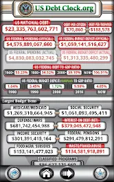
Don't let the name intimidate you. US Debt Clock .org is as straightforward as it gets. As soon as you open the app, you're greeted with a display of numbers ticking away. It's like watching a financial symphony play out in real time. The app tracks everything from the national debt and budget deficits to the amount of money in circulation. It's not just about numbers; it's about understanding the bigger picture.
Navigating the App
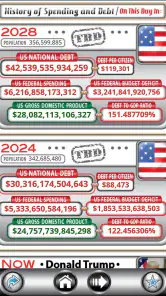
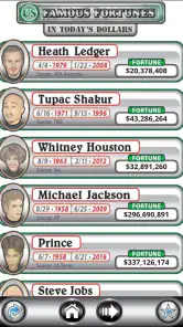
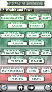
One of the things I love about this app is its simplicity. The interface has different sections dedicated to economic indicators. You can swipe through to explore areas like "Debt Per Citizen" or "Federal Spending." It’s like having a crash course in economics without the boring lectures. The data changes over time, giving you a current-looking view of the figures on screen.
If you’re deciding whether that layout is for you, I’d first consider how you normally read numbers on a phone. Someone who enjoys comparing several indicators at a glance may find the arrangement useful; someone who prefers a single, carefully explained chart may find it crowded. The key is to explore one section at a time rather than treating the first screen as a complete explanation of the economy.
For people who use a phone with visual adjustments or spoken assistance, the practical question is whether the figures remain comfortable and understandable with their usual settings. I would test the sections I care about before settling in: a screen can look manageable at first and become demanding when I try to read a longer list or move repeatedly between categories. That quick check is more useful than assuming one display style works equally well for everyone.
More From Our News Desk

Clash of Clans Is Won Between the Battles

Android Auto Makes the Case for Quieter Car Software

MobiOffice: Transforming Mobile Productivity with Seamless Integration

EA SPORTS FC™ Mobile Soccer: Redefining Mobile Sports Gaming

How Microsoft OneDrive Became a Mobile Productivity Giant

How Google Translate Breaks Language Barriers Effortlessly
And for all you data geeks out there, you'll appreciate the level of detail provided. You can even delve into specifics like state debts or the Social Security liability. It's a treasure trove of information that can be both enlightening and a bit overwhelming at times.
Using it without getting lost
A practical way to explore is to pick one figure that connects to a question you already have. For example, if a news story mentions federal spending, I’d look at that section first, then compare it with a related indicator rather than hopping randomly across every category. This makes the screen easier to process and helps me avoid treating separate totals as if they explain one another automatically.
For a classroom discussion or a conversation with family, the app can help make large-scale finances feel less abstract: open a topic, describe what the number represents in everyday terms, and use it as a reason to ask what context is missing. I would not use a changing display as a citation in a report without checking a stable source and its methodology. That extra step is a worthwhile trade-off when accuracy and traceability matter.
It also works well as a companion to a news article rather than a replacement for one. If a story refers to debt per citizen, for instance, I can use the app to see that figure in the wider collection, then return to the reporting for definitions and causes. This order keeps the browsing focused: the app supplies a visual prompt, while the article supplies the explanation and sourcing needed to interpret it responsibly.
For a quick personal routine, I’d save a question rather than trying to memorize a changing total. Before opening the app, decide whether you want to understand spending, debt, or another topic; after browsing, write down the question that remains. That small habit turns a scroll through figures into a useful next step and reduces the temptation to treat a snapshot as a lasting conclusion.
Motor, sensory, and everyday access
Swiping between sections gives the experience a simple, direct rhythm, but it also means navigation depends on comfortable touch interaction. Anyone who finds repeated gestures difficult may prefer to browse briefly and deliberately, pausing on one area rather than moving through many screens. I would also avoid assuming that a visually dense display will suit every reader: people who need larger, less crowded text or rely on spoken access should check how it feels on their own device before paying.
Context changes the experience too. At home, I can take time to inspect a figure; on a commute or in bright outdoor light, a screen full of changing information is harder to use attentively. It is better suited to a deliberate glance than to quick, distraction-prone checking. If I need a calm, accessible explanation of a single statistic, a well-structured article or public report may be the better choice.
That makes this a poor fit for moments when attention is divided. I would not try to interpret a cluster of financial figures while walking, keeping an eye on a child, or listening for a transit announcement. In those situations, the risk is not just missing a detail; it is taking away a simplified impression without having time to check what the number represents. A focused reading session is a better match for the app’s information-heavy approach.
There is a useful distinction between access to information and ease of using the information. The app puts many topics within reach, but a person may still need more time, a larger display, or a quieter setting to make sense of them. If you share a figure with someone else, I’d explain the label and the question it raises instead of handing over a screenshot as if it were self-explanatory. That is a simple way to make the data more approachable without overstating what the display tells you.
Why It Matters
Now, you might be wondering, why should I care about all these numbers? Well, understanding the national debt and economic indicators is crucial for grasping where the country stands financially. It impacts everything from government policies to your personal finances. By using US Debt Clock .org, you gain insight into the economic forces that shape our world, making it a handy tool for anyone wanting to stay informed.
Moreover, the app can be a great conversation starter. Imagine bringing up a figure you noticed at dinner and asking what it includes or how it affects a policy discussion. The better use, in my view, is not to impress people with a large number but to open a grounded conversation about what the number measures and what it leaves out.
Who should try it, and who should look elsewhere
Chrono Numeric Labs LLC’s finance app is aimed at people who enjoy exploring many economic indicators in one place, including students, news followers, and anyone who wants a visual overview before reading deeper. It has a 4.7 average from nearly a thousand ratings, and more than 10,000 installs suggest it has found an audience among people who like this kind of quick reference. The app is rated for everyone, but that age label does not make a crowded data screen equally comfortable for every ability or situation.
A realistic use would be checking a topic after hearing it discussed on the evening news, then using the app to decide what to read about next. It can also suit a student preparing questions for a lesson on public budgets, provided the figures are treated as a starting point and not a complete lesson. For a family conversation, I’d choose one indicator and invite people to ask what it means rather than attempting to tour every section in one sitting.
The trade-off is that it is not a budgeting app, a personalized financial adviser, or a substitute for a carefully sourced economic report. If your priority is a plain-language explanation, a searchable government publication or a focused news article will usually be easier to follow. If you want to browse a range of figures and decide for yourself which questions deserve attention, this app has a more immediate, exploratory feel than those alternatives.
Compared with a budgeting tool, its focus is public finance rather than tracking your household income, spending, or goals. Compared with a news app, it offers a place to browse a collection of indicators instead of building a story around one event. Neither alternative is simply better: choose a budget app for personal decisions, reporting for causes and context, and this one when you want a broad visual prompt for further exploration.
I’d skip it if I mainly wanted plain-language lessons, a step-by-step account of how a policy works, or a number I could cite without checking its source. It is also not the right choice if a dense screen or repeated swiping makes phone use uncomfortable. Those are not minor preferences when the central experience depends on reading and navigating a lot of figures; a clear article, accessible report, or audio explanation can be more useful.
Cost, expectations, and my verdict
The app costs $4.99, with in-app purchases listed at $1.99 per item, so I would check what is included in the version you plan to use before committing. It was released on February 22, 2020, and its current version is 2.0 for Android 5.0 and later. That gives you useful compatibility context, but the practical test is still whether its presentation works for your eyes, hands, and preferred way of learning.
Since it is paid, I’d make the decision based on the specific way you expect to use it, not just on curiosity about one headline. If you anticipate returning to different indicators and enjoy browsing them visually, the purchase may make sense. If you only need an occasional explanation of a single statistic, a freely available public report or a solid news explainer may be a better fit. The listed in-app purchase price also makes it sensible to check the options before assuming the initial cost covers every extra you might want.
One useful habit is to separate what the app helps you notice from what you need to verify elsewhere. I might spot a relationship between two figures, but I would still look for definitions, dates, and methodology before using that observation in a class assignment or a serious discussion. This is not a flaw unique to a number-led app; it is the trade-off of getting a compact visual overview instead of a full account of how each measure is built.
So, is US Debt Clock .org worth your time? It can be, if you’re a finance enthusiast or simply want a way to browse the country’s economic indicators. I find it educational when I use it with a question in mind, and its direct navigation makes exploring topics feel approachable. Its dense presentation and paid model mean it will not suit everyone, though, and it should not be mistaken for a personal finance service or an authoritative report.
My more measured recommendation is to try it if you enjoy self-directed browsing and can comfortably read a dense, number-led screen. I would skip it if you need a simplified, hands-free, or highly contextual explanation, or if you expect a free app. Used as a curiosity tool rather than a final authority, it can make public finance easier to explore while leaving room for more careful sources when the details matter.
US Debt Clock .org Frequently Asked Questions
Is US Debt Clock .org suitable for my device?
US Debt Clock .org is a finance app for Android, with a minimum operating-system requirement of version 5.0. Before downloading, check that your device meets this requirement. The app is rated Everyone, so its content is considered suitable for a general audience. Its store summary describes it as giving users a real-time glimpse of US financial statistics.
Who develops US Debt Clock .org, and what does it cost?
US Debt Clock .org is developed by Chrono Numeric Labs LLC. The app costs $4.99, and in-app purchases are listed at $1.99 per item. Keep these costs in mind before downloading, especially if you plan to explore any paid extras. The app focuses on presenting financial statistics, so its appeal is likely strongest for users who regularly follow US economic information.
What is the purpose of the US Debt Clock .org app?
The US Debt Clock .org app provides real-time data on the financial state of the United States, including national debt, federal budget deficit, and other economic indicators. It's designed to keep users informed about the country's economic health, offering a comprehensive view of fiscal dynamics. This app is particularly useful for students, educators, and anyone interested in economic trends and government spending.
How accurate is the data provided by the US Debt Clock .org app?
The data presented by the US Debt Clock .org app is sourced from reliable governmental and financial institutions, ensuring a high level of accuracy. However, users should be aware that the information is constantly updated and may slightly vary as new data becomes available. It’s always recommended to verify the figures with official sources if precision is crucial for your needs.
Is the US Debt Clock .org app free to use?
Yes, the US Debt Clock .org app is free to download and use. It offers an array of features without requiring any subscription or payment. Users can access real-time updates and detailed breakdowns of various economic indicators at no cost, making it accessible for everyone interested in economic data and fiscal policy.
Pros
- Real-time updates on US financial metrics.
- User-friendly interface with clear visuals.
- Comprehensive data on national debt.
- Easy access to various economic indicators.
- Informative tool for financial education.
Cons
- Limited to US financial data only.
- Requires internet for real-time updates.
- Interface can be overwhelming initially.
- No interactive features or custom settings.
- Ads can be distracting for some users.
- Category
- Finance
- Version
- 2.0