Show My Colors: Color Palettes
- 76.00
- 4.2
- Installs
- 500.00K
- Price
- Free

Screenshots
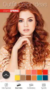

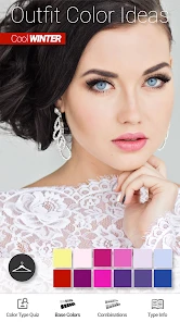
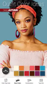
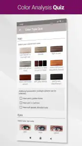
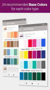
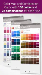
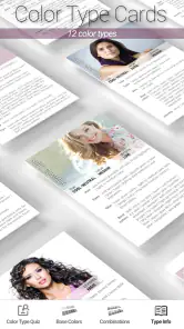
Analysis by Reviewed
When I’m choosing clothes or makeup, color decisions can turn a quick errand into a lot of second-guessing. Show My Colors: Color Palettes is a beauty app built around seasonal color palettes, giving me a way to think about shades before I shop rather than relying on a passing impression. Its focus is practical: help me feel more deliberate about what colors I look for and how I combine them.
Plan around the moments you need a connection
Because the app is meant to support color choices while shopping, the moment I reach for it matters. I’d use it before leaving home to narrow down the shades I’m looking for, then check it again in a store if I’m torn between two options. A palette is most useful as a reference, not a rulebook: lighting, fabric, makeup finish, and personal taste can all change how a color feels in real life.
I would avoid making the app the only thing I rely on during a rushed checkout. If a page or palette takes time to load, I still want to be able to make a sensible choice by comparing the item with colors I already own. Treating the palette as a guide makes the experience more flexible and avoids turning a helpful suggestion into a source of stress.
Prepare for quick mobile decisions
The format suits short, practical visits rather than a long design session. I can picture checking a palette while browsing a clothing rack, or using it at home to plan makeup shades that work with an outfit. One useful habit is to take a screenshot or jot down a few color names before heading out, so I have a personal reference ready if mobile service is unreliable. That is a simple workaround, not a claim that every part of the app works offline.
Show My Colors comes from BrilliantSeasons and is free to install, with optional in-app purchases priced from $2.99 to $4.99 per item. It is rated for Everyone, has an average rating of 4.2 from around 2,600 ratings, and has been installed over 500,000 times. The app first appeared on April 7, 2020; version 1.52 requires Android 9 or later. Those details make it easy to judge whether it fits your device and budget, but the real question is whether seasonal palettes match the way you like to shop.
Using seasonal palettes with confidence
Let's dive right into the vibrant world of Show My Colors: Color Palettes. The app is like having a rainbow in your pocket, ready to assist you at any moment. First off, the interface is a breeze to navigate. With its intuitive design, you'll find yourself effortlessly exploring a spectrum of colors that you didn't even know existed. It's like having a personal color guru guiding you!
Features that pop
One of the standout features is the ability to extract color palettes from images. Just snap a photo or upload an image from your gallery, and voila! The app will generate a palette based on the colors in the image. It's perfect for those moments when inspiration strikes at the most unexpected places, like a cozy café or during a walk in the park.
More From Our News Desk

Clash of Clans Is Won Between the Battles

Android Auto Makes the Case for Quieter Car Software

MobiOffice: Transforming Mobile Productivity with Seamless Integration

EA SPORTS FC™ Mobile Soccer: Redefining Mobile Sports Gaming

How Microsoft OneDrive Became a Mobile Productivity Giant

How Google Translate Breaks Language Barriers Effortlessly
Moreover, the app offers a plethora of pre-made palettes for you to explore. Feeling indecisive? No worries, let the app surprise you with its random palette generator. It's like spinning a color roulette wheel, and trust me, it's addictive!
Customization and creativity
If you're someone who loves to experiment, you'll appreciate the customization options available. Tweak and adjust colors to your heart's content, ensuring that your palette perfectly matches your vision. The app even allows you to save your creations and share them with others. Imagine the possibilities for collaboration and feedback!
Bringing colors to life
Another feature worth mentioning is the app's ability to simulate how your palette will look in various settings. From digital screens to printed materials, the app provides a realistic preview, so you can be confident that your colors will look just as stunning in real life as they do in the app.
The app also integrates seamlessly with other design tools, making it a versatile addition to your creative toolkit. Whether you're working on a digital project or planning a home makeover, this app has got you covered.
Who benefits most from a seasonal palette?
I think the clearest fit is someone who wants a consistent starting point for shopping, especially if choosing between warm, cool, muted, or vivid shades feels overwhelming. Before a sale or a wardrobe refresh, I’d pick a few palette colors and use them to filter options, then make the final call based on comfort, fit, and what I’ll actually wear. For makeup, the same approach can help me avoid buying a shade that looks appealing in isolation but is difficult to pair with the products I already use.
There is a trade-off: seasonal color guidance is a framework, not a verdict on what someone is allowed to wear. If you enjoy experimenting with contrast, prefer monochrome outfits, or choose makeup by mood, a rigid palette may feel limiting. In that case, I’d use it as a source of ideas and keep a more open-ended color reference nearby rather than treating a seasonal category as a shopping restriction.
A practical way to use palettes while shopping
For a realistic shopping trip, I’d check the palette at home first and choose one or two colors to keep in mind. In a store, I’d compare an item in daylight near a window when possible, since indoor lighting can make shades look warmer or cooler than they do outside. If I’m shopping online, I’d use the palette to shortlist colors, but still check the retailer’s photos and return terms; a screen preview cannot guarantee how a garment or cosmetic will look in person.
That workflow also makes the app easier to use when connectivity is inconsistent. I can decide the main question before I leave—perhaps whether I need a soft neutral or a brighter accent—instead of expecting the app to settle every choice on the spot. If I’m browsing with a friend, sharing a saved palette can make the conversation more concrete: we can talk about the colors themselves rather than vague impressions like “something warmer.”
How it compares with other color tools
Compared with a basic color-picker or a general palette website, this app’s appeal is its seasonal, shopping-oriented lens. A conventional picker is better when I need exact color values for a design file; a broad inspiration board is better when I want to collect images without categorizing them. Here, the value is having color guidance framed around clothing and makeup decisions. That narrower purpose is helpful if it matches your needs, but less compelling if your main goal is professional color specification or building a large visual mood board.
Connectivity deserves a practical check before relying on any app in a shop with poor reception. I’d open the app while connected before setting out and keep a simple note of the colors I’m considering. If something fails to load, I can still compare products against that note instead of repeatedly refreshing or delaying a purchase. I also wouldn’t upload or photograph anything sensitive just to create a palette; ordinary inspiration images are enough for a casual color exercise.
Make image palettes useful, not distracting
When I use a photo to build a palette, I’d choose an image with a clear color idea rather than one full of competing details. A close-up of a fabric, a favorite accessory, or a makeup look can give me a more usable starting point than a busy scene where the background dominates. This is a small but meaningful distinction: the generated colors reflect the image, not necessarily the item or detail I had in mind. Cropping or selecting a more focused picture can help keep the result relevant to the decision I’m trying to make.
I’d also treat image-derived colors as prompts rather than exact shopping matches. A shade displayed on a phone can shift with screen settings and surrounding light, while a lipstick or textile has its own finish and texture. If I’m trying to coordinate a new purchase with something I already own, I’d compare the real items together whenever possible. The palette can help me name the direction—such as a muted green or a warm neutral—but it cannot remove the value of seeing the materials side by side.
A realistic errand, from planning to purchase
Imagine I’m going out after work to find a top that works with trousers I already wear often. At home, I’d look through palettes and settle on a couple of color directions rather than trying to memorize every swatch. I might save a palette or write down the shades that seem promising, then use that short list in the shop. If the store’s lighting makes two tops look almost identical, I’d compare them near a window or against the trousers if I brought them along, and choose based on which one feels right in person.
If mobile service drops inside the store, the planning still pays off: I have a reference and a clear question, rather than needing to load the app for every rack. If I find a promising item but remain unsure, I can take a moment to inspect it outside the harshest light before deciding. This approach is particularly useful for people who shop in short bursts and don’t want a phone-based tool to slow down a purchase. It keeps the app in a supporting role while leaving the final judgment to my eyes and preferences.
Where the app may not be the best fit
I’d skip a seasonal palette approach if I already know that I choose clothes mainly by silhouette, comfort, or fabric and rarely change my mind because of color. It may also be a poor match for someone who wants a technical tool for matching exact shades across a design workflow. The app’s color inspiration can be useful, but a specialist picker or a reference system built for precise color values would make more sense for print production, branding, or detailed digital design.
There is also a personal side to the trade-off. If color analysis starts to feel like a set of rules, it can make getting dressed less fun. I wouldn’t use a palette to talk myself out of a color I love or to judge whether a look is “allowed.” For me, the best use is to discover combinations I might overlook, then keep whichever ideas actually suit my wardrobe, makeup habits, and mood.
What to expect from the free starting point
The app is free to install, which makes it easy to try its palette-based approach before deciding whether it belongs in a regular shopping routine. Optional purchases cost between $2.99 and $4.99 per item, so I’d first explore what is available without paying and identify whether the core way of working suits me. A purchase makes sense only if it adds something I will use repeatedly; I would not spend simply because I feel I need a more authoritative answer about what colors to wear.
That distinction matters because seasonal guidance is most valuable when it reduces friction, not when it creates a new obligation to buy or follow a category. I’d use the initial experience to see whether the palettes are easy to interpret and whether the image and customization tools fit the way I think about color. If I only need a quick reference for occasional outfits, a few saved notes may be enough. If I enjoy making and revisiting palettes, the app has a clearer place in my routine.
In conclusion, Show My Colors: Color Palettes is a game-changer for anyone who works with colors. It's not just an app; it's a gateway to a world of endless color possibilities. So go ahead, unleash your creativity and let your projects shine with the perfect palette. You'll wonder how you ever lived without it!
My connectivity verdict
I’d recommend it to shoppers who want seasonal color ideas in a compact mobile format and are happy to use a palette as guidance rather than a strict answer. If you mainly need precise values for design work, an exact color tool is likely a better fit; if your shopping trips often take you beyond reliable service, prepare a small reference in advance. For me, the best approach is to explore palettes while connected, then bring only the useful color cues into the shop. That keeps the app’s role clear: a handy nudge toward more confident choices, not a substitute for seeing a shade in person.
Show My Colors: Color Palettes Frequently Asked Questions
Is Show My Colors: Color Palettes suitable for beginners who want help choosing colors?
Yes. Show My Colors: Color Palettes is a beauty app focused on seasonal color palettes, with the aim of helping people shop for clothes and makeup with more confidence. Its palette-based approach can be useful if you are just starting to think about which colors suit your style, as well as if you already enjoy experimenting with color. The app is free to download, with optional in-app purchases.
What is Show My Colors: Color Palettes?
Show My Colors: Color Palettes is a creative app designed to help users explore and create color palettes. Whether you're a designer, artist, or someone who loves playing with colors, this app provides an intuitive interface to generate, customize, and save your favorite color combinations. It's available for both Android and iOS platforms.
How does Show My Colors: Color Palettes work?
Show My Colors allows users to create color palettes by selecting colors manually or using a color wheel. The app also offers the option to extract colors from images, which is useful for designers looking to match colors with existing visuals. Users can save their palettes, share them, and even find complementary colors to enhance their creative projects.
What are the key features of Show My Colors: Color Palettes?
Key features of Show My Colors include a user-friendly interface for creating custom palettes, the ability to extract colors from photos, options to share palettes with others, and access to a library of pre-made palettes for inspiration. Additionally, the app supports both RGB and HEX color codes, making it versatile for various design needs.
Is Show My Colors: Color Palettes free to use?
Show My Colors is free to download and use with basic features available to all users. However, there are premium features that can be unlocked via in-app purchases. These might include advanced color tools, additional palette slots, or an ad-free experience, enhancing the app's functionality for professional users. Optional purchases are priced from $2.99 to $4.99 per item.
Pros
- Easy to create custom color palettes.
- User-friendly interface and navigation.
- Supports a wide range of color codes.
- Share palettes easily with others.
- Offers inspiration from trending palettes.
Cons
- Limited features in free version.
- Occasional ads in free version.
- Color accuracy varies on different screens.
- No offline mode available.
- Limited export formats for palettes.
- Category
- Beauty
- Version
- 1.52