Paint my House: Exterior Color
- 33.00
- 4.4
- Installs
- 100.00K
- Price
- Free

Screenshots
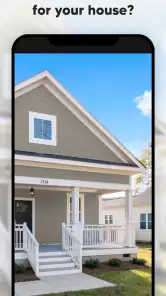
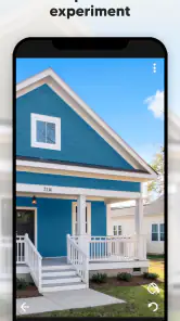
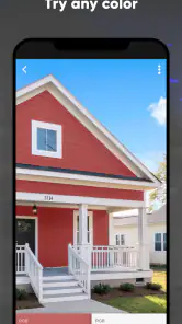
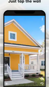
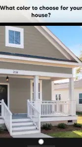
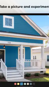
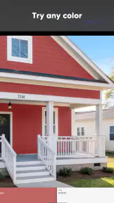
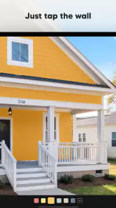
Analysis by Reviewed
I tried Paint my House: Exterior Color as a quick way to explore exterior paint ideas without committing to a real wall. It is a house-and-home app from Try the Colors s.r.o. that focuses on one simple task: changing the visible wall color in an exterior image and comparing possibilities. That narrow purpose is also its biggest strength. I did not approach it as a full renovation planner, but as a visual decision tool for the moment when you are asking, “Would this house look better in a warm white, a darker neutral, or something more noticeable?”
The app is free to install, suitable for Everyone, and has reached over 100K installs. Its average rating is 4.4 from around 3.6K ratings, which matches my overall impression: it is easy to understand and useful for quick experimentation, although the result still needs to be treated as a preview rather than a final promise of how paint will look outdoors. The current version is 3.3.199, and it runs on Android 7.0 or later.
What to expect before you start choosing colors
The first thing to understand is that this is not a complete home-improvement suite. You will not be using it to calculate paint quantities, prepare a contractor brief, compare product specifications, or manage a renovation schedule. Its job is much more direct: help you see a range of exterior color directions on a house image.
That makes it particularly appealing when you are still in the inspiration stage. Perhaps the roof is staying as it is, the windows are already chosen, and the unresolved question is the wall color. Instead of opening several unrelated image editors and trying to paint around windows manually, you can use this app to move through a palette and get a faster visual impression.
I found the single-tap approach more useful than it sounds. A color decision often becomes difficult because people discuss isolated paint swatches rather than the whole facade. Seeing the wall change while the roof, openings, and surrounding details remain visible gives the choice some context. A shade that looks attractive on a small card may feel too cold beside a dark roof, while a color that seems plain by itself may make the house look calmer and more balanced.
The app is best understood as a conversation starter. I would use it before visiting a paint shop, before asking family members to choose between samples, or before sending a designer a clearer idea of the direction I want. I would not use a phone preview as the only basis for buying a large amount of paint, because screen brightness, outdoor light, surface texture, and the actual paint finish can all change the final appearance.
There is also a practical trade-off in the app’s simplicity. Because the experience is centered on exterior wall color, it does not distract you with a long chain of renovation decisions. On the other hand, users looking for detailed control over trim, doors, shutters, landscaping, or several separate surfaces may quickly want more than this focused tool offers.
Who will get the most from it
I think it suits homeowners, renters planning a future move, property sellers preparing a visual refresh, and anyone collecting ideas for a new build. It can also help when two people have different mental pictures of the same color. One person may say “soft beige” and another may imagine something much darker; a visual test gives the discussion something concrete.
It is especially helpful for first-time users who do not want to learn a complicated editing program. The core action is easy enough to understand without technical knowledge, and the app’s Everyone age rating reflects that approachable style. If you can recognize the wall area and tap through color choices, you can begin exploring without a design background.
I would be more cautious about recommending it to a professional architect or exterior designer who needs precise material rendering, measured surfaces, lighting studies, or client-ready presentation boards. In that situation, a dedicated visualization package or a professional workflow will offer more control. This app is a fast sketchpad for color direction, not a replacement for technical documentation.
Getting through the first setup without overthinking it
After installing it, I recommend starting with one clear question rather than trying to solve the entire exterior at once. For example, decide whether you are comparing light and dark walls, warm and cool neutrals, or a stronger accent direction. A narrow question makes the first session much more productive than tapping randomly through every possibility.
Keep the first image as uncomplicated as possible. A front-facing view with the main wall area visible is easier to judge than a heavily angled photograph with trees, parked cars, deep shadows, or large decorations covering the facade. This is one of the most important practical tips: the quality and clarity of the starting view influence how useful the color experiment feels.
Before judging a shade, look at the fixed elements around it. Roof tiles, window frames, doors, stonework, gutters, and paving are not merely background details. They determine whether a wall color feels coordinated or disconnected. I found it more reliable to compare a few colors beside those permanent features than to decide based on the wall alone.
It is also worth deciding how you will remember the options you like. You may want to note a short description such as “lighter than the current wall, still warm beside the roof” rather than relying on memory. When several colors are visually similar, the best choice can otherwise become difficult to identify later. The app helps you see the alternatives, but your own notes help turn those alternatives into a decision.
The app is free, which makes this kind of low-commitment exploration easy to try. It also includes in-app purchases ranging from $0.99 to $29.99 per item. I would keep that in mind if you are planning a long session or expecting every available option to be included without cost. The sensible approach is to begin with the free experience, decide whether the workflow genuinely helps you, and only then consider whether an optional purchase is worthwhile for your project.
Reaching the first meaningful result
The first successful action is not simply changing a wall once. It is finding a small group of colors that represent genuinely different directions. I suggest starting with a light neutral, a mid-tone neutral, and a more contrasting option. That gives you a useful frame of reference. Once you know which general family works best with the house, you can spend time refining within that family instead of wandering through isolated shades.
When I compare options, I look at three things. First, does the wall still allow the architectural shape to stand out? Second, does it sit comfortably beside the roof and windows? Third, would the house feel welcoming in both bright daylight and darker weather? The app cannot answer the last question perfectly, but thinking about it prevents the common mistake of choosing a color only because it looks attractive in one bright preview.
A useful workflow is to make the first pass quickly, then return to the strongest candidates more slowly. On the first pass, I am looking for broad reactions: too pale, too heavy, too yellow, too cold, or promising. On the second pass, I compare only the promising choices and ask whether the difference is meaningful enough to justify a real-world change.
This two-stage method is more efficient than treating every shade as equally important. It also reduces a common problem with visual apps: endless browsing that feels productive but never produces a shortlist. The goal is not to find a theoretically perfect color inside the app. The goal is to leave with a clearer direction for the next real-world step.
For an everyday example, imagine that I am helping a family repaint a small suburban house. One person prefers a bright exterior because it feels clean, while another worries that it will look stark beside the roof. I would use the app to test a light neutral first, then a warmer version, and finally a deeper shade for contrast. Instead of debating abstract names, we could compare the house views and agree on which direction deserves physical samples.
Where the preview can confuse you
The most important limitation is that a digital color replacement is not the same as applying paint to a textured exterior. Real walls have grain, cracks, repairs, moisture marks, and changing reflections. A phone screen presents a controlled image, while a house is seen from different distances and under constantly changing light. I would therefore use the app to reject unsuitable ideas and organize preferences, not to guarantee an exact final color.
Shadows deserve special attention. A wall partly covered by a tree or roof overhang may appear darker than it really is, and a color can seem more dramatic simply because of the photograph. If one area looks appealing and another looks wrong, check whether the difference comes from the chosen color or from uneven lighting in the image.
Another source of confusion is the relationship between wall color and trim. The app’s central task is the wall, so it is easy to focus on that surface and forget that the existing window frames, doors, and roof remain visually dominant. A wall that looks good in isolation may clash with a strong trim color. I recommend viewing each option as part of the whole house, then asking whether the fixed details support it.
Very similar colors can also create false precision. On a screen, two neighboring shades may look clearly different when placed side by side, yet the distinction may be much less obvious on a large exterior. Conversely, a small change in tone can become noticeable across a broad wall. This is why I would take the shortlist to physical paint cards or sample boards before making a purchase.
Users may also wonder whether the app is meant for a particular type of home. In practice, its value depends less on architectural style than on the image and the visibility of the wall. A simple facade with an unobstructed wall is easier to assess than a house where most of the exterior is hidden by vegetation or complex features. If the wall cannot be seen clearly, the preview will naturally be less convincing.
Another reasonable question is whether it replaces advice from a paint professional. I do not think it does. It can help you arrive with a more specific idea, which may make a store or designer conversation easier, but it cannot evaluate local weather exposure, substrate condition, existing coatings, or the suitability of a particular product. Those decisions still belong to the real renovation process.
Using the app as part of a better color decision
Once I have a shortlist, I stop treating the app as a browsing tool and use it as a comparison aid. I look at the same candidates in a consistent order and write down why each one works or fails. This prevents the last color viewed from becoming the favorite simply because it is fresh in my mind.
A second useful habit is to compare the wall against the permanent elements before thinking about personal taste. If the roof is visually strong, the wall may need to calm it rather than compete with it. If the windows and trim are very light, a slightly deeper wall may give the facade enough definition. These are not rules the app can calculate for you, but the preview makes the relationships easier to notice.
I would also avoid testing only safe colors. Include one option that feels slightly outside your usual preference. That does not mean choosing the boldest possible shade; it means creating a meaningful contrast so you can tell whether your preferred neutral is genuinely right or simply familiar. The app is low-risk precisely because you can explore that direction without painting the building first.
For people working with family members, the app can make the decision more orderly. Ask each person to choose two candidates independently, then compare the overlap. If there is no overlap, discuss the fixed features that caused the disagreement. This turns a vague argument about taste into a practical conversation about roof compatibility, brightness, and the mood of the facade.
For a property seller, I would use the app more conservatively. The aim should be broad appeal rather than a highly personal statement. Testing restrained, coordinated wall directions can help visualize a refresh, but I would not assume that a digital preview alone will show how buyers respond. The app is useful for preparing options, while real samples and local advice remain important before work begins.
How it compares with ordinary alternatives
The usual alternative is to collect physical paint cards or small sample pots. Those are better for evaluating actual finish, texture, and daylight, but they can be slow and expensive when you are still unsure about the general direction. Paint my House: Exterior Color is faster at the early elimination stage. I can reject a color family in moments instead of buying several samples that were never likely to work.
Another alternative is a general photo editor. That route may offer more detailed selection and retouching, but it usually requires manual masking, careful edges, and more patience. For someone who only wants to compare exterior wall colors, the specialized workflow is more approachable. The trade-off is that a general editor may be better when you need to change several materials independently or produce a polished presentation.
There is also the option of asking a professional for a visualization. That is the stronger choice when the project is expensive, the architecture is complicated, or the decision needs to be communicated formally. The app makes more sense before that stage, when I want to arrive with a few informed preferences rather than a blank request.
In other words, I see this app as sitting between imagination and physical sampling. It is quicker than buying materials and simpler than learning a full editing tool, but less reliable than viewing real paint on the actual wall. That middle position is not a weakness by itself; it is the reason I would keep it available during the early planning phase.
Who should skip it and who should keep it installed
I would skip it if my main need were exact architectural visualization, detailed multi-surface editing, or technical renovation planning. I would also be disappointed if I expected the screen preview to settle the final paint choice without physical testing. The app cannot remove the uncertainty created by weather, texture, and changing daylight.
I would keep it installed if I regularly help friends or family choose home colors, if I am collecting ideas for a future exterior project, or if I tend to buy samples before narrowing the options. Its quick visual feedback can save time and make conversations clearer. The free entry point also makes it reasonable to test without treating the decision as a major commitment.
My final recommendation is straightforward: use it to create a shortlist, not a guarantee. Start with a clear question, choose a clean view, compare the wall with the roof and trim, and carry the best candidates into physical testing. Its real value is turning an uncertain color conversation into something you can see and discuss.
After using it, I found the focused design refreshing. It does not try to become every home-planning tool at once. Try the Colors s.r.o. has built a practical visual aid for one early renovation decision, and that focus makes the first meaningful result easy to reach. If your project needs a quick exterior color experiment on Android, this free app is worth trying; just keep its previews in their proper role as a smart first step before the real paint goes on.
Pros
- Simple controls make exterior color testing easy for beginners.
- Useful for comparing several paint ideas before starting a real project.
- Quick color changes help visualize different house styles.
- Suitable for experimenting with bold and neutral exterior palettes.
- Can inspire ideas for trim
- walls
- doors
- and accent combinations.
Cons
- Color previews may differ noticeably from real paint in daylight.
- Limited customization can make unusual house designs hard to match.
- Some shades may look flat without realistic texture or shadows.
- Large images or detailed scenes may take longer to process.
- The app may feel repetitive once the available color options are exhausted.

- Category
- House & Home
- Version
- 3.3.199