WhatColors: AI Color Analysis
- 461.00
- 3.1
- Installs
- 100.00K
- Price
- Free
Screenshots

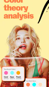
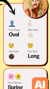
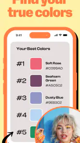

Analysis by Reviewed
Ever been in a situation where you're staring at your wardrobe, completely stumped on what color to wear? Or perhaps you're redecorating your living room and you just can't decide whether the couch should be teal or navy blue. Enter WhatColors: AI Color Analysis, the app that promises to make color-related decisions a breeze using the magic of AI.
Cost matters most when you know what you are paying for
I like that the app is free to install, because it gives me a chance to see whether photo-based color advice is useful before committing money. In-app purchases range from $3.99 to $29.99 per item, but that range alone does not tell me what any particular purchase unlocks. I would check the description and terms for an item inside the app before paying, and avoid buying on the assumption that a certain tool or result is included.
That makes the sensible approach simple: try the free access first, then judge the app by whether it solves a real recurring problem for you. If I only need occasional inspiration, paying may not make sense. If I use its palette guidance regularly and understand exactly what a purchase offers, I can make that decision with clearer expectations. The price range is a reason to pause and inspect, not a reason to assume the paid options are either essential or unnecessary.
Where the color guidance can earn its place
The useful value here is not an authoritative verdict on what I should wear. It is a way to turn a vague question—“what goes with this?”—into a few possible directions. That can be enough to make getting dressed less frustrating, especially when I already own plenty of clothes but tend to reach for the same safe colors.
I would get more from it by treating a suggested palette as a small experiment. Rather than rebuilding my wardrobe around a result, I can pick one color I rarely wear and try it alongside a familiar neutral. If the combination feels wrong in person, I have learned something without buying a whole outfit. This is a modest but practical benefit: the app can prompt low-cost tests with clothes already in my closet.
Small habits that make photo suggestions more useful
For a fair comparison, I would photograph one item at a time in steady, indirect daylight, with the garment filling most of the frame. I would keep the background simple and avoid mixing shots taken under different bulbs or at different times of day. These are not special app settings; they are ways to reduce visual distractions and lighting shifts that can skew any phone-based color judgment.
There is another useful distinction: a photo of a garment can help me think about its color, but it cannot show the whole experience of wearing it. Fabric texture, sheen, how a shade changes in motion, and whether the cut suits me all matter. If a palette suggests a match, I would still hold the pieces together in person and check them in the setting where I plan to wear them.
More From Our News Desk

Clash of Clans Is Won Between the Battles

Android Auto Makes the Case for Quieter Car Software

MobiOffice: Transforming Mobile Productivity with Seamless Integration

EA SPORTS FC™ Mobile Soccer: Redefining Mobile Sports Gaming

How Microsoft OneDrive Became a Mobile Productivity Giant

How Google Translate Breaks Language Barriers Effortlessly
For shopping, I would use the app before browsing rather than while rushing through a store. A quick look at colors I already wear can give me a narrower target, then I can compare a candidate item with those clothes and decide whether it fills a genuine gap. That workflow helps prevent a promising palette from becoming an excuse to buy something I will rarely use.
Who is likely to get the most from it
This is a better fit for curious, visually minded users than for anyone who wants a definitive personal-style assessment. It can suit someone who is learning to combine colors, refreshing a few everyday outfits, or looking for a playful starting point before making a home-color decision. It may also help a person who finds written color theory abstract and prefers to begin with an image and a visual suggestion.
I would skip it if my main goal were to catalog every garment, plan outfits across a calendar, or receive detailed advice about body shape, fabric, and fit. A wardrobe organizer is more suitable for tracking what I own; a human stylist is better when I want nuanced advice that accounts for context and personal taste. And for a lasting paint or furniture decision, physical samples viewed in the actual room are more dependable than relying on a phone image alone.
Questions worth resolving before relying on a result
Can I use the app to settle a color choice completely? I would not. Its strongest role is offering ideas to compare, while daylight, skin tone, fabric, surroundings, and personal preference all affect the final impression. I would use its output as a shortlist, then make the call with the real item in front of me.
Is it a substitute for a color picker? Not quite. A basic picker is useful when I need to identify a shade in an image; this app is more relevant when I want palette or outfit direction. If I need a precise digital color value for design work, I would choose a dedicated tool built for that purpose instead of treating fashion-oriented suggestions as technical measurements.
Does the free option make it worth trying? For someone who often gets stuck on clothing colors, yes, it is reasonable to test before spending. Whether any paid item is worthwhile depends on what it includes and how often I would use it, so I would inspect the in-app purchase details rather than guess from the price range.
A quick wardrobe decision, not a color rulebook
The clearest reason to try this beauty app is its focus on personal color analysis for clothing. Quiet Games describes WhatColors as a way to use a photo to explore a palette and outfit ideas. That makes it most relevant when I want a starting point for getting dressed, not when I need a professional color consultation or a guarantee that one shade will suit every setting.
For example, if I am choosing between two tops before heading out, I can use the app’s palette suggestions to narrow down which colors might work together. I would treat the result as inspiration, then check the clothes in daylight and against my own preferences. Camera images can make colors look different from how they appear in person, so a suggested match is a useful prompt rather than a final verdict.
What the photo-based approach is good for
A photo-led color tool is handy when I want to compare ideas without laying every item in my wardrobe across the bed. One practical approach is to photograph a garment in even natural light, then use the suggested palette to think of other pieces I already own that could complement it. I would avoid mixing strong sunlight, deep shadow, and indoor lighting in the same comparison: those changes can make a color seem warmer or cooler than it really is.
It can also help me shop with a clearer plan. Before buying something, I can consider whether its color fits the palette I am exploring and whether it can work with clothes I already wear. That is a more useful test than asking whether a shade looks attractive on its own. Still, the app cannot make a garment fit well or tell me whether I will enjoy wearing it; those decisions remain mine.
Unraveling the Color Mystique
So, how does this app work? It’s quite straightforward, actually. WhatColors: AI Color Analysis uses sophisticated algorithms to analyze colors in real-time. Just fire up the app and point your camera at any object, and voilà! The app breaks down the colors into understandable terms. Imagine having a color expert in your pocket, ready to give you insights on any hue under the sun.
Features that Make a Difference
The app doesn’t just stop at identifying colors; it goes a step further by suggesting complementary colors. This feature is a lifesaver for those of us who are color-challenged. Planning an outfit? The app will suggest colors that match perfectly with your chosen piece, ensuring you step out looking like a million bucks.
For the interior design enthusiasts, the app is a game changer. It lets you visualize different color schemes on your walls or furniture without lifting a paintbrush. Simply point your camera, and the app will suggest palettes that can transform your space into a haven of aesthetic pleasure.
Choosing it over familiar alternatives
Compared with a basic color-picker, which mainly tells me what color appears in an image, a palette-focused tool is more useful when I need ideas for combinations. It is also a different kind of help from a wardrobe-planning app: the emphasis here is on color, not on organizing every item or building a calendar of outfits. If my main problem is remembering what I own, I would choose a closet organizer instead. If I want a quick nudge toward a coordinated color choice, this app is closer to the task.
One small but practical tip is to use suggestions as a shortlist. I can take a palette, find two or three pieces in similar tones, and decide based on comfort, occasion, and what is clean and available. That avoids turning an AI recommendation into a rigid rule. It is especially useful for someone who likes experimenting but wants a little structure before trying unfamiliar combinations.
User Experience
Using the app is as easy as pie. The interface is intuitive, with a sleek design that’s easy on the eyes. Navigation is smooth, and the tools are easily accessible, which means no more fumbling around trying to find the right settings. Plus, it’s light on resources, so you won’t have to worry about it eating up your phone’s memory.
There’s also a community feature where you can share your color discoveries and get inspiration from other users. It’s like having a global network of color enthusiasts right at your fingertips!
Price, expectations, and tradeoffs
The app is free to install, while in-app purchases range from $3.99 to $29.99 per item. I would start with the free access and decide whether the color guidance fits my routine before spending anything. Those purchase prices do not tell me what each item includes, so I would check the in-app details carefully before buying rather than assume a particular feature or benefit is paid for.
Its average rating is 3.1 from around 5.3K ratings, and it has 100K+ installs. I take that as a reason to keep expectations measured: color suggestions can be subjective, and photo conditions can affect what looks convincing. The app is free, rated for Everyone, and its current version is 1.3.0; it was released on Mar 31, 2024, and requires Android 8.0 or later. It is made by Quiet Games.
But hey, no app is perfect, right? While WhatColors: AI Color Analysis does an excellent job with most colors, it occasionally struggles with less common shades. However, updates are frequent, and the developers seem committed to ironing out these kinks.
A sensible fit for some wardrobes
I can see this being most useful for someone who enjoys clothes but second-guesses color combinations, or for a person trying to build a more coordinated set of everyday outfits. It is less suitable if you want exact, professionally calibrated color readings, a complete wardrobe inventory, or advice that accounts for fabric, fit, and personal style in depth. For paint decisions, I would also compare real samples in the room: a phone display cannot replace seeing a color beside the actual furniture and under the room’s lighting.
A realistic use would be getting ready for work, spotting a jacket that feels hard to pair, and using a photo-based palette to think of a few shirt or accessory options. I would then make the final choice at the mirror, in the light I will actually be seen in. That quick, low-pressure workflow is where the app makes the most sense: it helps me get unstuck without pretending to decide my style for me.
Final Thoughts
At the end of the day, WhatColors: AI Color Analysis is a fantastic tool for anyone looking to make better color decisions, be it in fashion, home decor, or just for fun. It’s user-friendly, packed with features, and offers a unique way to interact with the world of colors. Whether you’re a designer, a fashionista, or just someone who loves colors, this app is definitely worth a shot.
So next time you’re in a color conundrum, you know where to turn. Happy coloring!
WhatColors: AI Color Analysis Frequently Asked Questions
Can WhatColors help me choose outfits from my wardrobe?
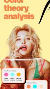
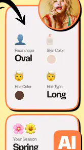
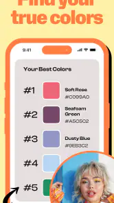
WhatColors is presented as an AI color analysis app for your wardrobe: you can scan a photo to get a color palette and outfit suggestions. This may be useful when you want ideas for coordinating clothing colors or exploring which shades work together. The app is in the Beauty category, and its focus is practical wardrobe styling rather than general-purpose color identification.
What should I know about the app before downloading it?
WhatColors: AI Color Analysis is a beauty app developed by Quiet Games. It is free to download, rated for Everyone, and has reached over 100,000 installs. Its current version is 1.3.0, and it requires Android 8.0 or later. The app has an average rating of 3.1 from around 5,300 ratings, so it may be worth considering user feedback alongside its wardrobe color-analysis purpose.
What is WhatColors: AI Color Analysis and how does it work?
WhatColors: AI Color Analysis is an innovative application designed to analyze colors through the use of advanced artificial intelligence. Users can upload images or use their device camera to capture objects, and the app identifies and describes the colors present. This app is particularly useful for designers, artists, and anyone with an interest in color theory. It leverages AI to provide precise color data and insights, aiding in design decisions and enhancing creativity.
Is WhatColors: AI Color Analysis free to use?
Yes, WhatColors: AI Color Analysis offers a free version with basic features that allows users to perform color analysis on a limited number of images per month. However, for users who require more advanced features and unlimited usage, there is a premium subscription available. The premium version offers enhanced color identification capabilities, more detailed analysis, and additional tools to support professional and creative needs. In-app purchases are listed at prices ranging from $3.99 to $29.99 per item.
How accurate is the color analysis provided by WhatColors: AI Color Analysis?
The app uses cutting-edge AI technology to provide highly accurate color analysis. It is designed to recognize a wide range of colors with precision, making it a reliable tool for artists and designers. However, accuracy can be affected by the quality of the image or lighting conditions. For best results, users should ensure images are well-lit and of high quality. Continuous updates and machine learning improvements also enhance its accuracy over time.
Pros
- Accurate color identification.
- User-friendly interface.
- Fast processing time.
- Supports multiple image formats.
- Accessible offline.
Cons
- Limited free features.
- Occasional app crashes.
- Requires high-quality images.
- Ads in the free version.
- Limited customization options.
- Category
- Beauty
- Version
- 1.3.0