MonoBoost Cancel Subscriptions
- 175.00
- 3.8
- Installs
- 10.00K
- Price
- Free

Screenshots
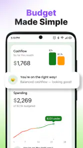
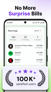
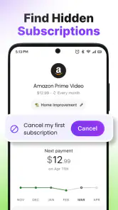
Analysis by Reviewed
I approached MonoBoost as a practical tool for people who want a clearer view of recurring subscriptions and a way to stop unwanted charges. Its store summary describes it as a subscription manager and stopper, while the short description uses the name “MonoBoost.” That distinction matters because the app’s value is not in entertainment or social interaction; it is in reducing the mental work involved in remembering which services are still active.
My overall impression is that it aims at a very familiar problem: subscriptions are easy to start and surprisingly easy to forget. A tool dedicated to that problem can be useful for someone who manages several digital services, shares financial responsibilities, or simply finds recurring payments difficult to track. At the same time, this is not an app I would recommend blindly to everyone. Its usefulness depends on how clearly it presents information, how much manual attention it requires, and whether its paid options fit the way you want to manage subscriptions.
How the app feels to read and navigate
The most important accessibility question for a subscription tool is whether I can understand the situation quickly. When I open an app like this, I do not want a complicated financial dashboard. I want to know what is recurring, what needs attention, and what action I can take next. The best experience would let me move from an overview to a specific subscription without hunting through decorative screens or unclear labels.
MonoBoost’s purpose gives it a potentially strong advantage here: the subject matter is narrow. It is not trying to be a full banking app, budget planner, calendar, or expense tracker at the same time. That focused role should make it easier for a new user to understand why each screen exists. I found that kind of focus more helpful than a crowded money-management app that mixes subscriptions with every other type of spending.
Still, readability is more than having a simple concept. Subscription information can become confusing when dates, renewal status, cancellation steps, and payment amounts appear too close together. I would pay close attention to whether the app distinguishes an active subscription from one that is merely recorded, and whether its wording makes clear what MonoBoost can do directly versus what I must complete with the service provider.
That distinction is especially important for people who are not comfortable with financial terminology. A phrase such as “stop subscription” may sound like one tap ends a billing relationship, but the actual process can depend on where the subscription was purchased. A good workflow should explain the next step in plain language rather than assuming that every user already understands app-store billing, trial periods, or renewal timing.
The current version is 1.0.24, which places the app in an early stage of its product life. I see that as a reason to judge the interface patiently but carefully. Early tools can feel refreshingly uncluttered, yet they may also have rough edges in navigation, empty states, or error messages. For someone who relies heavily on visual clarity, I would spend a few minutes exploring the main screens before entering a large amount of subscription information.
Making a subscription review less mentally demanding
One useful way to approach MonoBoost is to treat it as a review station rather than a passive list. I would not open it only when a charge surprises me. I would use it during a quiet moment, inspect each recurring service, and decide whether it still earns its place. This turns the app into a small decision-making routine instead of another notification competing for attention.
A practical tip is to review one group at a time. Start with entertainment, then move to work tools, cloud storage, fitness services, or family-related subscriptions. Grouping the review mentally reduces the chance of abandoning it halfway through. It also makes unclear entries easier to spot because similar services are being considered together.
For users with reading difficulties or limited attention, short sessions may be more comfortable than trying to organize everything at once. I would check a few entries, close the app, and return later. That approach also helps prevent impulsive cancellations when I am tired or distracted. A subscription manager should support deliberate decisions, not turn a crowded screen into another source of pressure.
Motor, sensory, and situational considerations
Subscription management is often treated as a purely visual task, but access depends on much more than eyesight. People may use a phone one-handed, operate it with limited precision, rely on larger text, or work in a noisy environment where reading instructions is easier than listening. MonoBoost is most useful when its core actions remain understandable even under those ordinary constraints.
For motor access, I would look for generous touch targets, predictable placement of controls, and a clear separation between viewing an entry and taking an irreversible action. Cancellation is exactly the kind of task where an accidental tap can create anxiety. A confirmation step with an unmistakable description would be preferable to a small control placed beside an edit or reminder action.
I would also avoid doing important subscription work while walking, commuting, or carrying something in my other hand. Even a well-designed interface can become difficult when the phone is moving or when I have only a few seconds to act. The safer workflow is to collect information first and make changes later when I can read every prompt carefully.
For users with low vision, the app’s usefulness will depend on how well text, icons, spacing, and contrast work together. I would increase the phone’s text size before relying on the service for a serious cleanup. If enlarged text causes labels to truncate or buttons to overlap, that is a meaningful barrier, not a minor cosmetic issue. A subscription tool has to communicate dates and actions precisely, so missing words can change the meaning.
Users who are sensitive to visual clutter may appreciate a focused tool more than a general finance app filled with charts and categories. On the other hand, a screen that relies heavily on color to show status could be difficult for people who do not distinguish colors easily. I would want every important state to have a written label or another clear cue, rather than using color as the only signal.
For people with hearing loss, a subscription manager should not make essential information depend on sound. Text-based instructions and visible confirmations are the safer approach. Likewise, users with cognitive disabilities may benefit from a simple sequence: identify the service, understand its status, choose an action, and confirm the result. If the app sends users through several ambiguous screens, the mental burden rises quickly.
A realistic everyday situation
Imagine a user who notices several small recurring charges after reviewing a bank statement. They remember signing up for some services but cannot recall which ones are still useful. Instead of opening every provider separately, they use MonoBoost as a central place to organize the review. On a weekend afternoon, they examine the entries, mark the services they no longer need, and follow the relevant stopping process one at a time.
The accessibility benefit in this situation is not a special mode or a dramatic automation feature. It is the reduction of context switching. The user does not have to hold a list of service names, renewal dates, and decisions in memory while jumping between unrelated apps. For someone with attention difficulties, fatigue, or limited working memory, that consolidation can make the task feel possible.
There is also a useful trade-off. Centralizing the review makes the process easier to organize, but it does not remove the need to verify the result. After stopping a subscription, I would check for a confirmation from the provider or review the subscription status in the place where the billing relationship is actually managed. MonoBoost can help me decide what to address, but I would not treat a button press as proof that a future charge is impossible.
Situational access beyond the ideal setup
Some people manage subscriptions while traveling, changing phones, using limited connectivity, or dealing with a stressful financial situation. In those moments, a clear record is valuable, but expectations need to stay realistic. I would not begin a major subscription cleanup on a weak connection or immediately before a renewal deadline. A delay, login issue, or unclear handoff could leave too little time to resolve a problem.
The app may also be useful for households where one person handles recurring services for several people. I would keep the records organized with especially clear names so that a family member’s service is not confused with my own. That is a small but important habit: vague labels create accessibility problems because they force the user to remember extra context every time they open an entry.
For older users or anyone who is uncomfortable with subscription billing, I would recommend setting up the app together with a trusted person rather than handing over complete control. The other person can help interpret a renewal or cancellation screen, while the account owner remains involved in the decision. This is safer than assuming that a simple interface automatically makes a financial task risk-free.
Where the experience still has barriers
The first barrier is expectation management. A subscription “stopper” sounds more powerful than a simple reminder list, so users may assume that every cancellation happens inside MonoBoost. In practice, subscription arrangements can involve different providers and billing systems. I would want the app to make that boundary impossible to misunderstand, because confusion here can lead to continued charges or premature confidence.
The second barrier is the cost model. MonoBoost is free to install and is intended for everyone by its content rating, but it also offers in-app purchases ranging from $9.99 to $99.99 per item. That is a wide span, and it means the free entry point should not be confused with unlimited access to every capability. Before building my entire subscription routine around it, I would inspect which functions require payment and whether the price makes sense for the amount of money or time I expect to save.
That pricing structure may be reasonable for a user who regularly discovers forgotten services, but it may be excessive for someone with only one or two subscriptions. In that case, a spreadsheet, calendar reminder, or the subscription controls already available through the relevant platform may be enough. The usual alternatives are less specialized, but they can be cheaper, familiar, and easier to share with someone who does not want to learn another app.
A spreadsheet has a different accessibility profile. It offers flexibility and can be enlarged or rearranged, but it requires more manual setup and maintenance. A calendar reminder is simpler and may work well for a small number of renewals, yet it does not provide the same focused review experience. A banking app can show recurring charges, but it may not explain how to stop the underlying service. MonoBoost sits between these options: more focused than a spreadsheet and more subscription-oriented than a bank statement, but still dependent on accurate records and sensible user follow-through.
Another barrier is the risk of stale information. Any manager becomes less useful if I stop updating it after the first cleanup. I would create a habit of checking entries after starting, changing, or stopping a service. That may sound obvious, but it is one of the non-obvious trade-offs of centralization: a single organized list is excellent when maintained and misleading when neglected.
Privacy is also part of accessibility because people cannot comfortably use a financial tool if they do not understand what information they are entering or how it is handled. I would read the app’s on-screen explanations and permissions carefully before adding sensitive details. I would also avoid entering more information than the task requires. A focused subscription record should be useful without becoming an unnecessary archive of personal financial data.
Who should use it, and who should skip it
I would recommend MonoBoost to someone who has enough recurring services to lose track of them, prefers a dedicated tool over a general budget app, and is willing to verify cancellation outcomes. It may be particularly helpful for users who benefit from reducing context switching or who want a structured moment to question ongoing charges.
I would be more cautious recommending it to a person who expects automatic cancellation of every service, wants a fully hands-off financial assistant, or has only a single subscription to manage. I would also suggest comparing the paid options carefully if cost is a concern. The app’s focused purpose is appealing, but focus alone does not justify paying more than the problem is worth solving.
Its Everyone age rating makes it broadly approachable, but that does not mean every user will find the financial workflow equally easy. A teenager, older adult, or person receiving support with money decisions may still need help interpreting a provider’s cancellation terms. Inclusive design is not only about who can open the app; it is about who can safely understand the consequences of each action.
My inclusive verdict after using it
MonoBoost is a promising fit for people who want subscription management to feel like a contained, reviewable task instead of a scattered search through accounts and bank records. I like the idea of using one focused workspace to identify services, question their value, and follow through carefully. Its strongest accessibility contribution is the possibility of lowering memory and context-switching demands.
My recommendation comes with conditions. I would enlarge text if needed, test the navigation before entering lots of information, keep labels unambiguous, and confirm every cancellation with the original provider. I would also compare the paid features with simpler alternatives before committing, especially if I manage only a few subscriptions.
Mnboost Corp presents the app as a free tool, and it has reached over ten thousand installs with an average rating of 3.8 from around a thousand ratings. Those figures suggest an app that has attracted real interest while still leaving room for a careful personal assessment. I would not choose it solely because it is free to start; I would choose it if its workflow makes subscription decisions clearer for my particular needs.
In the end, I see MonoBoost as most valuable for users who need organization rather than financial complexity. It can make a frustrating chore more manageable, but it should support—not replace—careful reading, provider confirmation, and personal judgment. If those limits are acceptable, its focused approach can make recurring subscriptions easier to see and easier to question.
Pros
- Quickly identifies recurring subscriptions and renewal dates.
- Helps organize multiple subscriptions in one convenient dashboard.
- Can highlight unused services that may be worth canceling.
- Useful reminders can reduce unexpected renewal charges.
- Simple interface makes subscription tracking accessible to most users.
Cons
- Some cancellation steps may still require contacting the provider directly.
- Subscription detection may be limited by account or platform permissions.
- Results can vary depending on supported services and billing providers.
- Users should verify cancellations to avoid charges after using the app.
- Advanced features may require a paid plan or in-app purchase.

- Category
- Tools
- Version
- 1.0.24