iScape: Landscape Design App
- 127.00
- 2.9
- Installs
- 500.00K
- Price
- Free

Screenshots



Analysis by Reviewed
I like the idea behind iScape: Landscape Design App because it tackles a problem that is usually awkward to solve with a pencil, a tape measure, and a pile of garden-center brochures: imagining an outdoor space before spending money on it. This free lifestyle app from iScape Holdings Inc. is built around landscaping, garden design, and outdoor planning, and its main appeal is visual rather than technical. You can use it to think through a yard, patio, planting area, or other outdoor project before committing to a real change.
My experience with this kind of tool is that the first few minutes matter more than a long feature list. If the app feels responsive while I am testing an idea, I keep experimenting. If every adjustment becomes slow or confusing, I return to paper or a general photo editor. iScape sits somewhere between those two options: it is more purpose-built than a blank canvas, but it still works best when I treat it as a planning aid rather than a professional landscape-design package.
How iScape feels when you begin planning
The app is available at no upfront cost, which makes it easy to try for a small project. Its content rating is Everyone, so it is approachable for a household planning a shared garden makeover, not only for experienced gardeners. I would start by using it for one clearly defined space instead of attempting to map an entire property immediately. A front border, balcony, seating corner, or narrow side yard gives you a manageable area in which to learn the visual workflow.
The most useful way to judge the app is not by how quickly it opens, but by how quickly it lets you make a meaningful decision. Can I compare a planted border with a simpler gravel layout? Can I see whether a seating area looks crowded? Can I place several possible elements and remove them without losing my original idea? Those are the moments where a landscaping app earns its place on my phone.
iScape’s focus gives it an advantage over ordinary drawing apps. A general image editor can place objects on a photograph, but it does not naturally encourage the sequence of thinking required for outdoor planning. Here, I can approach the image as a proposed space rather than as a finished picture. That difference is small at first, yet it helps when I am trying to answer practical questions about proportion, balance, and visual clutter.
There is also a useful psychological benefit. A rough visual mock-up makes it easier to discuss a project with another person. Instead of saying “perhaps something taller near the wall,” I can show the direction I am considering. I would not treat the result as a construction drawing, but it can reduce misunderstandings before a purchase or installation begins.
What affects the feeling of speed
Perceived speed depends heavily on how ambitious the composition becomes. A simple concept with a background image and a few additions should feel easier to manage than a crowded design containing many overlapping elements. That is not unique to iScape, but it matters here because landscape ideas can grow quickly once I start testing furniture, plants, borders, and decorative details.
More From Our News Desk

Clash of Clans Is Won Between the Battles

Android Auto Makes the Case for Quieter Car Software

MobiOffice: Transforming Mobile Productivity with Seamless Integration

EA SPORTS FC™ Mobile Soccer: Redefining Mobile Sports Gaming

How Microsoft OneDrive Became a Mobile Productivity Giant

How Google Translate Breaks Language Barriers Effortlessly
My practical advice is to work in passes. First, establish the broad structure: lawn, paving, planting zones, and the main seating or circulation area. Then add secondary details. This keeps the early stage responsive and makes it easier to understand which change improved the plan. If I decorate too soon, I spend more time moving small items around than evaluating the layout itself.
Another helpful habit is to save or preserve a clean version of the concept before experimenting further, wherever the current workflow allows it. I prefer having an uncluttered baseline to return to rather than trying to remember what the original arrangement looked like. This is especially important when comparing two different approaches, such as a low-maintenance layout against a more densely planted one.
The app’s current version is 1.4.0, and it was released on February 24, 2025. Those details are useful context for expectations: I would keep the app updated, but I would also approach it as a developing mobile design tool rather than assume it has the depth or polish of established desktop software. The most convincing test is whether it remains comfortable during my own typical planning session.
Where heavier use can become demanding
The demanding moments are likely to come when a project becomes visually busy. A large photograph, numerous placed objects, repeated rearranging, and frequent zooming or panning all create more work for a phone than a single uncomplicated mock-up. I would not begin a detailed garden renovation while several other demanding apps are open in the background, particularly on an older device.
For a smoother session, I would prepare the source photo first. A clear image taken in good light is easier to work with than a dark, cluttered photograph full of vehicles, bins, tools, and temporary objects. Cleaning the scene before importing it is not just an aesthetic improvement; it reduces the number of distractions I need to work around and makes visual comparisons more reliable.
I also recommend planning in short stages. After establishing the main layout, I would pause and inspect it at normal viewing size instead of staying zoomed in. A design can look precise when enlarged but feel cramped when viewed as a whole. This wider check is one of the simplest ways to catch a bad proportion before becoming attached to small decorative choices.
For a realistic everyday scenario, imagine a Saturday morning before visiting a garden center. I would photograph the existing patio, create one version with a dining area and open walking route, then make another with more planting and less furniture. The point would not be to produce a perfect rendering. It would be to decide which direction deserves a real measurement and shopping list. That is an appropriate workload for the app and a sensible way to avoid impulsive purchases.
Where I would be cautious is a major property-wide plan with many zones, complicated levels, or a large number of individual objects. A phone screen is not ideal for managing that much detail, and a visual mock-up can become harder to interpret as it grows. For that kind of work, I would move to a larger-screen design program or consult a landscape professional, using iScape only for early visual exploration.
Stability, mistakes, and recovering your work
Reliability is more than whether an app launches. In a planning tool, it also means feeling safe while making changes. I want to experiment freely, remove an element, try another position, and return to a previous idea without worrying that a long session will be wasted. I therefore recommend saving progress at natural milestones rather than waiting until the entire design feels finished.
A sensible recovery routine is to keep separate versions for major alternatives. For example, I might maintain one concept focused on entertaining and another focused on planting. That approach is clearer than continually replacing one design with another. It also gives me a way to compare the ideas later, when the excitement of the first editing session has passed.
I would be particularly careful before closing the app after a long editing session or switching to another task. Mobile apps can be interrupted by calls, low memory, system updates, or simple battery problems. I am not claiming a specific failure pattern for iScape; this is simply good practice for any visual editor. The more time I have invested in a composition, the more valuable it is to confirm that the latest meaningful change has been retained.
The average rating is 2.9 from around 1.1 thousand ratings, with over 500 thousand installs. I read that as a reason to keep expectations measured. The app has clearly attracted a substantial audience, but the rating does not suggest universal satisfaction. I would pay attention to my own workflow during the first project rather than assume that popularity guarantees a seamless experience on every device.
There are also around 127 written reviews, which can be useful when deciding whether the app fits a particular phone and planning style. I would look for comments that match my intended use instead of treating every complaint or compliment as equally relevant. Someone creating a quick patio concept may have a very different experience from someone attempting a detailed multi-area renovation.
Device limits and the cost of going further
The minimum operating system is Android 8.0. That widens compatibility, but operating-system support alone does not tell me how comfortable the app will feel on every handset. Two phones can run the same system version while differing greatly in screen size, memory, processor age, and available storage. I would expect a newer mid-range or high-end phone to be a more pleasant place for layered visual work than an older entry-level model.
A larger display is valuable here for a reason beyond comfort. When I place an object near an edge, a small screen makes it harder to judge alignment and spacing. A larger phone or tablet-like device gives me more room to inspect the whole scene while still working on a selected area. If my main goal is careful layout rather than a quick idea, screen real estate may matter more than having the newest operating system.
Resource demands can also show up as battery use or heat during a long session, especially when I am repeatedly editing a detailed image. I would not start a serious planning session with a nearly empty battery, and I would avoid doing the first full design while away from a reliable connection to power. That is not a criticism unique to this app; it is a practical limitation of using a phone as a visual workspace.
The free entry point is appealing, but in-app purchases range from $9.99 to $299.99 per item. That is a very wide range, so I would inspect the purchase screen carefully before committing to anything. For casual planning, I would first establish whether the free experience solves my actual problem. If I eventually need paid content or capabilities, I would compare that cost with a general design app, a desktop tool, or simply the price of correcting a real-world landscaping mistake.
This pricing structure also changes who should use the app. A homeowner testing one small idea can reasonably begin with the free option. A professional or frequent remodeler should evaluate the total cost over repeated projects instead of assuming that the initial download represents the full expense. I would also avoid buying anything merely to make a single mock-up look more elaborate; visual polish is less important than accurate proportions and a workable layout.
How it compares with familiar alternatives
The usual alternative is a notebook, printed photograph, or a basic photo-editing app. Those options can be cheaper in the long run and may feel faster for a very rough sketch. A notebook is excellent for measurements, notes, sunlight observations, and plant quantities. A photo editor can be flexible if I already know how to work with layers. Neither is as focused on the specific mental task of previewing an outdoor change.
iScape is a better choice when I need to communicate a visual direction quickly. It can help answer questions such as whether a proposed feature dominates the yard or whether an open area needs more structure. A general drawing tool may offer greater freedom, but that freedom can also mean more setup and less guidance. I would choose the landscaping-focused approach when the project begins with a real outdoor photograph and a practical design decision.
On the other hand, a professional landscape-design application is usually the stronger option for exact dimensions, technical documentation, grading, irrigation planning, plant schedules, or a project that must be handed to a contractor. I would not use a phone mock-up as a substitute for checking property boundaries, drainage, underground services, local rules, mature plant size, or structural requirements. The app can help me imagine; it cannot replace site verification.
That distinction is one of the most important trade-offs. A visually attractive arrangement may still be unsuitable because of shade, access, maintenance, soil, water flow, or the mature spread of plants. I would use the app to narrow choices, then measure the real space and investigate the practical conditions. The best workflow combines its visual convenience with information gathered outside the screen.
Who will get the most from it
I think iScape is most useful for people who make decisions visually. If I struggle to picture a new border from a written description, placing a proposed element over a photo can make the idea much easier to discuss. It is also helpful for couples, families, or neighbors who need to agree on a direction before buying materials.
It suits small and medium concept exercises particularly well: rethinking a patio corner, comparing a planted entryway with a cleaner design, imagining a privacy screen, or testing how much furniture a space can comfortably hold. The strongest result is not necessarily a beautiful image. It is a clearer decision about what to measure, what to remove, and what deserves further research.
I would skip it, or at least avoid relying on it, if I need engineering-level accuracy, a complete construction plan, or dependable plant suitability advice for a specific climate and soil. I would also hesitate if my phone is older, has limited free storage, or becomes uncomfortable during long editing sessions. In those cases, a notebook plus a larger-screen professional tool may be a better combination.
One non-obvious use is using the app as a constraint checker rather than an inspiration machine. I can deliberately place only the items I already own, then see whether a new purchase would make the space too crowded. Another is testing maintenance intensity visually: a design packed with planting may look appealing, but comparing it with a simpler version can reveal how much open space and access I am giving up.
A third useful approach is to create a “do nothing yet” reference image. I would photograph the current space and keep it beside proposed versions. That makes it easier to notice whether a change genuinely improves the area or merely feels exciting because it is new. It also helps prevent the common mistake of adding features without solving the original problem.
My final view on performance and practical value
After weighing the workflow, device considerations, and cost boundaries, I see iScape as a convenient visual planning companion rather than a complete landscape-design system. Its performance is likely to feel most comfortable when I keep projects focused, use a clean source image, and build the composition in stages. Heavy, highly detailed scenes demand more patience and make a larger, newer device more valuable.
The app’s free starting point and Everyone rating make it easy to explore, while the broad range of optional in-app purchase prices means I would approach upgrades thoughtfully. I would not pay for extras until I had completed a small test project and understood exactly what was missing from my workflow. That trial-first approach is especially sensible given the modest average rating of 2.9.
My recommendation is therefore specific: try it if you want to compare outdoor ideas visually before shopping or discussing them, and keep your first project modest. Use the result to guide measurements and conversations, not to approve construction by itself. If you need exact technical planning, extensive property management, or a tool that remains effortless under a very large design, choose a more advanced alternative.
iScape is at its best when it turns a vague garden idea into a concrete conversation. It can save me from choosing materials blindly, expose an overcrowded layout early, and make a small renovation feel easier to organize. It is not a replacement for real measurements or professional planning, but for the first visual step, I find the focused approach more useful than starting with a blank drawing app.
iScape: Landscape Design App Frequently Asked Questions
Which devices can run iScape: Landscape Design App?
iScape is available for devices running iOS 8.0 or later. Before downloading, check your device’s operating-system version and make sure you have enough storage for the app and the photos you plan to use. The app is designed around working with outdoor images, so a device that can take or import clear yard photos will make it easier to explore and compare design ideas.
Who develops iScape, and what kind of app is it?
iScape is a lifestyle app developed by iScape Holdings Inc. Its focus is outdoor planning, including landscaping and garden design. It is intended for people who want to visualize possible changes to a yard or patio, as well as professionals who want to present concepts. The app’s visual approach can help make early design discussions more concrete before deciding what to do outdoors.
What is iScape: Landscape Design App used for?
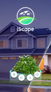
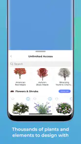
iScape is a landscaping visualization tool that helps homeowners, garden enthusiasts, and professionals plan outdoor spaces before making changes. You can use it to place plants, trees, flowers, hardscaping elements, water features, furniture, and other design objects onto a photo of your yard. This makes it easier to compare ideas, communicate plans, and create a more realistic impression of the finished landscape.
How does iScape create a landscape design from a real yard photo?
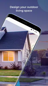
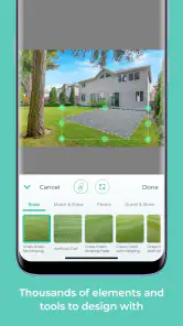
The app generally works by allowing you to take a new picture or import an existing photo of your garden, patio, or outdoor area. You can then add visual elements from its available catalog and position, resize, rotate, or layer them over the image. The result is a photo-based concept rather than a precise construction blueprint, so measurements and site conditions should still be checked separately.
Is iScape suitable for beginners, or is it mainly designed for professionals?
iScape is accessible to beginners because its visual editing approach is easier to understand than traditional landscape-design software. You do not need advanced technical knowledge to experiment with layouts and styles. At the same time, landscapers and designers may find it useful for presenting concepts to clients. However, professional users should treat the app as a presentation and planning aid, not a replacement for detailed plans.
Pros
- Easy drag-and-drop tools make garden planning approachable for beginners.
- Photo overlays help visualize plants and features in your actual outdoor space.
- The plant library offers useful inspiration for different landscape styles.
- Projects can be saved and revisited while comparing multiple design ideas.
- Helpful for discussing renovation concepts with landscapers or family members.
Cons
- Many useful plants and design elements require a paid subscription.
- Accurate results depend on taking clear
- well-framed photos of the area.
- Large projects may feel slow on older phones or tablets.
- The app focuses mainly on visual planning
- not detailed construction measurements.
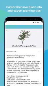
- Some plant information may vary by region and should be independently verified.
- Category
- Lifestyle
- Version
- 1.4.0