Vidius-Stunning Frames
- 240.00
- 4.0
- Installs
- 500.00K
- Price
- Free

Screenshots




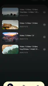
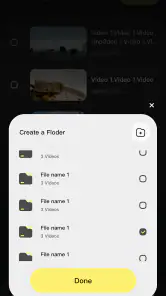
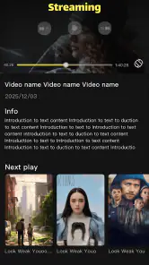

Analysis by Reviewed
Vidius-Stunning Frames is a free entertainment app from Edgar Kwena that I approached as a way to improve the quality of everyday viewing. Its store message points toward sharper, more impressive video, but the useful question is not simply whether a picture can look better. It is whether the app is comfortable to read, easy to navigate, and practical for people watching in different places or with different needs. After spending time with it, I see a straightforward viewer-focused tool with an appealing idea, although its value depends heavily on the quality of the original content and the device screen.
The app is available to a broad audience because it carries an Everyone age rating, and it is free to use. That makes it easy to try without turning the decision into a financial commitment. It runs on Android 7.0 and newer, while version 1.0.1 is the current release. Its 4.0 average from around 1.5 thousand ratings suggests that people generally respond well to it, but the score also leaves room for individual experiences to vary. I would not treat it as a replacement for every established video player. I would treat it as a focused option for anyone curious about a cleaner, more polished viewing experience.
How the interface feels when readability matters
My first concern with any visual entertainment app is whether I can understand the screen quickly. A viewer should not have to decode crowded controls before starting a film, clip, or other content. Vidius-Stunning Frames benefits from a simple purpose: it is built around watching rather than editing, messaging, or managing a large library. That narrow focus makes the app easier to approach than a tool overloaded with unrelated functions.
The name and presentation suggest that the visual result is the main attraction, so the interface needs to stay out of the way. I found that the best experience comes from treating the controls as temporary tools rather than part of the viewing surface. Start by choosing the content you want to watch, check the picture in a bright scene, and then settle into the video instead of repeatedly adjusting the display. This small habit reduces unnecessary navigation and keeps attention on the actual image.
For readers who prefer larger text or who find small labels tiring, the practical limitation is that visual enhancement cannot automatically make every control easier to read. A sharper frame is not the same thing as a larger interface. I would use the operating system’s own text and display settings where needed, then assess whether the app remains comfortable. Those settings can help with menus, but they will not change the quality of a low-resolution source.
One useful way to judge the app is to compare the same short scene in Vidius-Stunning Frames and in your usual player. Choose a scene containing both faces and fine detail, such as hair, fabric, or distant lettering. Look first at the image, then at the controls. If the picture feels more defined without making the interface feel busier, the app is doing something useful for you. If the difference is barely visible, the familiar player may remain the more efficient choice.
Navigation also matters for people who do not want to make frequent visual adjustments. I prefer an app that lets me begin watching without a long setup routine. Vidius-Stunning Frames is most convincing in that role when I use it as a quick viewing destination rather than a place to organize every piece of media on my phone. That distinction is important: people looking for extensive catalog management, detailed playback customization, or a highly configurable media center may find a dedicated alternative more suitable.
More From Our News Desk

Clash of Clans Is Won Between the Battles

Android Auto Makes the Case for Quieter Car Software

MobiOffice: Transforming Mobile Productivity with Seamless Integration

EA SPORTS FC™ Mobile Soccer: Redefining Mobile Sports Gaming

How Microsoft OneDrive Became a Mobile Productivity Giant

How Google Translate Breaks Language Barriers Effortlessly
Small workflow choices that improve the experience
I recommend testing the app with three kinds of material instead of relying on one impressive clip. Use a bright outdoor scene, a dim indoor scene, and a video with text or fine patterns. This reveals whether the visual treatment helps consistently or only looks attractive in favorable conditions. It also exposes a common trade-off: extra sharpness can make compression marks, noise, or rough edges easier to notice.
A second useful habit is to compare viewing comfort at the distance you normally use. A picture that looks impressive when held close may not offer a meaningful improvement when the phone is placed farther away. This is particularly relevant for viewers with reduced visual acuity. The app may help when added clarity makes important forms easier to distinguish, but it cannot replace a larger display, appropriate glasses, or a properly adjusted system interface.
I also suggest avoiding constant switching between enhancement and ordinary playback while watching a full program. That makes small differences feel larger than they are and can become tiring. Instead, compare a few representative moments before choosing the mode that feels most comfortable. In my experience, a stable and relaxed viewing setup is more valuable than chasing the most dramatic frame-by-frame effect.
Motor, sensory, and situational considerations
Entertainment apps are often judged only by picture quality, yet physical interaction can determine whether someone enjoys using them. People with limited hand movement, tremors, joint pain, or fatigue may prefer a workflow with fewer taps and less precise control. Vidius-Stunning Frames is a better fit for those users when they can start content and leave the interface alone. It becomes less appealing if their preferred experience requires frequent fine adjustments.
That is why I would set up the app before a long viewing session. Select the content, position the phone, and make any necessary display changes while you still have energy and attention. For someone watching in bed or during a rest break, this can prevent repeated reaching and tapping. The same approach works for a user who relies on one hand or has difficulty targeting small controls accurately.
People with hearing-related needs should judge the app by the viewing material and their normal phone setup, not by the visual promise alone. A clearer picture does not automatically improve dialogue access. If subtitles or other audio alternatives are important to you, check how comfortably they can be used in your normal workflow and whether the text remains readable against changing backgrounds. I would not choose this app solely for hearing support; its central appeal is visual.
For viewers sensitive to intense contrast, rapid visual changes, or overly processed images, more definition is not always more comfortable. Some scenes can feel harsher when edges and texture stand out strongly. I recommend beginning with a short session and checking whether your eyes feel relaxed afterward. If the enhanced presentation causes strain, the ordinary player or a gentler display setting may be the wiser choice.
Color perception is another reason to compare rather than assume. A sharper presentation may help separate objects through clearer boundaries, but it cannot guarantee that colors will be easier for every viewer to distinguish. If you depend on color differences to follow content, test familiar scenes under the lighting conditions where you usually watch. A result that looks excellent in a bright room may not feel equally clear at night.
Users who rely on screen readers or other assistive technologies should also think about the whole interaction, not just the video surface. The visual quality of a frame does not tell me how every control will behave with a particular accessibility setup. I would test opening the app, selecting content, starting playback, and reaching the controls using the tools you already depend on. If that basic path is awkward, a more established player with a familiar accessibility workflow may be the better everyday option.
Where the app fits in real life
One realistic scenario is a commuter watching a downloaded clip during a quiet part of a journey. The phone may be held at an imperfect angle, the surrounding light may change, and the viewer may not want to keep adjusting the screen. In that situation, Vidius-Stunning Frames can make sense as a quick visual alternative to the default player, especially when the original clip contains details that look soft. The best result comes from preparing the video before the trip and avoiding a setup that requires repeated interaction.
Another scenario is sharing a phone with a family member who finds small details difficult to see. Instead of handing over a complicated media center, I would use a short familiar clip and compare the two viewing options together. This gives the other person control over the final judgment. What looks sharper to me may look tiring to them, and personal comfort should matter more than the app’s visual ambition.
The app can also suit someone who watches short entertainment content during breaks and wants a dedicated visual presentation without paying for another service. Its free price removes the usual trial barrier, while the broad age rating makes it approachable for general household use. Still, I would avoid presenting it as a universal solution. A person who mainly listens to content, needs advanced caption handling, or wants extensive library tools may gain more from a conventional media player designed around those priorities.
Its compatibility with Android 7.0 and newer is helpful for people keeping an older phone in service. That can be especially useful when a newer device is unavailable or when a family member uses a dependable older handset. Even so, compatibility alone does not guarantee identical comfort across screens. Display size, brightness, processing capability, and the condition of the source video all influence whether the visual change is worthwhile.
With over half a million installs, the app has reached a substantial audience for a relatively focused entertainment tool. I see that as a reason to give it a fair trial, not as proof that it will suit every viewer. The rating activity shows interest, but personal testing remains essential because visual preferences and accessibility needs differ sharply from one person to another.
Remaining barriers and practical trade-offs
The largest barrier is expectation. A phrase such as “Ultra HD quality” can lead people to expect that ordinary video will become genuinely high-resolution. In practice, an app can improve how a frame is presented, but it cannot recreate detail that was never captured. If the source is heavily compressed, blurry, or poorly lit, enhancement may expose its defects instead of hiding them. I would keep that limitation in mind before replacing a player that already works well.
There is also a trade-off between visual impact and comfort. Stronger edges can make objects appear more distinct, yet they may also emphasize ringing, blockiness, or artificial texture. This matters for viewers with migraines, visual sensitivity, or fatigue. The right question is not “Does the image look more dramatic?” but “Can I watch for my normal amount of time without discomfort?” That test is more meaningful than a quick screenshot comparison.
People with motor limitations may encounter friction whenever playback requires precise tapping or repeated gestures. My workaround is to prepare the viewing session in advance and keep the phone supported on a stable surface. Someone who needs frequent access to large, predictable controls may still prefer a familiar player with an interface they already know. Vidius-Stunning Frames is most practical when its visual role can be enjoyed with minimal ongoing interaction.
Situational access can change the verdict too. In direct sunlight, a screen may remain difficult to read regardless of image processing. In a dark room, excessive brightness or contrast may become uncomfortable. On a small display, the improvement may be less noticeable than expected, while a larger screen can reveal more of the source material’s strengths and weaknesses. I would test the app in the place where I actually watch, not only under ideal conditions.
There is a further decision for households with mixed needs. One person may value a more defined image, another may prioritize captions, and someone else may want simple audio controls. A single app rarely wins every category. I would keep the usual player installed and compare them rather than treating Vidius-Stunning Frames as an all-or-nothing replacement. That approach also makes it easier to return to the familiar option when a particular video or viewer benefits from it.
Privacy, permissions, and device behavior are areas where I would personally review the app’s current Android prompts before settling into regular use. I do not assume that a visual entertainment app should receive broad access simply because it plays media. Read each request in context, allow only what fits your intended workflow, and reconsider the setup if the app asks for access that feels unrelated to viewing. This is a sensible habit for any free app, particularly one used by children or on a shared phone.
Who should try it, and who should skip it
I would recommend trying Vidius-Stunning Frames if you enjoy comparing visual presentation, watch clips where fine detail matters, or want a free alternative to the player already on your phone. It is also worth considering for someone using an older Android device who wants to see whether a dedicated viewing app feels better than the default option. The low commitment makes a short, honest comparison easy.
I would be more cautious if you need dependable support for captions, screen-reader navigation, extensive playback controls, or a carefully managed media library. In those cases, choose the player whose core design matches your access needs first, then consider visual enhancement as a secondary benefit. I would also skip it if your main goal is to transform poor source footage into true high-definition material, because no presentation layer can fully overcome missing detail.
My most useful recommendation is to create a personal test rather than relying on the store summary. Pick content you know well, watch it in your normal room, and compare comfort after several minutes rather than judging only the first impression. Include a scene with faces, one with fine texture, and one with subtitles if you use them. That workflow quickly reveals whether the app offers a real improvement or merely a more noticeable effect.
My inclusive verdict on Vidius-Stunning Frames
Vidius-Stunning Frames is an approachable entertainment app with a clear visual purpose, a free entry point, and support for older Android versions. Edgar Kwena has positioned it as a way to make viewing feel more polished, and I can see why that idea appeals to people who care about image clarity. Its strongest quality is not that it solves every viewing problem, but that it gives users a simple alternative to compare against the player they already use.
From an inclusive point of view, its success depends on context. It may help viewers who benefit from more apparent definition and who prefer a short, low-interaction viewing workflow. It is less convincing for people whose main barriers involve audio, complex navigation, precise motor control, or the need for advanced assistive support. Visual enhancement should complement those needs, not be mistaken for a complete accessibility solution.
The app’s 4.0 average and growing audience make it reasonable to test, while its current version, 1.0.1, reminds me to keep expectations practical and watch for how the experience develops. I would keep the default player available, compare familiar content, and let comfort decide. The best reason to use Vidius-Stunning Frames is not a promise of perfection, but the chance to find out whether its visual approach makes your own viewing easier and more enjoyable.
Vidius-Stunning Frames Frequently Asked Questions
What devices can run Vidius-Stunning Frames?
Vidius-Stunning Frames is an entertainment app for Android devices running version 7.0 or later. Check your device’s operating-system version before downloading, as compatibility can affect whether you can install and use the app. The app is free, and its current version is 1.0.1. Keeping your device’s software up to date can also help apps run smoothly.
Who developed Vidius-Stunning Frames, and is it popular?
Vidius-Stunning Frames was developed by Edgar Kwena. It has more than 500,000 installs, an average rating of 4.0, and around 1,500 ratings, giving prospective users a sense of its reach and overall reception. The app was released on January 25, 2026, and is rated Everyone, making it suitable for a general audience.
What is Vidius-Stunning Frames, and what can I use it for?
Vidius-Stunning Frames is a creative photo-editing app designed to enhance images with decorative frames and visual presentation effects. It can be useful for preparing pictures for social media, creating greeting cards, highlighting special memories, or giving ordinary photos a more polished appearance. Before downloading, keep in mind that the available tools, frame categories, and editing options may vary depending on your device and the app version.
Is Vidius-Stunning Frames easy to use for beginners?
The app is intended to provide a straightforward editing experience, making it suitable for users who want to decorate photos without learning complicated professional software. Typically, you select an image, browse the available frame styles, apply your preferred design, and save or share the result. However, users looking for advanced retouching, layered editing, or highly precise customization may find the controls more limited than those in full-featured photo editors.
Does Vidius-Stunning Frames include free frames and editing features?
Vidius-Stunning Frames may offer a selection of frames or basic features at no cost, while other designs or functions can depend on the app’s current distribution model. Availability may change after updates, and some versions can include advertising or optional purchases. It is a good idea to review the listing details, permissions, and in-app purchase information on the official Android or iOS store before installing.
Pros
- Quickly adds stylish frames to photos and videos.
- Includes creative designs for different moods and occasions.
- Simple controls make editing accessible for beginners.
- Useful for preparing content for social media posts.
- Preview changes before saving the finished creation.
Cons
- Some frame styles may require in-app purchases.
- Export quality can vary depending on the original media.
- Advanced editing tools may feel limited for experienced users.
- Large projects may take longer to process on older devices.
- The app may add branding or restrictions to certain exports.
- Category
- Entertainment
- Version
- 1.0.1