 About Bitmoji
Bitmoji Review: A Fast, Expressive Avatar App That Can Be Hard to Navigate
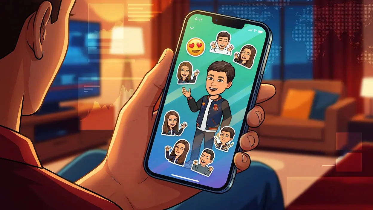
Bitmoji succeeds because it understands that most people do not want to design an avatar; they want a recognizable version of themselves ready to say something. That distinction shapes the whole experience. The app is less a character creator than a small, searchable expression desk: make a face, find a pose, send it into a conversation. Its best design decisions keep that loop moving. Its weaker ones show up when the app assumes you already know where to look.
After spending time with Bitmoji, I came away impressed by how efficiently it turns a personal avatar into everyday social shorthand. The design is friendly without feeling like a toy, and the sticker library gives the character a surprising range of moods. But this is an app whose value depends on speed and familiarity. When navigation gets in the way of finding the right reaction, the small delay matters more than it would in a conventional entertainment app.
A character creator that knows its real job
The central design thesis is strong: customization creates attachment, while stickers create usefulness. Bitmoji needs both, but it does not treat them as equally urgent. Once an avatar exists, the most frequent task is likely choosing a sticker and sharing it elsewhere. The interface makes that activity prominent, then keeps appearance editing available for the moments when a user wants to refresh their character. This is a sensible hierarchy for an app that lives partly inside conversations it does not control.
That choice also explains the product’s cultural staying power. A Bitmoji can function as a reaction, a signature, or a low-effort stand-in for the person sending it. The avatar is not merely decoration; it gives a message a little more personal texture than a stock emoji. A sticker of your character celebrating or looking unimpressed can feel pointed in a way a generic icon rarely does. The app’s usefulness, then, is social rather than practical in the usual productivity sense.


First use: enough direction, not quite enough context
On first opening the app, the path toward creating an avatar is easy to understand. The customization flow presents a sequence of choices, and its visual emphasis helps keep the process approachable. You are not asked to learn a complex editor before making progress. Categories break the task into manageable decisions, and seeing the character change as you adjust features gives each choice immediate meaning.
The trade-off is that a guided sequence can make the finished avatar feel like the destination, even though the app’s everyday purpose begins afterward. A new user may complete the fun part and still need a moment to understand how to browse stickers, save one, or share it through another app. The interface could do more to connect those stages: a concise, well-timed cue explaining that stickers can be searched and shared would orient a first-time user without turning setup into a tutorial.
There is also a personal judgment built into the editor. Appearance options invite experimentation, but the controls cannot capture every face or style equally well. That is a limitation of the format as much as a navigation flaw, yet the interface should make iteration feel low-risk. The useful message is not “get it right now,” but “you can come back and change it.” When that sense of reversibility is clear, customization feels playful rather than like a test of accuracy.
Latest News



Navigation and hierarchy: browsing is the main event
Once the avatar is ready, the sticker collection becomes the working surface. Categories provide a broad map of the available moods and situations, while search offers a faster route when a user has a phrase or feeling in mind. This split is appropriate: browsing suits the person who wants to discover something, and search suits the person who already knows what they need. The character remains visually consistent across the library, so the user can scan expressions without repeatedly relearning the app’s visual language.
The hierarchy is less convincing when broad category labels force users to guess how the collection has been organized. A person looking for a particular kind of response may not know whether it belongs under a mood, an occasion, or a general topic. That ambiguity is common in sticker libraries, but it is not harmless: the whole point is to find a useful image before the conversation moves on. Search is the obvious escape hatch, though it works best when users know the words the collection expects.
Bitmoji’s navigation is also shaped by the fact that sharing often happens through a keyboard or another app’s integration, not only from the main app. That makes the product feel less like a self-contained destination and more like a tool distributed across the phone. It is a smart model, but it creates a discoverability problem: features can appear in different places depending on how a person enters the experience. Google Maps has a clearer single-purpose destination, while Bitmoji must make its presence useful in several conversational contexts.
Feedback after actions: small confirmations carry weight
Sticker selection is a lightweight action, so feedback should be equally light but unmistakable. A visible preview or clear selected state reassures the user that the intended image is the one being shared. The app’s visual approach generally supports this: the artwork itself is prominent, and the user can identify the character and expression at a glance. That matters more than elaborate animation would. In a messaging workflow, the best feedback is the kind that confirms a choice without making the user wait.
Sharing is where the experience can feel less cohesive. A tap may hand the sticker off to another app, and the next stage of the action then depends on that app’s interface. The user has to understand whether the sticker was copied, inserted, or simply opened for selection elsewhere. This is not entirely within Bitmoji’s control, but the handoff is part of the experience from the user’s perspective. Clear labels and predictable previews can reduce uncertainty before the transition.
When the handoff works, the payoff is immediate: a personal expression appears in the conversation with little ceremony. That speed is the app’s strongest form of feedback. It turns a sequence of interface actions into a social response, and the response from the recipient becomes part of the reward. Bitmoji does not need to gamify that loop. The conversation itself supplies the reason to return.
Friction and recovery: the cost of a wrong turn
Most mistakes in Bitmoji are minor: choosing the wrong category, missing a search term, or deciding that an avatar detail does not look right. Recovery should therefore be almost invisible. Backtracking through customization is relatively intuitive because the task is divided into clear parts, and changing a choice does not carry the emotional cost of losing a finished project. That reversibility is an understated strength of the editor.
Sticker discovery is less forgiving. When a search returns an unexpected result or a category proves unhelpful, the user can try another route, but the interface does not always explain why the first attempt failed. A stronger recovery pattern would preserve the user’s intent, make it easy to broaden a search, and offer related categories rather than sending them back to the top of the library. These are small refinements, but they would make the app feel more attentive to how people actually search: tentatively, with partial words and shifting ideas.
There is a broader tension here between abundance and speed. A large collection makes the avatar useful across more moods and occasions, but it also creates more work for the person trying to pick one sticker. Adding content is not automatically a design improvement. The collection needs enough structure, useful search behavior, and sensible organization to keep the growing library from turning into a catalog that users skim past.
Consistency and the small screen
Bitmoji’s visual consistency is one of its quiet advantages. The avatar remains the anchor, and the illustrations make the app feel recognizably itself even as the user moves between editing and browsing. Controls generally serve the task at hand rather than competing with the artwork. This is especially important on a phone, where a crowded screen quickly makes a sticker library feel like a wall of tiny choices.
The small-screen decisions are mostly sound. Large, expressive illustrations are easy to identify at a glance, and a compact layout suits the quick, one-handed moments in which people often select a reaction. The compromise is that dense browsing can make category changes and fine-grained customization feel more fiddly. A phone gives the app intimacy, but not much room for comparison. The design wisely prioritizes the chosen character and sticker over extra controls, though some navigation cues could be more prominent without crowding the screen.
Consistency becomes harder across the wider experience, because the app shares work with keyboards, messaging tools, and other services. The visual handoff may vary, and the same action can feel different depending on where the user starts. Bitmoji cannot impose a single interface on every partner, but it can make the transition legible and keep its own naming and expectations steady. That distinction matters: consistency does not mean every screen must look identical; it means users should not have to guess what an action will do.
What experienced users notice
For a regular user, the editor is not the center of the experience anymore. The value lies in muscle memory: open the right panel, search or scan, choose a familiar expression, and get back to the conversation. That routine is where the app earns its place on a phone. If the path remains predictable, even a brief interaction feels effortless. If category labels or sharing behavior change the expected route, the friction is immediately noticeable precisely because the user has learned a faster one.
Experienced users also judge the library by its timing and tone. A sticker can be visually polished and still be useless if it does not fit the moment. The strongest entries communicate a clear emotion or situation without requiring explanation, and the avatar’s resemblance gives them an extra layer of personality. This is a more demanding standard than simply having many designs. The product works best when the collection feels like a vocabulary for ordinary conversation, not a gallery that happens to contain a few reactions.
Compared with a utility such as Android Auto, Bitmoji has no need to make every interaction serve a practical endpoint. Compared with Google Play Books & Audiobooks, it is not asking users to settle into a long session. Its ideal visit may last only seconds. That makes restraint a real design skill: get the user to a fitting expression, make the handoff clear, and let the conversation take over.
The strongest design choice
Bitmoji’s best decision is keeping one recognizable personal character at the center of a broad set of expressive situations. The avatar gives the library coherence, while variation in pose and mood keeps it useful. Without that anchor, the app would be a collection of interchangeable stickers. With it, even a simple reaction can feel authored by the person sending it.
That design choice also makes customization pay off beyond the editor. A user’s effort is carried into every sticker, turning setup into an investment in future interactions. It is a neat exchange: spend a little time shaping the character, then use that identity in small, everyday ways. This is the reason the app can be sticky without demanding long sessions or a complicated routine.
The limitation is that the personal anchor raises expectations the interface cannot always meet. If an avatar feels only approximately right, or if the perfect sticker is hard to locate, the promise of personal expression weakens. The best design work here is not adding more options for their own sake; it is making the existing choices easier to understand, revise, and reach.
A clear design verdict
Bitmoji is a thoughtfully shaped expression tool whose strongest moments happen between other things: during a message, after a joke, or when a quick reaction says more than plain text. It handles avatar creation with an approachable structure, keeps its character art easy to recognize, and turns customization into a reusable social asset. Those choices give the app a clear purpose and a durable place in everyday phone use.
Its weaknesses are mostly about orientation and handoff. New users could use a better bridge from avatar creation to sticker sharing; regulars would benefit from more forgiving discovery and clearer transitions between the app and the services around it. None of that undercuts the core idea, but it keeps an otherwise polished interaction from feeling consistently effortless.
The design verdict is positive, with one important caveat: Bitmoji is at its best when it helps people move quickly from “that’s how I feel” to a sticker that actually looks and sounds like them. It understands the social value of a familiar face better than it understands every route through its growing library. Smooth out that discovery gap, and the app’s most charming quality would also become its most reliable one.