 About Transparent clock and weather
Transparent Clock and Weather Turns Your Home Screen Into a Forecast
A weather app usually asks you to open it. Transparent clock and weather makes a different pitch: put the forecast on the home screen, let the clock and conditions sit over your wallpaper, and check the sky without taking another step. It sounds like a small design choice. In practice, it changes the app’s job from delivering a forecast to quietly occupying the most visible space on your phone.
That is the story here, and it is more interesting than a claim that one forecast is more accurate than another. This app’s appeal rests on proximity. The time, temperature, and weather details can be seen where you already look, making the phone’s home screen a tiny dashboard. The trade-off is just as clear: a useful widget can become visual clutter, and a polished presentation cannot guarantee that every forecast detail is the one you need.
A forecast that lives in plain sight
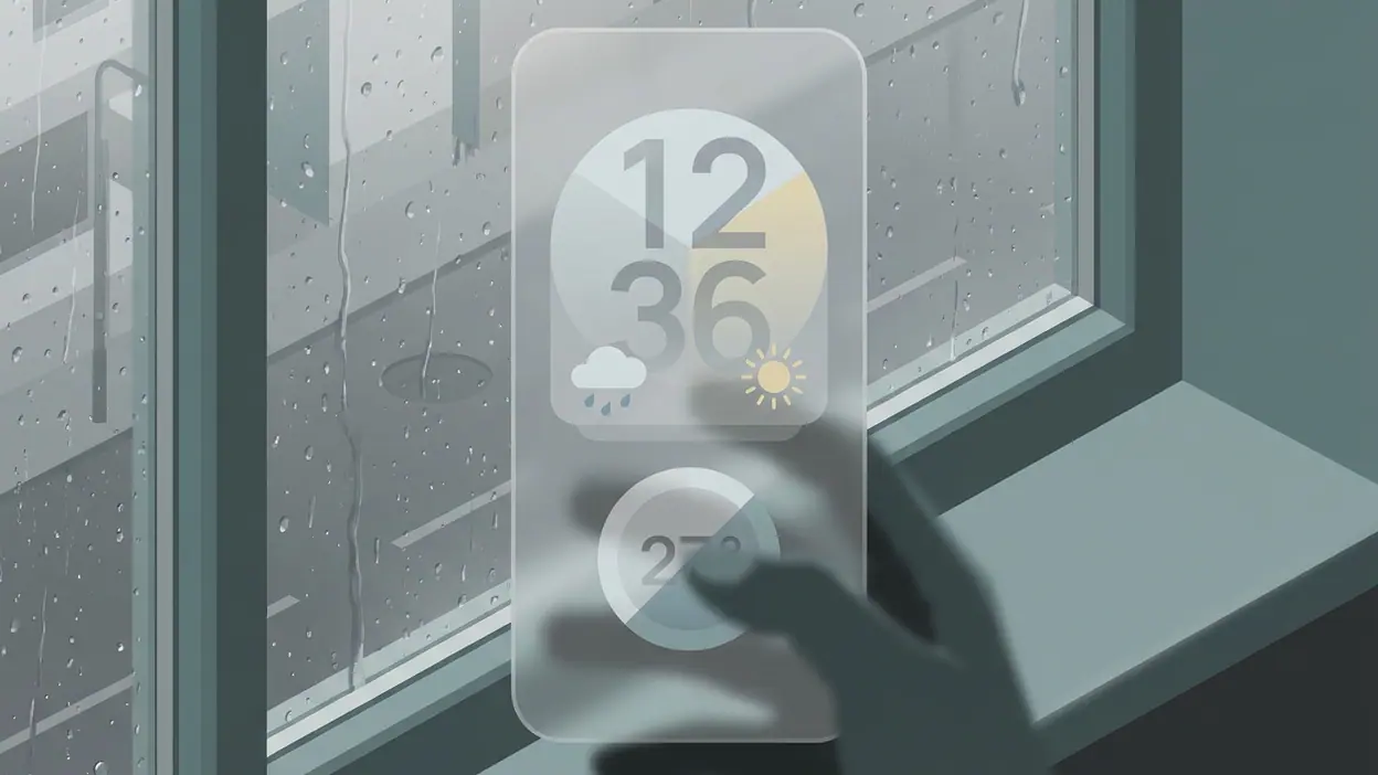
Transparent clock and weather is built around a home-screen widget that combines time and weather information. Its defining visual idea is transparency: rather than placing an opaque panel over the wallpaper, the widget can blend into the background and leave more of the screen visible. The result feels less like opening a weather service and more like furnishing the phone with a practical display.
That matters because weather checks are often brief. You want to know whether it is cold, whether rain is likely, or whether the conditions have changed before you leave. A widget reduces the distance between question and answer. There is no app launch to remember and no forecast screen to navigate just to get a quick read. For people who check the weather several times a day, those saved seconds add up to a habit.


The clock is not an accessory bolted onto the forecast; it gives the widget a reason to remain on the home screen all day. Time is already essential there, so adding weather information makes the space work harder. That combination is the product’s strongest practical argument. It does not need to persuade you to adopt a new routine. It tries to make an existing glance more useful.
Customization is central to that promise. Widget appearance and information density can be adjusted to fit different home-screen layouts and personal tastes. A restrained setup can sit quietly over a photograph; a more information-rich one can make the weather harder to miss. That flexibility is welcome, though it also means the best-looking configuration may take some experimentation. “Transparent” is a visual approach, not a guarantee that every wallpaper and widget arrangement will look equally clean.
Why the home screen became the headline
The attention around apps like this is easy to understand. Phone home screens have become personal spaces, tuned through wallpapers, icon arrangements, and widgets. A weather panel that respects the background promises utility without forcing the user to give up the look of the screen. It meets two desires at once: get information quickly, and keep the phone feeling like your own.
Latest News

That is a sharper proposition than simply offering another list of hourly temperatures. The user sees the forecast in the same place as the time, and the design can be adapted rather than imposed. For someone who dislikes opening a full-screen app for a basic check, that is not cosmetic. It is a small reduction in friction repeated over and over.
But the home screen is also a crowded piece of real estate. Calendar appointments, messages, music controls, and other widgets all compete for attention. The weather display earns its place only if it gives enough information to justify the space without overwhelming the wallpaper. The app’s central tension is therefore visual as much as meteorological: make the forecast obvious, but not so prominent that the phone starts to feel like a control panel.
The surprising detail is what it does not solve
Here is the catch: putting weather in front of you does not necessarily make the forecast more useful. A glanceable temperature is handy, but a glance cannot explain everything. If you need to compare the next several hours, understand a developing weather system, or decide whether a journey is safe, you may still need a dedicated forecast view. The widget can shorten the first step; it cannot replace every second one.
That distinction keeps expectations in check. Transparent clock and weather is strongest as a persistent summary, not as a claim to be the definitive tool for every weather decision. The more information a user wants visible at once, the more the widget risks losing its tidy, transparent quality. The less it shows, the more likely it is that a tap will still be necessary. There is no single layout that erases that compromise.
There is also a practical dependency on the phone’s home-screen system. Widgets are only as convenient as their placement, refresh behavior, and fit with the launcher or operating system. A beautifully configured display can still disappoint if updates lag behind what the user expects, or if a chosen layout forces important details into a cramped space. Those are not reasons to dismiss the app, but they are reasons to judge it on a real home screen rather than on the promise of its name.
The real user tension: calm or control
For a casual user, the appeal is immediate. You wake the screen, see the time and conditions, and get on with the day. For a more demanding weather watcher, the same simplicity can feel incomplete. They may want detailed radar, broader forecast context, or more ways to inspect changing conditions. The app has to serve both the person who wants a quick answer and the person who dislikes being left with only a quick answer.
In my view, its best use is not to replace a full weather app but to make routine checks effortless. That is a more modest role, and a more convincing one. The widget handles the everyday question; a deeper forecast tool handles the unusual or consequential one. Thinking of it this way avoids the familiar trap of expecting a home-screen display to be a full meteorological workstation.
That division of labor also makes the design choices easier to assess. If the time and current conditions are immediately legible, the widget is doing its main job. If customization lets it fit the home screen without demanding constant adjustment, that is a genuine benefit. If the interface encourages a user to rely on a single snapshot for a complicated decision, the convenience has gone too far.
What rival weather apps reveal
Comparisons with 1Weather Forecasts & Radar, Weather Radar - Meteored News, weather24: Forecast & Radar, and Windy.com - Weather Forecast help clarify the category rather than settle a winner. Their names point toward the broader ways people approach weather: forecasts, radar, news, and more detailed conditions. Transparent clock and weather competes on a different front. Its distinction is not that every weather task becomes easier, but that the basic forecast is closer at hand.
That contrast exposes the value of specialization. A feature-heavy weather service may be better suited to someone who wants to explore maps and forecast layers. A persistent clock-and-weather widget makes more sense for someone who wants the essentials visible while doing something else. These are different priorities, not necessarily different levels of quality. The useful question is not which app contains the most information, but which one gets the information you actually use into the right place.
It also explains why this app can feel more personal than a conventional forecast screen. The home screen is a space users arrange for themselves, and a transparent widget has to coexist with that arrangement. The forecast becomes part of the phone’s appearance, not just a destination within it. That may sound superficial until you consider how often a phone is checked without any intention of opening a weather app.
Small change, durable usefulness
There is no need to inflate this into a revolution. Transparent clock and weather does not make weather prediction inherently better by putting it on the wallpaper. Its more credible contribution is to make routine information easier to reach while giving users control over how that information sits on their device. The innovation is modest, but the behavior it supports is familiar and frequent.
That modesty is also why the app’s weaknesses matter. A widget that looks good but obscures its details fails its practical purpose. A forecast summary that is too sparse sends users back into the app anyway. And no amount of transparency can make the weather itself predictable. The product succeeds when its design stays out of the way without making the information hard to read.
Its real achievement is turning a repeated phone habit into a useful weather check. If you want a detailed radar session, one of the more forecast-focused rivals may suit you better. If you want the time and a quick view of conditions without opening another screen, this app’s approach makes sense. The payoff is not drama in the forecast; it is the quiet convenience of having the answer where your eyes already go.
That is the closing sting: the most useful weather app may be the one you rarely open. Transparent clock and weather earns its place not by demanding attention, but by making a small part of the day easier to manage. Keep expectations focused on the home-screen glance, and the idea holds up. Expect it to replace every weather tool on your phone, and the transparency starts to reveal what is missing.